Material Design
for Android Developers

Ahmad El-Melegy
Android Developer
About Me
CAT Member since 2013.
Ex-CAT Coordinator.
Ex-CATaZine Editor in Chief.
CSED student - 4th year.
Android Developer.
Back-end Developer.
Github https://github.com/AhmadElMelegy
Linkedin https://eg.linkedin.com/in/ahmadmelegy

Why Should I care ?

Who don't want ?!

Be Lazy !

Why Material ?
We need to stop designing for mobile, We need to stop designing for desktop. And definitely do not start designing just for wearables or just for TV or just for autos. Mobile is over.
We need to start designing for people.
Matias Duarte
Why Material ?
Why Material ?
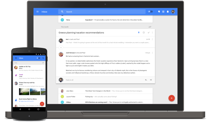
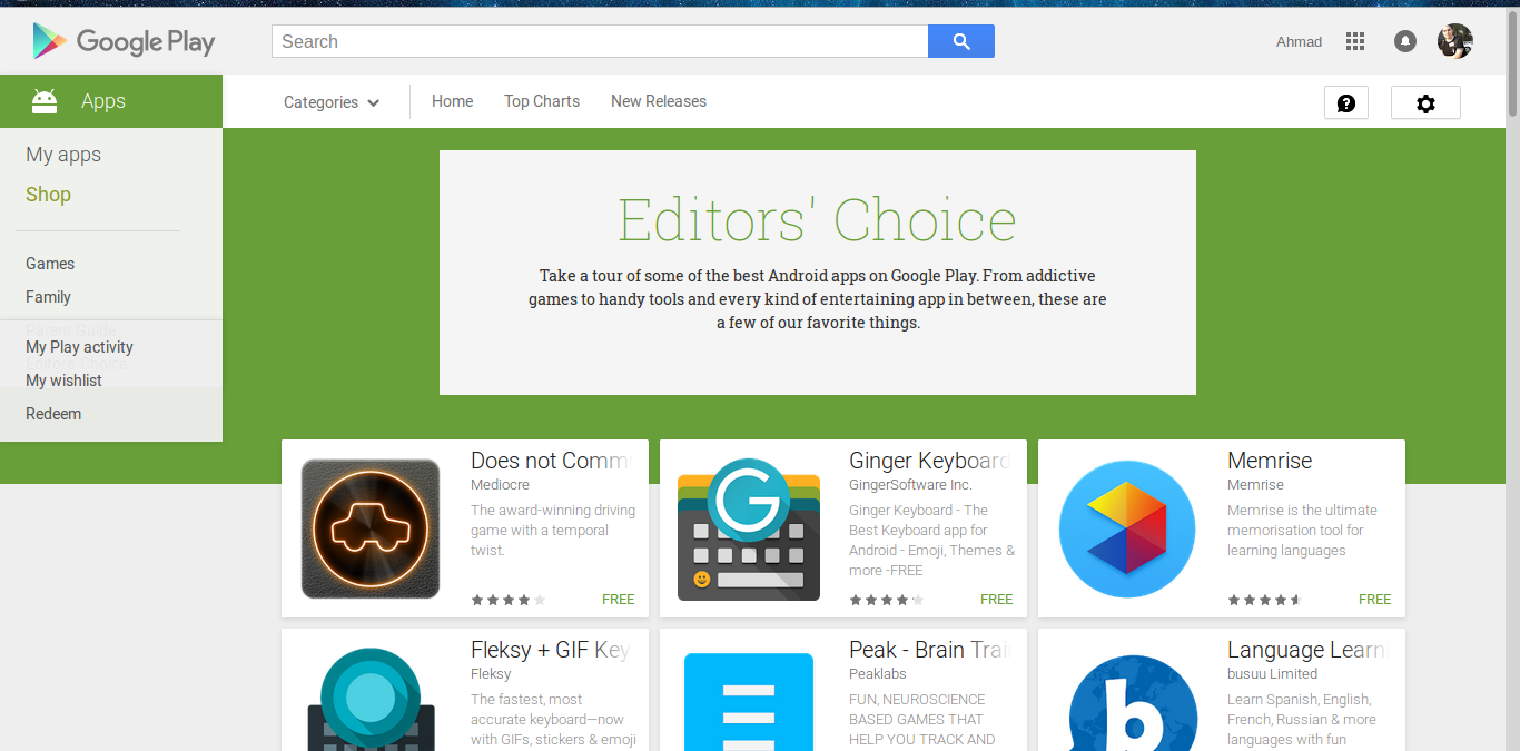
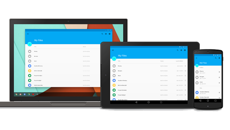
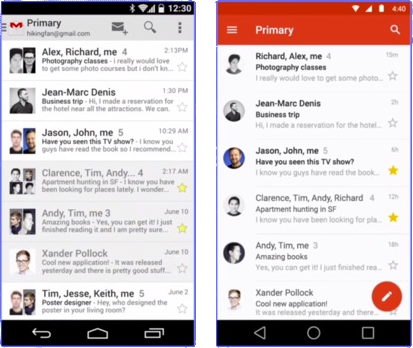
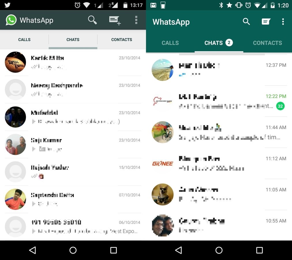
It's EVERYWHERE !!

Is it difficult ?

Material Design Support Library

One line does the Magic !
compile 'com.android.support:design:23.0.1'
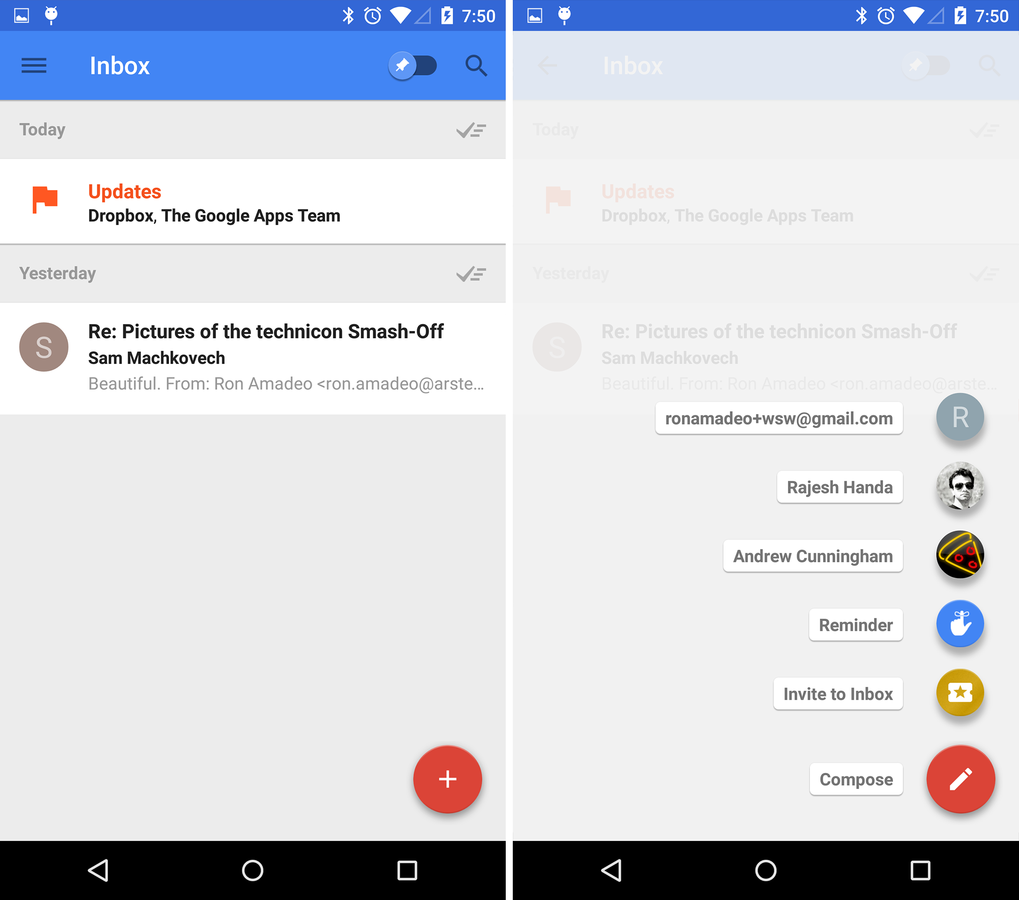
UI Components in Material Design Support Library
- Floating Action Button knows as FAB
- Snack Bar
- Coordinator Layout
- Toolbar
- Floating Labels for editing text
- Material Tabs
- Navigation Drawer view
- Motions and scrolling effect (Appbar and Toolbar)
Before we start !
But I have nothing to do with colours
Don't Panic !

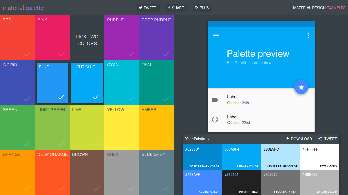
Material Palette
https://www.materialpalette.com/
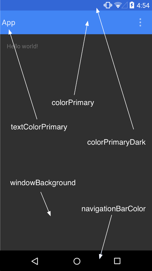
let's define our colours
<color name="colorPrimary">#3F51B5</color>
<color name="colorPrimaryDark">#303F9F</color>
<color name="colorAccent">#FF4081</color>
Use them
<style name="AppTheme" parent="Theme.AppCompat.Light.DarkActionBar">
    <item name="colorPrimary">@color/colorPrimary</item>
    <item name="colorPrimaryDark">@color/colorPrimaryDark</item>
    <item name="colorAccent">@color/colorAccent</item>
</style>
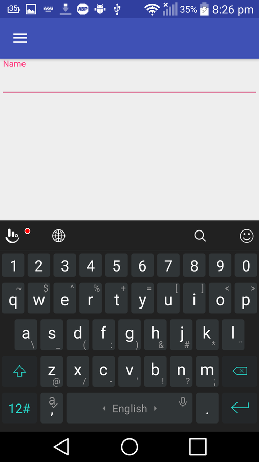
Floating Action Button
Floating Action Button
<FrameLayout
    android:id="@+id/rootLayout"
    android:layout_width="match_parent"
    android:layout_height="match_parent">

    <android.support.design.widget.FloatingActionButton
        android:id="@+id/fab"
        android:layout_width="wrap_content"
        android:layout_height="wrap_content"
        android:layout_gravity="bottom|end"
        android:layout_margin="@dimen/fab_margin"
        android:src="@android:drawable/ic_dialog_email"
        app:fabSize="normal"/>
</FrameLayout>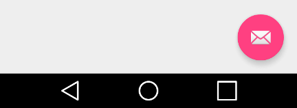
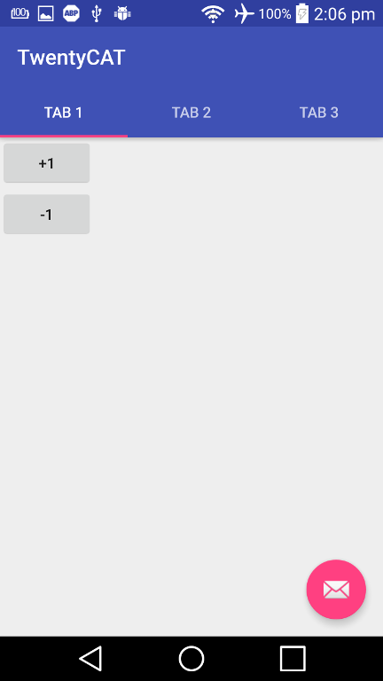
Add Some Action !
FloatingActionButton fab = (FloatingActionButton) findViewById(R.id.fab);
fab.setOnClickListener(new View.OnClickListener() {
    @Override
    public void onClick(View view) {
        Toast.makeText(MainActivity.this, "Add your action", Toast.LENGTH_SHORT).show();
    }
});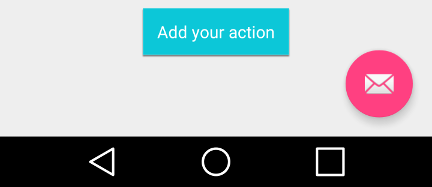
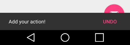
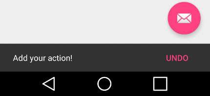
Snack bar
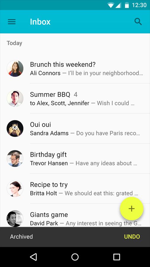
Snack bar
Snackbar.make(view, "Add your action!", Snackbar.LENGTH_SHORT)
        .setAction("Undo", new View.OnClickListener() {
            @Override
            public void onClick(View v) {
            }
        })
        .show();

Coordinator Layout
Coordinator Layout
<android.support.design.widget.CoordinatorLayout
    android:id="@+id/rootLayout"
    android:layout_width="match_parent"
    android:layout_height="match_parent"
    xmlns:android="http://schemas.android.com/apk/res/android"
    xmlns:app="http://schemas.android.com/apk/res-auto">

    <android.support.design.widget.FloatingActionButton
        ....
    />

</android.support.design.widget.CoordinatorLayout>
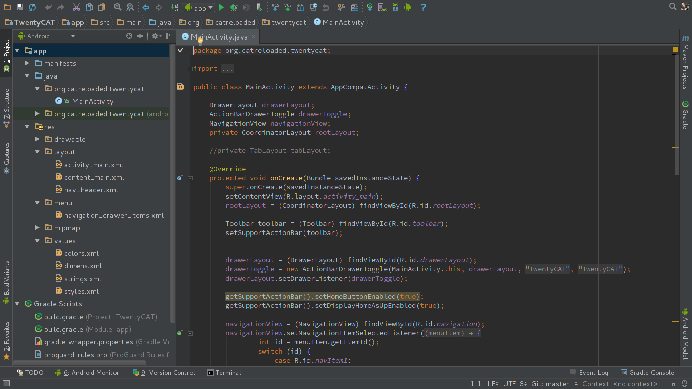
ActionBar ⟶ ToolBar
In the past
Nowadays
<style name="AppTheme" parent="Theme.AppCompat.Light.DarkActionBar">
    <item name="windowActionBar">false</item>
    <item name="windowNoTitle">true</item>
</style>
<android.support.design.widget.CoordinatorLayout
...>
<android.support.design.widget.AppBarLayout
android:layout_width="match_parent"
android:layout_height="wrap_content"
android:theme="@style/ThemeOverlay.AppCompat.Dark.ActionBar">
<android.support.v7.widget.Toolbar
android:id="@+id/toolbar"
android:layout_width="match_parent"
android:layout_height="?attr/actionBarSize"
android:background="?attr/colorPrimary"
app:popupTheme="@style/ThemeOverlay.AppCompat.Light"
app:theme="@style/ThemeOverlay.AppCompat.Dark.ActionBar" />
</android.support.design.widget.AppBarLayout>
...
</android.support.design.widget.CoordinatorLayout>Styles
Layout
Add Toolbar
Toolbar toolbar = (Toolbar) findViewById(R.id.toolbar);
setSupportActionBar(toolbar);
Add Toolbar in Activity/Fragment
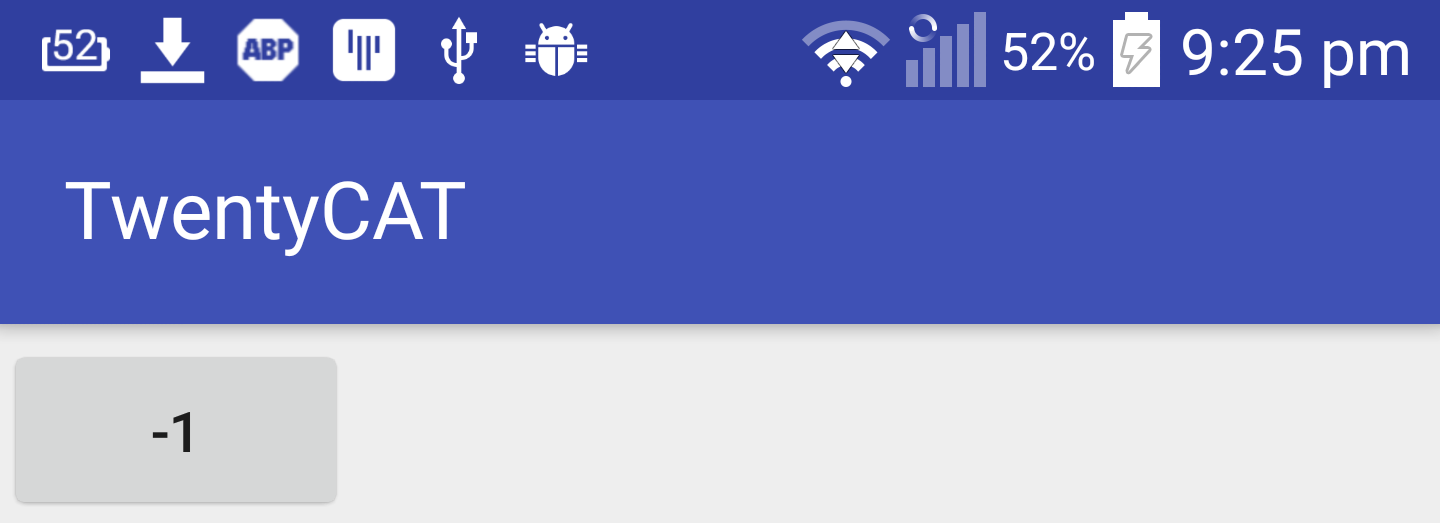
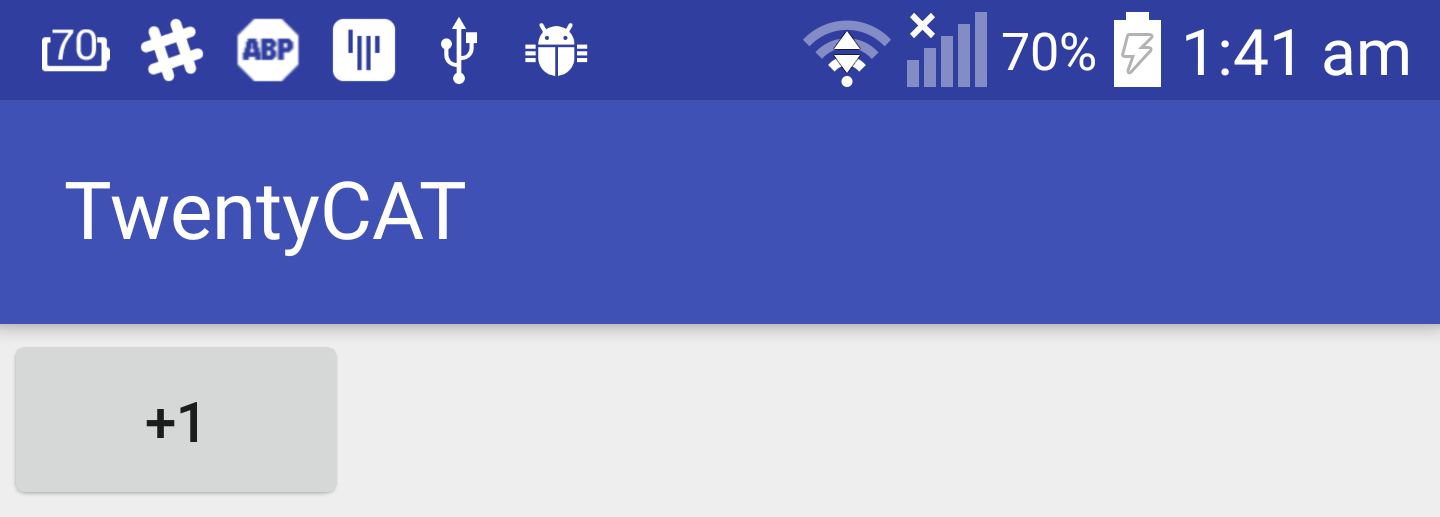
Let's Add some content
<LinearLayout
    android:layout_width="match_parent"
    android:layout_height="match_parent"
    android:orientation="vertical">

    <Button
        android:layout_width="wrap_content"
        android:layout_height="wrap_content"
        android:text="+1" />

    <Button
        android:layout_width="wrap_content"
        android:layout_height="wrap_content"
        android:text="-1" />
</LinearLayout>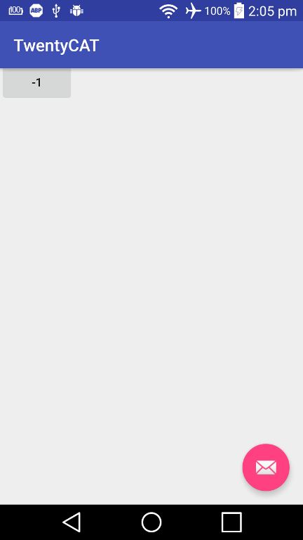
Fix it
<LinearLayout
    ...
    app:layout_behavior="@string/appbar_scrolling_view_behavior">

    ...
</LinearLayout>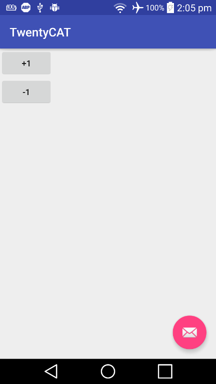
TabLayout
<android.support.design.widget.CoordinatorLayout
    ...>

    <android.support.design.widget.AppBarLayout
        ...>

        <android.support.v7.widget.Toolbar
            .../>

        <android.support.design.widget.TabLayout
            android:id="@+id/tabLayout"
            android:layout_width="match_parent"
            android:layout_height="wrap_content" />

    </android.support.design.widget.AppBarLayout>

    ...
</android.support.design.widget.CoordinatorLayout>
Layout
TabLayout tabLayout = (TabLayout) findViewById(R.id.tabLayout);
tabLayout.addTab(tabLayout.newTab().setText("Tab 1"));
tabLayout.addTab(tabLayout.newTab().setText("Tab 2"));
tabLayout.addTab(tabLayout.newTab().setText("Tab 3"));
Activity
TabLayout Attributes
app:tabMode="fixed"
app:tabGravity="fill"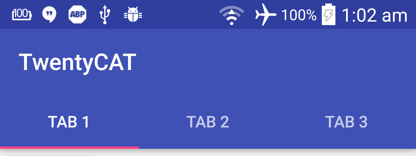
app:tabMode="fixed"
app:tabGravity="center"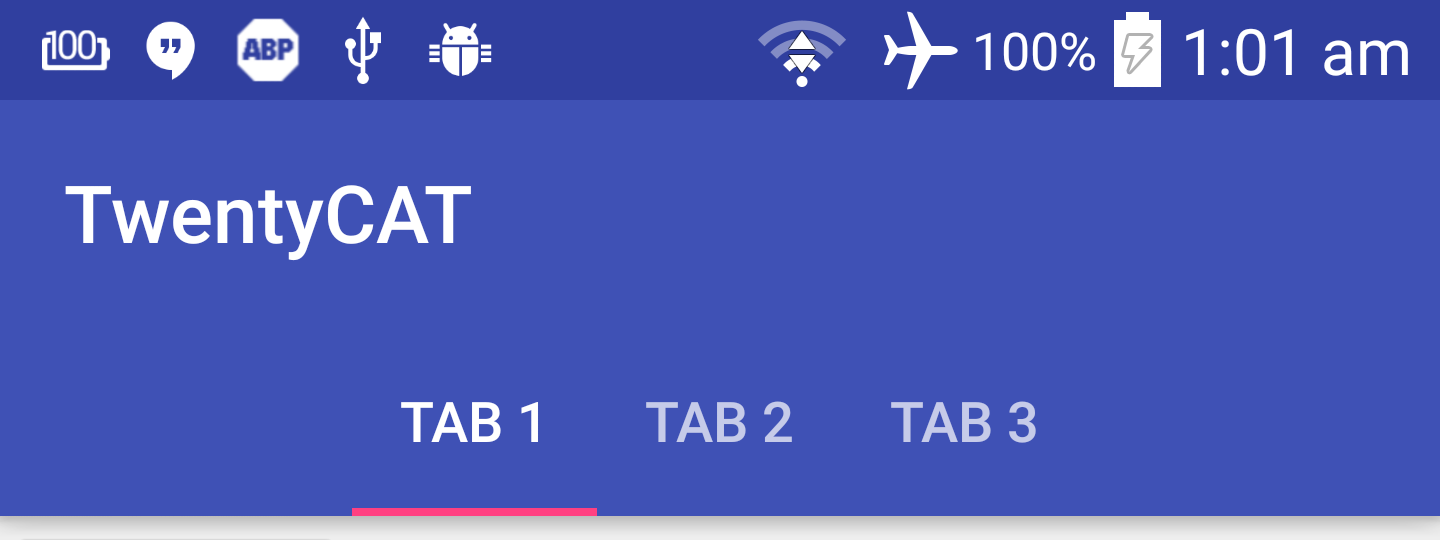
app:tabMode="fixed"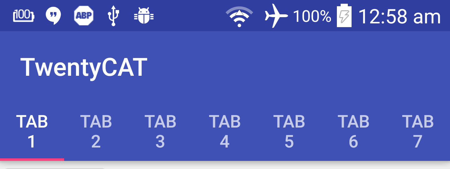
app:tabMode="scrollable"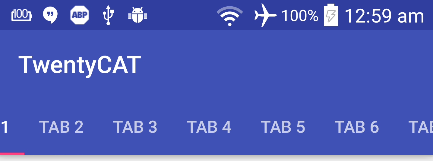
Let's play with AppBarLayout
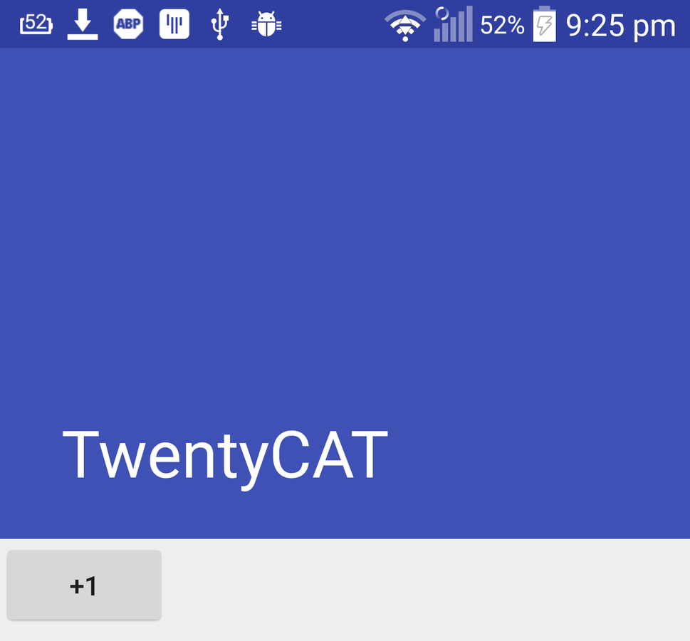
Add more content
<ScrollView
    android:layout_width="match_parent"
    android:layout_height="match_parent"
    app:layout_behavior="@string/appbar_scrolling_view_behavior">

    <LinearLayout
        android:layout_width="match_parent"
        android:layout_height="match_parent"
        android:orientation="vertical">

        <Button
            android:layout_width="wrap_content"
            android:layout_height="wrap_content"
            android:text="+1" />

        ...

    </LinearLayout>
</ScrollView>
Let's play with AppBarLayout
Then add a Scroll Flags to Toolbar like this
<android.support.v7.widget.Toolbar
    ...
    app:layout_scrollFlags="scroll|enterAlways" />
Replace ScrollView with NestedScrollView
<android.support.v4.widget.NestedScrollView
    android:layout_width="match_parent"
    android:layout_height="match_parent"
    app:layout_behavior="@string/appbar_scrolling_view_behavior">

    <LinearLayout
        android:layout_width="match_parent"
        android:layout_height="match_parent"
        android:orientation="vertical">

        <Button
            android:layout_width="wrap_content"
            android:layout_height="wrap_content"
            android:text="+1" />

        ...

    </LinearLayout>
</android.support.v4.widget.NestedScrollView>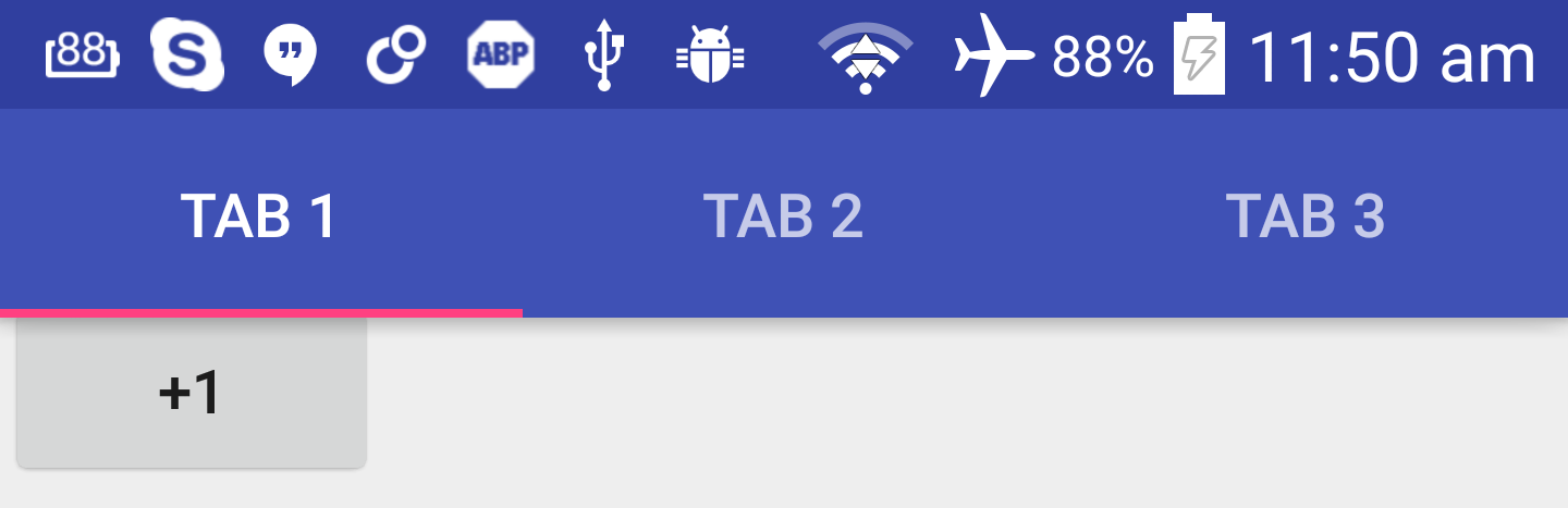
It WORKS !!
Scroll Flags
-
scroll
-
enterAlwaysCollapsed
-
enterAlways
- exitUntilCollapsed
CollapsingToolbarLayout
- Wrap Toolbar with CollapsingToolbarLayout but still be under AppBarLayout
- Remove layout_scrollFlags from Toolbar
- Declare layout_scrollFlags for CollapsingToolbarLayout and change it to scroll|exitUntilCollapsed
- Change AppBarLayout's layout height to the size of expanded state. In this example, I use 256dp
Steps
<android.support.design.widget.AppBarLayout
    android:layout_width="match_parent"
    android:layout_height="256dp"
    android:theme="@style/ThemeOverlay.AppCompat.Dark.ActionBar">

    <android.support.design.widget.CollapsingToolbarLayout
        android:id="@+id/collapsingToolbarLayout"
        android:layout_width="match_parent"
        android:layout_height="match_parent"
        app:layout_scrollFlags="scroll|exitUntilCollapsed">

        <android.support.v7.widget.Toolbar
            android:id="@+id/toolbar"
            android:layout_width="match_parent"
            android:layout_height="?attr/actionBarSize"
            android:background="?attr/colorPrimary"
            app:popupTheme="@style/ThemeOverlay.AppCompat.Light"
            app:theme="@style/ThemeOverlay.AppCompat.Dark.ActionBar" />

    </android.support.design.widget.CollapsingToolbarLayout>

</android.support.design.widget.AppBarLayout>
The Result
Modify the transition if you want
- app:expandedTitleMargin
- app:expandedTitleMarginBottom
- app:expandedTitleMarginEnd
- app:expandedTitleMarginStart
Add background image to App Bar
<ImageView
    android:layout_width="match_parent"
    android:layout_height="match_parent"
    android:scaleType="centerCrop"
    android:src="@drawable/header" />

<android.support.v7.widget.Toolbar
    ...
Just Add an Image View !

Remove background attribute from toolbar.

parallax
<ImageView
   ...
   app:layout_collapseMode="parallax" />
Want the background colour back ?!
<ImageView
...
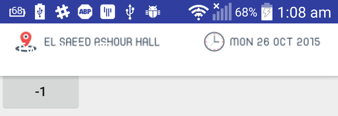
app:contentScrim="?attr/colorPrimary"/>Navigation Drawer
header view layout
res/layout/nav_header.xml
<FrameLayout xmlns:android="http://schemas.android.com/apk/res/android"
    android:layout_width="match_parent"
    android:layout_height="192dp"
    android:theme="@style/ThemeOverlay.AppCompat.Dark">

    <ImageView
        ...
        android:background="#2B3E51"
        android:scaleType="centerCrop" />

    <ImageView
        ...
        android:layout_gravity="bottom"
        android:layout_marginBottom="36dp"
        android:src="@drawable/cat" />

    <TextView
        ...
        android:layout_gravity="bottom"
        android:layout_margin="16dp"
        android:text="TwentyCAT"
        android:textAppearance="@style/TextAppearance.AppCompat.Body1" />

</FrameLayout>
Add navigation menu
res/menu/navigation_drawer_items.xml
<menu xmlns:android="http://schemas.android.com/apk/res/android">
    <group android:checkableBehavior="all">
        <item
            android:id="@+id/navItem1"
            android:icon="@android:drawable/ic_menu_mylocation"
            android:title="Home"/>

        <item
            android:id="@+id/navItem2"
            android:icon="@android:drawable/ic_menu_mylocation"
            android:title="About"/>

        <item
            android:id="@+id/navItem3"
            android:icon="@android:drawable/ic_menu_mylocation"
            android:title="Contact"/>
    </group>
</menu>
Add navigation view
res/layout/activity_main.xml
<android.support.v4.widget.DrawerLayout
    xmlns:android="http://schemas.android.com/apk/res/android"
    xmlns:app="http://schemas.android.com/apk/res-auto"
    xmlns:tools="http://schemas.android.com/tools"
    android:id="@+id/drawerLayout"
    android:layout_width="match_parent"
    android:layout_height="match_parent"
    tools:context=".MainActivity">

    <android.support.design.widget.CoordinatorLayout
    ...

    <android.support.design.widget.NavigationView
            android:id="@+id/navigation"
            android:layout_width="wrap_content"
            android:layout_height="match_parent"
            android:layout_gravity="start"
            app:headerLayout="@layout/nav_header"
            app:itemIconTint="#333"
            app:itemTextColor="#333"
            app:menu="@menu/navigation_drawer_items" />

</android.support.v4.widget.DrawerLayout>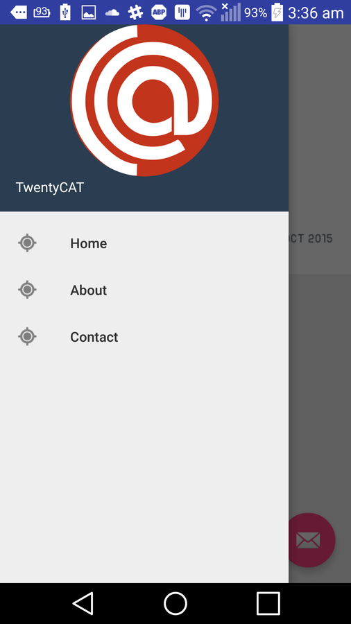
NavigationView nav = (NavigationView) findViewById(R.id.navigation)
nav.setNavigationItemSelectedListener(new NavigationView.OnNavigationItemSelectedListener() {
    @Override
        public boolean onNavigationItemSelected(MenuItem menuItem) {
            int id = menuItem.getItemId();
            switch (id) {
                case R.id.navItem1:
                    break;
                case R.id.navItem2:
                    break;
                case R.id.navItem3:
                    break;
            }
            return false;
        }
});
handling navigation menu items click event
TextInputLayout
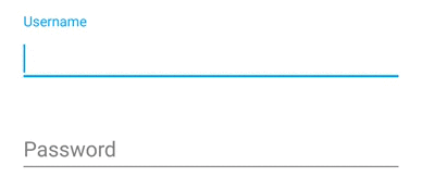
TextInputLayout
<LinearLayout
    android:layout_width="match_parent"
    android:layout_height="match_parent"
    android:focusableInTouchMode="true"
    android:orientation="vertical">

    <android.support.design.widget.TextInputLayout
        android:layout_width="match_parent"
        android:layout_height="wrap_content">

        <EditText
            android:layout_width="match_parent"
            android:layout_height="wrap_content"
            android:hint="Name" />
    </android.support.design.widget.TextInputLayout>
</LinearLayout>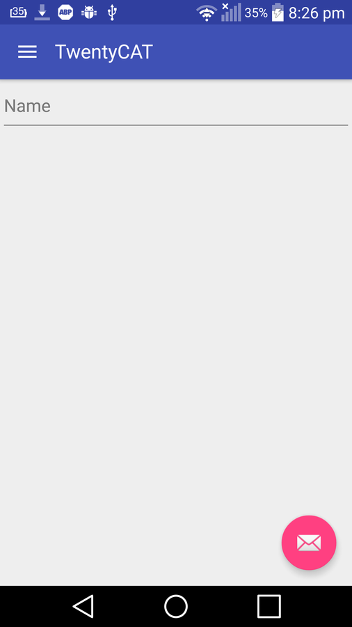
Enough for this library

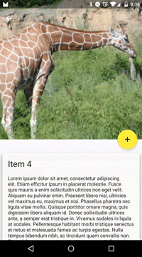
Card View
Add Card View Dependency
compile 'com.android.support:cardview-v7:21.0.+'<android.support.v7.widget.CardView
xmlns:card_view="http://schemas.android.com/apk/res-auto"
android:layout_width="fill_parent"
android:layout_height="wrap_content"
card_view:contentPadding="16dp"
card_view:cardElevation="2dp"
card_view:cardCornerRadius="5dp">
<LinearLayout
android:layout_width="fill_parent"
android:layout_height="wrap_content"
android:orientation="vertical">
<ImageView
android:layout_width="fill_parent"
android:layout_height="150dp"
android:src="@drawable/cat"
android:scaleType="fitXY"/>
<TextView
style="@style/Base.TextAppearance.AppCompat.Body1"
android:layout_width="fill_parent"
android:layout_height="wrap_content"
android:layout_marginTop="8dp"
android:text="CAT Reloaded" />
</LinearLayout>
</android.support.v7.widget.CardView>

Source Code
https://github.com/AhmadElMelegy/material-design-20CAT
Questions ?
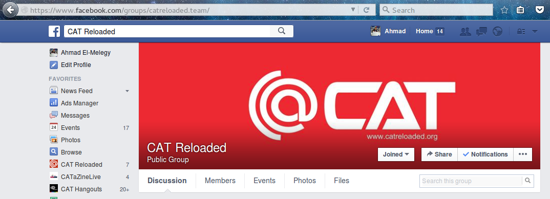
https://www.facebook.com/groups/catreloaded.team/
Thanks :)
Material Design for Android Development
By Ahmad El-Melegy
Material Design for Android Development
This deck was presented in 20 CAT event.