User Experience and Interface Design for Web Apps - II
@MichaelGiagg @AL_Laframboise

Today's Problem

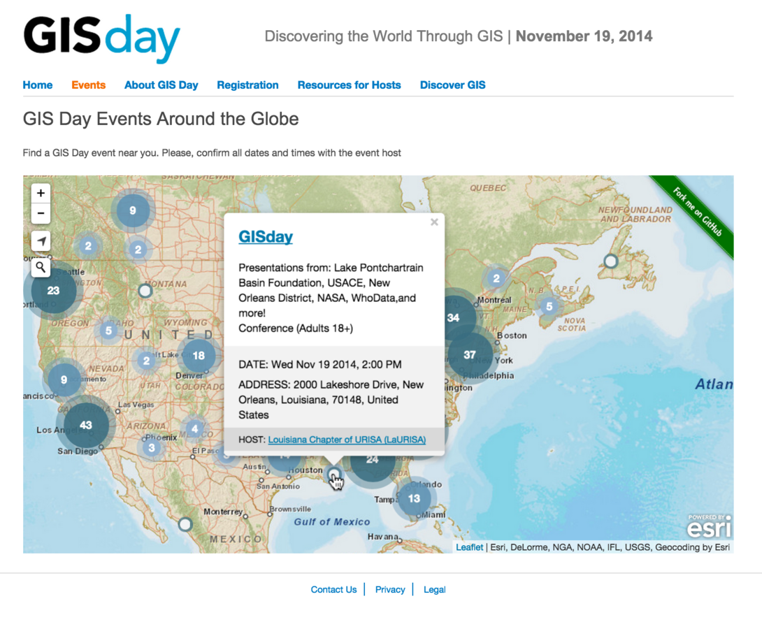
This is a working app.


Good design?


Need more information!
- Who was it designed for?
- What was it supposed to do?
- Were users able to accomplish their task?
- Were the users happy?
- What was the success criteria?

Design Process
- Strategy
- Concept
- Design
- Graphical Design
- Implementation

Strategy?


Original Strategy
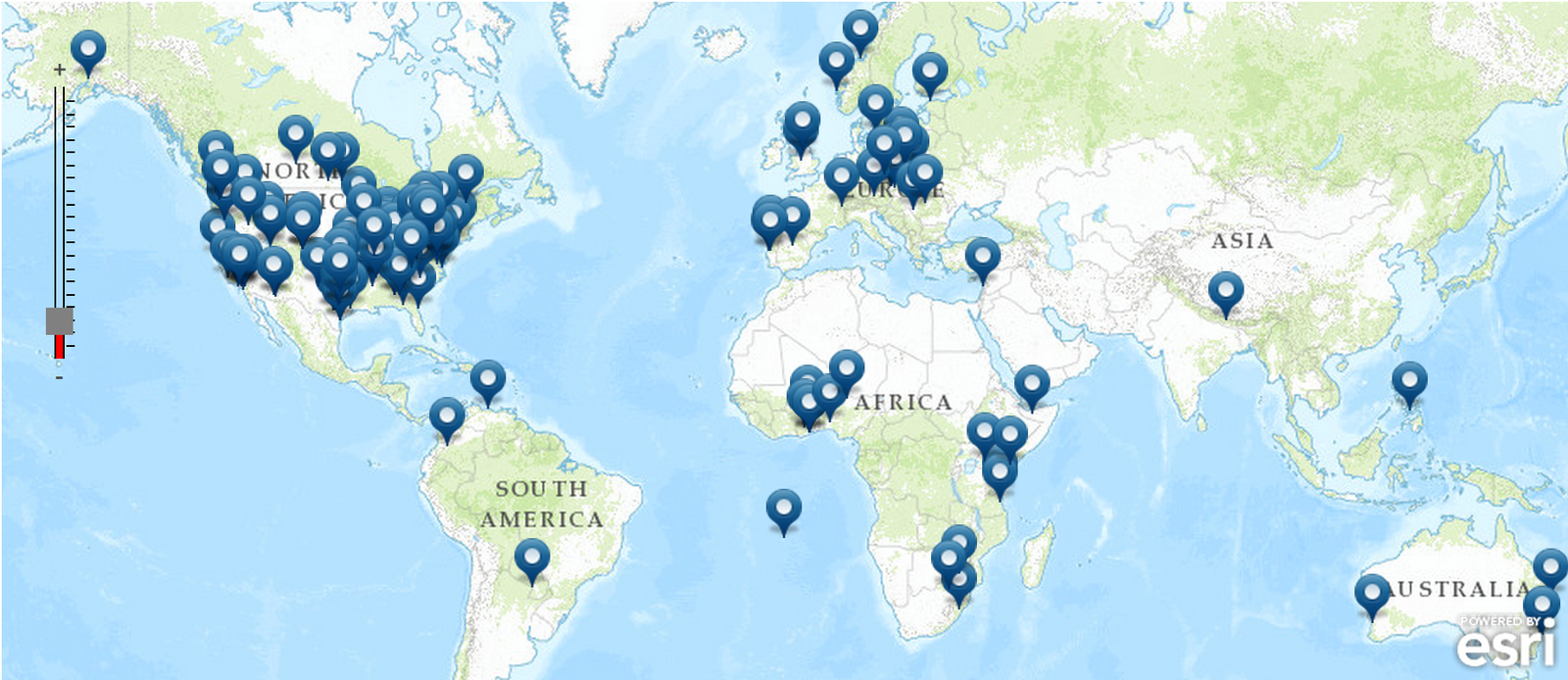
We need a map.
We need a map.
We need to solve a problem!


Useful?

Let's Redesign!

Strategy Revised - I
-
Why are we doing this?
- Who is our audience?
- What are the needs of the end-user?
-
Help people find GIS Day events near them (online)
-
Potential participants interested in GIS Day events...
- Find an event, learn about event, attend event

Strategy Revised - II
- What is the business need?
- What is the success criteria?
- People learn about GIS and discover Esri
- More people find and participate in events and more people use Esri software

Identify Problems


Call to "Maction"?


Context?


Use of space?


Cartography?


Map Controls?

Data?


Information?


Search for events?

Conceptual Design
User Story, Workflows, State diagrams

User Stories/Use Cases
- Primary - Search for place or event name
- Take them to an event
- Display information
- Secondary - Search via map controls
- Zoom
- Geolocation
- Map

Conceptual Workflow
- User opens GISDay.com webpage
- User types in search for a place or event name
- User selects search result (go to 4.)
- User moves cursor over map
- User clicks on map (go to 4.)
- Map zooms to location and shows popup info
- User clicks event links to learn more
- New webpage opens
- Email window opens

Wireframes
Disposable, Simplified Sketch

Blank Slate!


Context


Larger Map


Unified Search - place + event


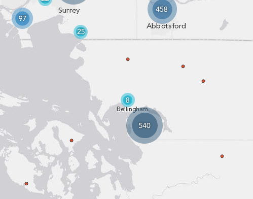
Overlapping Points


Event Information


Satisfied with Design?
Test against use cases and workflow.
Did it allow user to accomplish task?

Graphical Design
Colors, Schemes, Fonts...

Visual Hierarchy


Symbol Colors


Search UI


Popup


Interaction Design
Map UI Behaviors

Search Interaction


Select an Event
- Zoom to a location
- Expand cluster
- Show popup (information)

Popup Behavior


Popups
- Auto appear (no clicks)
- Centered on map
- Alway visible
- Mobile friendly
- Useful content
- Compliment selected item!

Cluster Behavior


Cluster
- Visual queues for hover
- Auto-expand and contract
- Simple transparency factors in CSS

Implementation
Frontend and Backend Coding

Data

Feature Service

esri-leaflet-geocoder
esri-leaflet-demographic-layer
esri-leaflet-heatmap-feature-layer
esri-leaflet-clustered-feature-layer
esri-leaflet-requirejs-example
esri-leaflet-browserify-example
esri-leaflet

The Result?


Before After


< 150 JS
< 200 CSS

And Usability Testing Says...


Did it allow users to complete the task?
Did it meet the business needs?
Did it meet our success criteria?
Was it a good design?

Final Notes
A well-designed "mapplication" is a useful application.
github.com/esri/gis-day-map
slides.com/michaelgaigg - slides.com/alaframboise
@MichaelGaigg @Al_Laframboise


Thank you!
-
Please fill out the sessions survey in your mobile app
-
Select "User Interface and User Experience Design for Web Apps"
-
Click "Technical Workshop Survey
-
Answer question and add comments

Better UI and UX Design for Mapping Apps - Part II
By alaframboise
Better UI and UX Design for Mapping Apps - Part II
- 5,895


