Build Better Component Libraries
with Styled System
A Brief Overview
Style Functions are at the core of Styled System
// from styled-system's README

import styled from 'styled-components'
import { space, width, fontSize, color } from 'styled-system'

// Add styled-system functions to your component

const Box = styled.div`
  ${space}
  ${width}
  ${fontSize}
  ${color}
`;

// example implementation

const Page = () => (
  <Box m={3} p={2} bg="palevioletred">
    Hello, World!
  </Box>
);
An Ideal Structure
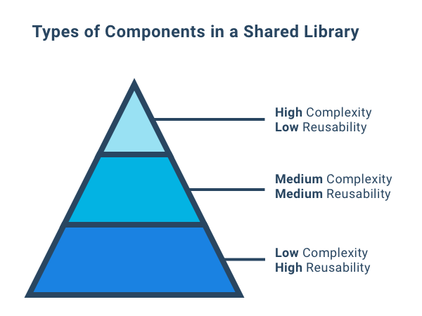
An Ideal Structure
Low Complexity & High Reusability
Buttons, Text, Cards, Labels, & Grid
Medium Complexity & Medium Reusability
Input field with label and validation text
Hight Complexity & Low Reusability
Date picker, Autocomplete input field
Application-Specific Components
Connectors
responsible for managing application-level state
Components
responsible for managing UI state and logic
Blocks & Elements
responsible for managing layout and styles
Why Build A Component Library?
Measure Twice, Cut Once
increase velocity across teams (design, dev, & QA)
Reduce Fragmentation
fewer components and more manageable UI
Adapt to Change
modular UI is designed to adapt and grow
Common Problems
Second-Class Theming
• design values are unknown or unclear
• consistency is tedious to maintain
• updates are time consuming
Common Problems
Inconsistent Component APIs
• generally unintuitive
• often lack discoverability
• rarely standardized
const ButtonCard = () => (
  <Card type="darkBorder" isThin>
    <Text type="small" isBold>Click the button</Text>
    <Button type="primary" small isDark>
      Primary Dark Small Button
    </Button>
  </Card>
);
Example
Common Problems
Component Fragmentation
• lack of component hierarchy
• components are difficult to extend / enhance
• duplicates and near-duplicates abound
├ components/
| ├ Card/
| | ├─ Badge.tsx      ← — — — Element
| | ├─ Header.tsx     ← — — — Element
| | └─ index.tsx      ← — — — Block
| ├ ProfileCard/
| | ├─ Badge.tsx      ← — — — Element
| | ├─ Header.tsx     ← — — — Element
| | └─ index.tsx      ← — — — Block
| ├ WarningCard/
| | ├─ Icon.tsx       ← — — — Element
| | ├─ Header.tsx     ← — — — Element
| | └─ index.tsx      ← — — — Block
| ├ SideModalCard/
| | ├─ Header.tsx     ← — — — Element
| | └─ index.tsx      ← — — — Block
Example
Styled System Solutions
First-Class Theming
• style props know how to navigate the theme
• making the right choice is simple
• mistakes are apparent
const ButtonCard = () => (
  <Card borderColor="borders.dark" p={2}>
    <Text color="slate" fontSize="small" fontWeight={2}>
      Click the button
    </Text>
    <Button variant="primaryDark" px={1} py={1}>
      Primary Dark Small Button
    </Button>
  </Card>
);
Example
Styled System Solutions
Consistent Component APIs
• shared API across components
• predictable output
• system teaches you how to use the system
Example
const ButtonCard = () => (
  <Card borderColor="borders.dark" p={2}>
    <Text color="slate" fontSize="small" fontWeight={2}>
      Click the button
    </Text>
    <Button variant="primaryDark" px={1} py={1}>
      Primary Dark Small Button
    </Button>
  </Card>
);
Styled System Solutions
Reduced Fragmentation
• encourages component reuse
• allows extension / enhancement
• supports hierarchical composition
Example
const ButtonCard = () => (
  <Card type="darkBorder" isThin>
    <Text type="small" mb={3} isBold>Click the button</Text>
    <Button type="primary" small isDark>
      Primary Dark Small Button
    </Button>
  </Card>
);
const EditProfilePage = () => (
  <PageLayout>
    <Heading as="h1">Edit Profile</Heading>
    <Card borderColor="borders.dark" p={2}>
      <Text color="slate" fontSize="small" fontWeight={2}>Edit Photo</Text>
      <Button variant="primaryDark" px={1} py={1}>Edit</Button>
      <Button variant="secondary" px={1} py={1}>Cancel</Button>
    </Card>
    <Card borderColor="borders.dark" p={2}>
      <Text color="slate" fontSize="small" fontWeight={2}>Edit Personal Info</Text>
      <Button variant="primaryDark" px={1} py={1}>Edit</Button>
      <Button variant="secondary" px={1} py={1}>Cancel</Button>
    </Card>
  </PageLayout>
);
Wrapping Up
Styled System Helps Keep UI Maintainable
• first-class theming
• consistent component APIs
• helps reduce fragmentation
Thanks For Listening!
Resources
• Build Better Component Libraries with Styled System (Alan Smith)
• Composite Component Pattern (Alan Smith)
• Component-based Design with Styled System (Varun Vachhar)
• How Styled System works (Styled System)
• Defining Component APIs in React (Brent Jackson)
• Atomic Design (Brad Frost)
• Subatomic Design Systems (Daniel Eden)
Styled System
By Alan Smith
Styled System
An internal Twilio talk about building components with styled-system


