FE like it's 2018, Y'all!

hey guys, did you hear they introduced tables ?

Diana Miron
front-end developer
UI/UX designer
JSgirls.ro founder
www.dianadesign.ro

www.jsgirls.ro
@JSgirls_ro
jsgirls.ro


Hello, world!

Andrei Antal
@andrei_antal
- frontend engineer (since I can remember)
- web & JS technologies enthusiast
- passion for UI design and UX
- perpetual learner
organizer for ngBucharest
@ngBucharest
groups/angularjs.bucharest



CONTENTS
- Web pages design history
- Responsive design and media queries
- Flexbox
- CSS Grid
INTRO
(pre) History of web design
...and then there was light
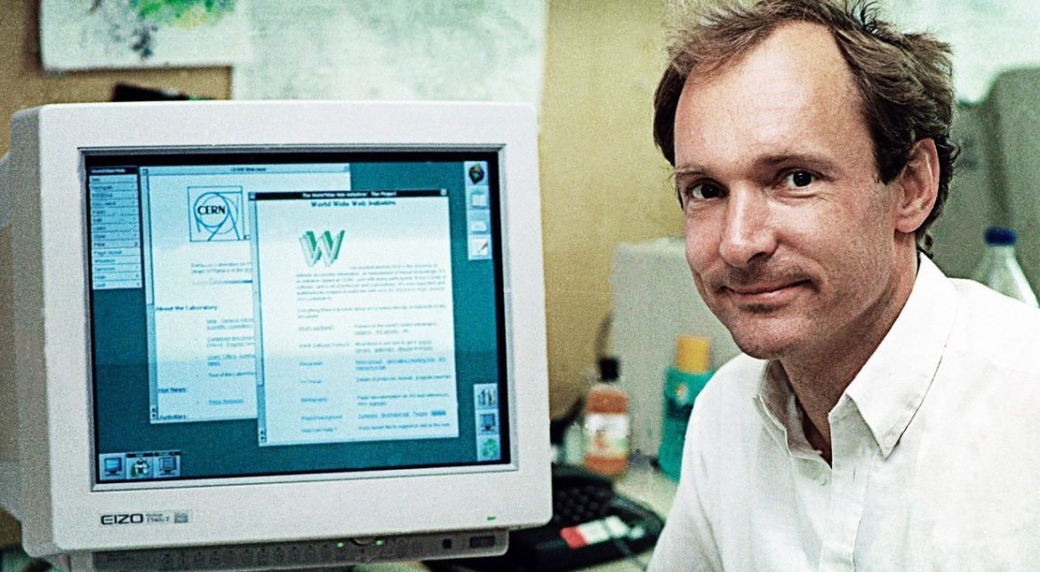

- The World Wide Web was invented by Tim Berners-Lee and developed at CERN in 1989-1990
- The first web browser was released to the public on August 1991
1991
- First Linux kernel released by Linus Torvald
- Intel 486 chip released
- Creative Labs releases first sound card
- Street Fighter 2 released
- Symantec releases Norton Anti Virus
- Terminator 2: Judgment Day released
- The Soviet Union dissolved - end of Cold War
- Start of Gulf War and Balkan War
- Nirvana releases Nevermind album
- Freddie Mercury died
The web close to day 10.000

The car at day 10.000

The TV at day 10.000
The phone at day 10.000
The human at day 10.000

The first web page
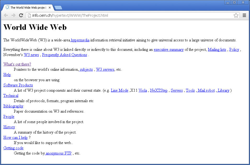
First browsers


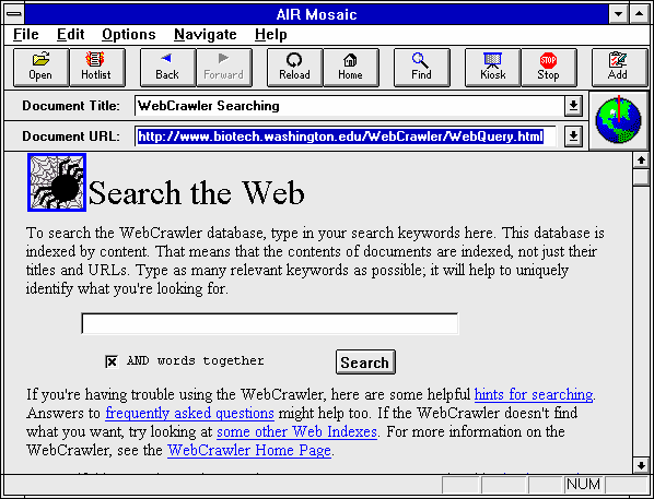
1993 - Mosaic browser - first commercial browser
1995 - Netscape and Internet Explorer
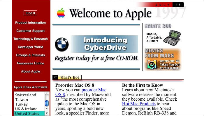
Early days
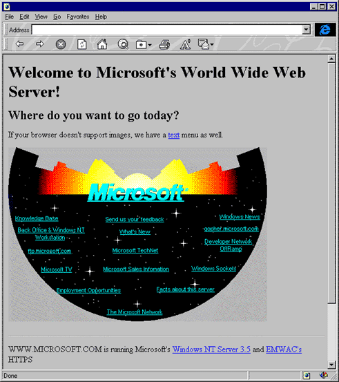
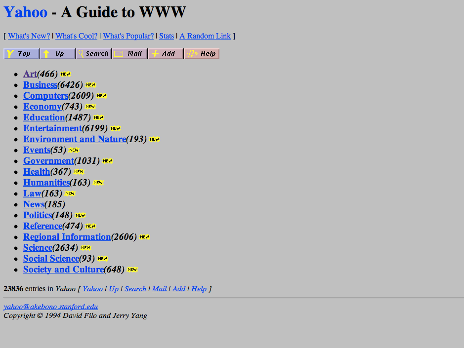
Second generation webistes
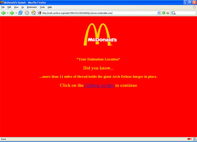
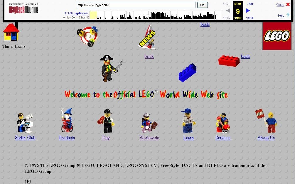
Design revolution

Table based layouts
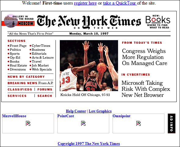
Spacer gif
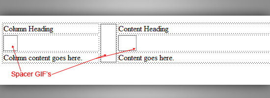
Table based layouts

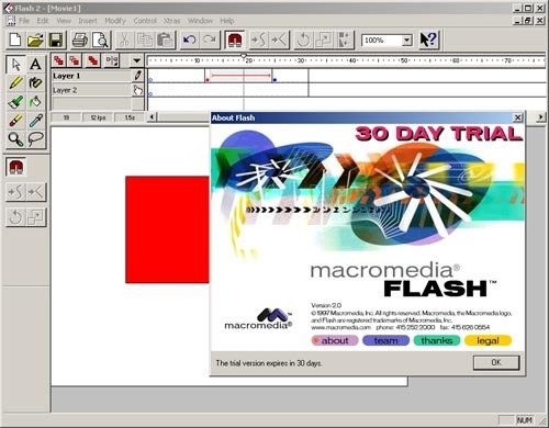
Macromedia Flash
CSS Timeline
Responsive Design
and
Media Queries
CSS Frameworks


Design for multiple screens

Responsive web design

Responsive web design
Definition
Responsive web design means designing your website so that it responds to your users environment based on screen size, platform and orientation.
Responsive web design
Definition
It looks different and things jiggle around, scale, re-order, appear, and disappear so it works well in your browser size or whatever device you’re using to view it...
Responsive web design
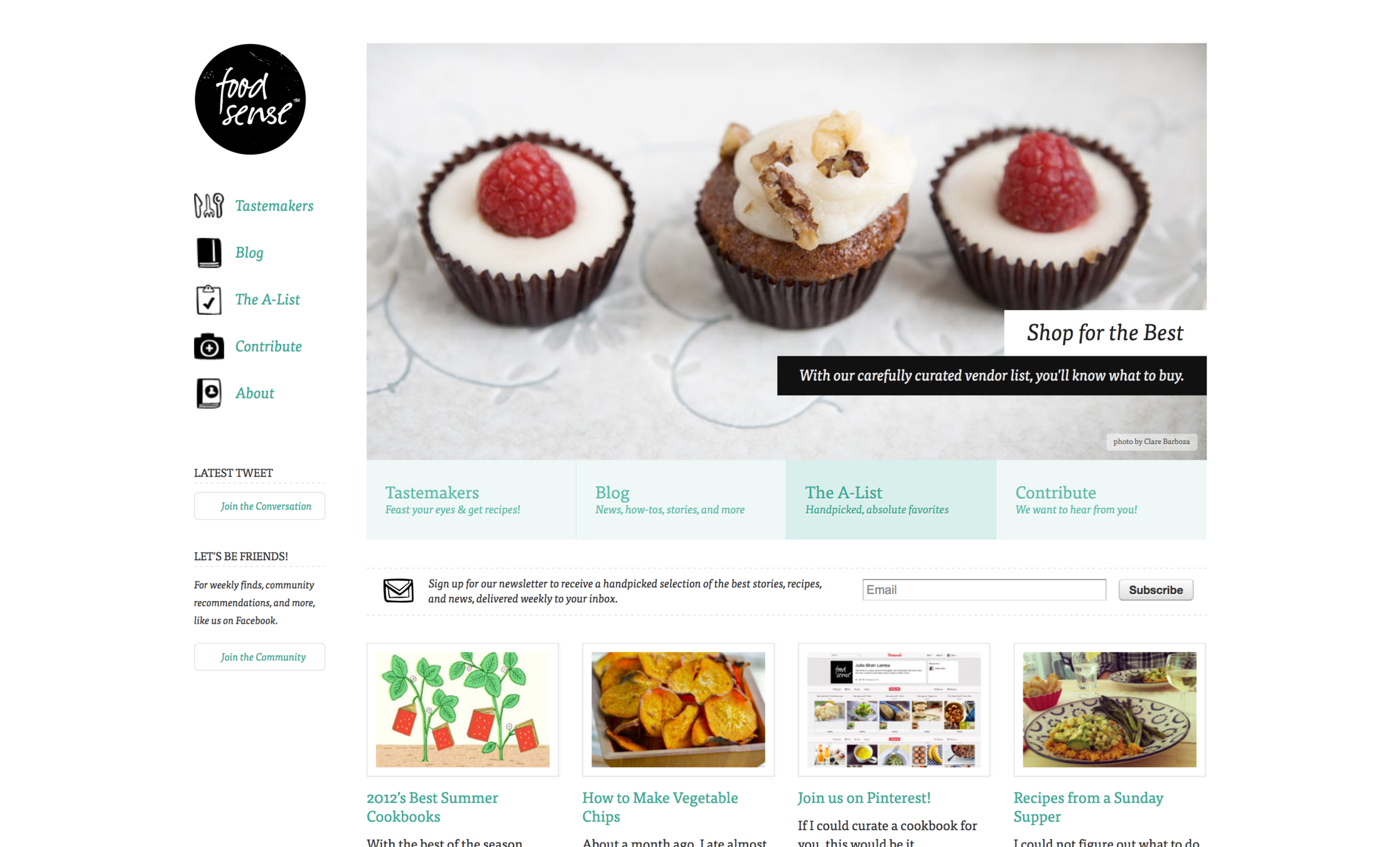
Responsive web design

Responsive web design

Responsive web design

Responsive web design

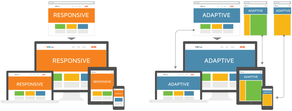
Adaptive vs Responsive
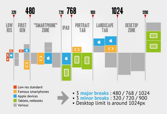
Breakpoints
Responsive web design
New ways of thinking
- Works on everything - Design for many sizes at once
- Clean design - reduce clutter, essential content only
- Design from the content out - Let content decide breakpoints
- Less Graphic files - CSS gradients, font icons
Layout patterns

Fluid Layout
Layout patterns
Column Drop

Layout patterns
Layout shifter

Navigation patterns
Toggle Navigation

Navigation patterns
Left Nav Flyout - aka Hamburger menu

RWD components
-
Flexible, grid-based layouts
- % widths and em units, not fixed pixels
-
Flexible images and media
- width/height not fixed
-
CSS3 Media Queries
- @media rule
Flexible layout

// HTML

<div class="container">
  <section>...</section>
  <aside>...</aside>
</div>
// CSS
.container {
width: 538px;
}
section, aside {
margin: 10px;
}
section {
float: left;
width: 340px;
}
aside {
float: right;
width: 158px;
}Flexible layout
target ÷ context = resultFlexible layout
section, aside {
  margin: 1.858736059%; /*  10px ÷ 538px = .018587361 */
}
section {
  float: left;
  width: 63.197026%;    /* 340px ÷ 538px = .63197026 */
}
aside {
  float: right;
  width: 29.3680297%;  /* 158px ÷ 538px = .293680297 */
}
Flexible layout
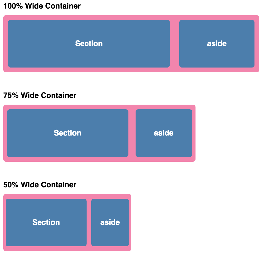
Flexible layout
Relative Viewport Lengths
- vw - Viewports width
- vh - Viewports height
- vmin - Minimum of the viewport’s height and width
- vmax - Maximum of the viewport’s height and width
Grid systems
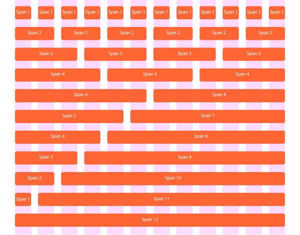
Media queries
Media queries provide the ability to specify different styles for individual browser and device circumstances -
apply uniquely targeted styles
// HTML

<!-- Separate CSS File -->
<link href="styles.css" rel="stylesheet" media="all and (max-width: 1024px)">
// CSS
/* @media Rule */
@media all and (max-width: 1024px) {...}
/* @import Rule */
@import url(styles.css) all and (max-width: 1024px) {...}Media queries
@media screen and ( min-width: 500px ) and ( max-width: 800px ) {

 /* CSS declarations */

}
The width of the window must be AT LEAST 500px
The width of the window must ALSO be NO MORE THAN 800px
media_feature: width | min-width | max-width | height | min-height | max-height | aspect-ratio | min-aspect-ratio | max-aspect-ratio | color | min-color | max-color | color-index | min-color-index | max-color-index | monochrome | min-monochrome | max-monochrome | resolution | min-resolution | max-resolution | scan | grid
media_type: all | aural | braille | handheld | print | projection | screen | tty | tv | embossed | speech
Media queries
@media screen and ( min-width: 500px ) and ( max-width: 800px ) {

    img {
        border: 5px solid #!f;
    }

}
Images will have a white border when the window is from 500px to 800px wide
Viewport <meta> tag

<meta name="viewport" content="width=device-width, initial-scale=1">DEMO TIME
Flexbox and Alignment
Floats

img {
  float: right;
  margin: 0 0 1em 1em;
}
Clearfix
.clearfix:after {
  content: "";
  display: table;
  clear: both;
}

Floating layout

nav {
  float: left;
  width: 200px;
}
section {
  margin-left: 200px;
}
nav {
float: left;
width: 25%;
}
section {
margin-left: 25%;
}Inline-block layout
nav {
  display: inline-block;
  vertical-align: top;
  width: 25%;
}
.column {
  display: inline-block;
  vertical-align: top;
  width: 75%;
}
Layout issues
Grids

Layout issues
Vertical centering
nasty
padding
line-height
transform
.element {
position: relative;
top: 50%;
transform: translateY(-50%);
}.middle {
display: table-cell;
vertical-align: middle;
}Source order shift

Basis for classic layout
The "display" property
- Block
- Inline
- None
Flexbox

<div class="container">
    <div class="item">Red</div>
    <div class="item">Orange</div>
    <div class="item">Yellow</div>
    <div class="item">Green</div>
    <div class="item">Blue</div>
</div>
Flexbox
<div class="container">
    <div class="item">Red</div>
    <div class="item">Orange</div>
    <div class="item">Yellow</div>
    <div class="item">Green</div>
    <div class="item">Blue</div>
</div>
.container {
  display: flex;
}
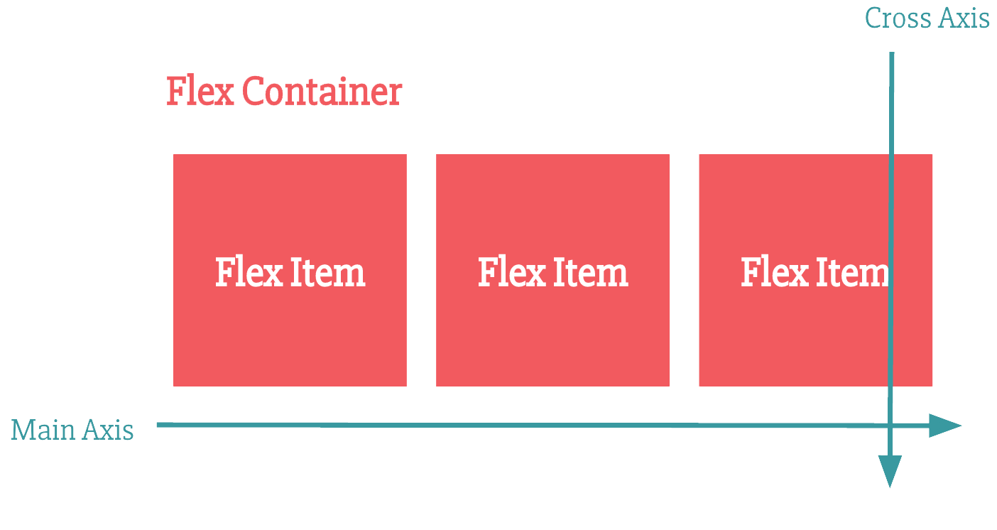
Flexbox content axis
Flexbox direction
<div class="container">
    <div class="item">Red</div>
    <div class="item">Orange</div>
    <div class="item">Yellow</div>
    <div class="item">Green</div>
    <div class="item">Blue</div>
</div>
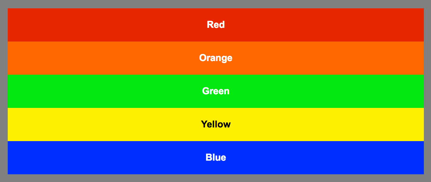
.container {
display: flex;
flex-direction: column; // row is the default
}
<div class="container">
    <div class="item">Red</div>
    <div class="item">Orange</div>
    <div class="item">Yellow</div>
    <div class="item">Green</div>
    <div class="item">Blue</div>
</div>
.container {
display: flex;
flex-direction: row-reverse;
}
Flexbox direction
<div class="container">
    <div class="item">Red</div>
    <div class="item">Orange</div>
    <div class="item">Yellow</div>
    <div class="item">Green</div>
    <div class="item">Blue</div>
</div>
.item:nth-child(5) {
order: -1;
}
.item:nth-child(2) {
order: 1;
}Flexbox child order

<div class="container">
    <div class="item">Red</div>
    <div class="item">Orange</div>
    <div class="item">Yellow</div>
    <div class="item">Green</div>
    <div class="item">Blue</div>
</div>
.container {
display: flex;
justify-content: center; /* aligns on main axis */
}Flexbox content alignment

.container {
  display: flex;
  justify-content: space-between;
}
Flexbox content alignment

.container {
  display: flex;
  justify-content: space-around;
}
.container {
    display: flex;
    height: 200px;
    align-items: stretch; /* streches along cross axis */
}
Flexbox content streching

.container {
    display: flex;
    height: 200px;
    align-items: flex-end;
}

.item:nth-child(3) {
    align-self: stretch;
}
Flexbox child alignment

.container {
    display: flex;
    height: 200px;
    justify-content: center;
    align-items: center;
}
Flexbox centering

.container {
    display: flex;
    height: 200px;
    justify-content: center;
    align-items: center;
}
Flexbox centering

.container {
    display: flex;
    height: 200px;
    justify-content: space-around;
    align-items: center;
}
Flexbox centering
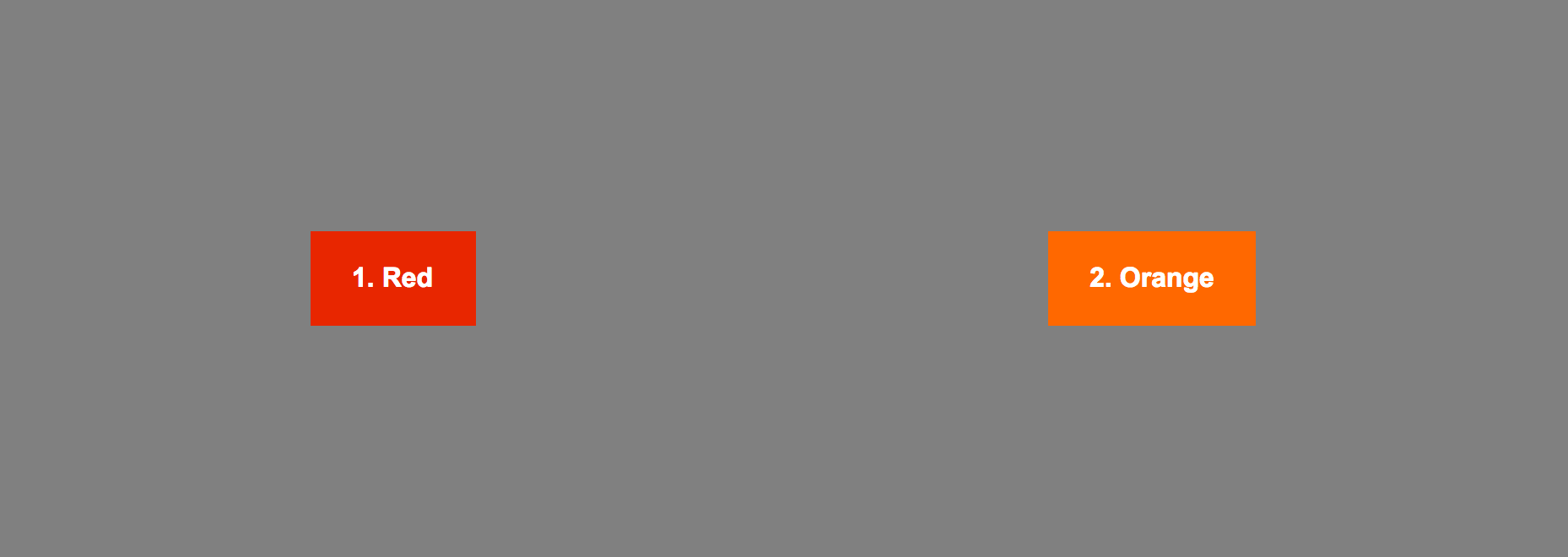
.container {
    display: flex;
}

.item:nth-child(4) {
    flex-grow: 1;
}
Flexbox content filling

.container {
    display: flex;
}

.item:nth-child(4) {
    flex-grow: 1; /* will be 1/3 of space left */
}

.item:nth-child(5) {
    flex-grow: 2; /* will be 2/3 of space left */
}
Flexbox content filling

.container {
    display: flex;
}
.item {
    flex-shrink: 0;
}
.item:nth-child(7) {
    flex-shrink: 1;
}
Flexbox content filling

.container {
    display: flex;
}
.item {
    flex-basis: 60px;
}
Flexbox basis size

.container {
    display: flex;
}
.item {
    flex-basis: 60px;
}
.item:nth-child(1) {
    flex-grow: 1;
}
Flexbox content filling

.item {
    flex-grow: 1;
    flex-shrink: 1;
    flex-basis: auto;
}

/* equivalent to */

.item {
    flex: 1 1 auto;
}
Flexbox shorthand syntax
.container {
    display: flex;
    flex-wrap: wrap;
}
.item {
    flex: 1 0 150px;
}
Flexbox content wrapping

Flexbox content wrapping

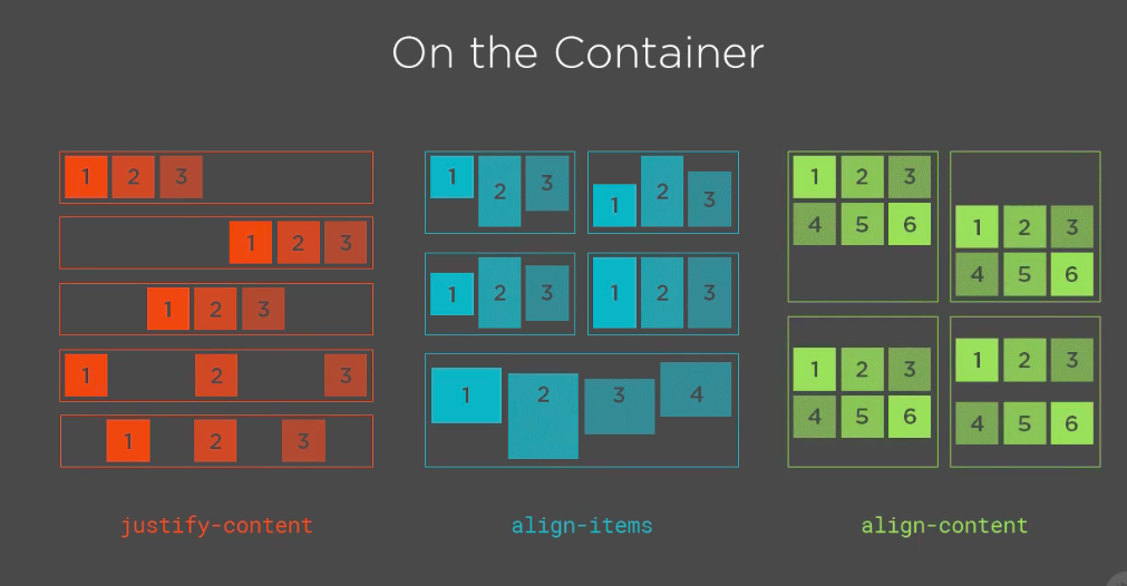
Flexbox
Flexbox
Flexbox is good for:
- Space distribution between elements and positioning (both vertical and horizontal)
- Centering items
- Sticky footers
- Form controls
Flexbox
Flexbox might not be the best candidate for:
- All layout for the page
- grids
Grid can position elements in 2 dimensions, flex only in one
https://github.com/philipwalton/flexbugs
🐞
CSS Grid
The Next Big 💩
built by those who did

1996 - “frame-based” layout model
2005 - Advanced Layout Module
Jan 2017 - Chromium 56 for Android
March 2017 - Firefox Mozilla
2 days later - Chrome
end of March - Opera + Safari
Ironically, the last company to ship CSS Grid was Microsoft
A terrific example of standards success and cross-browser collaboration.
It closes the loop on a process that has been more than 20 years in the making.

Why CSS Grid ?
CSS Grid can do things Flexbox can't do
Flexbox - layout in a single dimension – in a row OR a column
CSS Grid - layout of items in two dimensions – rows AND columns
Explicit about the size of a grid item + the size your content takes up
It is the most powerful layout tool that we have invented for CSS. Yet
Syntax
Grid Container
(parent)
.container {
  display: grid;
  grid-template-columns: 40px 50px auto 50px 40px;
  grid-template-rows: 25% 100px auto;
}
.container {
  display: grid;
  grid-template-columns: repeat(3, 20px) 5%;
}
.container {
display: grid;
grid-template-columns: 1fr 1fr 1fr;
}.container {
display: grid;
grid-template-columns: 1fr 50px 1fr 1fr;
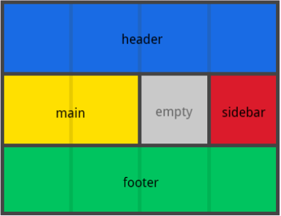
}.container {
grid-template-columns: 50px 50px 50px 50px;
grid-template-rows: auto;
grid-template-areas:
"header header header header"
"main main . sidebar"
"footer footer footer footer";
}
.item-a {
grid-area: header;
}
.item-b {
grid-area: main;
}
.item-c {
grid-area: sidebar;
}
.item-d {
grid-area: footer;
}
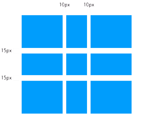
.container {
    display: grid;
    grid-column-gap: 10px;
    grid-row-gap: 15px;
}
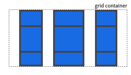
Alignment
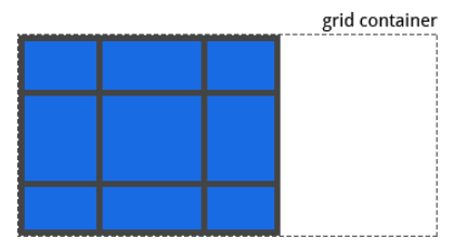
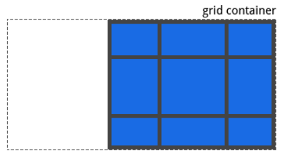
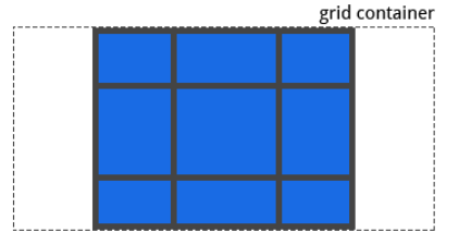
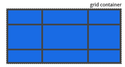
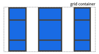
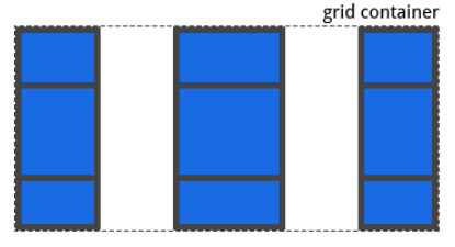
justify-content -> Aligns the content inside a grid item along the row axis
align-content -> Aligns the content inside a grid item along the column axis
.container {
  justify-content: start | end | center | stretch |
  space-around | space-between | space-evenly;
}
.container {
justify-content: start;
}
.container {
  justify-content: end;
}
.container {
  justify-content: center;
}
.container {
  justify-content: stretch;
}
.container {
  justify-content: space-around;
}
.container {
  justify-content: space-between;
}
.container {
  justify-content: space-evenly;
}
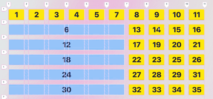
grid-auto-flow

.container {
  grid-auto-flow: row | column | row dense | column dense
}
Grid Items
(children)
grid-column-start
grid-column-end
grid-row-start
grid-row-end
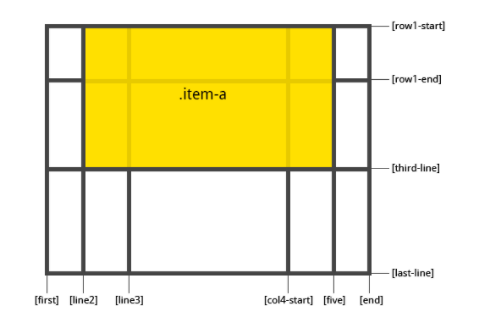
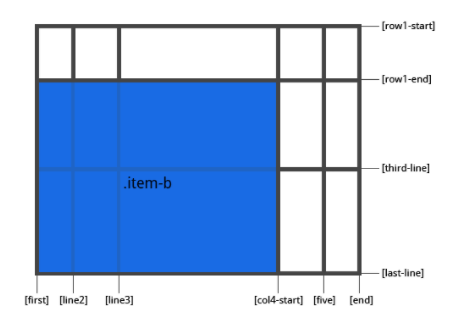
Positioning
.item-a {
  grid-column-start: 2;
  grid-column-end: five;
  grid-row-start: row1-start
  grid-row-end: 3
}
.item-b {
  grid-column-start: 1;
  grid-column-end: span col4-start;
  grid-row-start: 2
  grid-row-end: span 2
}
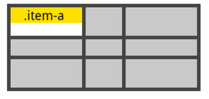
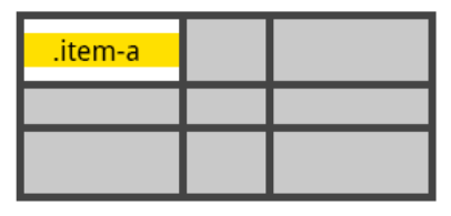
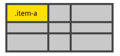
Alignment
justify-self -> Aligns the content inside a grid item along the row axis
align-self -> Aligns the content inside a grid item along the column axis
.item {
  justify-self: start | end | center | stretch;
  align-self: start | end | center | stretch;
}
.item-a {
align-self: start;
}.item-a {
align-self: end;
}
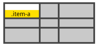
.item-a {
  align-self: center;
}
.item-a {
align-self: stretch;
}
Dev Tools

Resources
CSS Grid Layout Module Level 1
https://www.w3.org/TR/css-grid-1/
CSS Grid Layout – Mozilla Developer Network
https://developer.mozilla.org/en-US/docs/Web/CSS/CSS_Grid_Layout
Grid by Example – Rachel Andrew
https://gridbyexample.com/examples/
Grab & Go Grid Layout Patterns by Rachel Andrew
https://gridbyexample.com/patterns/
Layout Demos by Jen Simmons
http://labs.jensimmons.com/2016/
Learn CSS Grid by Jen Simmons
http://jensimmons.com/post/feb-27-2017/learn-css-grid
CSS Grid and Grid Inspector in Firefox
https://www.mozilla.org/en-US/developer/css-grid/
Practical CSS Grid: Adding Grid to an Existing Design by Eric Meyer
https://alistapart.com/article/practical-grid
Progressively Enhancing CSS Layout: From Floats To Flexbox To Grid by Manuel Matuzović
https://www.smashingmagazine.com/2017/07/enhancing-css-layout-floats-flexbox-grid/
Box Alignment Cheatsheet by Rachel Andrew
https://rachelandrew.co.uk/css/cheatsheets/box-alignment
CSS Grid Layout by Rachel Andrew – An Event Apart video
https://aneventapart.com/news/post/css-grid-layout-by-rachel-andrewan-event-apart-video
Revolutionize Your Page: Real Art Direction on the Web by Jen Simmons – An Event Apart video
https://aneventapart.com/news/post/real-art-direction-on-the-web-by-jen-simmons-an-event-apart
“Learn Grid Layout” video series by Rachel Andrew
https://gridbyexample.com/video/
Why I love CSS Grid – a short video by Jen Simmons
https://www.youtube.com/watch?v=tY-MHUsG6ls
Modern Layouts: Getting Out of Our Ruts by Jen Simmons – An Event Apart video
https://vimeo.com/147950924
Conclusion
Thanks Y'all!
antal.a.andrei@gmail.com


Diana
diana@ap3.ro
@dianadesign19
Andrei
@andrei_antal
Copy of Frontend Like It's 2018
By Andrei Antal
Copy of Frontend Like It's 2018
Coddete Celebration Days 2018 - Frontend Like It's 2018 by Diana and Andrei
- 1,810


