Web Accessibility for Designers
Andy Ernst
https://slides.com/andyernst/a11y-design


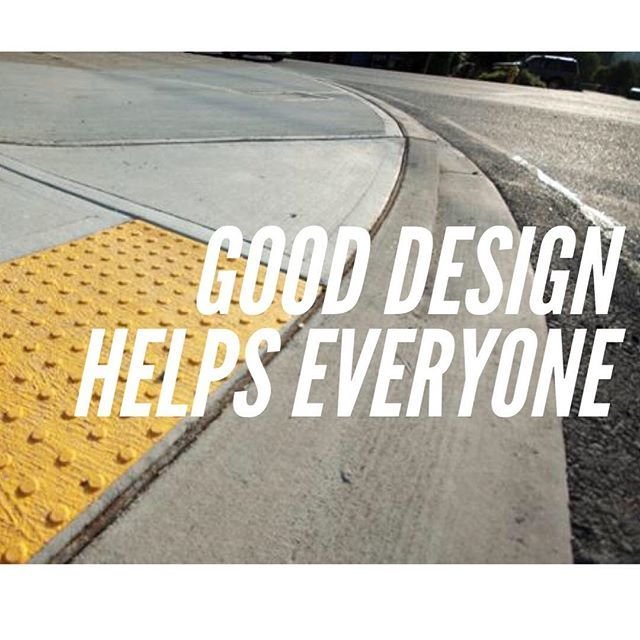
Goal of this talk
- What
- Who
- Why
- How
- Covering basics only
What is Accessibility?
- Called a11y for short
- Allowing people to see and use your products
- Inclusive experience for everyone
Parts of Accessibilty
- POUR
- Perceivable
- Operable
- Understandable
- Robust
Who are we talking about?
- 6% cognitive
- 4% seeing color
- 2% no or little vision
- 3% hearing
- 8% motor
http://www.interactiveaccessibility.com/accessibility-statistics
Why improve accessibility?
- More users
- Right thing to do
- Otherwise you'll get sued
- Better experience for everyone
- Easier to do early

fix it now!
Personas
-
Dyslexic
-
Low vision, color blind
-
Hearing-impaired
-
Motor impaired
-
Non-sighted
Sarah
- Dyslexia
-
Difficulty with
- reading

http://geon.github.io/programming/2016/03/03/dsxyliea
Fixes
- Limit text width
- Min text size 14px, but use rems
- Call outs
- Straightforward language
- Spelling tolerance
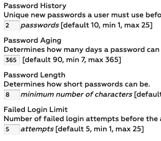

DEMO
Adjusting font sizes
Also helps when
- Distracted
- Skimming
- Non-native language
- Good design

Allan
- Low vision
- Color blind
-
Difficulty with:
- small fonts
- colors

Fixes
- Avoid small fonts
- Allow zooming
- Consider when fonts enlarged
- Consider high-contrast mode
- Multiple cues
- Test color with camera

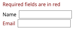
DEMO
Color blindness tester
Also helps when
- Forgot glasses
- Glare on screen
- Old monitor

Liz
- Cannot hear well
-
Difficulty with:
- any audio
- unclear/multiple audio
Fixes
- Multiple methods
- Avoid audio-only cues
- Add captioning/transcripts
- Volume/speed adjust
no text alternative?

Also helps when
- Noisy environment
- Non-native language
Julie
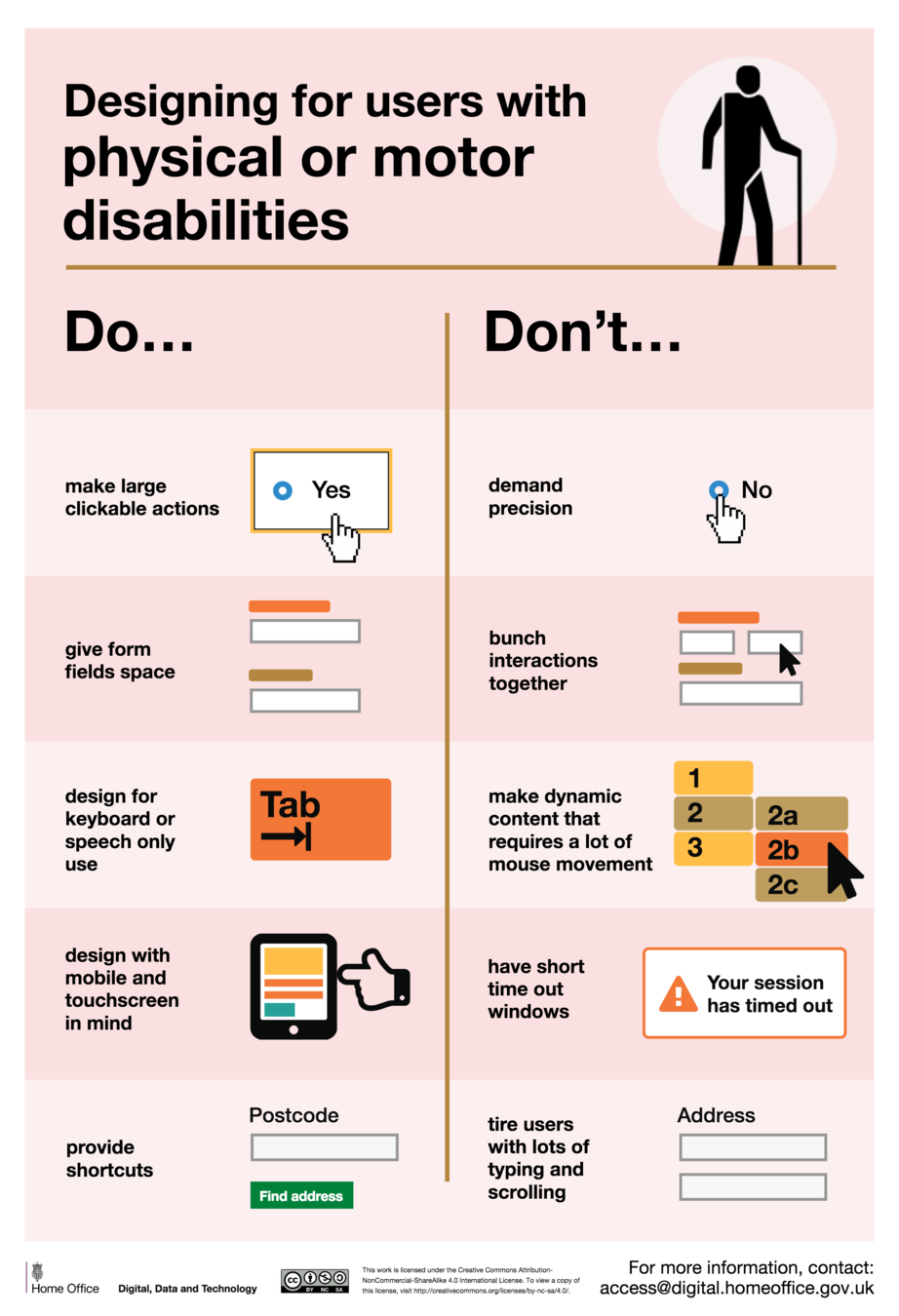
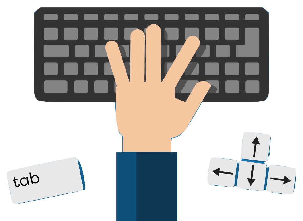
- Cannot use a mouse
-
Difficulty with:
- bad websites
- javascript-heavy websites
Fixes
- Keyboard testing
- Keyboard clicking
- Proper HTML
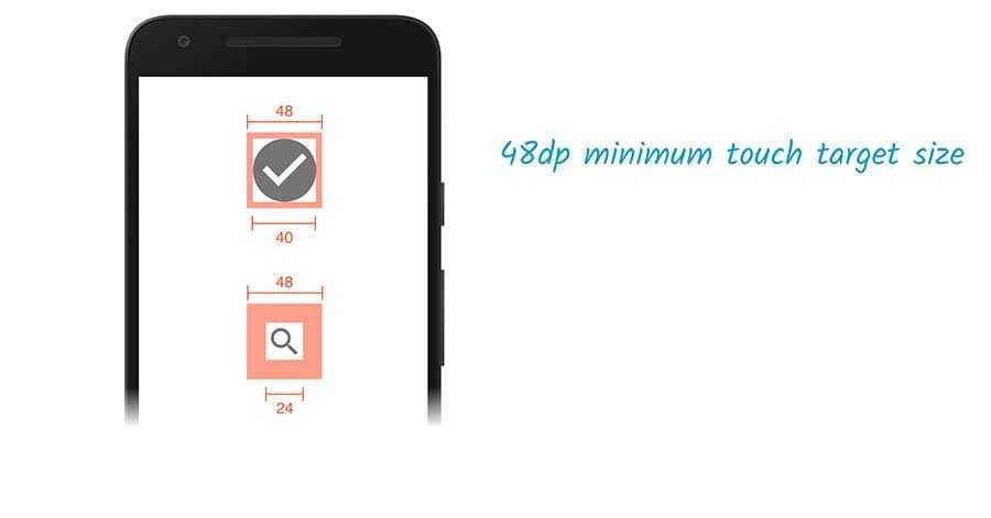
- Large touch targets
-
Careful with modals and fancy things
- devs should use a library
Avoid
Don't
Instead:

But if you have to


Remove the outline?
- Managing focus
- Removing a11y features
DEMO
Keyboard-only navigation
Also helps when
- On bus with phone
- Holding something
- Web forms

Brian
- Cannot see
-
Difficulty with:
- poor HTML structure
- bad user-flow
- Javascript-heavy sites


DEMO

⌘ + F5
VoiceOver is Installed on all iPhones and macs
See training in System Preferences > Accessibility > VoiceOver > Open Training
Fixes
- HTML hierarchy
- Proper HTML elements
- Meaningful link names
-
Alt text
- Blank is legit alt text
- Aria attributes

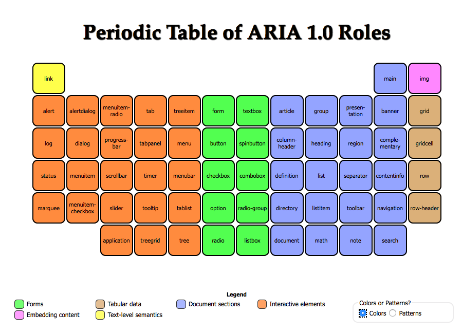
ARIA whaaaaaat?
- Many ARIA roles and attributes
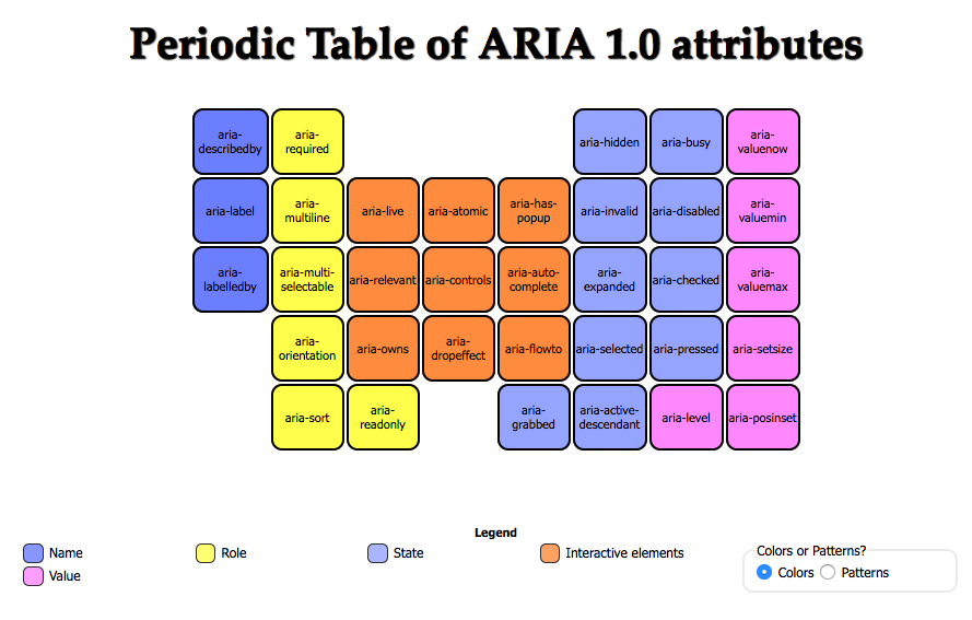
aria-label
aria-hidden
aria-live


Aria best hits
-
role="button" -
aria-label="Search articles" -
aria-hidden="true" -
aria-live="assertive"
ARIA
-
Good structure &
Good HTML > aria
<span role="checkbox"
    aria-checked="true"
    tabindex="0">
label name
</span>
-
Always tested by real human
Also helps
- Good HTML helps everyone
- Crawlers
The perfectly accessible website
Pure HTML, no CSS, no JS
But we break it with nice styles and JS functionality
Recap
- POUR
- Perceivable
- Operable
- Understandable
- Robust

Accessible website? You win!
Resources
-
A11y reference
-
A11y posters
-
Sketch plugin for contrast
Resources
- Definitions
- Examples
- Personal stories
Questions?
Andy Ernst
aernst@axon.com
https://slides.com/andyernst/a11y-design
Web Accessibility for Designers: the web is for everyone
By Andy Ernst
Web Accessibility for Designers: the web is for everyone
A talk about the basics of web accessibility and how improving accessibility helps all users. This includes a demonstration of tools to test and troubleshoot these issues and how they affect React developers.
- 497


