Education,
Income
and
Poverty
Anna Peters
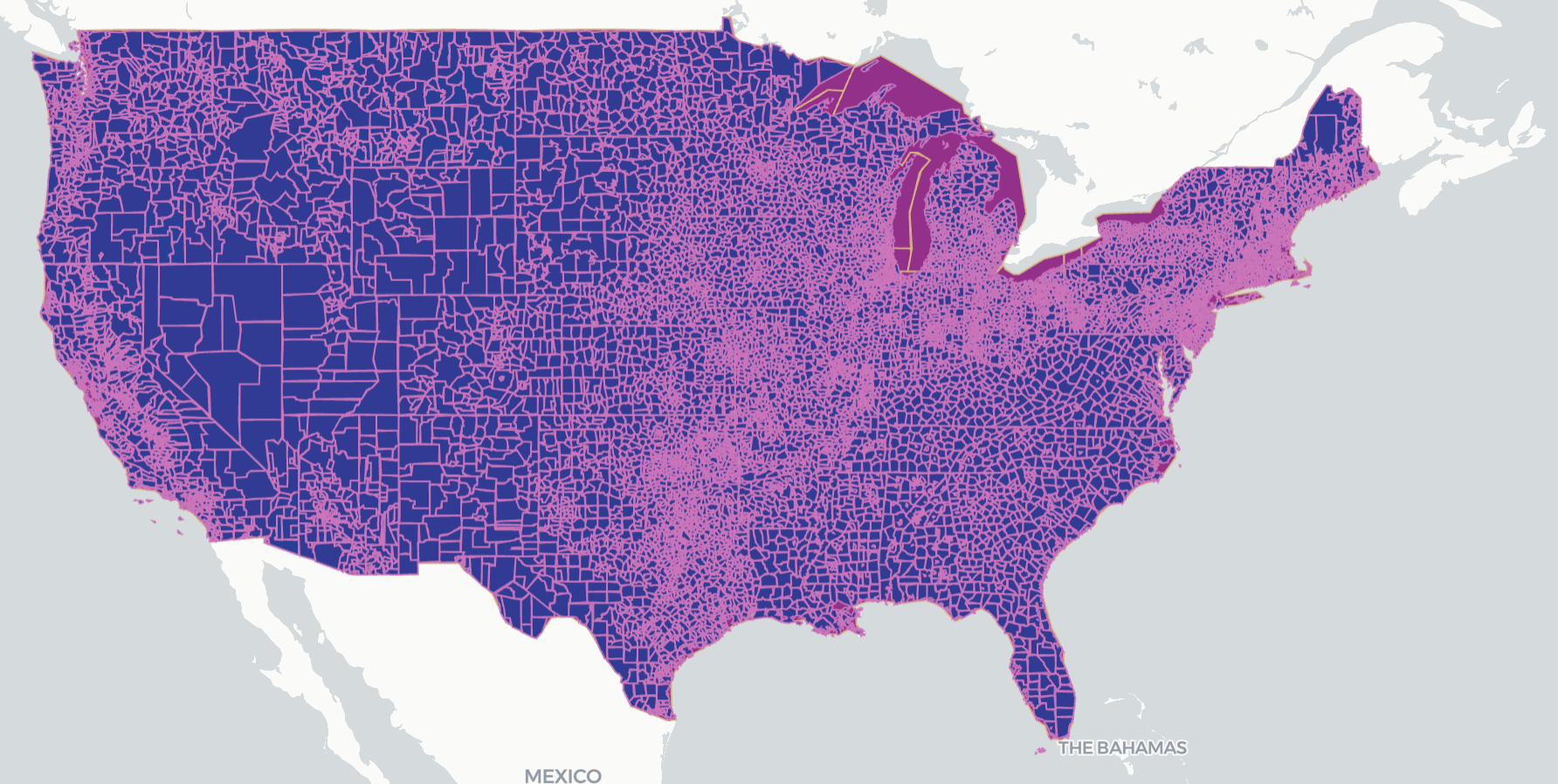
Locales
A map of the U.S. adjusted for population density with locales superimposed over the polygon map of states. This is to represent the spatial distribution of population before showing our data.
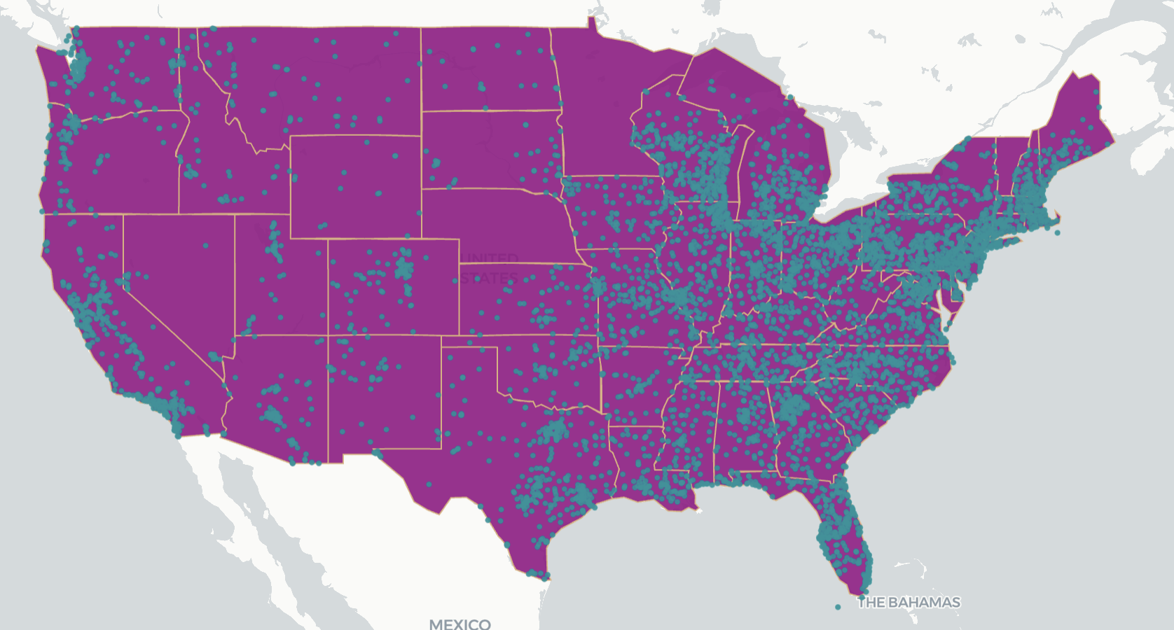
Private Schools in the US
A point map of where all private schools in the US are located over the map of states.
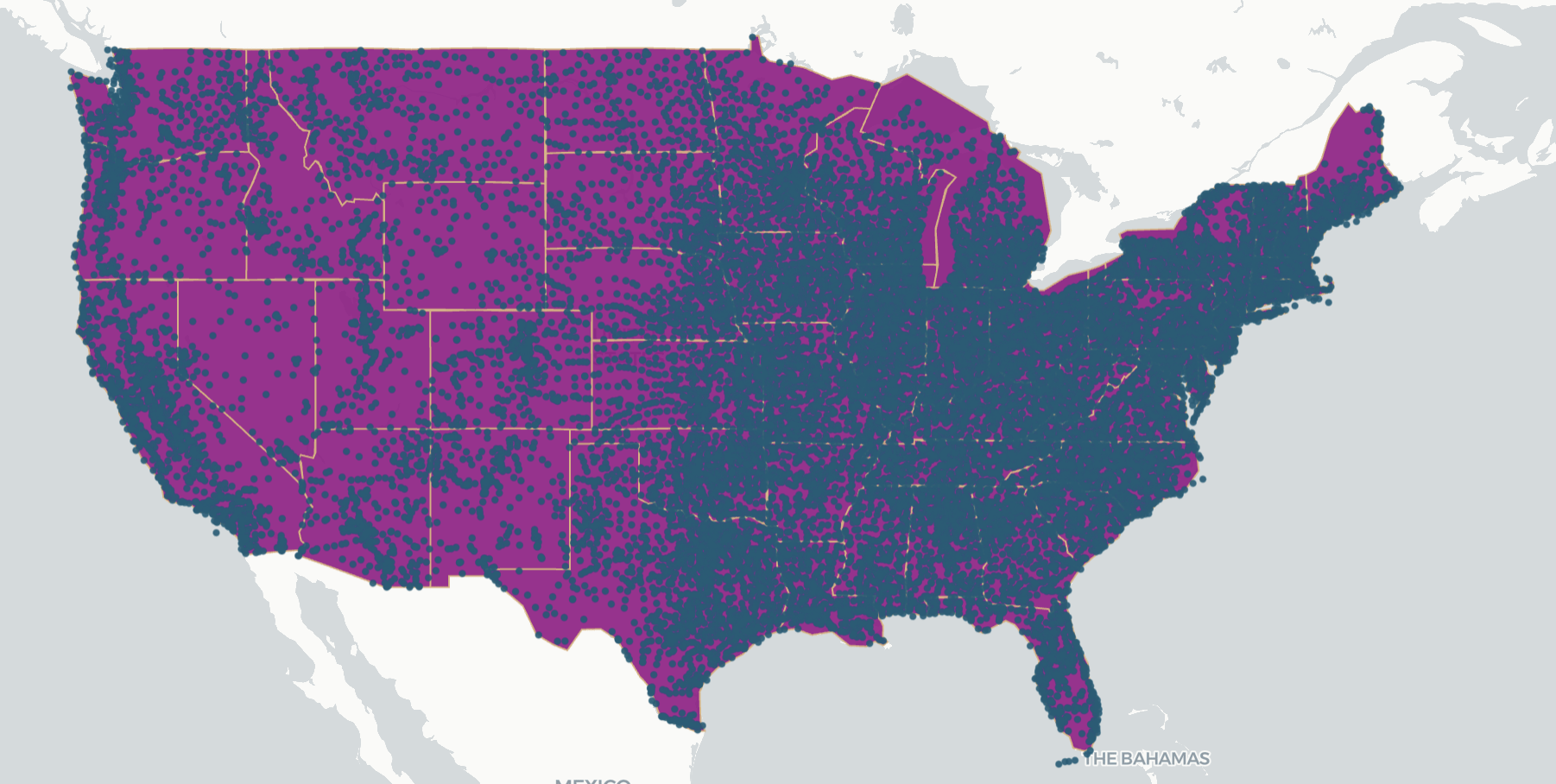
Public Schools in the US
A point map of all public schools in the US are located overlayed on the state map.
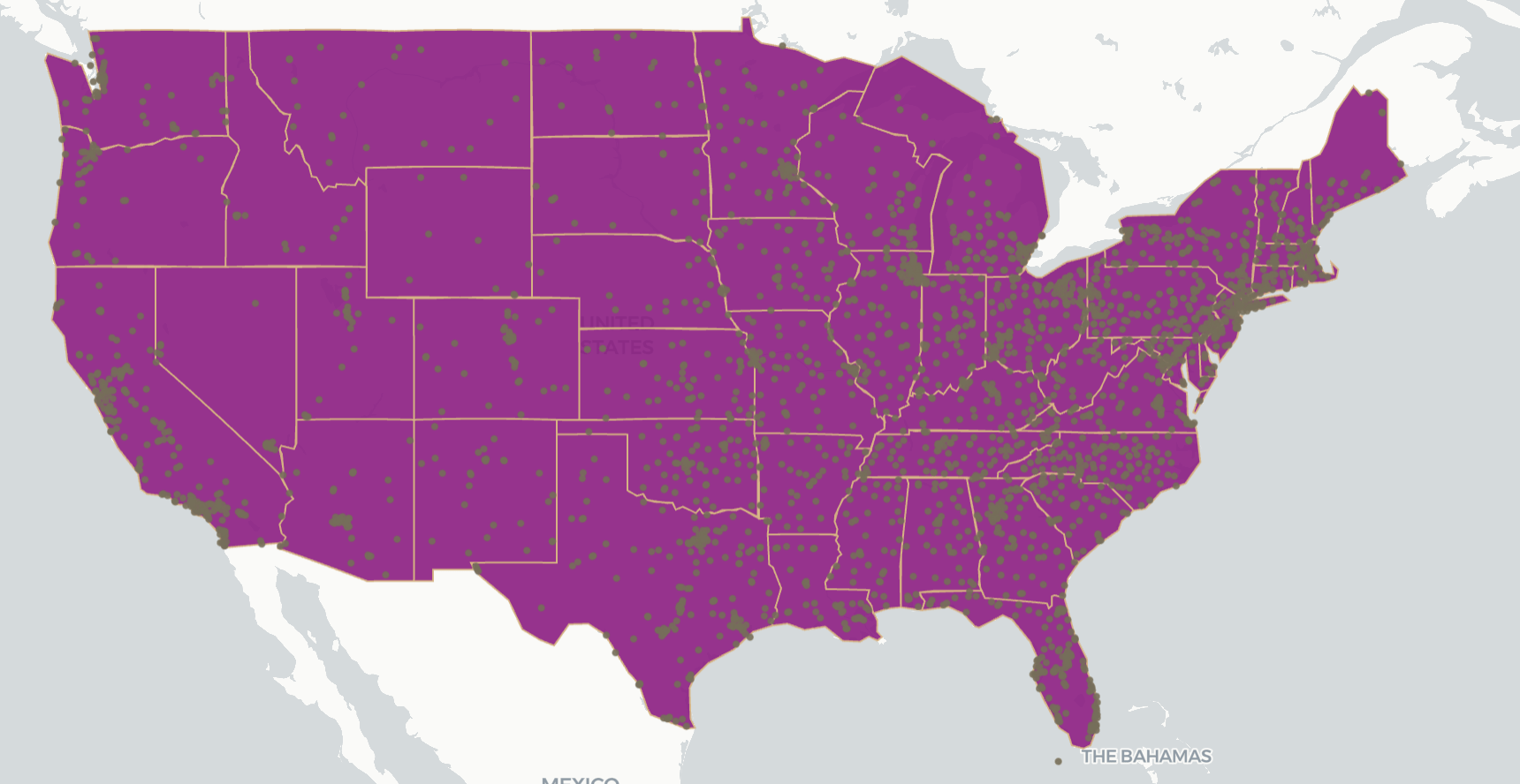
Postsecondary Schools in the US
A point map of all colleges and other postsecondary schools in the US overlayed over the state map.
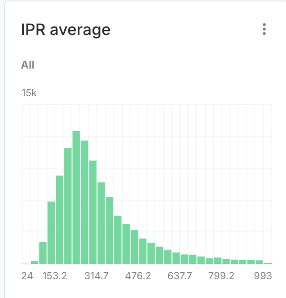
School Districts by Poverty Level
Now, this map represents each school district and locale with the average poverty level in said region. Brighter colors are poorer.
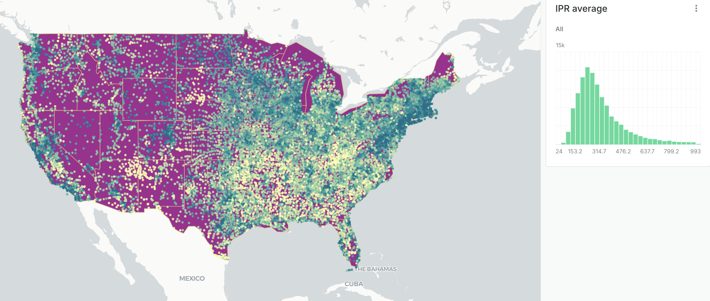
IPR (Income to Poverty Ratio) average per school district. (a score of 1 is the poorest, 1000 is the richest).
Thanks!
All data from the National Center for Education Statistics (NCES)
Publicly available at data.gov
Education, Income and Poverty
By Anna Peters