Doubtnut Product Case Study

Problem Statement
- Increase the engagement of users from Hindi speaking states by 50% on a day to day basis in the next 6 months.
User in Focus
- Users from Hindi Speaking states primarily UP, Bihar, Rajasthan, MP, etc
Assumptions
- The users are generally tech savy
- The users speak in Hindi, however, understand and can read basic English and Hinglish.
- English version of the app has been used for the case study since apart from the language, the UI is the same so any change in the UI/ additional features will impact the engagement for the Hindi Version as well.
- An Android phone has been used for the case study
Approach
- Create User Personas for main usecases of the Doubtnut App
- Analyze the User Flows
- Improve the current engagement flow.
- Analyze and lay out new opportunites for increased engagement.
User Personas
| Persona | A | B |
|---|---|---|
| Demographics | Student | UP | Class 12th | Student | Bihar | Class 12th |
| Needs and Goals | 1) Ask and get answers to the doubts asked 2) Wants to find online classes for relevant subjects. 3) Engage with fellow students on the app/ make friends |
1) Answer the doubts asked by other students and practice in the process. 2) Attend online classes that he is enrolled in. 3) Engage with fellow students on the app/ make friends |
| User Story | I've been an average student in academics and I wish to improve that by attending online classes and getting my doubts answered. | I've been performing good in academics due to the online courses and I like to help others by solving their doubts which allows me to practice as well. |
User Flows (A)
User Flows (B)
Analyzing and improving current user engagement
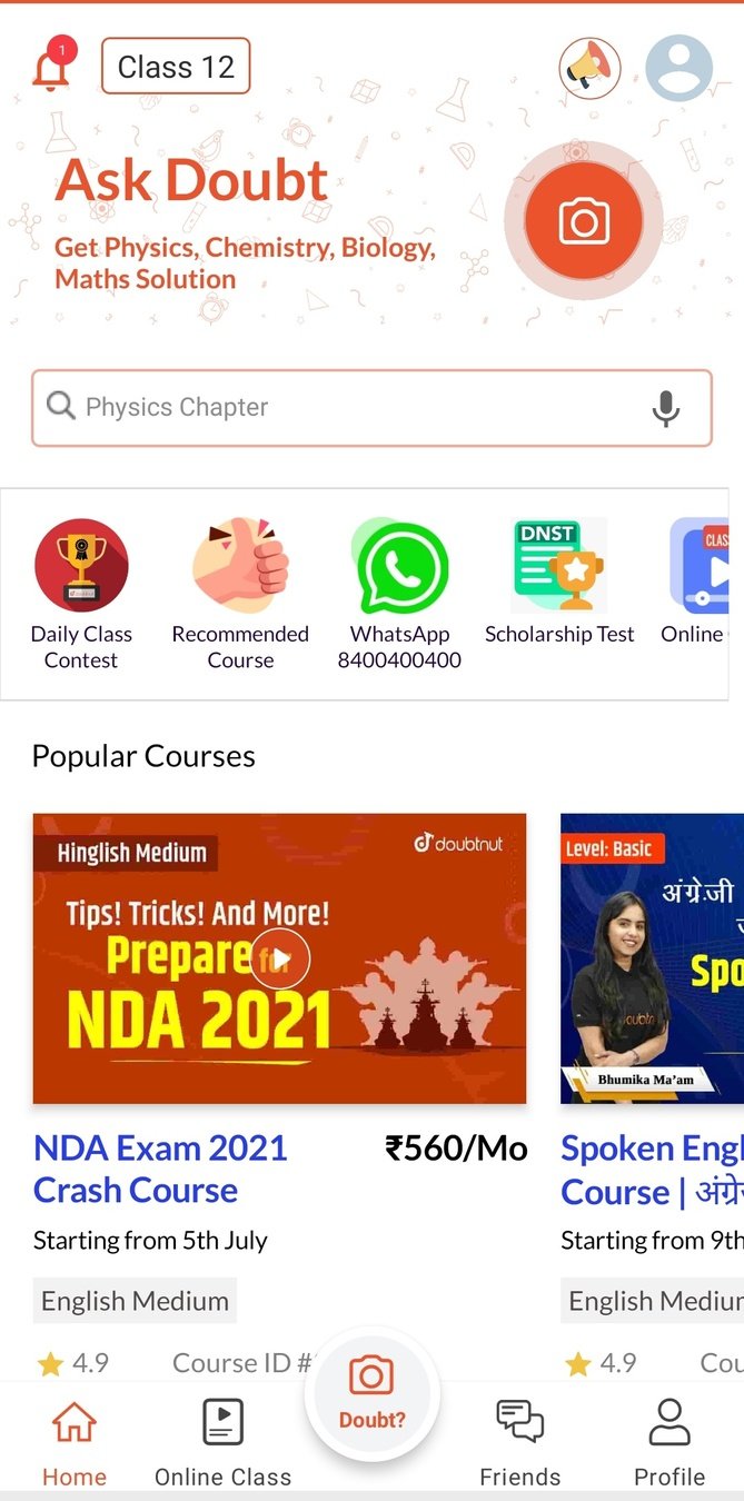
Home Page Experience
Green Text - Stuff working great
Red Text - Stuff that can be improved
Blue Text - Recommendations
Clearly mentioned primary action that can be taken by the user along with the button to take the action.
Button placed at an ideal position which is easily accessible and allows the user to take the action.
Green Text - Stuff working great
Red Text - Stuff that can be improved
Blue Text - Recommendations
Home Page Experience
These navigation options do reduce the task time of the users by offering single click access. However, reorganizing them can increase the scope for engagement.
Recommendation : Prioritise navigation options such as "Doubt pe charcha", "Padhao aur kamao" and "Gup Shup" that provide scope for increased engagement as compared to current options.
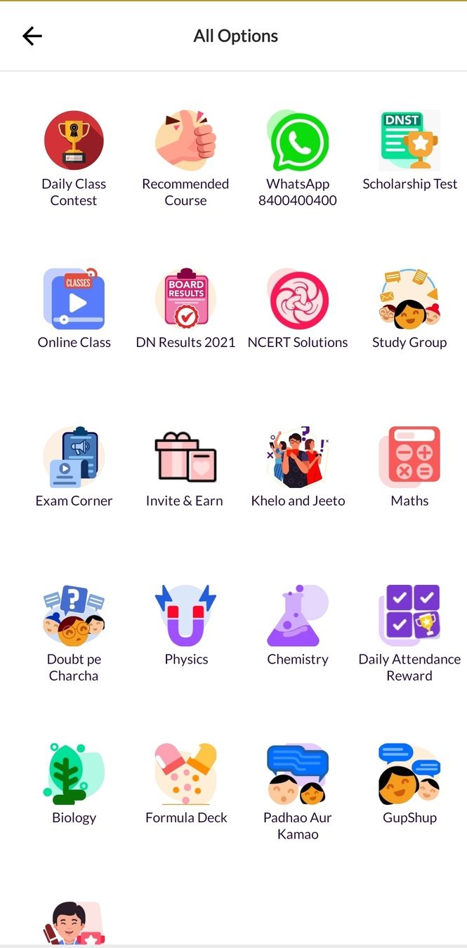
All options that are available for navigation options when clicked on "View All"
Recommended Order -
1) Daily Contest
2) Recommended Course
3) Doubt pe Charcha
4) Study Group
5) Gup Shup
6) NCERT solutions
7) Padhao aur kamao
Green Text - Stuff working great
Red Text - Stuff that can be improved
Blue Text - Recommendations
Home Page Experience
Even though IIT JEE has been selected as the course, courses that are popular like NDA are being shown which might not be relevant.
Recommendation : Show individual recommended courses based on the course that has been selected initially which might prompt the user to check it out.
Green Text - Stuff working great
Red Text - Stuff that can be improved
Blue Text - Recommendations
Home Page Experience
These sections have been placed too down the home page below other sections such as "Toppers se sune" and "Exam Corner"
Significance : These sections allow the user to view popular courses for specific courses and give an overview.
Recommendation : Place these section higher up the home page as the user can check out various courses for specific subjects and find a relevant course in a shorter time.
Note : Less time spent finding courses with low bounce rates means the user found the relevant course in shorter time and doesn't necessarily mean low engagement.

Popular courses have been categorized using tabs that allows the user to view popular courses for specific subjects without visiting separate pages.
Green Text - Stuff working great
Red Text - Stuff that can be improved
Blue Text - Recommendations
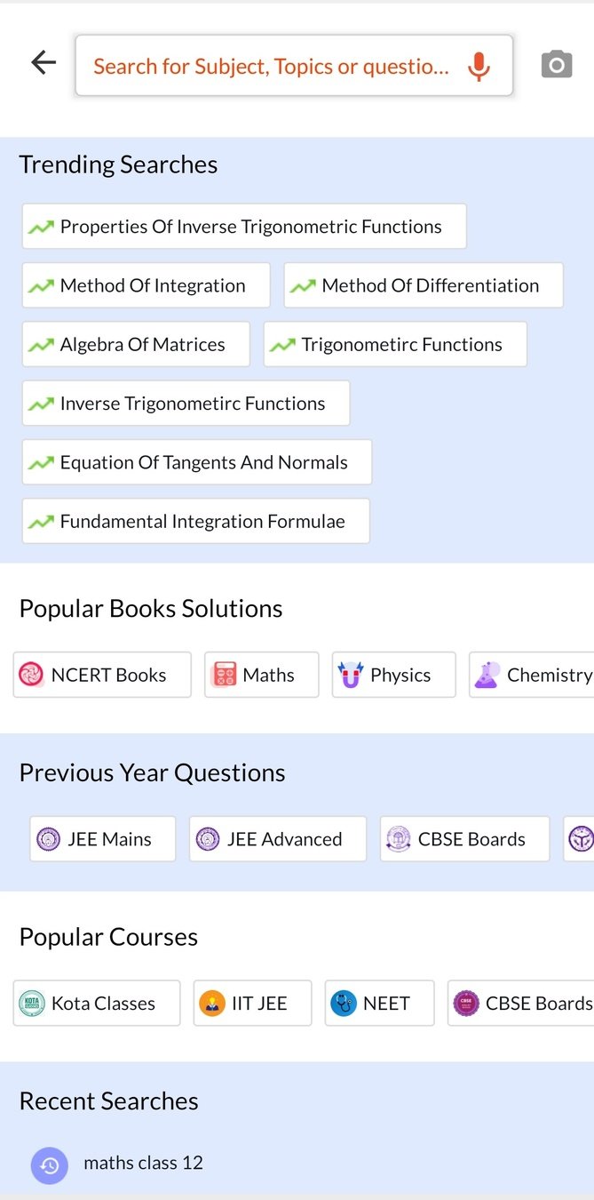
Search Experience
Recent searches have been included but they are placed after the other navigation options due to which the user might miss it and end up searching again which increases the time to find the relevant content.
Recommendation : Place recent searches above the other navigation options since there's a higher chance of the user selecting the previously searched terms.
Several navigation options have been provided in different categories which gives the user the option to check out the relevant content without searching manually.
Green Text - Stuff working great
Red Text - Stuff that can be improved
Blue Text - Recommendations
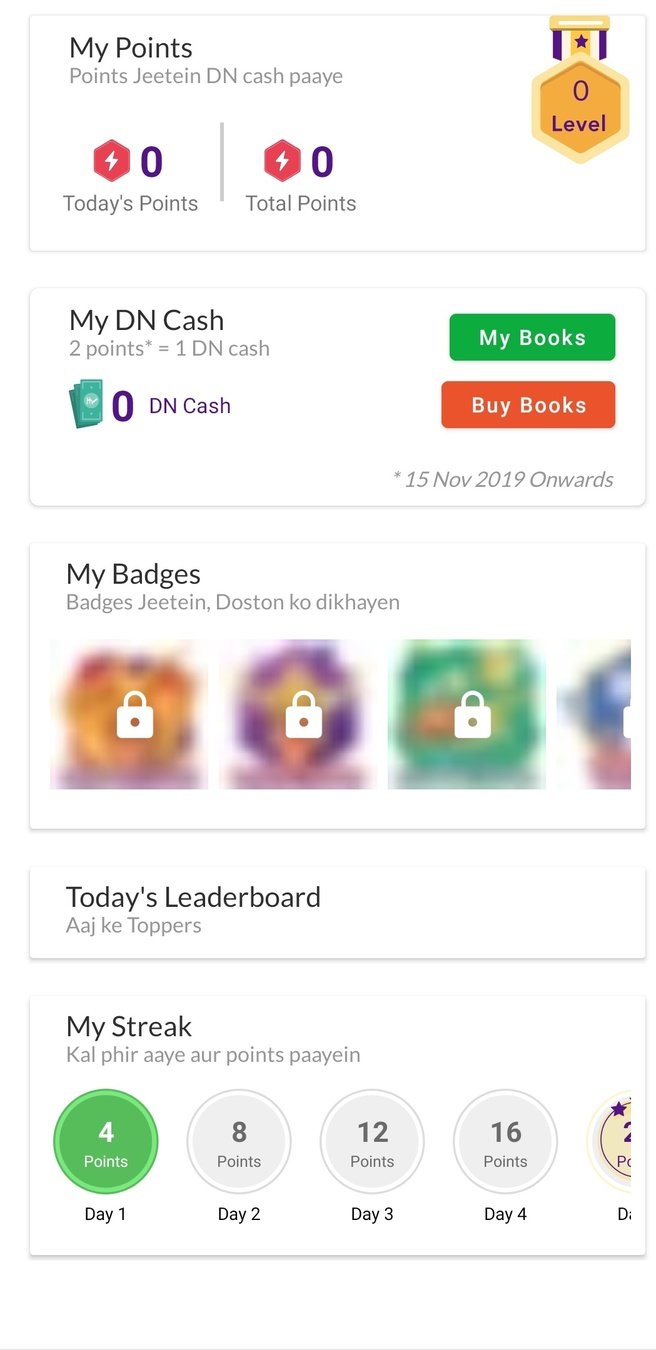
Streaks and Badges
Streaks represent the frequency of a tasked performed consecutively, in Doubtnut's case, opening the app and marking the attendance. However, the streak score and badges are hidden under my points section on the profile.
Recommendation : Display the current streak score and badges on the profile upfront. This urges the user to check the app daily to increase their streak score and perform tasks to earn badges when they see that of their peers.
Streaks and Badges
Streaks represent the number of consecutive days the required action i.e. opening the app and marking attendance was taken.
The condition of the streak can be changed as well to " 1 video watched/ doubt asked or answered and marked attendance" since simply marking attendance can be done very quickly and will not have a significant impact on the total engagement.
Badges show the achievements the user has achieved over a period of time after performing various tasks.
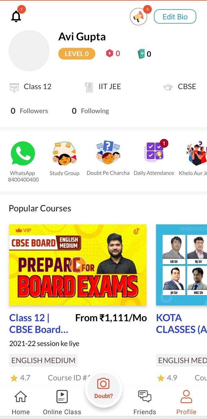
Current UI
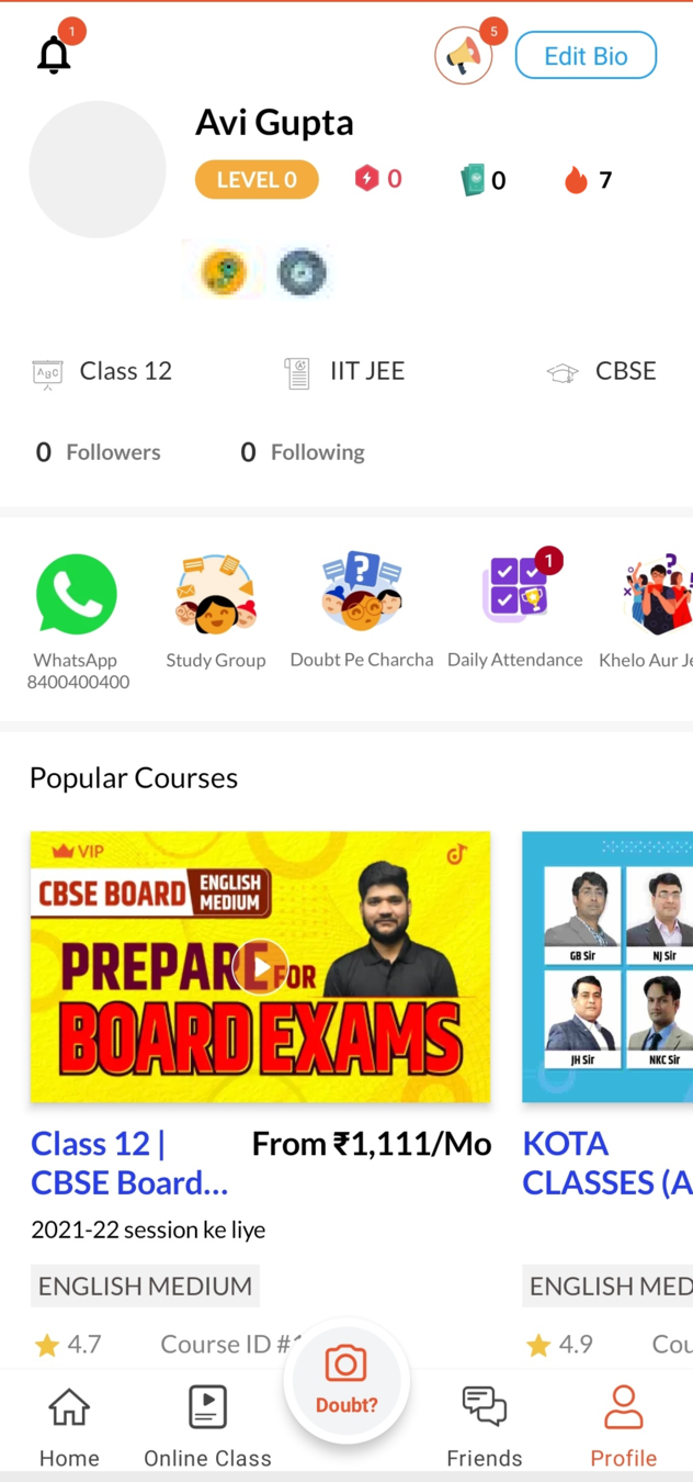
Recommended UI
Significance : Displaying badges and streaks will prompt the users to return daily and perform the tasks to get a high streak and earn medals.
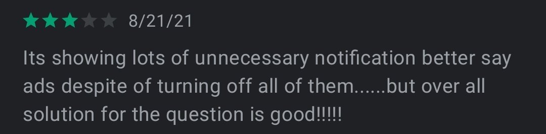
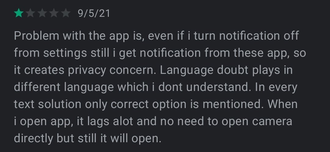
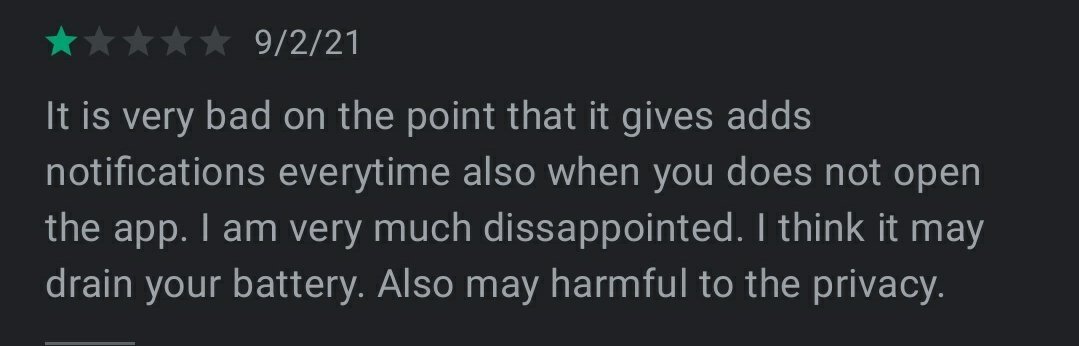

Notifications
While notifications are a good way to remind the users to engage with the app, too much notifications annoy the user and they will end up turning the notifications off or even uninstalling the app in some cases.
Note : This is something I personally experienced as well. The notifications became too frequent which gets annoying in the long run.
Recommendation : Less frequent and personalized notifications. These will have a higher chance of engagement.
Rewards for Solving Doubts
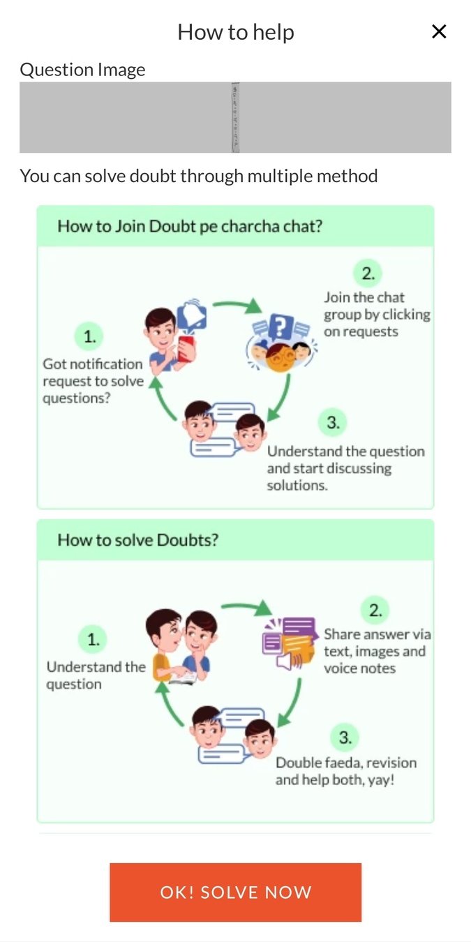
Feature Recommendation : Reward DN points to students as an incentive for solving other's doubts.
This will help increase the engagement in 2 ways -
1) More students will solve the doubts when an incentive is provided.
2) Since more students are solving doubts now, there will be answers for more questions due to which the solution can be found easily. This will also motivate the students who is asking the doubt to use the app to get a solution next time a doubt arises since the answers can be found easily. .
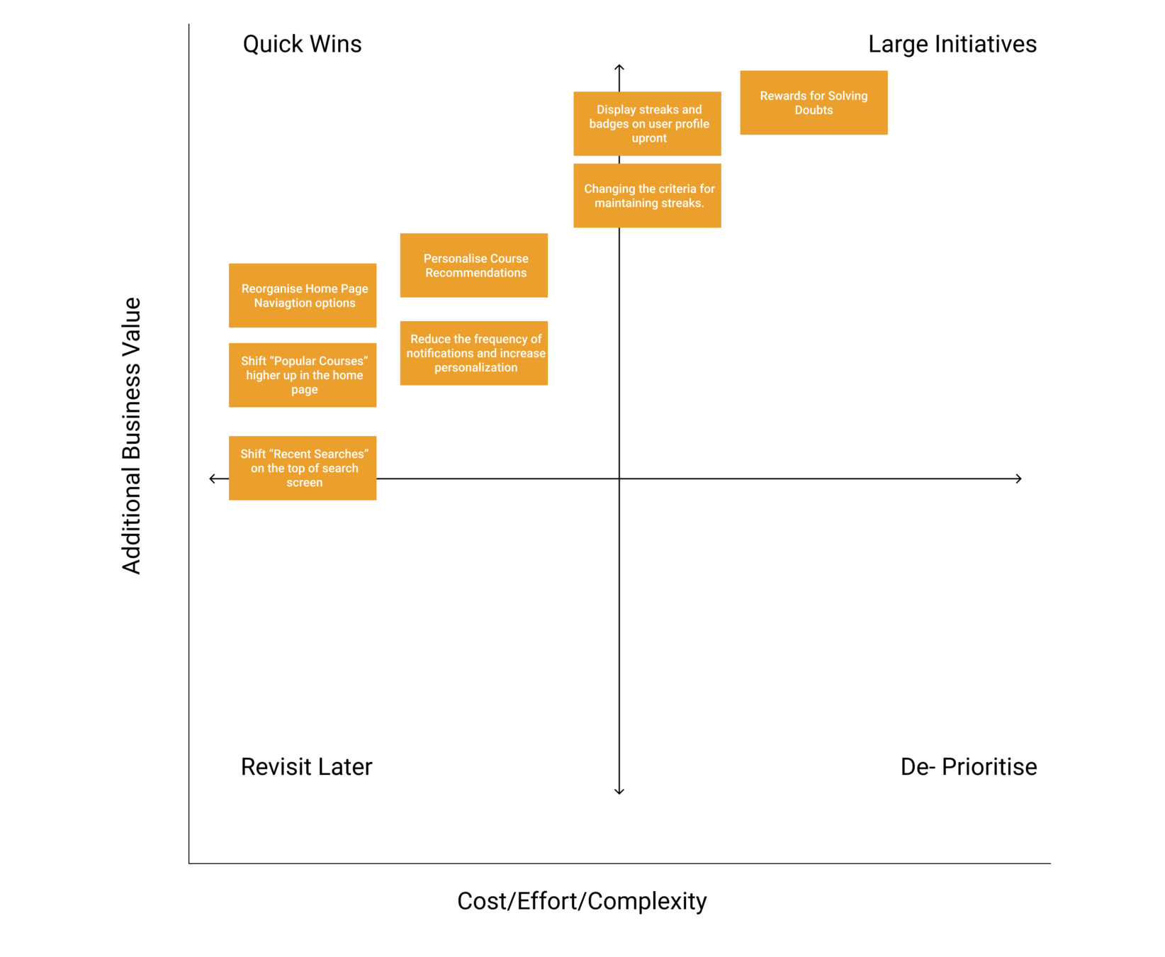
Priority Matrix
Note
Critiquing a product is very easy in a case study like this. I also understand many of the features might be well thought data-driven decisions.
Kudos to the Doubtnut team for working so hard to create a product helping students all over India with their doubts and studies!
Thank You!
Thanks for reading this Case Study. If you have any questions or suggestions, please feel free to reach out.
By - Avi Gupta

- aviguptta
deck
By avigupta