


Ayesha PRO
Lead Design Technologist working on Design Systems, React Component Libraries, and Accessibility
Ayesha Mazumdar
UX Engineer @ Optimizely
@AyeshaKMaz
Scaling
^
Accessibility
📋 Today's Agenda
Just a placeholder
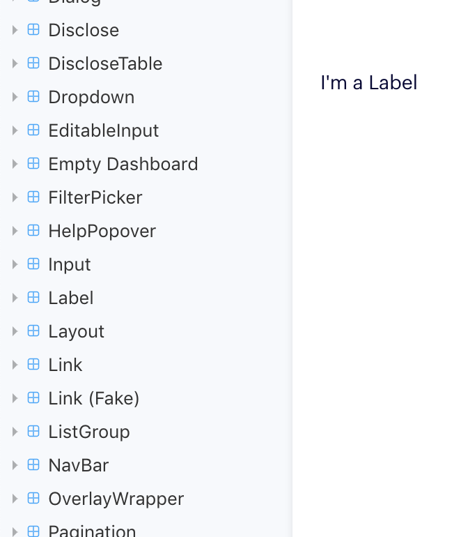
Label
Create...
Button Icon
Select Dropdown
Input
Visuals
Keyboard Navigation
Screen Readers
Component
Accessibility Win
ac·ces·si·bil·i·ty
alias: A11Y
Ensuring everyone,
no matter their ability,
can "perceive, understand, navigate, contribute to, and interact with" an application
noun
Every change made to a component permeates throughout the entire ecosystem to all consumers
🎉
The Good
Every change made to a component permeates throughout the entire ecosystem to all consumers
😳
With great power comes great responsibility...
The Bad
With great power comes great responsibility...
Key Problem Areas:
button {
outline: none;
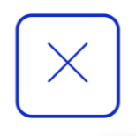
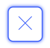
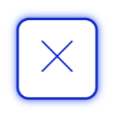
}Focus + Hover States
Focus + Hover States
Neutral
Hover
Focus
Focus + Hover
.oui-button-icon:focus {
  box-shadow: 0px 0px 3px $brand-blue-dark;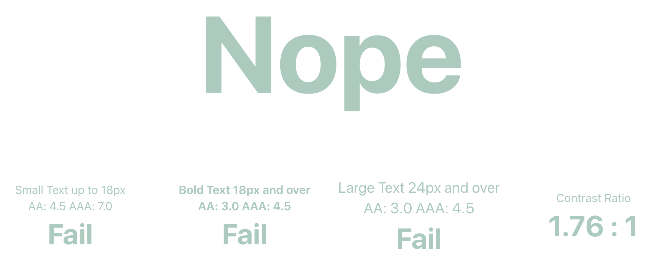
}Contrast
<ButtonIcon iconName="ellipsis"/><ButtonIcon iconName="ellipsis" iconFill="#abcabc"/>Contrast
import {
  amberBase,
  aquaBase,
  brandBlueDark,
  greenBase,
  orangeBase,
  pinkBase,
  redBase,
  magentaBase,
  greyBase,
} from '../../tokens/forimport/index.es';

// map fillColorName prop values to OUI color tokens
export const FILL_COLOR_MAP = {
  aqua: aquaBase,
  amber: amberBase,
  default: brandBlueDark,
  green: greenBase,
  orange: orangeBase,
  pink: pinkBase,
  red: redBase,
  magenta: magentaBase,
  grey: greyBase,
};

export default {
  FILL_COLOR_MAP,
};
ButtonIcon.propTypes = {
/** Custom color for icon inside button **/
iconFillName: PropTypes.oneOf(Object.keys(FILL_COLOR_MAP)),
{...}
}Titles
return (
    <button
      {...}
      title={ props.title }>
      <Icon name={ props.iconName } size={ props.size } />
    </button>
);ButtonIcon.propTypes = {
// Name of the icon to use
iconName: PropTypes.string.isRequired,
{...}
/** Title of the button used for hover and screen readers
* Describe the button's action, not the icon itself
*/
title: PropTypes.string.isRequired,
};Even Better - aria-label
return (
    <button
      {...}
      aria-label={ props.title }
      title={ props.title }>
      <Icon name={ props.iconName } size={ props.size } />
    </button>
);ButtonIcon.propTypes = {
// Name of the icon to use
iconName: PropTypes.string.isRequired,
{...}
/** Title of the button used for hover and screen readers
* Describe the button's action, not the icon itself
*/
title: PropTypes.string.isRequired,
};* Bonus slide added after React Boston
Given unpredictable support for the title attribute, adding aria-label can help provide consistent support for screen readers. There is no single perfect solution though, Sara Soueidan has a great article on the subject
Screen Readers
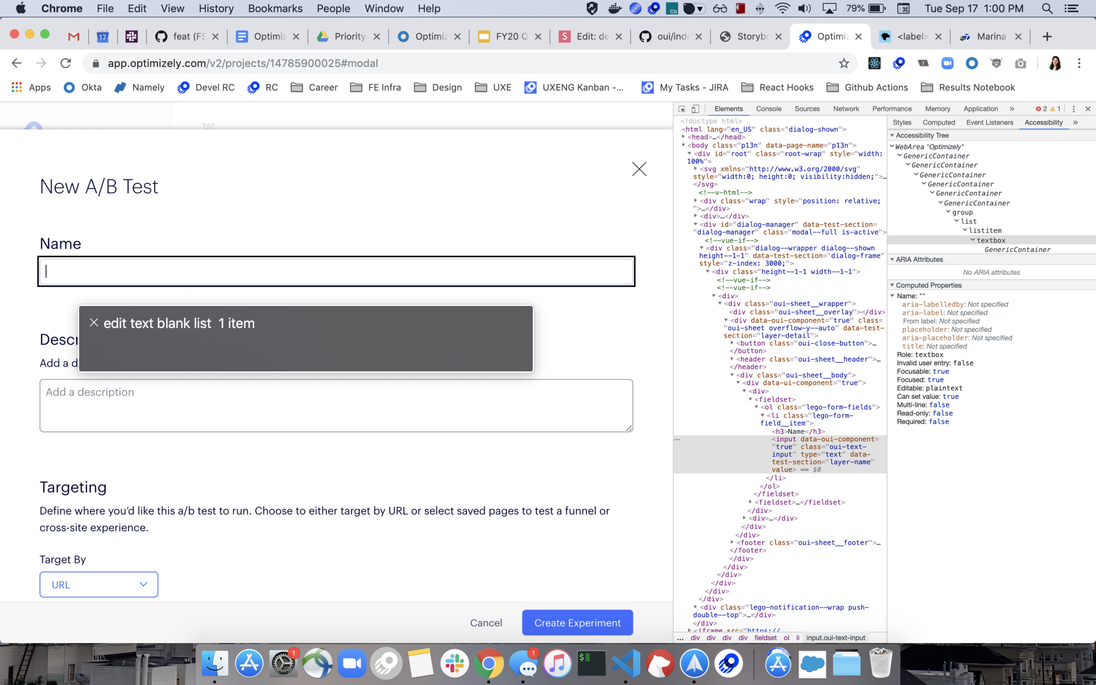
<li>
  <Label>API Call</Label>
  <p>
    To track this event, add the following code to your page.
    <Link href={url}>
      Learn more
    </Link>
  </p>
  <Attention>
    { this.renderApiCallText() }
  </Attention>
</li>
Label is used for its style, not its semantic meaning
Screen Readers
But, where's the input?
<Input type="text"/>Screen Readers
<Input type="text"/>if (props.label) {
return (
<Label>{...}</Label>
<input>{...}</input>
);
}/components/input/index.js
Screen Readers
<Input
  id="input-01"
  label="Experiment Name"
  type="text"
/>
<div>
<Label inputId={ id }>
{ label }
</Label>
{ this.renderInput() }
</div>/components/input/index.js
*Required Prop
*
*
Screen Readers
export { default as Input } from './components/Input';
export { default as Label } from './components/Label';
Plus...
becomes...
export { default as Input } from './components/Input';Screen Readers
Create...
aria-expanded="true|false"
role="combobox"
role="menuitem | placeholder"
tabindex="-1"
Keyboard Navigation
aria-haspopup="true"
Keyboard Navigation
let currentFocusedIndex = this.state.currentFocusedIndex;
if (keyCode === ESC) {
  toggleOpen()
} else if (keyCode === ENTER || keyCode === SPACE) {
  handleItemSelect(currentFocusedIndex)
} else if(keyCode === DOWN) {
  currentFocusedIndex ++;
} else if(keyCode === UP) {
  currentFocusedIndex --;
}
// reset state
{...}
Example Psuedocode:
Just a placeholder
Label
Create...
ButtonIcon.propTypes = {
  iconFillName: PropTypes.oneOf(Object.keys(FILL_COLOR_MAP)),
  title: PropTypes.string.isRequired,
  {...}
}Effort
Impact
Fable and Access Works
Usability testing with people with disabilities
Covers AA and AAA criterion
Other Design Systems and Component Libraries
Don't reinvent the wheel
Come say hi 👋 during the breaks
Reach out on Twitter: @AyeshaKMaz
Connect on LinkedIn: /ayeshakmaz
By Ayesha
We often build component libraries to improve consistency, collaboration, and customization for a given product. But what if a component library could also scale accessibility across the entire organization? Building accessible components can help distribute responsibility across all of design and engineering, without needing everyone to be an expert on the nitty-gritty details. This presentation looks at specific component examples and use cases to help you and your team contribute to a better, more inclusive web.
