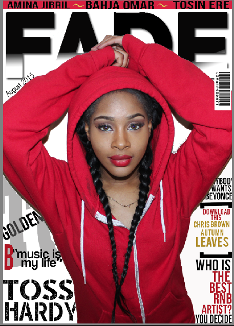
The preliminary task has prepared me to the actual making of my music magazine. From the start of creating my school magazine, my knowledge of using Photoshop has increased considerably. I have found the software quite difficult in my preliminary as I have never used it before. I now know how to edit pictures on Photoshop and use the 'magic wand' to cut out any irrelevant bits to the main image or texts which I have screen shot from 'dafont.com'. I have learned how to download fonts from dafont.com which increased the visual appeal of my magazine. Also, the fonts from dafont.com added some dimension to my magazine. I feel like I understand the conventions of magazines better than I did before. The analysis of the front cover, contents page and double page spread has led me to understand how music magazines have used different features and techniques to draw the audience in. The most important thing I have learnt is how to make my magazine look prefessional and how to make it appeal to my target audience.
My preliminary task was very basic in terms of typography and images as I used basic fonts from Photoshop and used one specific font rather than using two different fonts which would complement each other so therefore, in my main magazine, I used two different fonts with better effects to create a more outstanding composition which appeals to the audience. Also another main feature which differentiates my preliminary task and my main task is that I used basic, apathetic image which lacked good lighting and an exciting location for my preliminary task. The main images I used for my preliminary task were pictures I took around the school however, with the main task, I chose to take pictures in either dark locations or either a place where the lighting was extremely bright. In my first task I missed out generic features of music magazines such as putting the magazines' name on the contents page.
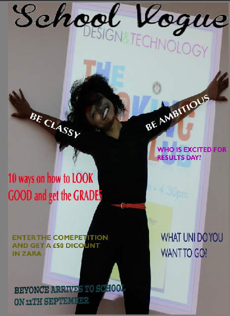
You can clearly see the difference between my preliminary task and my front cover. In my preliminary task, the lighting was not good and also the background looked wonky whereas, in my actual magazine, the lighting looks considerably better. Also, the colour scheme of my preliminary task looked disorganised whereas, the colour scheme I have used in my real magazine complemented the main image.
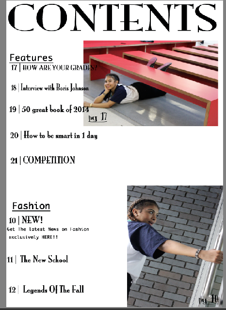
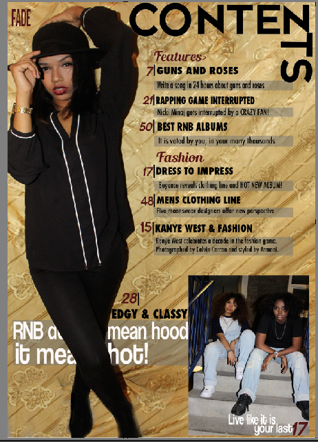
You can clearly see the difference between my preliminary task and my real contents page. The contents page of my preliminary task is very basic and simple. There was not a very good positioning in the overall composition. I used the 'Grid' on Photoshop to make the columns look even and professional. As you can see, the fonts used in my preliminary task did not complement each other whereas, in my actual contents page, the fonts suit each other. In my preliminary task, I used fonts from Photoshop whereas, in my real magazine I used fonts from 'dafont.com'
FINAL
Overall, my understanding about software has improved throughout this project my skills have come a long way in all different forms of technology and software editing. I think that the main advancement has been using Photoshop. I have learnt new techniques and skills that has helped me create a professional looking music magazine. I have also started thinking of better ways to attract my target audience whilst editing.
My photo-shoot for my main task went better than my preliminary task due to the fact that I was able to plan and analyse my photo-shoot and see what angles and what facial expressions best suited my target audience. Also, with the main task I realised that the locations and lighting used in my magazine was very important as it would change the way the image looked- whether it made it look professional or whether it made it look like an everyday picture. I think that I have developed critical evaluation of my own product. I have also developed skills when analysing other people's products through peer assessments. I have learnt that there needs to be a purpose for the magazine and see whether the purpose is being fulfilled in order to attract their target audience.
deck
By Bahja Omar