How effective is the combination of your main product and ancillary texts?
To understand really understand the effectiveness of the combination of music videos and posters and digipacks meant I had to look at real media examples. I did research into different artists such as Nas, Drake and Demi. I wanted see how these artists created their products and see how they broadcasted their work.
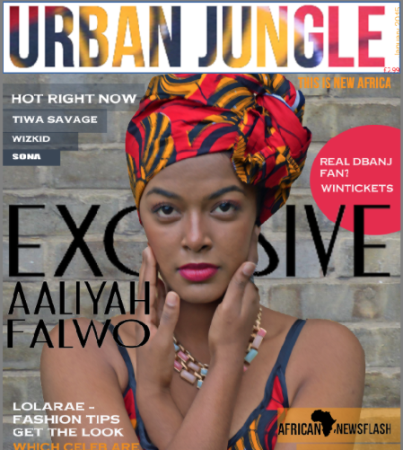
I found that the colours and themes are reoccurring amongst the products, for example Rihanna's album, had the same reoccurring themes and colours, there only 3 colours in on the cover (red,white and cream), with the reoccurring colours allows the target audience to assicoate this with artists. The same text and the font used is the same for both the CD cover and poster.
I had to follow the same conventions to have the same outcome as Rihanna and other professional artists.
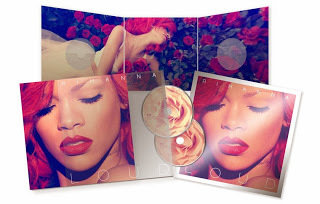
FIRST AD & DIGIPACK
I decided to re-create my Digipack and Ad, as the images were pixilated and the text wasn't the same all the way through. The CD cover didn't have the professional look I wanted.
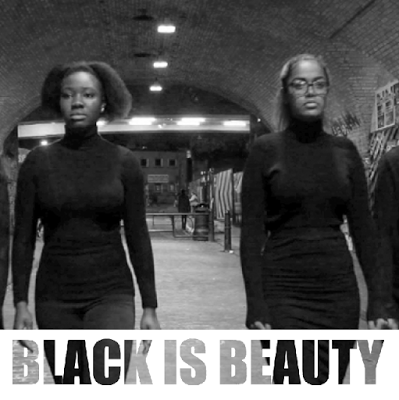
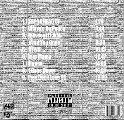
The main product was my music video, throughout the video the idea of the mass media neglecting black women runs through it. This theme is carried out in my ancillary tasks also to achieve a coherent campaign that continues throughout the poster and digipack.
It is important to have the same reoccurring themes on all the products to show they’re all from one source. In terms of the colour pallet and editing I had the reoccurrence of the Bad TV static effect. I decided to carry this on in my ancillary tasks, as I wanted to carry on the theme of distortion caused by the media. By doing so in all out products makes it effective as it doesn’t matter what product the target audience sees first, they would understand immediately what it is about.
The font was consistent in all my products, as my logo was the name of the band, having the same font always allowed my audience to connect that font with my group.
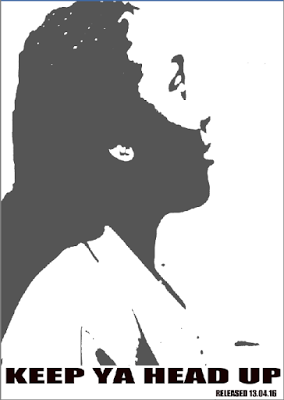
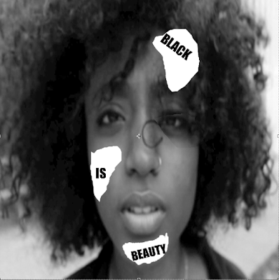
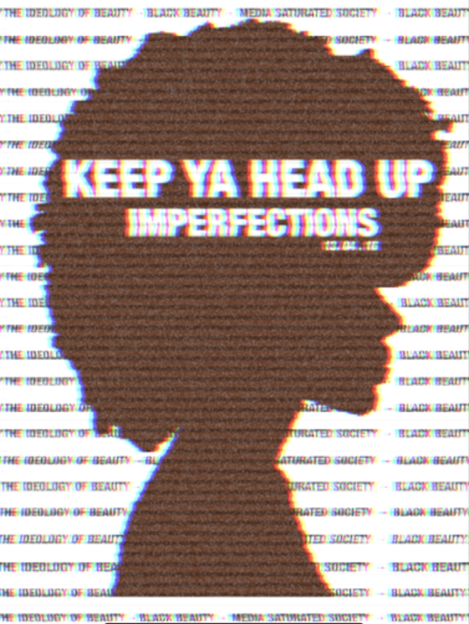
I wanted my poster to automatically grasp the attention of my audience and reflect my themes running through my music video. I decided to add text, with the key themes that run through my music video and the concept of my video (the ideology of beauty, black beauty, media saturated, society black beauty) I wrote black beauty between both themes as I wanted to show how black women are stuck between, and aren’t ever noticed.
I then took a picture and used the magic wound tool to remove the background the models facial features just to have a silhouette of her. I thought using a model with an Afro would be more appealing as it portrays the models I have used and the women I am addressing in my video. I then duplicated the layer to be above the layer of text. I used the ink tool to make the silhouette a shade of brown. Lastly I decided to add the effect on Final Cut Pro 'BadTv'. It added an old 90's TV effect, I did this to show the traditional ideology is still in society, and that the media affects the ideas of beauty consequently having black women neglected and critised in society as they are at the other spectrum of what is classified as beauty.

The reoccurrence of the Bad TV effect on my poster, Digipack allows all the products to interlink, when the target audience see the products they will see the similarities. This was effective and very crucial as if the poster as calm and brightly coloured and the video was the complete opposite then it would make it confusing and the products would not be as effective, as different editing will only weaken the product and its ability to reach its target audience.
The Bad Effect also helped to convey the negative forces
that the media displays especially when when
it comes to ethnicity.

The poster promotes the digipack, meaning that the colours, themes and fonts had to be similar in order for my target audience would understand that it is from one album and group.

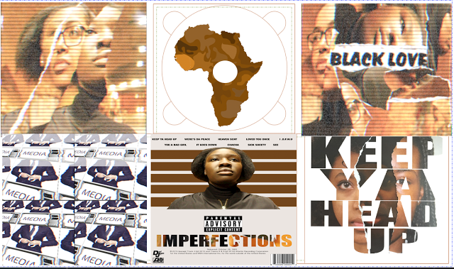
Throughout my CD cover and poster I used different shades of brown, to show a diverse range of colours of black women, showing that one shade isn’t better than another. Also it helped reflect the theme of my music video.
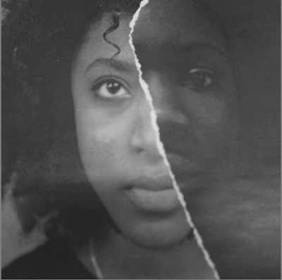
All text had the same font ‘Impact’ it is very bold and big, helping all text to stand out. Throughout my CD and Digipack I didn’t have a particular colour scheme for my text, as I always used the magic wand tool on Photoshop to remove the inside text and reveal the image behind. I developed this from my AS work, having the image and incorporating the text adds a personal feeling to your work. Also I decided to create my CD cover by ripping up pictures and sticking them together adding texture to the image. I got this idea from the ‘CLASH’ magazine. I also wanted to have different coloured models in picture but them standing together looked boring.
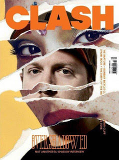
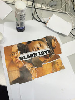
The hidden meaning behind out Digipack is that the image helped to convey the theme of competition within the black community, created by the media, pitching lighter skinned women and darker skinned women together. The white rips show the tension between them. But by gluing the image together shows that they are fighting the same battle and they need to work together. The rips also link to my music video. When Viola Davis says 'can't seem to get over that line', the rips are a symbol of the line black women face and the limited representation of black women.

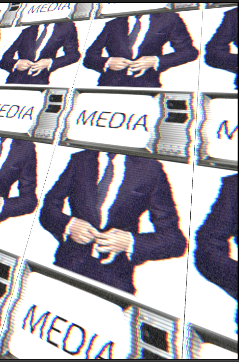
I decided to uses some images that I use in my video, as I felt it helped to give the overall picture of my video. Adding the 'Media Man' helped to convey that the media influences our understanding and interpretation of beauty. People who aren't my target audience may not understand my Digipack without this image. I didn't want Digipack to be extremely abstract that people wouldn't understand if.

Overall the combination of all three of our products is very effective as they all link, the effects used as well as the colours and ideas allows my audience to recognise the band, making my Digipack and Ad different from former real media products out in the market allows my product to stand out and more identifiable
deck
By bahjasarafunmi
deck
- 1,768


