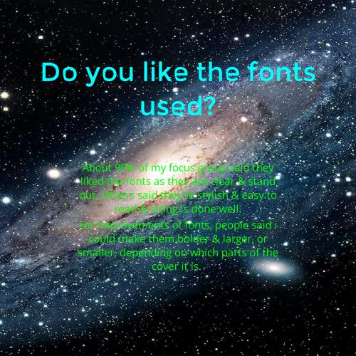
Task 6
Summary of research into similar products
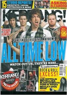
Conventions of Form
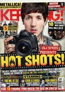
- The masthead is in a conventional place for every magazine as it is at the top of the page.
- The coverline being centeral is conventional for a magazine as it allows you to see it clearly.
- The main image is the largest, which is conventional as it is more important than the smaller images.
- The small images being dotted around the bottom of the page makes it conventional as that is where they are usually placed.
- The cover page fits the route of the eye also the rule of thirds, which is conventional as every magazine uses that layout.
- The shots used for the main image are conventional of the one artist, as you need to be able to see them, it connotes importance.
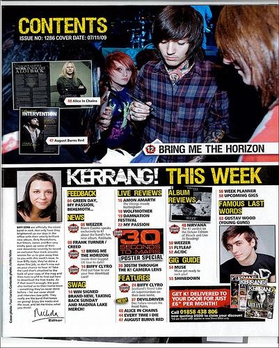
- The title being 'contents' in the top left is conventional as it is larger than most of the other text, showing that it is the title.
- The large image is also conventional for the contents page as it is showing the main artists that are going to be in the magazine.
- The smaller images are conventional for the layout of a magazine contents page, as they are linked in with the titles of the sections in the magazine, showing where abouts they're going to be featured.
- The way they have layed out the columns out are very organised, both of these things are conventional, you have to be able to read the things in order, which is what this allows us to do.
- The section on the editor's report is conventional as this is in most magazines.
- The image being enlarged over one of the pages for the double page spread is conventional, it emphasizes the importance of the artist.
- The text being large headline is conventional, as it needs to be bold to be seen, ,it will also attract a lot of attention.
- Having a standfirst is conventional for a double page spread magazine, as it's like background information about what's going on.
- Having a kicker to start the main block of test is conventional as it is used throughout many music magazines or just magazines in general.
- Having the pull quote is conventional, as it makes it seem more dramatic & will grab the readers attention, intreaging them to read on.
- Having the text spread out into columns is convention for a music magazine double page spread as it looks neat & tidy.
- The page numbers are conventional.
Convention of Genre
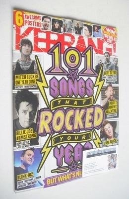
- The aggressive fonts are conventional for the music genre.
- The language used for the magazine cover is relative lexis for the genre, for example: rocked.
- The imagery used for the front cover is very relative & grungy, using black colours that appeal to the target audience.
- choice of shapes are used to emphasize the rock/metal genre, such as lightening bolts.
- The serif fonts used are conventional as they look rough & exciting.
- By using images of men with tattoos & long hair, this is appealing to the target audience as it is conventional of the rock/metal genre.
Mode of Address
- The mode of address with the language used on the cover is conventional for this type of music magazine, as it is informal & relaxed, which is what music should be.
- The images used connote informality as they aren't in smart business wear, they are doing what they love doing, wearing their own comfortable clothing in a comfortable environment, which is conventional for this genre of music, also typical to see in a music magazine.
- The font styles used are very informal, as they're very rough looking & edgy, the informality of the fonts is conventional.
Representation
- The artists for this genre are represented to be angry, aggressive, with attitude & black clothes, this is conventional for this music genre.
deck
By beths-mediaa