


Brad Adams
Frontend Developer
🗣 🇬🇧
.flexbox101 {
    display: flex;
}
A ⚡️ look into flexbox,
and why/how you should be using it.
Front-end developer professionally since 2014
@breadadams
I ❤️ CSS
(via class="")
.container, .row, .col-x-x (eg. .col-lg-12)
(via sass mixins)
@include make-row(), @include make-x-column()
(via sass mixins)
@include outer-container(), @include span-columns(), @include omega()
prior to
v2.0
75%
FLEXBOX
25%
Just flexbox
The CSS3 Flexible Box, or flexbox, is a layout mode providing for the arrangement of elements on a page such that the elements behave predictably when the page layout must accommodate different screen sizes and different display devices.
IE 10+ ONLY
(fully supported in Edge)
22+
(partial support pre 22)
6.1+
(partial support pre 6.1)
28+
(partial support pre 28)
Some browser prefixes necessary.
.container {
    display: flex;
    border: 3px solid #fff;
    background: rgba(255, 255, 255, 0.4);

    .item {
        width: 100px;
        height: 100px;
        background: #a2c4c9;

        &:not(:last-child) {
            margin-right: 10px;
        }
    }
}.container
.container
.container {
    display: flex;
    flex-direction: column;
}
.container {
display: flex;
flex-direction: row; // default
}1
2
3
1
2
3
Sets the main axis for the containers children.
.container
.container
.container {
    display: flex;
    flex-direction: column-reverse;
}
.container {
display: flex;
flex-direction: row-reverse;
}3
2
1
3
2
1
Sets the main axis for the containers children.
.container
.container {
    display: flex;
    flex-direction: row; // default
    justify-content: flex-start; // default
}
1
2
3
flex-start (default) | flex-end | center | space-between | space-around
👇
.container
.container {
    display: flex;
    justify-content: flex-end;
}
1
2
3
flex-start (default) | flex-end | center | space-between | space-around
👇
.container
.container {
    display: flex;
    justify-content: center;
}
1
2
3
flex-start (default) | flex-end | center | space-between | space-around
👇
.container
.container {
    display: flex;
    justify-content: space-between;
}
1
2
3
flex-start (default) | flex-end | center | space-between | space-around
👇
.container
.container {
    display: flex;
    justify-content: space-around;
}
1
2
3
flex-start (default) | flex-end | center | space-between | space-around
👇
.container
.container {
    display: flex;
    flex-direction: column;
}
1
2
3
flex-start (default) | flex-end | center | space-between | space-around
👇
(On the "y axis")
.container
.container {
    display: flex;
    flex-direction: column;
    justify-content: flex-end;
}
1
2
3
flex-start (default) | flex-end | center | space-between | space-around
👇
(On the "y axis")
.container
.container {
    display: flex;
    flex-direction: column;
    justify-content: center;
}
1
2
3
flex-start (default) | flex-end | center | space-between | space-around
👇
(On the "y axis")
.container
.container {
    display: flex;
    flex-direction: column;
    justify-content: space-between;
}
1
2
3
flex-start (default) | flex-end | center | space-between | space-around
👇
(On the "y axis")
.container
.container {
    display: flex;
    flex-direction: column;
    justify-content: space-around;
}
1
2
3
flex-start (default) | flex-end | center | space-between | space-around
👇
(On the "y axis")
.container
.container {
    display: flex;
    align-items: stretch; // default

    .item {
        height: auto;
    }
}
1
2
3
stretch (default) | flex-start | flex-end | center | baseline
👇
.container
.container {
    display: flex;
    align-items: flex-start;
}
1
2
3
stretch (default) | flex-start | flex-end | center | baseline
👇
.container
.container {
    display: flex;
    align-items: flex-end;
}
1
2
3
stretch (default) | flex-start | flex-end | center | baseline
👇
.container
.container {
    display: flex;
    align-items: center;
}
1
2
3
stretch (default) | flex-start | flex-end | center | baseline
👇
.container
.container {
    display: flex;
    align-items: baseline;
}
Block
label
Another label
Smaller label
stretch (default) | flex-start | flex-end | center | baseline
👇
.container
.container {
    display: flex;
    flex-wrap: nowrap; // default
}
1
nowrap (default) | wrap | wrap-reverse
👇
2
3
4
5
6
.container
.container {
    display: flex;
    flex-wrap: wrap;
}
nowrap (default) | wrap | wrap-reverse
👇
1
2
3
5
6
4
.container
.container {
    display: flex;
    flex-wrap: wrap-reverse;
}
nowrap (default) | wrap | wrap-reverse
👇
1
2
3
5
6
4
.container {
    display: flex;

    // flex-flow: <flex-direction> <flex-wrap>;

    flex-flow: row wrap;
    flex-flow: row-reverse wrap;
    flex-flow: column wrap-reverse;
    // Etc...
}.container
.container {
    display: flex;

    .item2 {
        order: -1;
    }

    .item1 {
        order: 1;
    }
}
2
3
1
Takes an integer value. Used to modify the position of an item within its flexbox parent.
.item2
.item3
.item1
.item {
    flex: 0 1 auto; // default

    // flex-grow: 0;
    // flex-shrink: 1;
    // flex-basis: auto;
}
Combination of 3 properties:
It's recommended that you use the shorthand property
.container
.container {
    display: flex;

    .item1 {
        flex-grow: 1;
    }

    .item2 {
        flex-grow: 2;
    }
}
1
2
3
Takes a unitless value. Defines what portion of "free space" should be distributed to an item.
.item1
.item2
.item3
1
2
.container {
    display: flex;

    .item1, .item2, .item3 {
        flex-grow: 1;
    }

    .item2 {
        flex-shrink: 5;
    }
}
Takes a unitless value. Defines "how much" an item should shrink if/when necessary.
.container
1
2
3
.container
1
2
3
.item1
.item1
.item2
.item2
.item3
.item3
.container
.container {
    display: flex;

    .item1, .item2 {
        flex-grow: 1;
    }

    .item3 {
        flex-basis: 320px;
    }
}
1
3
2
Takes a measurement value (px, em, %, etc.). Defines initial sizing of item before any extra-space is distributed (from flex-stretch and/or flex-shrink.)
.item1
.item3
.item2
320px
1
1
import { StyleSheet } from 'react-native'

const styles = StyleSheet.create({

    navigationBar: {
        flexDirection: 'row',
        alignItems: 'center',
    },

    headerImage: {
	width: deviceWidth,
	height: 150,
	flexDirection: 'row',
	alignItems: 'center',
	justifyContent: 'flex-end',
	paddingRight: 15,
	paddingBottom: 15
    }

})
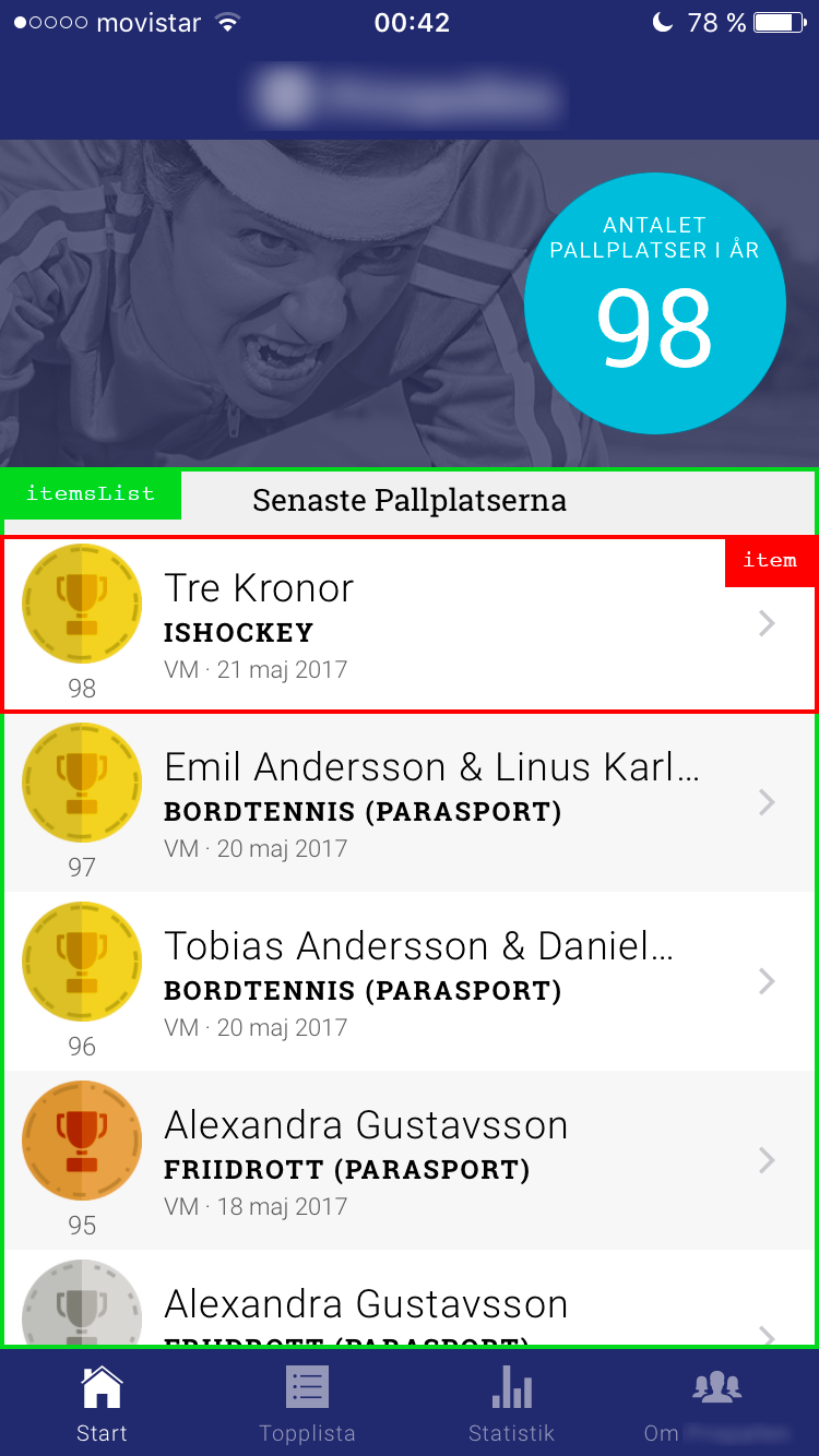
module.exports = stylesimport { StyleSheet } from 'react-native'
const styles = StyleSheet.create({
itemsList: {
flex: 1,
},
item: {
flexDirection: 'row',
justifyContent: 'flex-start',
alignItems: 'stretch',
height: 82,
paddingLeft: 10,
paddingRight: 20,
}
})
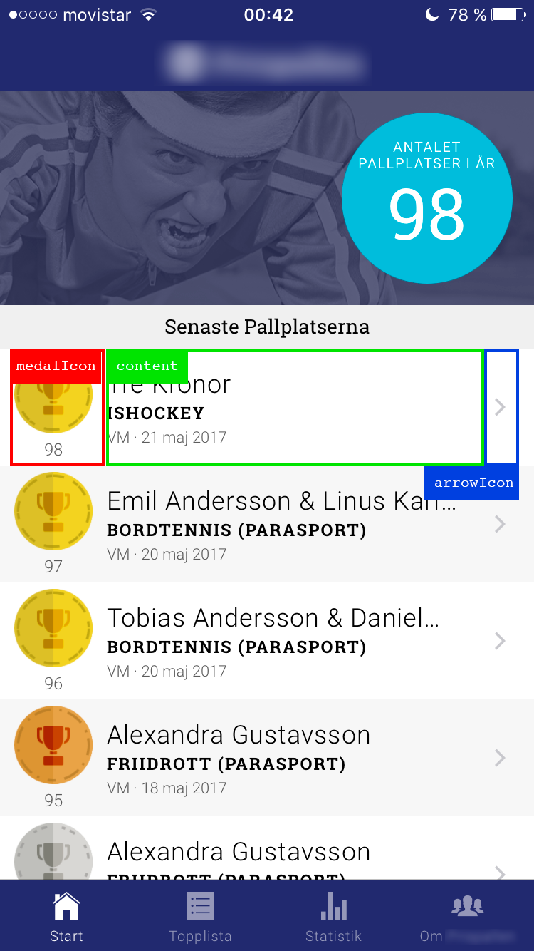
module.exports = stylesimport { StyleSheet } from 'react-native'
const styles = StyleSheet.create({
medalIcon: {
alignItems: 'center',
justifyContent: 'center',
},
content: {
justifyContent: 'center',
flex: 1,
},
arrowIcon: {
justifyContent: 'center',
}
})
module.exports = stylesflexbox.io
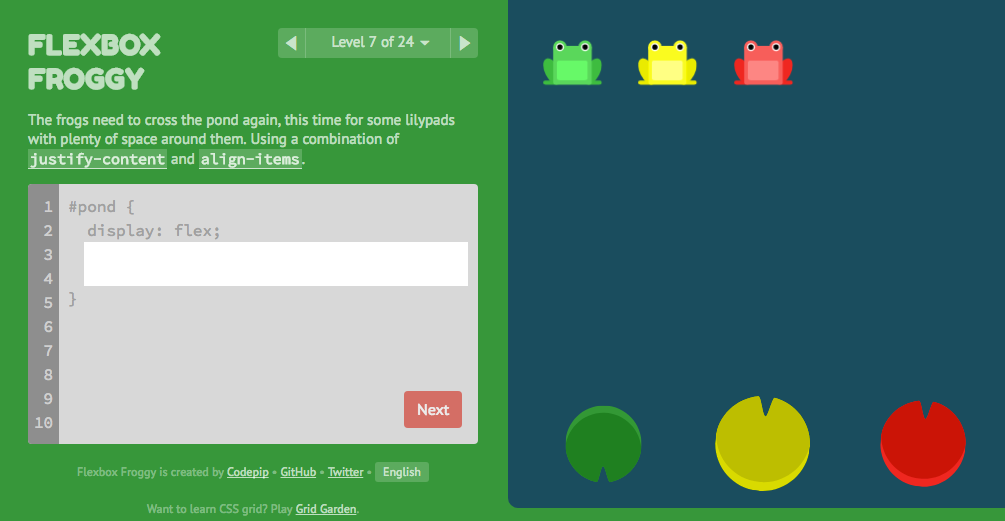
flexboxfroggy.com
🤔💭
By Brad Adams