Responsive Design
for beginners
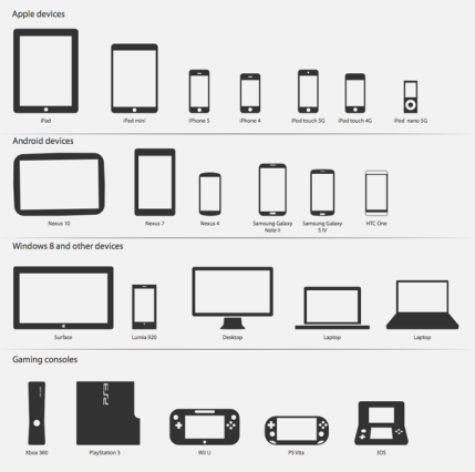
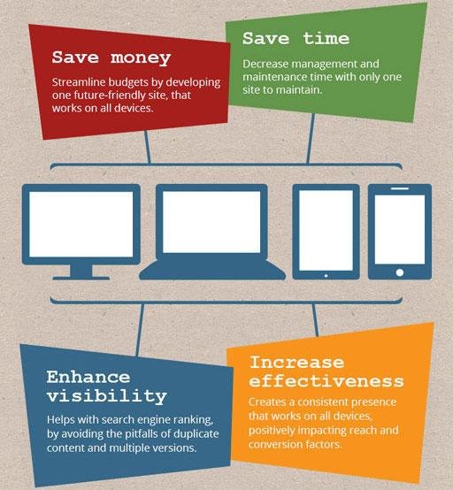
Responsive web design (RWD) is a web development approach that creates dynamic changes to the appearance of a website, depending on the screen size and orientation of the device being used to view it.
Why?
More Systems
Break points
@media
<!-- CSS media query on a link element -->
<link rel="stylesheet" media="(max-width: 800px)" href="example.css" />

<!-- CSS media query within a stylesheet -->
<style>
@media (max-width: 600px) {
  .facet_sidebar {
    display: none;
  }
}
</style>@media screen and (min-width: 700px) and (orientation: landscape) { ... }@media features
color
how many bits of color. 0 is black and white.
aspect-ratio
aspect ratio of the viewport
device-aspect-ratio
aspect ratio of the device itself
orientation
checks if width is bigger than height
resolution
pixel density of the device
@media types
all
everything
paged and print preview
screen
color screens
speech
speech synthesizers
safest to use: "print" and "screen"
/* Extra small devices (phones, less than 768px) */
/* No media query since this is the default in Bootstrap */

/* Small devices (tablets, 768px and up) */
@media (min-width: @screen-sm-min) { ... }

/* Medium devices (desktops, 992px and up) */
@media (min-width: @screen-md-min) { ... }

/* Large devices (large desktops, 1200px and up) */
@media (min-width: @screen-lg-min) { ... }
How bootstrap does it
Images
example
img {
    width: 100%;
    height: auto;
}
The simple way
img {
  width: 500px;
}
@media (max-width: 500px) {
  img {
    width: 250px;
  }
}
@media queries
<article>
    <img srcset="large.jpg 1400w, medium.jpg 700w, small.jpg 400w"
         sizes="(min-width: 700px) 700px, 100vw"
         alt="A woman reading">
</article>
srcset and sizes
Grid
Why Use Grid
Visually appealing
Reduces need to make design decisions
Easily create visual hierarchies
Reduces layout work
How to Use Grid
Use it EVERYWHERE*
Plan it out first, set up your rows
Don't leave items dangling
Make your own grid
... or not
Using Bootstrap
Bootstrap Grid
<div class="container-fluid">
   <div class="row">
      <div class="col-md-6">.col-md-6</div>
      <div class="col-md-6">.col-md-6</div>
  </div>
</div>
Use .container
Wrap around a new .row each time
Add up your columns to 12
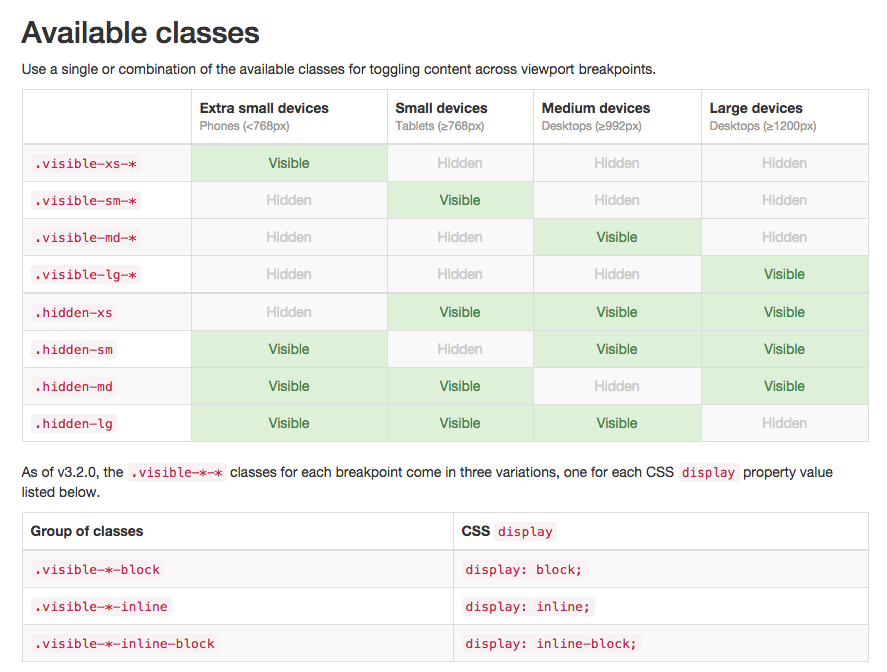
Visibility Helpers
Jquery Rescon
$(document).ready(function(){
    // Regular methods of doing it. Considering .rescon is the container for your columns
      $(".rescon").rescon();

    // You can programmatically reset the plugin
    $('#reset').on('click', function(){
        $(".rescon").rescon({ action : "reset"});
    })

    // And run it back again.
    $('#run').on('click', function(){
      $(".rescon").rescon({ action : "run"});
    })

    // Add custom sizes
    $(".rescon").rescon( {
        sizes : { "xs" : 0, "sm" : 300, "md" : 600, "lg" : 1000 }
    });

})Considerations
How is Search Engine Optimization?
Does it work with small devices?
Will I get long load times when I don't need everything?
Am I compromising features?
Is there an alternative?
Hands on
Responsive Design | and introduction
By Caner Uguz
Responsive Design | and introduction
Understanding what responsive design is and how to make it work in a website using bootstrap.