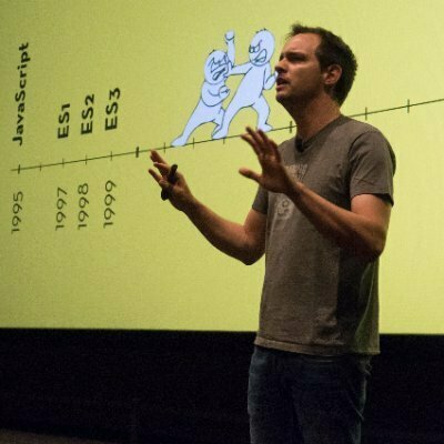
Scroll-enhanced experiences

@carmenansio
@carmenansio

Making things move

LottieFiles

@carmenansio
@carmenansio
@carmenansio

Before we dive in

@carmenansio

Respect user preferences

It's easy you only need a mediaquery

@carmenansio
@media (prefers-reduced-motion: no-preference) {
  /* your fancy motion */
}
@carmenansio

Last but not least

@carmenansio

With great power comes great responsibility

@carmenansio
@carmenansio

We need to answer

@carmenansio

Animation, Storytelling & Scrollytelling

What is animation?

@carmenansio

A process that creates moving images

@carmenansio
@carmenansio
@keyframes grow {
  0% {
    transform: scale(1);
  }
  
  100% {
    transform: scale(2);
  }
}

What happens in between?

@carmenansio

What is animation?

@carmenansio

A process that creates moving images

What is animation?

@carmenansio

Guide users, provide feedback & engage UX

What is storytelling?

@carmenansio

Make stories emotional and catchy 

What is scrollytelling?

@carmenansio

Transforms a longform story into an interactive experience

@carmenansio
@carmenansio

Scroll animations

@carmenansio

It's all about human behavior

What are scroll-driven animations?

@carmenansio

Scroll-driven animation usually refers to...

@carmenansio

An animation that happens while you scroll.

@carmenansio

An animation that happens when an element enters, leaves, or moves through a visible area. 

@carmenansio

Scrollport

@carmenansio
@carmenansio
@carmenansio
@carmenansio

Can we achieve this effect with only CSS?

@carmenansio
@carmenansio
.fill {
  animation: progress linear forwards;
  animation-timeline: scroll();
}

@keyframes progress {
  from {
    stroke-dasharray: 0px 1px;
  }
  to {
    stroke-dasharray: 1px 1px;
  }
}
@carmenansio

Universal Language

@carmenansio

Motion == Emotion

@carmenansio

Ye Olde Way

@carmenansio

With vanilla JavaScript

@carmenansio

Why you not need JS

@carmenansio

the main thread in a visual way

@carmenansio
@carmenansio
Reduce unused JavaScript
- Potencial savings of 4MB
@carmenansio

Why use CSS

for Scroll Animations?

@carmenansio

Because now

we can

@carmenansio

The scroll-driven Animations API lets you create smooth animations that are controlled by scrolling. 

@carmenansio

These animations run off the main thread, achieving a smooth performance with just a few extra lines of code.

Attaching an existing CSS animation

@carmenansio

to a scroller

@carmenansio
img {
	animation: 2s infinite alternate zoomin;
}
@keyframes zoomin {
  from {
    margin-left: 100%;
    width: 300%;
  }

  to {
    margin-left: 0%;
    width: 100%;
  }
}
@carmenansio
@carmenansio
@carmenansio
@carmenansio
@keyframes zoomin {
	from {
		margin-left: 100%;
		width: 0%;
	}

	to {
		margin-left: 0%;
		width: 50%;
	}
}
@carmenansio
img {
	animation: zoomin 2s infinite alternate;
}
@carmenansio
img {
	animation: zoomin linear both;
	animation-timeline: scroll();
}
@carmenansio

The scroll-driven animations specification

@carmenansio

Web Animations API - CSS Animation API

@carmenansio
@carmenansio
https://webstatus.dev/features/scroll-driven-animations?q=scroll+driven
@carmenansio
@carmenansio

Scroll -Driven animations with ScrollTimeline and ViewTimeline

@carmenansio

115

115

Worried about learning new stuff?

@carmenansio
@carmenansio
animation-timeline: scroll();
animation-timeline: view();

When an animation uses one of these two timelines, it follows that timeline and not the usual time-based one.

@carmenansio

Scroll Progress Timeline

@carmenansio

View Progress Timeline

@carmenansio

Let's create a fancy progress bar

@carmenansio

Let's create a happy progress bar

@carmenansio
@carmenansio
@carmenansio

Performance. CSS animations are smoother, less taxing on your browser's main thread, and they render faster.

@carmenansio
@carmenansio
@carmenansio
@carmenansio
@carmenansio
animation-timeline: scroll(root);
@carmenansio
.link {
  animation: stage both linear var(--run-count);
}
@carmenansio
img {
  animation: zelda-motion both steps(calc(var(--frames) - 1)) var(--run-count);
}

How the Scroll Animation Works

@carmenansio
@carmenansio
@keyframes stage {
	to {
		translate: calc(-100% + 40vmin) 0;
	}
}
@carmenansio
@keyframes zelda-motion {
	100% {
		object-position: 100% 0;
	}
}
@carmenansio
@supports (animation-timeline: scroll()) {
  /* your cool scrolly motion */
}
@carmenansio

Codrops

@carmenansio
@carmenansio
@carmenansio
@markuswalker
@carmenansio
.grid {
  display: grid;
  gap: 0.75rem;
  inline-size: min(90vw, 80rem);
  margin-inline: auto;
}
@carmenansio
.grid__item {
  aspect-ratio: 7/10;
  transform: skewX(10deg);
  animation: skew linear both;
  view-timeline: --skew;
  animation-range: entry exit 50%;
  animation-timeline: --skew;
  filter: brightness(0);
  overflow: hidden;
}
@carmenansio
.grid__item img {
  inline-size: 100%;
  block-size: 100%;
  object-fit: cover;
  animation: scale linear both;
  animation-timeline: --skew;
  animation-range: inherit;
}
@carmenansio
.grid__row:nth-of-type(odd) .grid__item {
  transform: skewX(-10deg);
}
@carmenansio
@keyframes skew {
  to {
    transform: skewX(0deg);
    filter: brightness(1);
  }
}
@carmenansio
@supports (animation-timeline: view()) {
  .warning {
    display: none;
  }
}
@markuswalker

Cool effects that you can achieve with Scroll-driven animations

@carmenansio
@carmenansio
@carmenansio
@carmenansio
@carmenansio
@carmenansio
.content {
  animation: appear linear;
  animation-range: entry 0% entry 100%;
  animation-timeline: view();
}
@carmenansio
@carmenansio
img {
	width: 100%;
	aspect-ratio: 16/9;
	object-fit: cover;
	// timeline
	view-timeline-name: --image;
	view-timeline-axis: block;
	// animation
	animation-timeline: --image;
	animation-name: scroll;
	// range
	animation-range: entry 25% cover 30%;
	animation-fill-mode: both;
}
@carmenansio
@carmenansio
@carmenansio
@carmenansio

It's all about images

@carmenansio
@carmenansio
@carmenansio
:root {
	--bg: hsl(0 0% 2%);
	--color: hsl(0 0% 100% / 0.1);
	--underline-width: 1lh;
	--underline-block-width: 200vmax;
	--underline-color: hsl(0 0% 50% / 0.05);
	--underline-transition: 5s;
	--finish: hsl(0 0% 100%);
	--accent: hsl(0 0% 100%);
	--fill: hsl(0 0% 50%);
}
@carmenansio
section {
	margin: 100vh 0;
	height: 100vh;
	width: 100vw;
	view-timeline-name: --section;
}
@carmenansio
p {
	width: 50vw;
	resize: both;
	max-width: 100vw;
	overflow: hidden;
	position: fixed;
	padding: 10vmin;
	top: 50%;
	left: 50%;
	translate: -50% -50%;
	animation: fill both linear;
	animation-timeline: --section;
	animation-range: cover;
	margin: 0;
}
@carmenansio
@property --progress {
	initial-value: 0;
	syntax: "<number>";
	inherits: true;
}
@carmenansio

But CSS is not programming

"Your JS dev friend"

@carmenansio
p > span {
	outline-color: hsl(10 80% 50%);
	outline-offset: 1ch;
	font-size: clamp(3rem, 4vw + 1rem, 10rem);
	color: var(--color);
	text-decoration: none;
	background-image: linear-gradient(
			90deg,
			transparent calc(100% - 8ch),
			var(--accent) calc(100% - 8ch)
		),
		linear-gradient(90deg, var(--fill), var(--fill)),
		linear-gradient(90deg, var(--underline-color), var(--underline-color));
	background-size: var(--underline-block-width) var(--underline-width),
		var(--underline-block-width) var(--underline-width),
		100% var(--underline-width);
	background-repeat: no-repeat;
	background-position-x: calc(
			(var(--underline-block-width) * -1) +
				(var(--progress) * var(--underline-block-width) * 1)
		),
		calc(
			(var(--underline-block-width) * -1) +
				(var(--progress) * var(--underline-block-width) * 1)
		),
		0;
	background-position-y: 100%;
	color: transparent;
	-webkit-background-clip: text;
	animation: color both linear;
	animation-timeline: --section;
	animation-range: cover 65% cover 100%;
}
@carmenansio
@keyframes fill {
	to {
		--progress: 1;
	}
}

@keyframes color {
	to {
		color: var(--finish);
	}
}
@carmenansio

Retro time

@carmenansio
@carmenansio
@carmenansio
timeline-scope: --question-block, --world, --mario;

Affraid of the timeline

@carmenansio
@carmenansio

Outrun

@carmenansio
@carmenansio
@warkentien2
@warkentien2
@warkentien2
@warkentien2
@warkentien2
@carmenansio
@warkentien2

What's next for CSS?

Bright future

@carmenansio
@carmenansio
@bramus
@argyleink
@una

Thanks

@carmenansio

Keep scrolling

@carmenansio

CSS Day 2024 - Scroll-Enhanced Experiences

By Carmen Ansio

CSS Day 2024 - Scroll-Enhanced Experiences

Presentation slides for 'Scroll-Enhanced Experiences' at CSS Day 2024

  • 266