CSS Grid layout
Grid is used for making complex web design layouts more easily as it's not so hard to master.
Using Flex you can make only 1D layout but with Grid can create 2D layout.
You have to start by giving the display property "grid" to the container element or parent element.
.container {
	display: grid;
}
CSS Grid layout (Cont...)
Nothing will change after adding display: flex; in the parent container, because we need to define the width of columns.
In order to set that columns width we have gird-template-columns property.
Now, define width of columns.
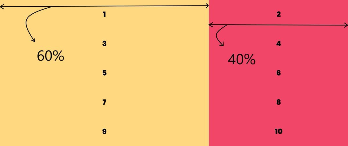
For example, let's say I need two columns of width 60% and 40% respectively.
grid-template-columns: 60% 40%;
CSS Grid layout (Cont...)
1st column width which is 60% of the width of grid container.
grid-template-columns: 60% 40%;2nd column width which is 40% of the width of grid container.
If you want to create the 3rd column, simply add the with of 3rd column & so on.
CSS Grid layout (Cont...)
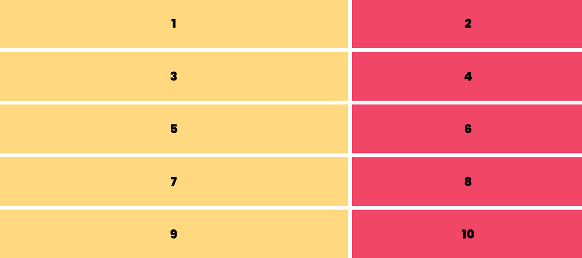
Using "grid-gap" property we will add spacing between them.
For example, I need 10px spacing along column and row. grid-gap: 10px;
CSS Grid layout (Cont...)
Output:
CSS Grid layout (Cont...)
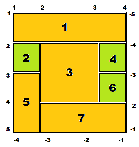
.one {
  grid-column: 1/4;
}
.three {
grid-column: 2/3;
grid-row: 2/4;
}.five {
grid-row: 3/5;
}.seven {
grid-column: 2/4;
}{
grid-template-column: 1fr 2fr 1fr;
}{
grid-gap: 10px;
}.parent{
justify-content: center;
align-content: center;
}CSS Grid layout
By Code 100mph


