Q3 - How effective is the combination of my tasks?
Conor Lane
I feel that I spent a fairly large amount of time considering how to incorporate my three texts into a cohesive package, factoring in all kinds of things such as themes, styles and concepts. I feel the main purpose of all my three products is to bring in the attention of people who would be interested in the kind of genre that the film is, but also to raise intrigue as to what the film could hold.
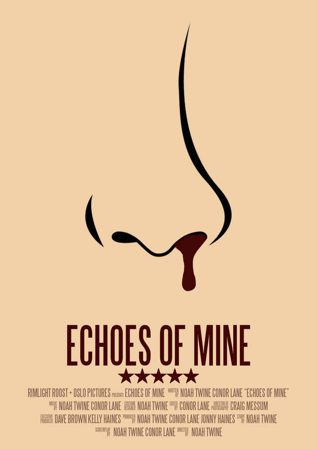

I feel like the poster especially leaves a large amount unanswered for the deliberate reason for people to either direct themselves towards the magazine review to find out more or even straight to the film; the nose bleeding is a direct reference to the film that you would only know if you saw the film yourself (and therefore making it an audience pleasure of solving ‘enigmas’ personally) but it also leads people to be more curious about the production and want to know more.
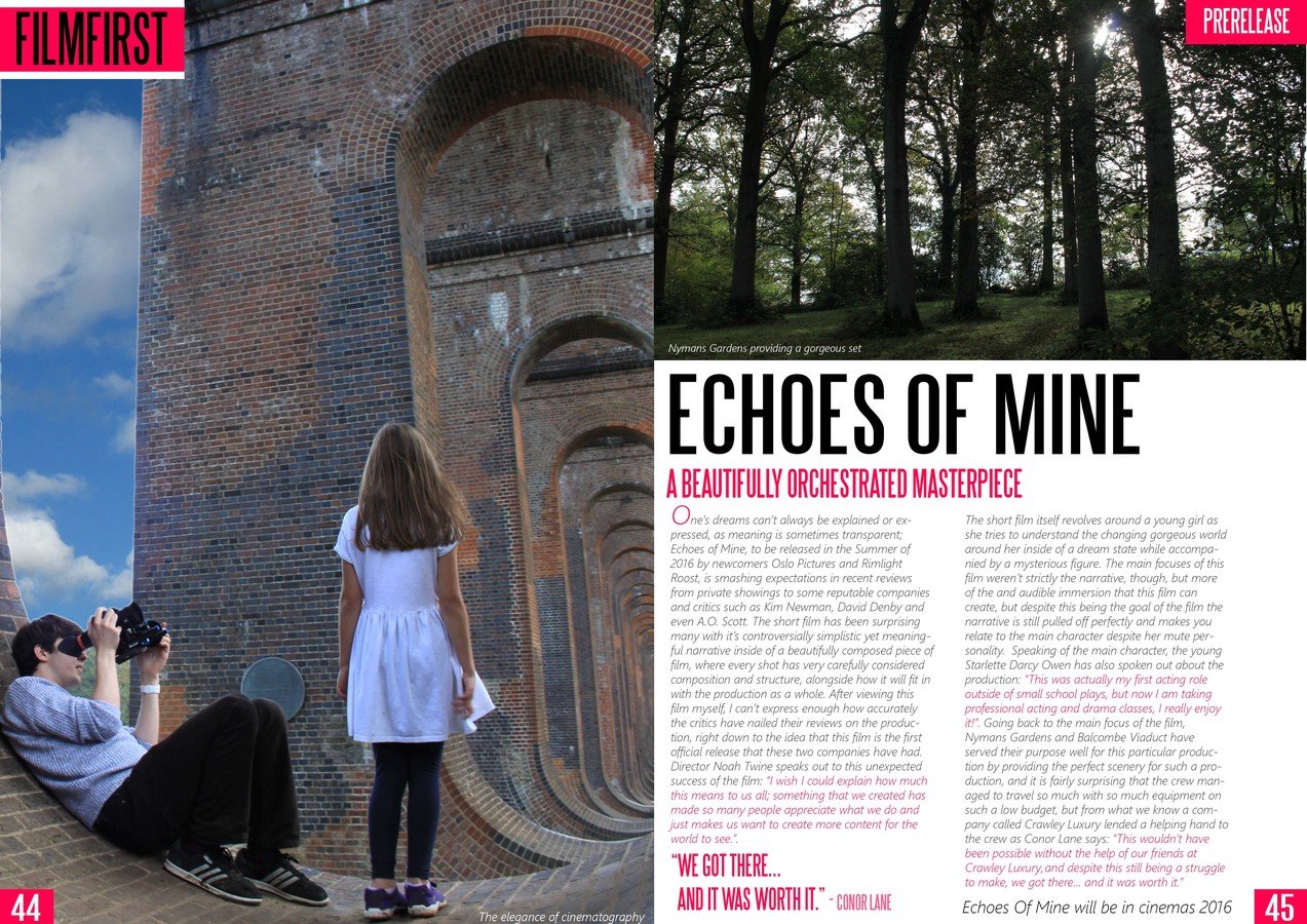
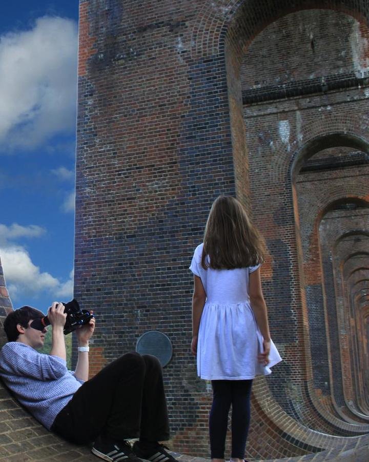
If, in my ideal situation, the viewer did then divert themselves to the magazine review they would find the behind the scenes shot and a location shot, with the promise of something amazing, as the review explains.
They would read about the film and see it is based around a little girl as opposed to something more violent, as the blood may suggest, and be interested to see how the film includes this kind of feature, and then after watching the film they can look back at the poster and also feel satisfied. Of course this is the ‘preferred reading’ as a whole, if you like, but it is the way that I planned out the whole idea behind my 3 tasks and why I chose these over doing a radio advert.
In terms of house style, I feel that the poster and magazine link the most closely especially considering in fonts where SteelTongs is used as the title in both, and also the credits in the poster. I feel like this carries the theme of a clean professional look throughout both media types and allows for some similarities to be shown between at least 2 of the tasks.
I was going to use steel tongs as the title for the film inside of the movie itself but I felt like the font I had already chosen was appropriate enough for the context it was in; it was a clean, professional font but was ‘gentle’ enough to not give the wrong impression of the film. This obviously worked the other way around for the posters as I felt the font I used in the film didn’t have enough impact on the poster/magazine.
I feel like the theme of innocence is carried out between the movie and the magazine, but not necessarily the poster, more specifically the image on the left hand side of the magazine, where you can see our DP and the star herself, Darcy; she is standing with the blue sky behind her which shows a sense of purity and also hold a contradicting connotation of innocence and a sense of size in the world.
Now what I mean by that is the camera angle is a low angle shot of her which typically would make a character look more powerful but in this case you also have the huge viaduct which makes her look so much smaller and non-injurious, therefore further creating her character and referencing to the film.
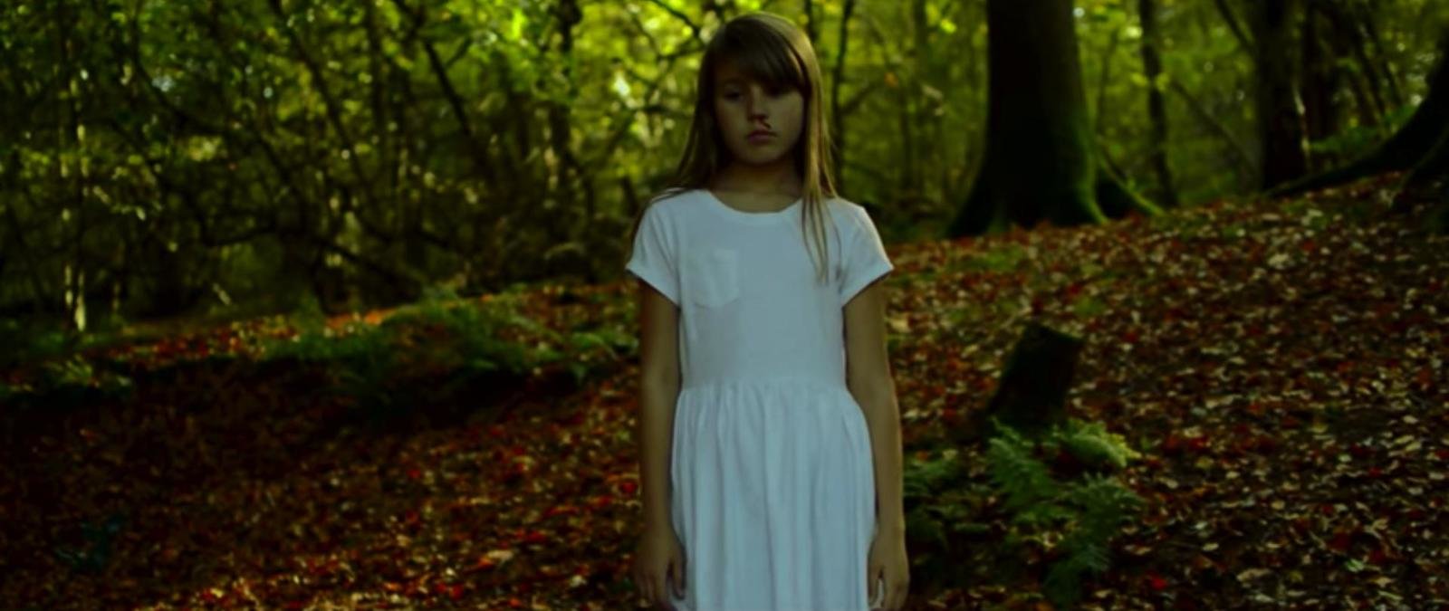
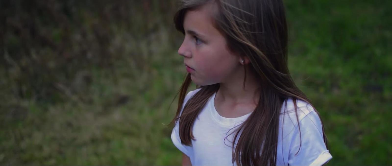
The production itself shows her to be confused yet blindly optimistic to the surroundings that she finds herself in and the audience becomes attached to her, not expecting to see the darker side of the film and subsequently being affected more by it, and as explained, I wanted this to be shown in both the magazine and the film to show some coherence and link them together.
How effective is the combination of my tasks?
By Conor Lane