


Content ITV PRO
This is Itvedant Content department
Business Scenario
Welcome!
Today is your 17th day as a Junior Data Analyst at a Retail Analytics Company.
The management team wants to build a Retail Sales Analysis Dashboard that provides a complete overview of business performance. The company generates thousands of transactions across different cities, categories, and sales channels. Management needs a single analytical solution that can:
Build Final Retail Sales Analysis Project
Therefore, management has assigned the analytics team to build a Final Retail Sales Analysis Project that combines data analysis, visualization, and business reporting.
Git Pull
Click here to download previous lab file: DM LAB 16
git pull origin branchNameClick to download Dataset : Retail_Dataset_Cleaned
Task 1: Analyze Retail Dataset
Before creating dashboards and generating insights, analysts must ensure that the dataset is accurate, complete, and ready for analysis. Raw retail data often contains missing values, duplicate records, incorrect data types, and inconsistent values that can affect business decisions.
1
Import Required Libraries
import pandas as pd
import numpy as np
import matplotlib.pyplot as plt
import seaborn as sns
2
Load Dataset
df = pd.read_csv("/content/Retail_Dataset_Modified.csv")
print("Dataset Loaded Successfully")
Open Google Colab
3
4
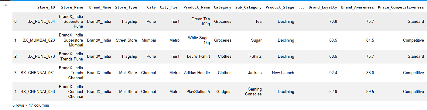
Display Dataset Information
df.head()Display First Five Records
a
b
Check Dataset Information
df.info()c
Display Statistical Summary
df.describe()5
Check Missing Values
df.isnull().sum()Convert Data Types Correctly
6
numeric_cols = [
    'Quantity_Available',
    'Units_Sold',
    'Revenue',
    'Shipping_Cost'
    ]
for col in numeric_cols:
    df[col] = pd.to_numeric(df[col], errors='coerce')
7
Handle Missing Values
Numerical Columns
a
num_cols = ['Quantity_Available', 'Units_Sold',
			'Revenue','Customer_Satisfaction',
            'Delivery_Time', 'Shipping_Cost']

for col in num_cols:
    df[col].fillna(df[col].median(), inplace=True)
b
Categorical Columns
cat_cols = ['City', 'Product_Name','Supplier']

for col in cat_cols:
    df[col].fillna(df[col].mode()[0], inplace=True)
8
Remove Duplicate Records
a
Check Duplicate Rows
df.duplicated().sum()b
Remove Duplicate Rows
df.drop_duplicates(inplace=True)c
Verify Dataset Shape
df.shapeStandardize Text Formatting by Removing Extra Spaces and Correcting Capitalization
9
8
df['Category'] = df['Category'].str.strip().str.title()

df['Category'].unique()
Create New Columns
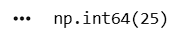
a
Create Profit Amount Column
df["Profit_Amount"] = (
    df["Revenue"] *
    df["Profit_Margin"] / 100
)

df[["Revenue",
    "Profit_Margin",
    "Profit_Amount"]].sample(5)
10
11
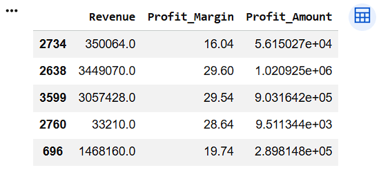
Transform Revenue into Revenue Category
df["Revenue_Category"] = np.where(
    df["Revenue"] < 5000,
    "Low Revenue",
    np.where(
        df["Revenue"] < 10000,
        "Medium Revenue",
        "High Revenue"
    )
)

df[["Revenue", "Revenue_Category"]].head()
12
8
Verify Final Dataset
df.info()df.isnull().sum()df.shapea
b
c
Task 2: Create Visual Dashboards
The retail company receives thousands of sales transactions every month from different cities, product categories, and sales channels. Although the data is available in tables, management finds it difficult to identify trends, compare performance, and make quick
1
business decisions by looking at raw records.
Therefore, management has asked the analytics team to create visual dashboards that transform raw retail data into meaningful and actionable business insights.
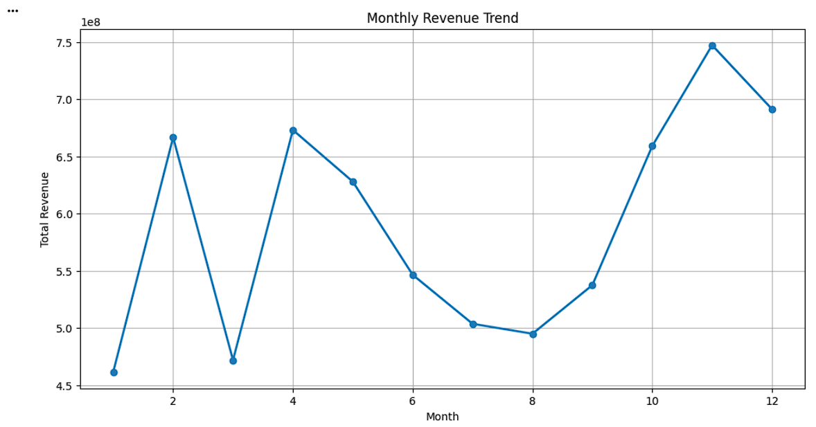
Create Monthly Revenue Trend
monthly_revenue = df.groupby('Month')['Revenue'].sum()
plt.figure(figsize=(12,6))
plt.plot( monthly_revenue.index, monthly_revenue.values, marker='o', linewidth=2 )
plt.title('Monthly Revenue Trend')
plt.xlabel('Month')
plt.ylabel('Total Revenue')
plt.grid(True)
plt.show()
2
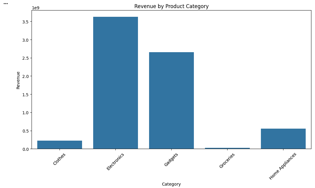
Create Revenue by Product Category Bar Chart
category_revenue = df.groupby('Category')['Revenue'].sum()
plt.figure(figsize=(12,6))
sns.barplot( x=category_revenue.index, y=category_revenue.values )
plt.title('Revenue by Product Category')
plt.xlabel('Category')
plt.ylabel('Revenue')
plt.xticks(rotation=45)
plt.show()
Create Revenue Distribution Histogram
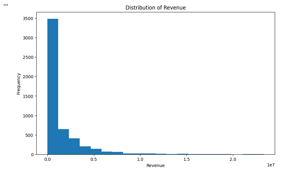
3
plt.figure(figsize=(10,6))
plt.hist( df['Revenue'], bins=20 )
plt.title('Distribution of Revenue')
plt.xlabel('Revenue')
plt.ylabel('Frequency')
plt.show()
4
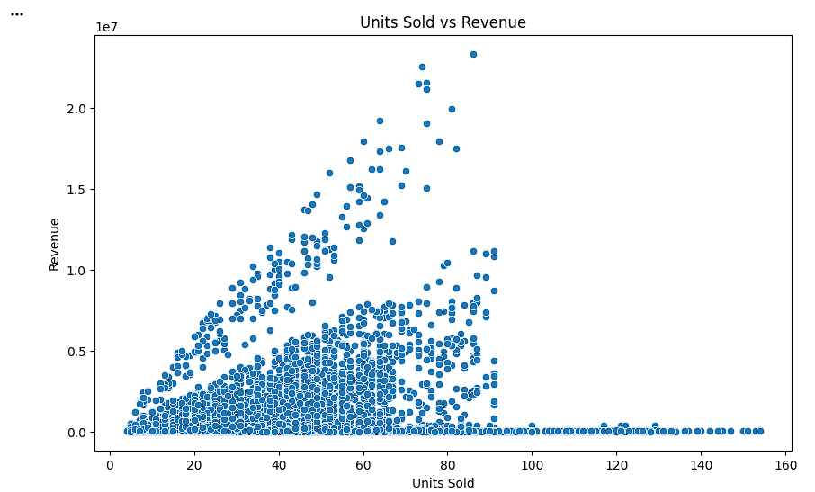
Create Units Sold vs Revenue Scatter Plot
plt.figure(figsize=(10,6))
sns.scatterplot( data=df, x='Units_Sold', y='Revenue' )
plt.title('Units Sold vs Revenue')
plt.xlabel('Units Sold')
plt.ylabel('Revenue')
plt.show()
5
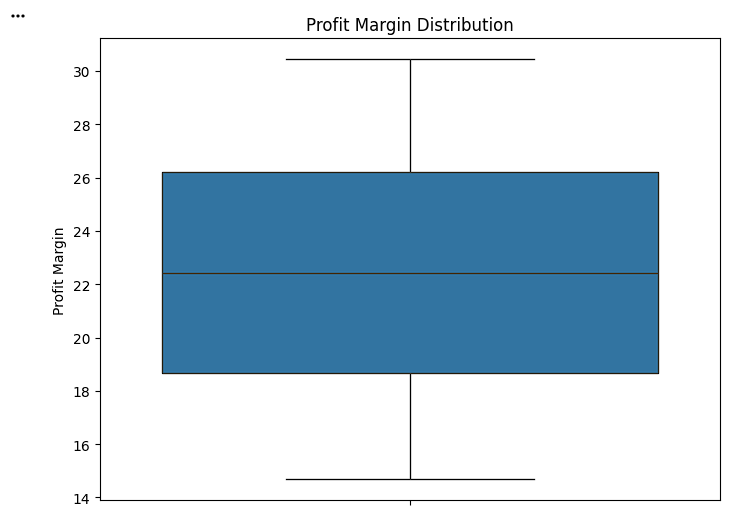
Create Profit Margin Distribution Box Plot
plt.figure(figsize=(8,6))
sns.boxplot( y=df['Profit_Margin'] )
plt.title('Profit Margin Distribution')
plt.ylabel('Profit Margin')
plt.show()
Task 3: Present Business Insights
After cleaning the retail dataset and creating visual dashboards, management wants the analytics team to present meaningful business insights instead of only displaying charts. Business insights help decision-makers understand what is happening in the business and what actions should be taken to improve performance.
1
Identify the Month Generating the Highest Revenue
monthly_revenue = df.groupby('Month')['Revenue'].sum()
highest_month = monthly_revenue.idxmax()
highest_revenue = monthly_revenue.max()
print("Highest Revenue Month:", highest_month)
print("Revenue:", highest_revenue)
2
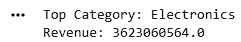
Identify the Top-Performing Product Category
category_revenue = df.groupby('Category')['Revenue'].sum()
top_category = category_revenue.idxmax()
top_revenue = category_revenue.max()
print("Top Category:", top_category)
print("Revenue:", top_revenue)
Great job!
You have successfully completed your lab on Build Final Retail Sales Analysis Project
In this lab, you have: Create visual dashboards using Matplotlib and Seaborn, generate a Monthly Revenue Trend chart to analyze sales performance over time, compare category-wise revenue using bar charts, Analyze the distribution of revenue using histograms, interpret charts and convert visual findings into meaningful business insights, Present data-driven recommendations to support business decision-making.
You are now ready to move to the next stage of Junior Data Analyst.
Checkpoint
Git Push
git push origin branchNameBy Content ITV


