


Content ITV PRO
This is Itvedant Content department
Learning Outcome
5
Interpret forecasts and trend results correctly
4
Analyse relationships using scatter plots
3
Create trend lines in Tableau
2
Identify situations where predictive analysis is useful
1
Explain trend analysis and forecasting concepts
Line charts and scatter plots
Dimensions and measures
Date and time dimensions
Marks card and Analytics pane
Basic chart interpretation
Learners should know :
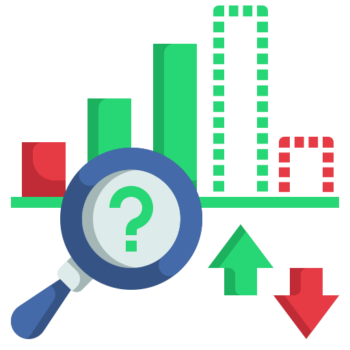
You’re in a meeting, a report is on the screen...
Last year’s numbers are clear
This quarter’s performance is solid
Everyone nods...
Then they ask questions such as:
What will happen next?
What will be the tentative sales for the upcoming year?
Can you predict the growth rate for the next 6 months?
The data is accurate
The charts are correct
Yet the most important question remains unanswered
Now something changes
A line extends beyond today....
Not exact
Not guaranteed
But directional
Suddenly:
Possible futures appear
Risks become visible
Opportunities emerge
The data didn’t change...
So how did the future suddenly show up?
This is what trend analysis and forecasting are built for
Decision-making also requires understanding:
Direction
Relationship
Likely outcomes
Tableau enables this through:
Trend lines
Predictive modelling
Forecasting tools
We now break down how these are built and interpreted....
Understanding Trend Analysis and Forecasting
What is Forecasting?
Estimates future values based on past trends
Uses statistical models
Forecasts indicate probability, not certainty
What is Trend Analysis?
Examines direction and pattern in historical data
Identifies:
Growth
Decline
Stability over time
Preparing Data for Predictive Analysis
Data Quality Requirements
Clean, structured dataset
Correct data types for Date, Measures
Adequate historical data for reliability
Identifying Variables
Dependent variable: what you want to predict
Independent variable(s): what influences it
Example:
Sales Revenue depends on Marketing Spend
Visual Foundations for Trend Analysis
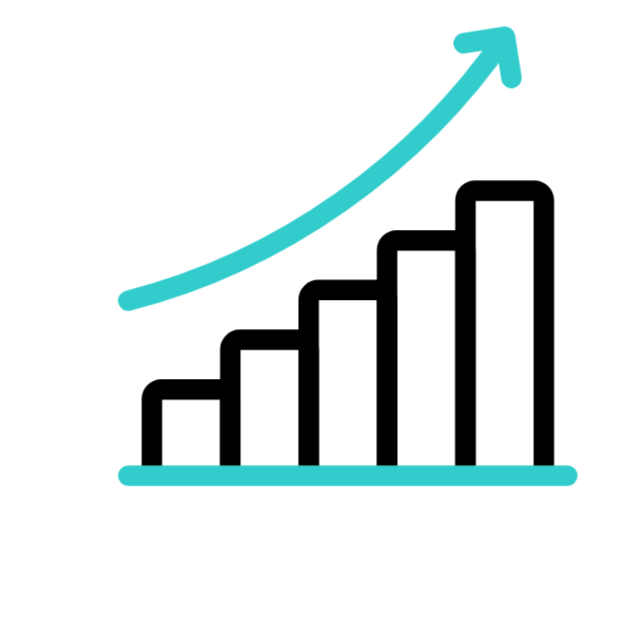
Line Charts for Time-Based Trends
Best for analysing performance over time
Examples:
Monthly sales trends
Year-over-year growth
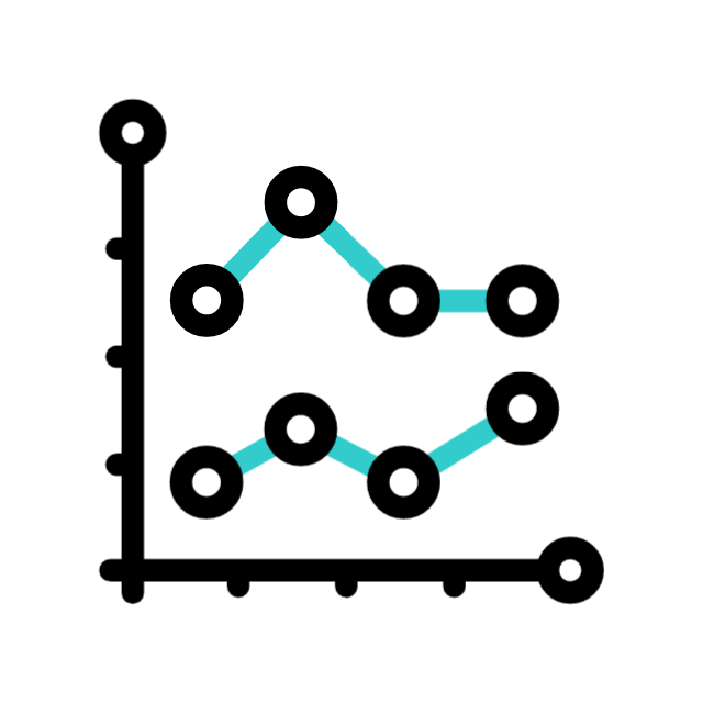
Scatter Plots for Relationship Analysis
Used to study correlation between two measures
Reveals:
Positive correlation
Negative correlation
No correlation
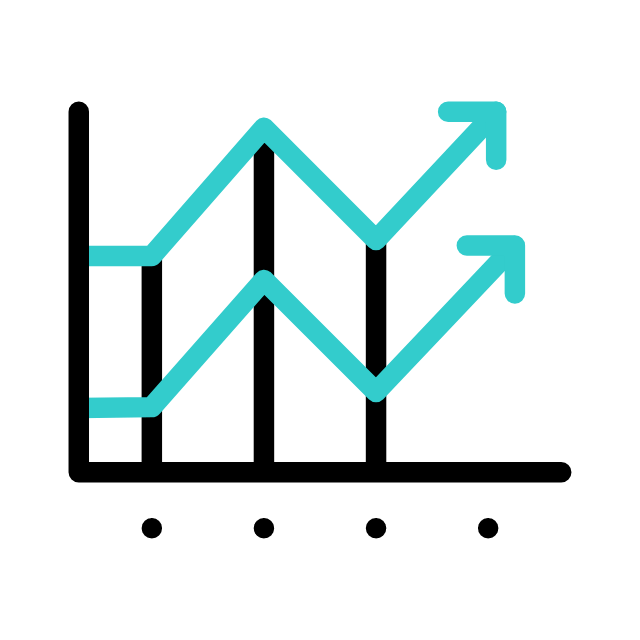
Trend Lines in Tableau
What is a Trend Line?
A statistical representation of overall direction
Common types
Exponential
Linear
Polynomial
Adding Trend Lines
Interpreting Trend Lines
Slope indicates direction and strength
Steeper slope = stronger relationship
Slope indicates direction and strength
Flat slope = weak or no trend
Slope indicates direction and strength
Slope indicates direction and strength
Use the Analytics pane
Drag Trend Line onto the visualization
Tableau automatically fits the model
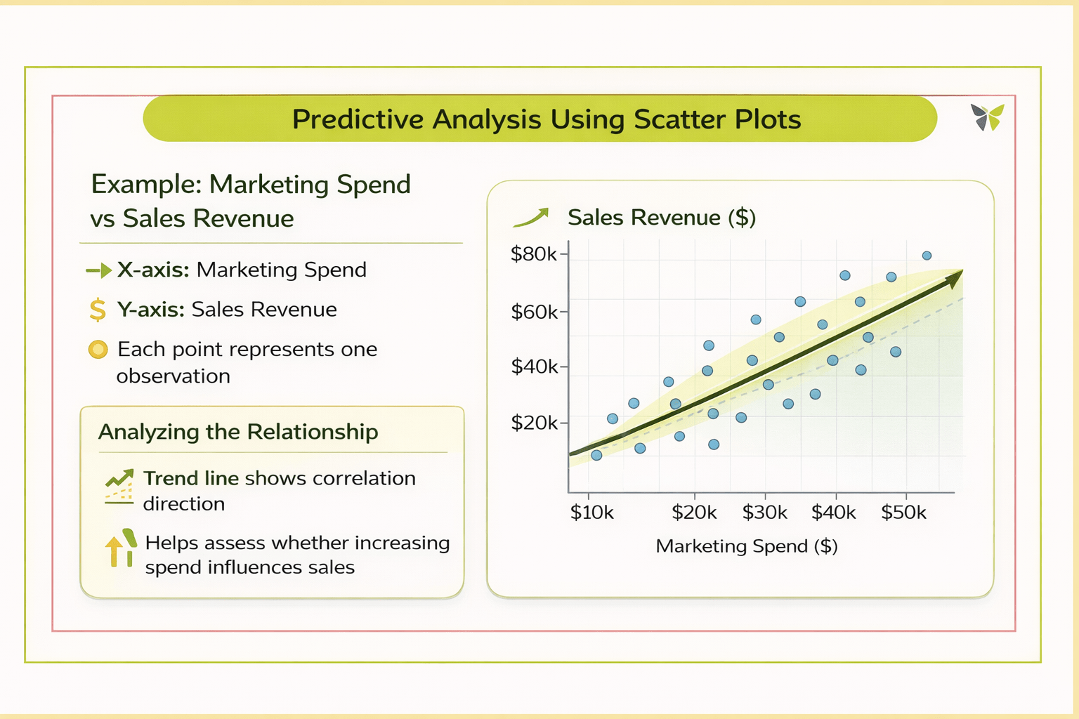
Predictive Analysis Using Scatter Plots
Example: Marketing Spend vs Sales Revenue
X-axis: Marketing Spend
Y-axis: Sales Revenue
Each point represents one observation
Analysing the Relationship
Trend line shows correlation direction
Helps assess whether increasing spend influences sales
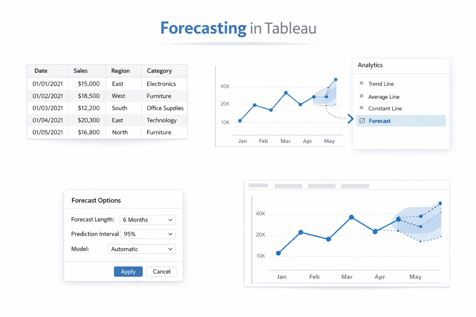
Forecasting in Tableau
What Tableau Forecasting Does?
Extends historical trends into the future
Uses built-in forecasting algorithms
Interpreting Forecast Results
Creating a Forecast
Start with a time-based line chart
Drag Forecast from the Analytics pane
Tableau generates projected values
Slope indicates direction and strength
Shaded bands represent confidence intervals
Wider bands indicate higher uncertainty
Forecast line shows expected future trend
Limitations and Best Practices
Limitations
Best Practices
Slope indicates direction and strength
Correlation does not imply causation
Forecasts rely on historical patterns
Avoid treating forecasts as guarantees
Combine predictive insights with business context
Always communicate uncertainty
Sudden external changes reduce accuracy
5
Tableau enables predictive insights through built-in tools
4
Forecasting projects likely future outcomes
3
Trend lines summarize patterns statistically
2
Scatter plots reveal relationships
1
Trend analysis explains direction in historical data
Summary
Quiz
What does a trend line represent?
A. To show average
B. To show groupings
C. Overall direction or relationship in the data
D. Maximum Values
Quiz- Answer
What does a trend line represent?
A. To show average
B. To show groupings
C. Overall direction or relationship in the data
D. Maximum Values
By Content ITV


