


Content ITV PRO
This is Itvedant Content department
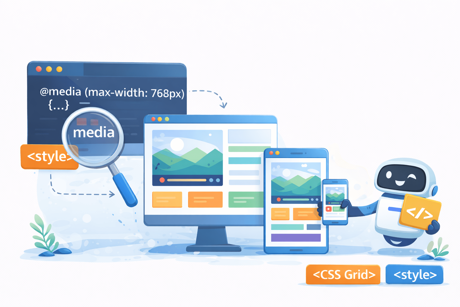
Responsive Web Fundamentals -I
Learning Outcome
Responsive Design Techniques
Viewport
Styling Enhancements
Pseudo Class
Responsive Background
Pseudo Element
What are some key elements for enhancing styling on a website
Element
Pseudo Element: Styles specific parts of an element’s content
Pseudo Class : Defines special states of an entire element
Let's Discover The Difference Between Pseudo-Classes And Pseudo-Elements!
Pseudo Class
Cracking The Pseudo Class Code
A pseudo-class in CSS is used to style elements based on their state or position
:active
:visited
:hover
:link
:first-child
:last-child
:nth-child
Pseudo Class
Cracking The Pseudo Class Code
A pseudo-class in CSS is used to style elements based on their state or position
:visited
:link
:hover
:active
:first-child
:last-child
:nth-child
The colon (:) before a pseudo-class in CSS indicates a special state or behavior of an element
:
:
:
:
:
:
:
Before delving into pseudo-classes, let's explore the structure of the website
<section>
<div class="grid_wrap">
</div>
</section>
Get Ready To Unleash The Magic Of Pseudo-Class!
Here we use <a> to "Read More"
Get Ready To Unleash The Magic Of Pseudo-Class!
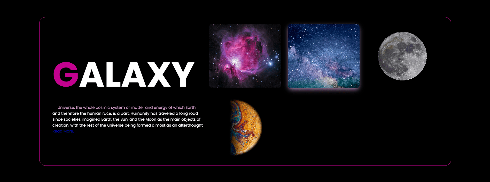
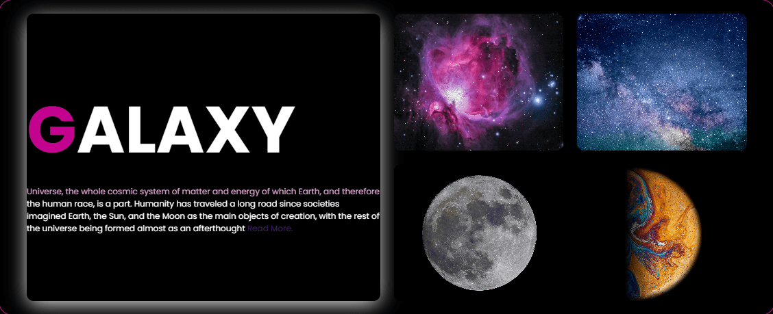
Let's take an example of "Read More"
<div class="grid_wrap">
<div class="big box">
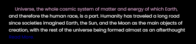
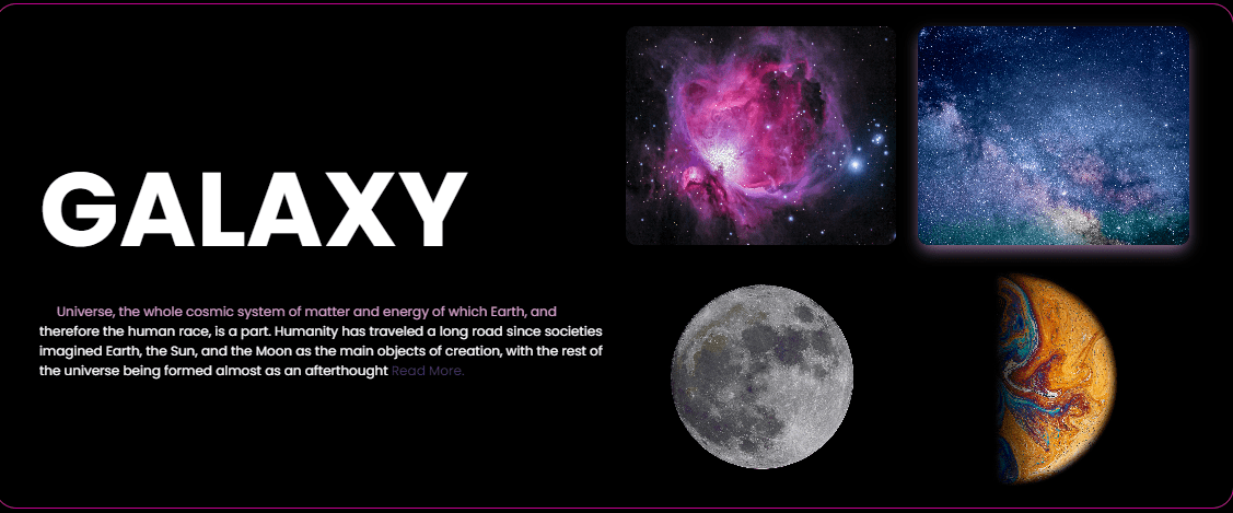
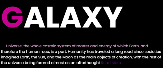
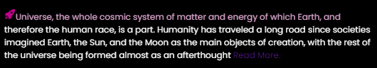
<p>Universe, the whole cosmic system of matter and energy of which Earth, and therefore the human
race, is a part. Humanity has traveled a long road since societies imagined Earth, the Sun, and
the Moon as the main objects of creation, with the rest of the universe being formed almost as
an afterthought
<a href="https://www.nasa.gov/"> Read More.</a>
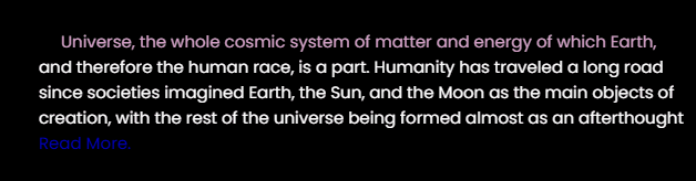
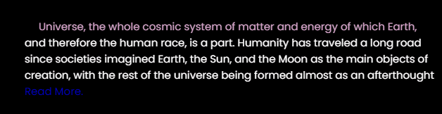
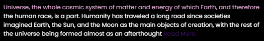
</p></div></div>Here, we don't apply CSS to <a> element
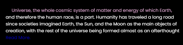
Read More
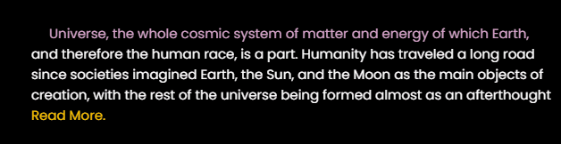
Here you can see the default color of a link (`<a>`) is blue
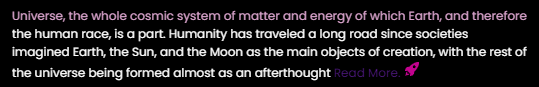
.grid_wrap .box p a:link {
    color: #ffc400;
}
:link pseudo-class in CSS is used to style hyperlinks that have not yet been visited by the user.
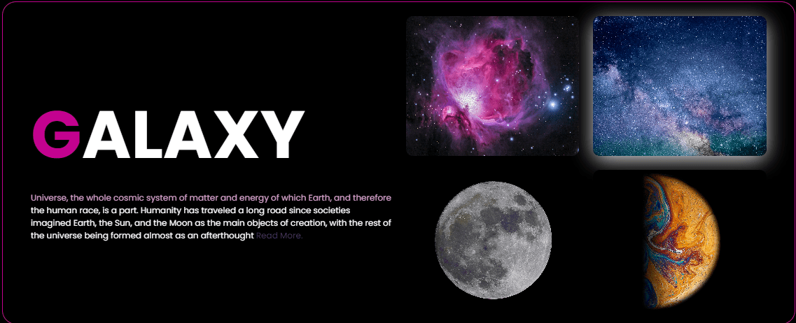
Here, we apply :link to <a> element
Here, we haven't applied any CSS to the `<a>` element
Here, you can see we set the color of the `<a>` element using `:link`
.grid_wrap .box p a:hover {
    color: #FF00FF;
}
:hover styles an element when the user hovers over it with a mouse.
Here, we apply :hover to <a> element
Here, the color of the element changes when you hover over it
.grid_wrap .box p a:active {
    color: red;
}
:active styles an element when it's being clicked or activated by the user
Here, we apply :active to <a> element
Here, the color of the element changes while it is being clicked
  .grid_wrap .box p a:visited{
    color: #00FF00;
}
:visited is a pseudo-class used to style a link that has been visited by the user.
Here, we apply :visited to <a> element
Here, since we've already visited this link, its color changes according to the specified code
Let's Elevate The Use Of Pseudo-Class To The Next Level
Here, we use pseudo-classes on grid elements
<section>
<div class="grid_wrap">
</div>
</section>
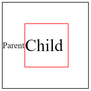
Child Elements
Parent Element
2
3
4
5
1
Here, we apply :first-child to grid elements
.grid_wrap .box:first-child {
box-shadow: 0px 6px 30px -3px rgba(255, 255, 255, 1);
}
:first-child selects the first child element within its parent, allowing you to style it specifically
Here, we apply :first-child to grid elements
.grid_wrap .box:first-child {
box-shadow: 0px 6px 30px -3px rgba(255, 255, 255, 1);
}
:first-child selects the first child element within its parent, allowing you to style it specifically
Here, we apply :nth-child to grid elements
.grid_wrap .box:nth-child(3) {
box-shadow: 0px 6px 30px -3px rgba(255, 255, 255, 1);
}
selects elements by position in the parent for targeted styling and patterns in CSS
Cracking The Pseudo Elements Code
Pseudo-elements in CSS let you style parts of elements, like the first letter or selected text.
We use `::` in pseudo-elements to differentiate them from pseudo-classes and target specific parts of elements.
::first-letter
::first-line
::selection
::after
::before
::first-letter
::first-line
::selection
::after
::before
::
::
::
::
::
Boost Typography With Pseudo-Element
.grid_wrap h1::first-letter {
color: #C3028F;
}
Here, we apply ::first-letter to <h1>
::first-letter is used to style the first letter of a block-level element
<h1>
</h1>
<div class="grid_wrap">
<div class="big box">
Boost Typography With Pseudo-Element
.grid_wrap .box p::first-line {
color: #d8a3cb;
}
Here, we apply ::first-line to <p>
::first-line is used to style the first line of a block-level element
Customizing Text Highlighting With Pseudo-Element
Here, we apply ::selection to <p>
.grid_wrap .box p::selection {
background-color: #C3028F;
}
::selection is used to style the portion of a document that a user has highlighted or selected
How Can We Spice Up Paragraphs With Captivating Content Before Or After Them?
After
Before
Using ::before or ::after to <p> tag
Understanding the CSS ::before Pseudo-Element
Here, we apply ::before to <p>
.grid_wrap .box p::before{
content: "";
background: url("https://itv-contentbucket.s3.ap-south-1.amazonaws.com/Web+Development+Assets/Space/rocket.svg");
/* code for setting image */
}
The `content` property in CSS adds content before or after an element without changing the HTML
Understanding the CSS ::after Pseudo-Element
Here, we apply ::after to <p>
.grid_wrap .box p::after{
content: "";
background: url("https://itv-contentbucket.s3.ap-south-1.amazonaws.com/Web+Development+Assets/Space/rocket.svg");
/* code for setting image */
}
The `content` property in CSS adds content before or after an element without changing the HTML
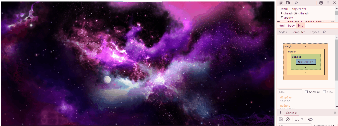
How Can CSS Help In Crafting Responsive Design For Dynamic Images?
Mastering Dynamic Images Crafting Responsive Design With CSS
Here you can see, the image doesn't auto-adjust to fit the screen when scaling
Let's take an example of responsive image
<body>
<img src="./space.png">
</body>
HTML
Making images responsive with max-width
img{
width: 100%;
max-width: 100%;
}
max-width limits how wide an element can be, preventing it from exceeding a specified width
CSS
Now, images can automatically adjust to fit the screen
How Does A Particular HTML Tag Help Web Pages Adapt To Different Devices?
Unleashing The Power To Make Your Website Shine On Any Device
<meta name="viewport" content="width=device-width, initial-scale=1.0">We use the meta viewport tag to control webpage scaling on different devices
We name it "viewport" to specify that the tag controls the visible area of the webpage on different devices.
We specify content in the meta viewport tag to define how the webpage should scale and display on various devices.
ensure that the webpage's width adapts to the device's screen width
establish the initial zoom level of the webpage
We set "initial-scale=1.0" to maintain the webpage's original size upon first loading
< name="viewport" >< content= >< "width=device-width, >< initial-scale=1.0">How Does A Particular HTML Tag Help Web Pages Adapt To Different Devices?
<meta name="viewport" content="width=device-width, initial-scale=1.0">How Do CSS Units Contribute To Responsive Web Design?
Mastering Absolute & Relative Measures With CSS Units
div{
width:50%;
height:400px;
border:2px solid black;
}
relative to their parent's size or the viewport's size
%
100%
How Do CSS Units Contribute To Responsive Web Design?
50%
em
Child Element
Parent Element
font-size : 30px;
font-size : 2em;
1vh = 1% Height of viewport
768px
vh
It stands for viewport height and represents a percentage of the browser window's height
1366 pixels wide X 768 pixels high
768px
height:10vh;
1vh = 1% Height of viewport
1vw = 1% Width of viewport
1366px
10vh = 10%
1366 pixels wide X 768 pixels high
width:10vw;
vw
It stands for viewport width and represents a percentage of the browser window's width
1vw = 1% Width of viewport
1/96th of 1in
16px
37.8px
1/10th of 1cm
96px
1/6th of 1in
1366px
10vw = 10%
Mastering Absolute & Relative Measures With CSS Units
1 px (pixel)
1 rem (root em)
1 cm (centimeter)
1 mm (millimeter)
1 in (inches)
1 pc (picas)
1/96th of 1in
16px
37.8px
1/10th of 1cm
96px
1/6th of 1in
Each image on the computer is built from tiny pixels(px)
1px
The smallest unit of measurement in CSS in pixel
1mm
3.7px
1px
16px
4.6mm
1rem(root em)
1cm
37.8px
10mm
1inch
96px
2.54cm
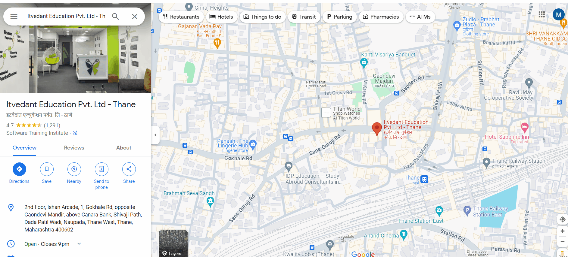
How to Embed A Map?
By Content ITV


