

Content ITV PRO
This is Itvedant Content department
Business Scenario
Hello talented developers!
In the previous lab, Lab 7 — ShopKart About Us, Contact Us & Footer Pages, you enhanced the ShopKart application by creating informative About Us and Contact Us pages and implementing a reusable Footer component.
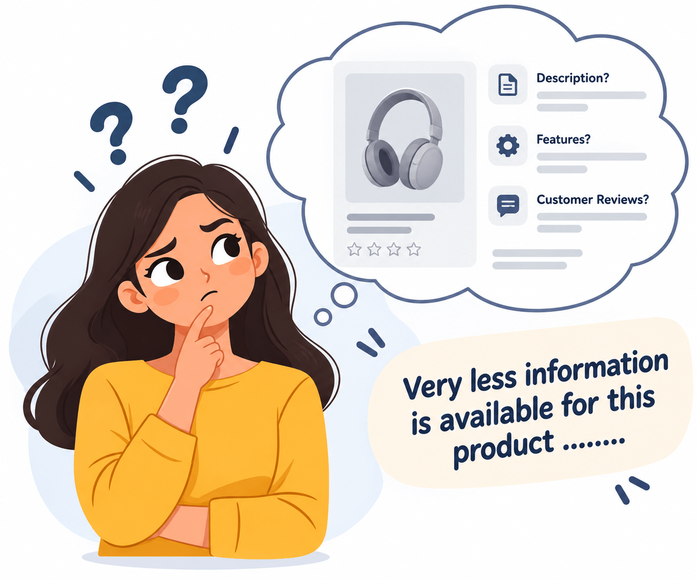
The information displayed inside the product cards is not enough for customers to properly understand the product before making a purchase.
Also, we already have a Products page where different products are visible for customers to browse and explore.
The Problem Is...
Customers need access to more detailed information such as the product description, key features, specifications, and customer reviews.
In this lab, you will extend the ShopKart application by creating a Product Details page and implementing Dynamic Routing using React Router.
Pre-Lab Preparation
Module:
1) Handling Side-Effects
2) Understanding of useParams()
3) Understanding of useNavigate()
git pull origin branchNameGit Pull
Task 1 : Create the product details page
Create the ProductDetails.jsx page inside the pages folder
1
Inside ProductDetails.jsx - add the following imports
2
import React, { useState } from "react";
import { Link, useNavigate, useParams} from "react-router-dom";
import "./ProductDetails.css";
Then below the imports, create the component:
3
function ProductDetails({ dispatch }) { const { id } = useParams();
const navigate = useNavigate();
const [quantity, setQuantity] = useState(1);
};
export default ProductDetails;Create the Product Details Data File
4
ProductDetails.jsx.src/data/productDetails.jsCreate the Product Details Data Object
5
const productDetails = [

  {
    id: 1,
    name: "Samsung Galaxy M14 5G",
    brand: "Samsung",
    category: "Electronics",
    image: "/images/products/samsung-galaxy-m14.png",
    rating: 4.4,
    reviews: 1850,
    shortDescription: "A powerful 5G smartphone with a large display, long-lasting
     battery and smooth everyday performance.",
    price: 12499,
    originalPrice: 14999,
    discount: "17%",
    availability: "In Stock",
    description:
      "The Samsung Galaxy M14 5G is designed to deliver a smooth and reliable smartphone
       experience for everyday users. It combines 5G connectivity with a large immersive
       display, dependable performance and a long-lasting battery that  helps users stay
       connected throughout the day. Whether you are browsing the internet, watching
       videos, communicating with friends and family, using social media or completing
       everyday tasks, the Galaxy M14 5G provides a practical and feature-rich experience.
       Its stylish design, capable hardware and useful features make it a suitable choice
       for users looking for a reliable smartphone for everyday use.",
keyFeatures: [
"5G Connectivity",
"Large Immersive Display",
"Long-lasting 6000 mAh Battery",
"Powerful Performance",
"Expandable Storage"
],
specifications: {
brand: "Samsung",
model: "Galaxy M14 5G",
connectivity: "5G",
battery: "6000 mAh",
color: "Black",
warranty: "1 Year"
},
customerReviews: [
{
name: "Rahul",
rating: 5,
comment: "Good performance and excellent battery backup for everyday use."
},
{
name: "Sneha",
rating: 4,
comment: "The phone offers good features and a smooth overall experience."
}
] }
];
export default productDetails;Note: The above product details data is provided for one product only. You need to create similar product details for the remaining products using the same structure.
const productDetails = [

  {
    id: 1,
    name: "Samsung Galaxy M14 5G",
    // Samsung details
  },
  {
    id: 2,
    name: "Puma Running Shoes",
    // Puma details
},
// ...
{
id: 12,
name: "Cello Non-Stick Pan",
// Cello details
}
];Now add the following import in ProductDetails.jsx
6
import productDetails from "../data/productDetails";Find the Selected Product
7
const product = productDetails.find(
  (item) => item.id === Number(id)
);
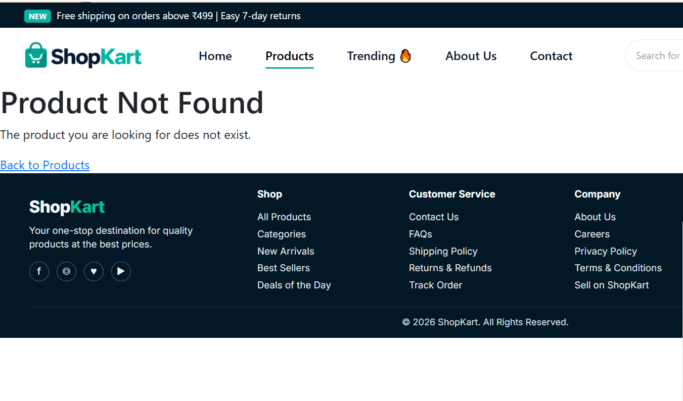
Handle an Invalid Product ID
7
useParams() gives the product ID from the URL as a string, such as "3".3.Number(id) converts "3" into the number 3..find() searches the productDetails array for the product whose ID matchesproduct, which we then use to display its details.ProductDetails.jsx, immediately after the previous code add : if (!product) {
return (
<main className="product-not-found">
<h1>Product Not Found</h1>
<p> The product you are looking for does not exist. </p>
<Link to="/products">
Back to Products
</Link>
</main>
);
}Add the Dynamic Route in App.jsx
8
/products/:id should open ProductDetails.jsx.<Route
path="/products/:id"
element={
<ProductDetails dispatch={dispatch} />
}
/>Test the Route Before Building the UI
8
ProductDetails.jsx, after the product check, add:return (
<main>
<h1>{product.name}</h1>
</main>
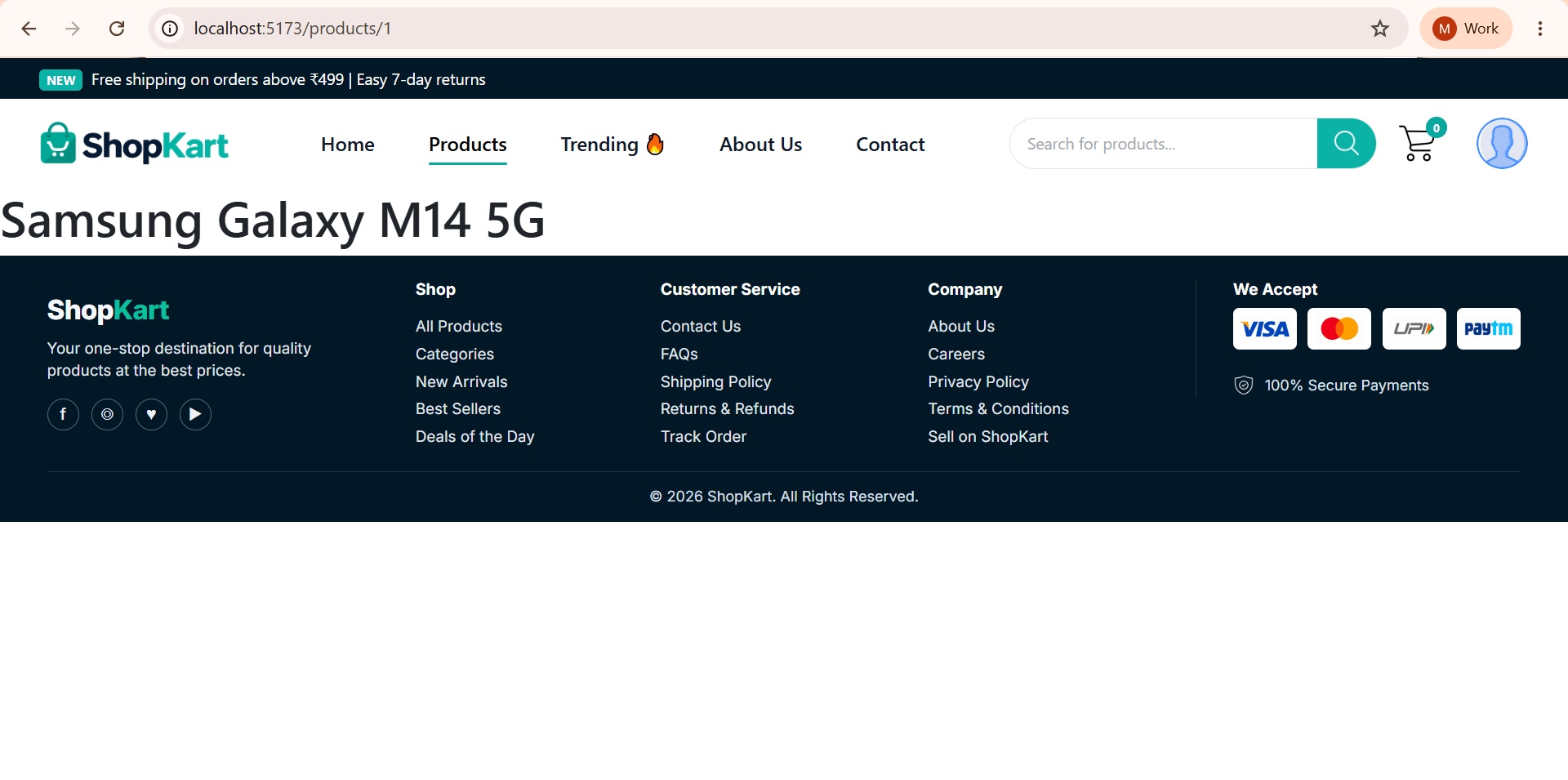
);Open: /products/1
Try opening a product ID that is not present in the product details data.
Task 2 : Create the Complete Product Details UI
return (
  <main>
    <h1>{product.name}</h1>
  </main>
);
with the complete Product Details page.
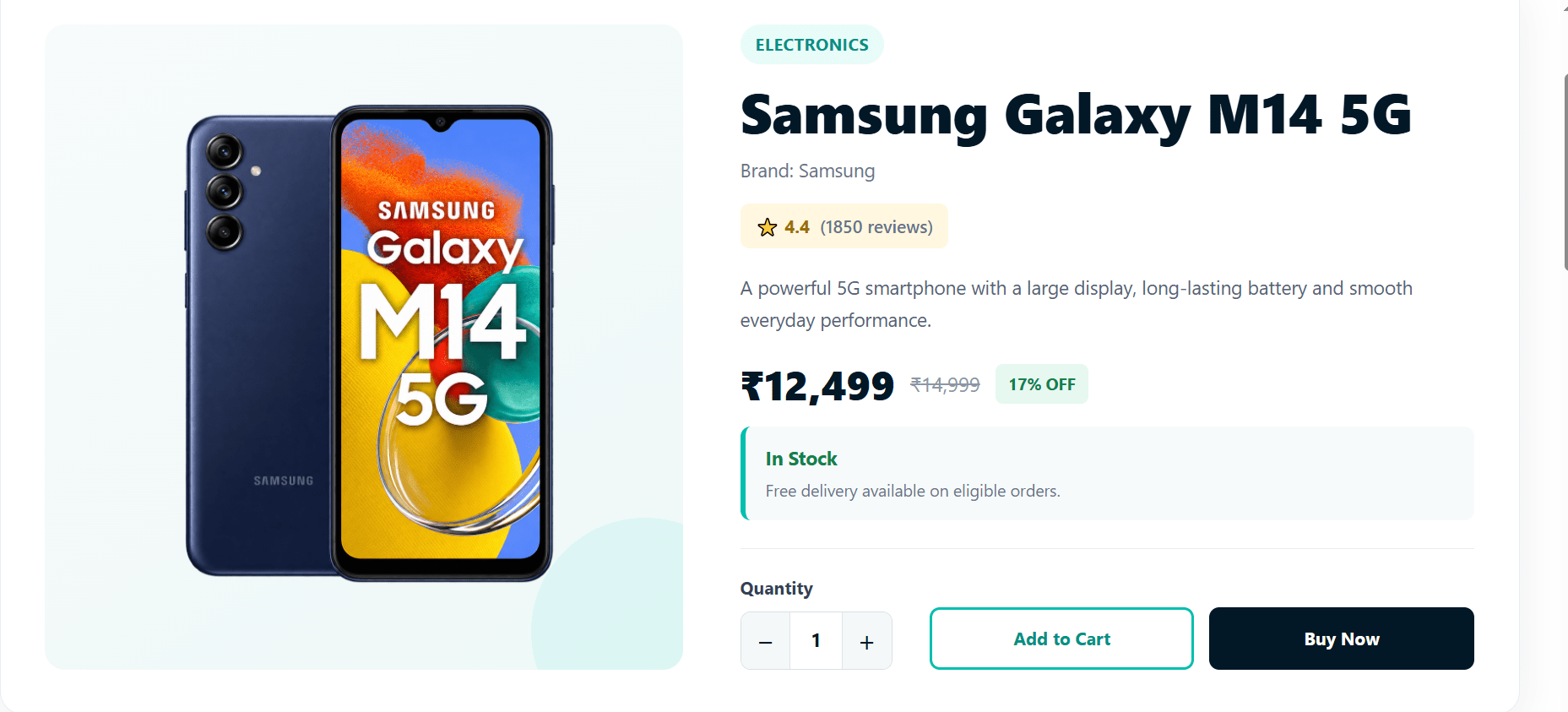
Add Product Overview
1
<section className="product-overview">
  <div className="product-image-section">
    <img src={product.image} alt={product.name} />
  </div>

  <div className="product-info-section">
    <p className="product-category">{product.category}</p>
    <h1>{product.name}</h1>
    <p className="product-brand">Brand: {product.brand}</p>

    <div className="product-rating">
      ⭐ {product.rating}
      <span>({product.reviews} reviews)</span>
    </div>
    <p className="product-short-description">{product.shortDescription}</p>
  </div>
</section>
Add Pricing
2
product-info-section div, after the short description.<div className="product-pricing">
<span className="current-price">₹{product.price.toLocaleString("en-IN")}</span>
<span className="original-price">₹{product.originalPrice.toLocaleString("en-IN")}
</span>
<span className="discount">{product.discount} OFF</span>
</div><div className="product-availability">
<strong> {product.availability} </strong>
<p> Free delivery available on eligible orders. </p>
</div><div className="purchase-section">
<div className="quantity-section">
<span>Quantity</span>
<div className="quantity-control">
<button type="button" onClick={() =>
setQuantity((previous) => Math.max(1, previous - 1))}>−</button>
<span>{quantity}</span>
<button type="button" onClick={() =>
setQuantity((previous) => previous + 1)}>+</button>
</div>
</div>
<div className="purchase-buttons">
<button className="add-cart-btn" onClick={handleAddToCart}>Add to Cart</button>
<button className="buy-now-btn" onClick={handleBuyNow}>Buy Now</button>
</div>
</div>Add Quantity and Purchase Buttons
3
const handleAddToCart = () => {

  for (let i = 0; i < quantity; i++) {

    dispatch({
      type: "ADD_ITEM",
      payload: product
    });

  }

};
Create the Add to Cart Handler
4
if (!product) block, add:Create the Buy Now Handler
5
const handleBuyNow = () => {

  for (let i = 0; i < quantity; i++) {
    dispatch({
      type: "ADD_ITEM",
      payload: product
    });

  }

  navigate("/cart");
};
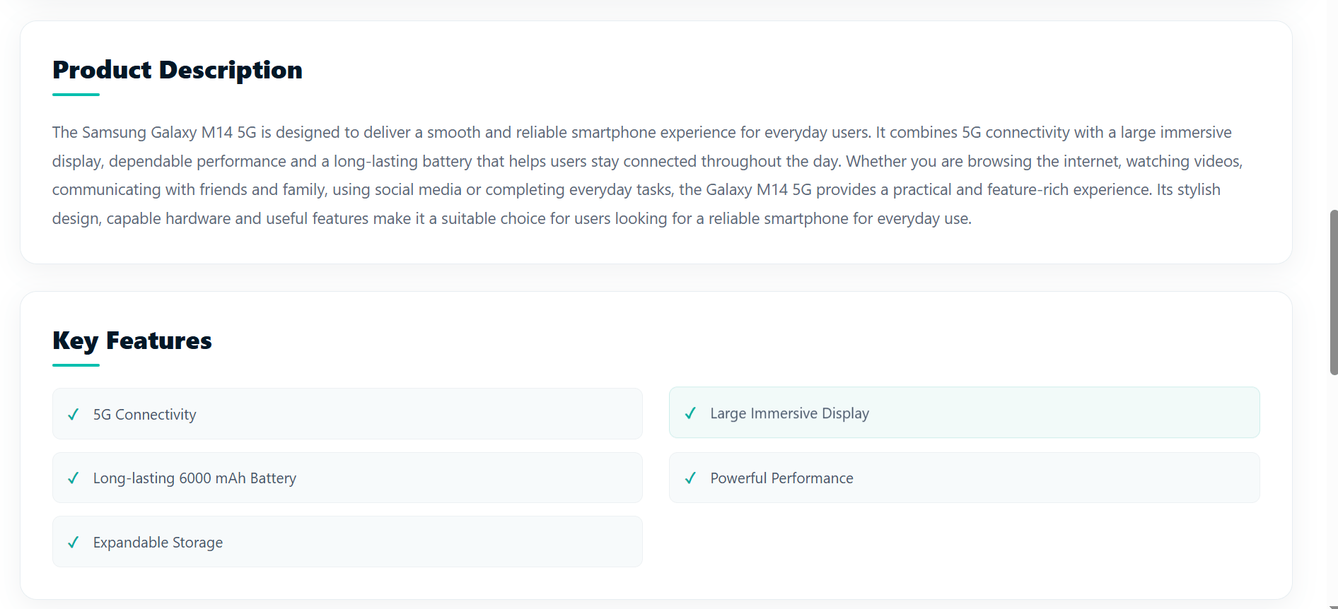
Add Product Description
6
</section> of .product-overview, add:<section className="product-description-section">
<h2>Product Description</h2>
<p> {product.description} </p>
</section>Add Key Features
7
<section className="product-features-section">

  <h2>Key Features</h2>

  <ul>
    {product.keyFeatures.map(
      (feature, index) => (
        <li key={index}> {feature} </li>
      )
    )}
</ul>
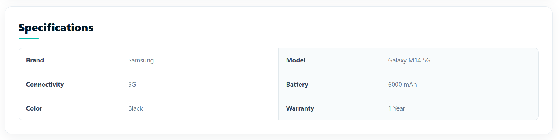
</section>Add Specifications
8
<section className="specifications-section">

  <h2>Specifications</h2>

  <div className="specifications-grid">
    {Object.entries(product.specifications).map(([key, value]) => (
      <div key={key}>
        <strong>{formatKey(key)}</strong>
        <span>{value}</span>
      </div>
    ))}
  </div>
</section>
Add FormatKey()
9
const formatKey = (key) => {

  return key
    .replace(/([A-Z])/g, " $1")
    .replace(/^./, (letter) =>
      letter.toUpperCase()
    );

};
Object.entries() is used to convert the product.specifications object into an array of key-value pairs, so we can easily loop through it using .map().
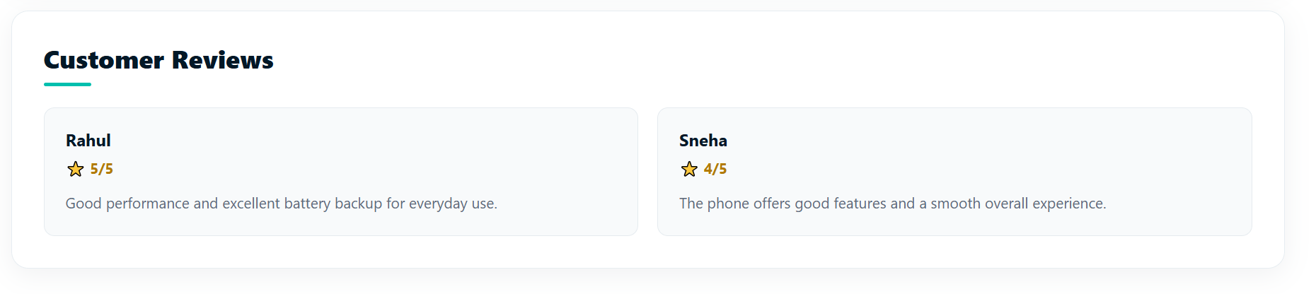
Add Customer reviews
10
<section className="product-reviews-section">
  <h2>Customer Reviews</h2>
  <div className="reviews-list">
    {product.customerReviews.map((review, index) => (
      <article className="review-card" key={index}>
        <h3>{review.name}</h3>
        <p className="review-rating">⭐ {review.rating}/5</p>
        <p>{review.comment}</p>
      </article>
    ))}
  </div>
</section>wheelType
Wheel Type
Style the entire product details page
10
Task 2 : Make Product Cards Open Product Details
belong to the product selected by the user.
User clicks Samsung Galaxy M14 5G
↓
Product ID = 1
↓
/products/1
↓
Product Details page opens
↓
Samsung Galaxy M14 5G details are displayed
Open Products.jsx At the top, find your existing imports add:
1
import { useNavigate } from "react-router-dom"; const navigate = useNavigate();
Add the Dynamic Link
2
.map().<div className="products-grid">
{filteredProducts.length > 0 ? (
filteredProducts.map((product) => (
<div className="product-card" key={product.id}>
.....
....<div className="products-grid">
{filteredProducts.length > 0 ? (
filteredProducts.map((product) => (
<div className="product-card" key={product.id}>
<div
className="product-image"
onClick={() => navigate(`/products/${product.id}`)} >
{product.discount && (
<span className="discount-badge"> -{product.discount} </span>
)} <button className="wishlist-button" onClick={(e) => e.stopPropagation()} >
♡
</button>
<img src={product.image} alt={product.name} />
</div>
<div className="product-info" onClick={() => navigate(`/products/${product.id}`)}>
<small>{product.category}</small>
<h3>{product.name}</h3>
<div className="rating">
⭐ {product.rating} <span>({product.reviews})</span>
</div>
<div className="product-price">
₹{product.price} <del>₹{product.originalPrice}</del>
</div>
<button
className="add-cart-button"
onClick={(e) => {
e.stopPropagation();
dispatch({
type: "ADD_ITEM",
payload: product
}); setAddedProductId(product.id);
setTimeout(() => {
setAddedProductId(null);
}, 2000);
}}
>
{addedProductId === product.id ? (
<>✓ Added to Cart</>
) : (
<>🛒 Add to Cart</>
)}
</button>
</div>
</div>
))
) : (
<div className="no-products">
<h3>No Products Found !</h3>
<p>Try changing your filters.</p>
</div>
)}
</div>Add Product Card Tooltip on hover
3
<div className="product-card" key={product.id} title="Click for more info">title="Click for more info" to your .product-card:Add the Dynamic Link
3
.map().{products.map((product) => (
<div className="product-card">
...
</div>
))}Task 2 : SHOPKART CONTACT US PAGE
Contact Information
Contact Form
Heading
Form Fields
Create Contact Information section
1
function Contact() {
return (
    <main className="contact-page">
      <section className="contact-wrapper">
        <div className="contact-info">
          <div className="info-block">
            <div className="info-icon"><img src="/icons/chat-icon.png" /></div>

            <div>
              <h3>Chat with us</h3>
              <p>Our friendly team is here to help.</p>
              <strong>support@shopkart.com</strong>
            </div>
          </div>
<div className="info-block">
<div className="info-icon"><img src="/icons/contact-call.png" /></div>
<div>
<h3>Call us</h3>
<p>Mon - Sat from 9AM to 6PM.</p>
<strong>+91 98765 43210</strong>
</div>
</div>
<div className="info-block">
<div className="info-icon"><img src="/icons/location.png" /></div>
<div>
<h3>Visit our office</h3>
<p>Come say hello at our office.</p>
<strong> 123 Shopping Street, <br /> Bangalore, Karnataka 560001 </strong>
</div>
</div>
<div className="map-section">
<iframe
src="https://www.google.com/maps/embed?pb=!1m18!1m12!1m3!1d3768.016736181310
5!2d72.94758897381992!3d19.194471348245365!2m3!1f0!2f0!3f0!3m2!1i1024!2i768!
4f13.1!3m3!1m2!1s0x3be7b92e8437d15b%3A0x8b55216ca2b2ebe9!2sI.T.VEDANT!5e0!3m
2!1sen!2sin!4v1789454072911!5m2!1sen!2sin"
title="I.T.VEDANT location"
loading="lazy"
referrerPolicy="strict-origin-when-cross-origin"
allowFullScreen />
</div> <div className="social-section">
<h3>Follow us</h3>
<div className="social-icons">
<span><img src="/icons/contact-facebook.png" /></span>
<span><img src="/icons/contact-twitter.png" /></span>
<span><img src="/icons/contact-x.png" /></span>
<span><img src="/icons/contact-youtube.png" /></span>
<span><img src="/icons/contact-instagram.png" /></span>
</div>
</div>
</div>
Style Contact Information
2
Create the Contact Form
3
 <div className="contact-form-section">
          <div className="form-content">
            <h1>
              Have a question?
              <br />
              We're here for <span>you!</span>
            </h1>

            <p className="form-intro">
              Tell us more about your query, suggestion, or feedback.
              <br />
              We'd love to hear from you and get back as soon as possible.
            </p>

            <form onSubmit={handleSubmit}>
              <div className="form-field">
                <label htmlFor="name">Your name *</label>
                <input id="name" type="text" name="name" value={formData.name}
                       onChange={handleChange} placeholder="Enter your name" required />
</div> <div className="form-field">
<label htmlFor="email">Your email *</label>
<input id="email" type="email" name="email" value={formData.email}
onChange={handleChange} placeholder="Enter your email" required />
</div>
<div className="form-field">
<label htmlFor="orderId">Order ID</label>
<input id="orderId" type="text" name="orderId" value={formData.orderId}
onChange={handleChange} placeholder="Enter your order ID (optional)" />
</div>
<div className="form-field message-field">
<label htmlFor="message">Your message *</label>
<textarea id="message" name="message" value={formData.message}
onChange={handleChange} placeholder="Type your message here..."
maxLength="500" required />
<span className="character-count">{formData.message.length}/500</span>
</div>
<div className="help-section">
<p> How can we help you? <span> Select all that apply</span> </p>
<div className="help-options">
<label><input type="checkbox" value="Order Issue"
onChange={handleHelpChange} /><span>Order Issue</span></label>
<label><input type="checkbox" value="Return / Refund"
onChange={handleHelpChange} /><span>Return / Refund</span></label>
<label><input type="checkbox" value="Payment Help"
onChange={handleHelpChange} /><span>Payment Help</span></label> <label><input type="checkbox" value="Account Support"
onChange={handleHelpChange} /><span>Account Support</span></label>
<label><input type="checkbox" value="Product Inquiry"
onChange={handleHelpChange} /><span>Product Inquiry</span></label>
<label><input type="checkbox" value="Other"
onChange={handleHelpChange} /><span>Other</span></label>
</div>
</div>
<button type="submit" className="contact-submit">
Send Message <span>→</span>
</button>
</form>
</div>
</div>
</section>
</main>
);
}
export default Contact;Add Form Functionality
4
  const [formData, setFormData] = useState({
    name: "",
    email: "",
    subject: "",
    orderId: "",
    message: "",
    help: []
  });
const [submitted, setSubmitted] = useState(false);formData → contains the current form values.setFormData → function used to update those values.useState({...}) → gives the form its initial values.2. Submitted : This state keeps track of whether the form has been submitted.
submitted = falsesetSubmitted(true);{submitted && <p>Thanks! Your ... const handleChange = (e) => {
const { name, value } = e.target;
setFormData((prev) => ({
...prev,
[name]: value
}));
setSubmitted(false);
};Handle Input Changes
5
e.target -> refers to the input field that the user is currently typing in.formDatasetFormData((prev) => ({
...prev,
[name]: value
}));
prev → contains the previous form data....prev → keeps all the existing form values.[name]: value → updates only the field that was changed.setSubmitted(false); -> If the success message was already displayed and the user starts editing the form again, the success message is hidden.
Handle Form Submission
6
const handleSubmit = (e) => {
  e.preventDefault();
  setSubmitted(true);
};
e -> is the event object generated when the form is submitted.e.preventDefault(); -> Normally, submitting an HTML form causes the browser to reload the page. preventDefault() stops that default behavior.setSubmitted(true); -> This changes: submitted = false to submitted = trueAdd Success Message
7
{submitted && (
  <p className="success-message">
    Thanks! Your message has been submitted.
  </p>
)}
Style the Contact form
8
Make the contact page responsive
9
Add Contact Page Route
10
<Route path="/contact" element={<Contact />}/>Task 3 : SHOPKART FOOTER
Create the Footer.jsx page inside the Components folder
1
Inside Footer.jsx - Create the Shopkart Footer structure
2
import React from "react";
import "./Footer.css";
function Footer() {
return (
<footer className="site-footer">
<div className="footer-main">
<div className="footer-brand">
<div className="footer-logo">Shop<span>Kart</span></div>
<p>Your one-stop destination for quality<br />products at the best prices.</p>
<div className="footer-socials">
<a href="#" aria-label="Facebook">f</a>
<a href="#" aria-label="Instagram">◎</a>
<a href="#" aria-label="Twitter">♥</a>
<a href="#" aria-label="YouTube">▶</a>
</div>
</div>
<div className="footer-column">
<h3>Shop</h3>
<a href="/products">All Products</a>
<a href="/products">Categories</a>
<a href="/products">New Arrivals</a>
<a href="/products">Best Sellers</a>
<a href="/products">Deals of the Day</a>
</div>
<div className="footer-column">
<h3>Customer Service</h3>
<a href="/contact">Contact Us</a>
<a href="#">FAQs</a>
<a href="#">Shipping Policy</a>
<a href="#">Returns & Refunds</a> <a href="#">Track Order</a>
</div>
<div className="footer-column">
<h3>Company</h3>
<a href="/about">About Us</a>
<a href="#">Careers</a>
<a href="#">Privacy Policy</a>
<a href="#">Terms & Conditions</a>
<a href="#">Sell on ShopKart</a>
</div>
<div className="footer-payments">
<h3>We Accept</h3>
<div className="payment-methods">
<span className="payment"><img src="/images/visa.png" alt="Visa" /></span>
<span className="payment"><img src="/images/mastercard.png"/></span>
<span className="payment"><img src="/images/upi.png" alt="UPI" /></span>
<span className="payment"><img src="/images/paytm.png" alt="Paytm" /></span>
</div>
<div className="secure-payment">
<span className="lock-icon"><img src="/images/footer-secure.png" /></span>
<span>100% Secure Payments</span>
</div>
</div>
</div>
<div className="footer-bottom">© 2026 ShopKart. All Rights Reserved.</div>
</footer>
);
}
export default Footer;Style the Footer section
3
Make footer section responsive
4
Render Footer Globally
5
App.jsx.<>
<Navbar userName={userName} cart={cart} />
<Routes>
<Route path="/" element={<Home userName={userName} />} />
<Route path="/products" element={<Products dispatch={dispatch} />} />
<Route path="/login" element={<Login setUserName={setUserName} />} />
<Route path="/register" element={<Register setUserName={setUserName} />}/>
<Route path="/cart" element={<Cart cart={cart} dispatch={dispatch} />}/>
<Route path="/about" element={<About />} />
<Route path="/contact" element={<Contact />} />
</Routes>
<Footer/>
</>We are done with this lab. The latest source code has been uploaded to GitHub. You can access the latest commit using the link below:
Great job!
In this lab, you extended the ShopKart application by building informative About Us and Contact Us pages and integrating a reusable Footer across the application.
Checkpoint
Git Push
git push origin branchNameNext-Lab Preparation
Module:
1) Handling Side-Effects
2) Understanding of useParams()
By Content ITV