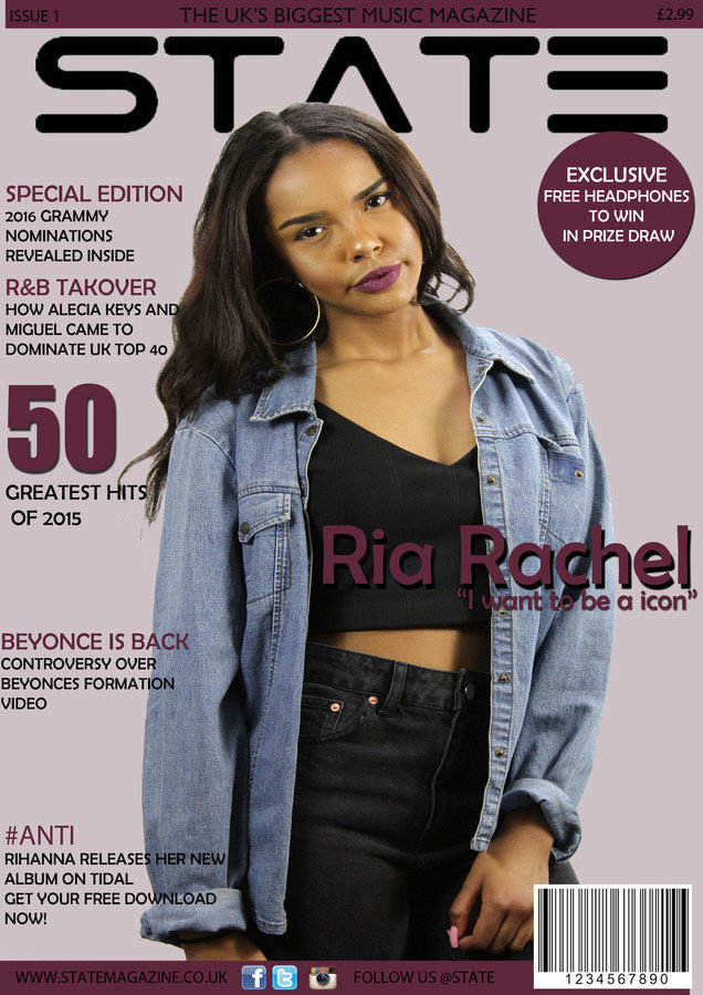
I decided to change my front cover several times due to the feedback i was given. This is my first draft of my magazine front cover. I found that the images i had taken conformed more to a fashion magazine than to a RnB music magazine. In order to change this i will take new photographs using different outfits but the same model. Here i have used a front shot which i feel puts emphasis on the clothing of the model inferring that it could be a fashion magazine. The Cover looks very empty lacking a even layout of cover stories. The black writing of the text is hard to see, i will change this to a brighter more visible colour. a The purple colour scheme is very overwhelming and does not conform to existing magazine covers to have a block colour in the background. Overall the cover, does not conform to the research i had orginally done. Colours such as light purples were not balancing with the bright colours of blue from the original outfit choices chosen in my research and planning.

FRONT COVER DRAFTS
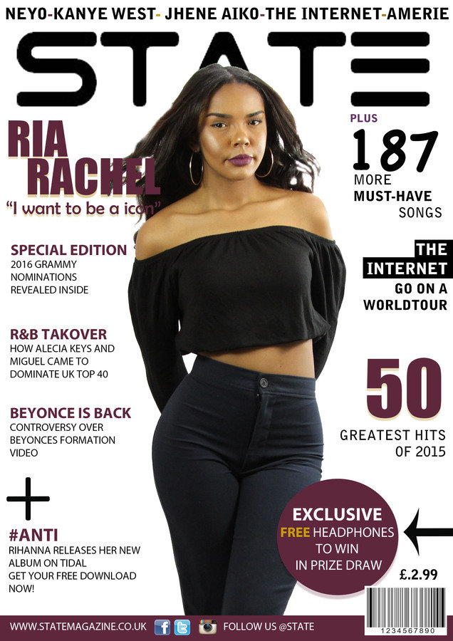
Here is the second draft of my front cover. I took on the feedback from my first draft and applied it to this cover.I decided to add more features to the front cover also i decided to have a white background in order for the main image and text to stand out. However i found that the main image was still not working. There is quite allot of space surrounding the model. Personally i feel the model is unable to carry the RnB vibe needed for my magazine. In response to this i am going to take a range of new photographs with a new model, this will consist of a whole new outfit. The colour scheme of Black and purple will be changed to other colours in my research such as yellow, orange and navy. The layout go my front cover will be experimented with changing a few of the cover stories i have included.

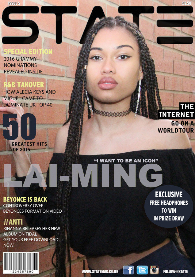
This is the final version of my front cover. I decided to take new photographs with a new model, i found this worked much better than the ones before. Instead of having a white background i have kept the brick wall incorporated in the orignial photo taken this added a urban vibe to the magazine. I used the same cover stories and added some to take up space on the cover. These cover stories related to the genre of RNB. I changed the colours, layout and fonts of specific features in order to be in proportion to the photograph and be vivd on the brick wall. My colour scheme mirrored my contents page developing my magazine on the theme colours of Navy,Orange, Black and Yellow. This magazine works much better than my previous drafts, developed from my feedback i was able to create a R&B magazine.

front cover drafts
By Curly leloo Chan-ellis
front cover drafts
- 450


