
P3 color gamut


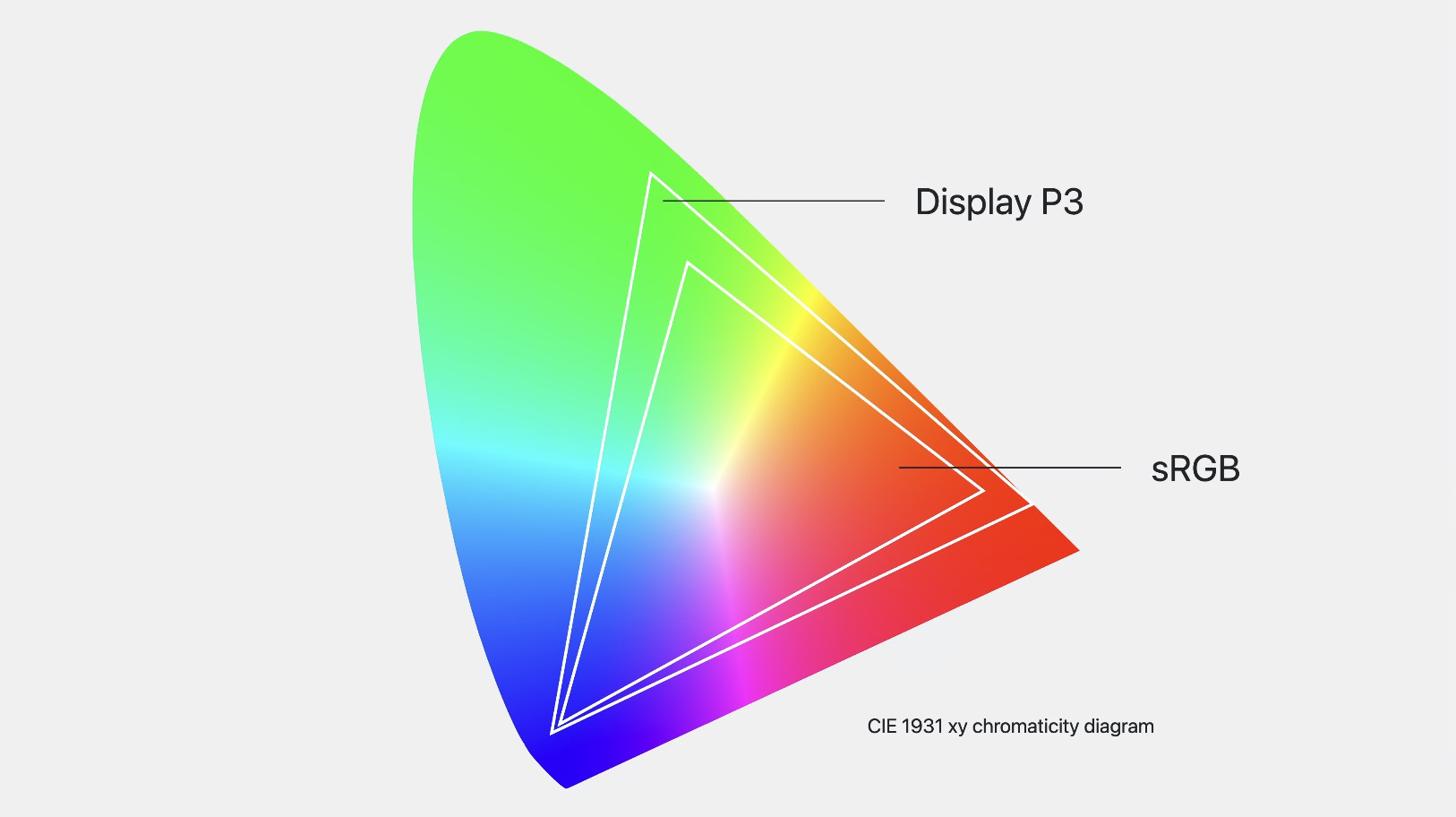
.most-hyped {
  --display-p3: color(display-p3 1 1 1);
  --rec2020: color(rec2020 0 0 0);
}
Color spaces
.element {
  background: oklch(80% .2 220);
}
lightness
chroma
hue
Color models

oklch()
Gradients
Gradients

Popover & Anchoring
Loading...
Popover & Anchoring

Linear()
Easing
Scroll driven animation
Loading...

@layer theme {
  html {
    --color: oklch(80% 2 220);
  }

  * {
    text-box-trim: both;
    text-box-edge: cap alphabetic;
  }
}

@layer component {
  div {
    margin-trim: block;
    padding: 2rlh;

    :is(article):has(&) {
      --rainbow-gradient: in oklch longer hue, red 0 0;

      padding-inline: max(1rem, (100% - 800px) / 2);
      background: linear-gradient(45deg var(--rainbow-gradient));
      container: div / inline-size;
    }

    :is(article) & {
      border: 2px solid color(display-p3 1 none 1);
      background: oklch(80% .37 220 / 25%);

      @container div (inline-size > 35rem) {
        font-size: calc(1rem * pow(1.25, 1));
      }
    }

    :is(aside) {
      container: aside / sticky;
      position: sticky;
      inset-block-start: 0;

      @container aside state(stuck) {
        & h2 {
          background: red;
        }
      }
    }

    :is(h2, h3) {
      inline-size: 17ch;
      text-wrap: balance;
    }

    > h2 {
      background: hsl(from var(--color) h s calc(l + 10%));
    }

    :not(article) & :nth-child(2 of .paragraph) {
      &:first-letter {
        initial-letter: 3;
        margin-inline-end: 1ch;
      }
    }

    & section {
      max-inline-size: 400px;

      > p {
        text-wrap: pretty;
      }

    }
  }
}
Crafting UI
w/ CSS
Frontend, 3. semester
Recap and beyond
Recap and beyond
CSS Selectors
Reset.css
Nesting
Cascade Layers
Øvelser
Grid & Flexbox
CSS Selectors
Reset.css
Nesting
Cascade Layers
Øvelser
Grid & Flexbox
Recap and beyond
Målet for i dag
-
Forstå (og mestre) CSS Selectors
-
Anvende Reset.css for at sikre en ensartethed
-
Forstå, hvordan Nesting hjælper med organisering
-
Vide, hvordan vi håndterer kompatibilitetsudfordringer
-
Forstå og anvende principperne bag Cascade Layers
-
Mestre Grid & Flexbox for at skabe designstrukturer
-
Øvelser, øvelser og flere øvelser for at opbygge praktisk erfaring
CSS Selectors
Reset.css
Grid & Flexbox
Nesting
Øvelser
Cascade Layers
Recap and beyond
Målet for i dag
-
Forstå (og mestre) CSS Selectors
-
Anvende Reset.css for at sikre en ensartethed
-
Forstå, hvordan Nesting hjælper med organisering
-
Vide, hvordan vi håndterer kompatibilitetsudfordringer
-
Forstå og anvende principperne bag Cascade Layers
-
Mestre Grid & Flexbox for at skabe designstrukturer
-
Øvelser, øvelser og flere øvelser for at opbygge praktisk erfaring
CSS Selectors
-
Oversæt selectoren (Fronter)
-
Gennemfør CSS Speedrun (Fronter)
-
Vi kigger på det i plenum
Øvelser - 15 min
Mål: Forstå (og mestre)
li:nth-last-child(odd):first-childVælg det første liste-element i rækken, men kun hvis det samtidigt er ulige, hvis man tæller fra slutningen af listen

:nth-child(2 of .featured)Vælg det andet element, men kun hvis det er en af de elementer, der har 'featured'-klassen.
:has()

meget snart!
artcle:has(> img) {}

p:not(article > *) { ... }

article > :is(.class, #id) { ... }

article > :where(.class, #id) { ... }
:is(), :where(), :not()
:has()
article:has(h2) { ... }

article:has(h2, h3) { ... }

article:has(h2):has(h3) { ... }

article:not(:has(h2)) img { ... }

article:has(> :last-child:nth-child(3)) { ... }
:has()
Hvad styler vi her?
:has()
Øvelse 1
50ch
:has()
Øvelse 2


:has()
display: contents;
p:has(img) {
  display: contents;
}
<article>
<img>
</article><p></p>:has()
display: contents;
p:has(img) {
  display: contents;
}
<article>
<img>
</article><p></p>:has()
display: contents;
p:has(img) {
  display: contents;
}
<article>
<img>
</article><p></p>Opfører sig nu som barn af <article>
:has()

:has()
Øvelse 3
:has()
:has()
:has()
:has()
:has()
:has()
body {
  display: grid;
}

body:has(main + aside) {
  grid-template-columns: 1fr 300px;
}
:has()
:root:has(dialog[open]) {
  overflow: hidden;
}
<dialog>
Loading...
CSS Reset
-
reset.css
-
normalize.css
-
opinionated.css
Kategorier
Mål: Anvende for at sikre en ensartethed
CSS Reset
Jeres tur - 10 min
Lav dit eget reset
-
Lav et nyt stylesheet i VS Code
-
Udfyld filen med regler, der kunne være relevante i et nyt projekt
-
Test evt. via HTML Kitchen Sink
-
Vi kigger på det i plenum
text-wrap
h1,
h2,
h3 {
  text-wrap: balance;
}

p {
  text-wrap: pretty;
}

Nye viewport units
Fra `vh` til `dvh`/`svh`
Nye viewport units
Fra `vh` til `dvh`/`svh`

Reset.css
body {
  min-height: 100svh /* 100dvh */;
}

h1,
h2,
h3 {
  text-wrap: balance;
}

p {
  text-wrap: pretty;
}
Nesting
Mål: Forstå, hvordan det hjælper med organisering
Nesting
section {
  border: 2px solid red;
}

section
  color: red;
}
h2 {Nesting
section {
  border: 2px solid red;


    color: red;

}
h2 {
  color: red;
}
Nesting
section {
  border: 2px solid red;


    color: red;
  }
}&h2 {
  color: red;
}
Nesting
section {
  border: 2px solid red;


    color: red;
  }
}>h2 {Nesting
section {
  border: 2px solid red;


    color: red;
  }
}
:is( )h2 {Nesting
:is()
:where()
:nth-child()
.
>
+
~
[data-*]
&
Symbols
Nesting
h1,
h2 {
  & span {
    color: blue;
  }
}
& === :is(h1, h2)Nesting
h1 {
  color: red;

  & {
    color: blue;
  }
}
Nesting
h1 {
  color: red;

  @media (width > 500px) {
    color: blue;
  }
}
Nesting
h1 {
  @media (width > 500px) {
    color: blue;
  }

  color: red;
}Nesting
h1 {
  @media (width > 500px) {
    color: blue;
  }

  color: red;
}h1 {
color: red; /* hoisted */
@media (width > 500px) {
color: blue;
}
}Nesting
h1 {
  .parent & {
    color: red;
  }
}
Nesting
h1 {
  color: blue;

  .parent & {
    color: red;
  }
}
if / else
<h1>I'm blue</h1>

<div class="parent">
  <h1>I'm red</h1>
</div>
Nesting
h1 {
  color: blue;

  .parent & {
    color: red;
  }
}
if / else
<h1>I'm blue</h1>

<div class="parent">
  <h1>I'm red</h1>
</div>
Nesting
h1 {
  color: blue;

  .grandparent .parent & span {
    color: red;
  }
}
Nesting
.container {
  display: grid;
  grid-template-columns: 1fr minmax(0, 1200px) 1fr;
  column-gap: 1rem;

  > * {
    grid-column: 2;
  }

  .full-bleed {
    grid-column: 1 / -1;
  }
}
Co-location

1fr minmax(0, 1200px) 1frNesting

Jeres tur
Udskift alle "section" med "div"
Kompatibilitet
Mål: Vide, hvordan vi håndterer det

@supports (grid-template-rows: subgrid) {
  ...
}

@supports selector(p:has(> img)) {
  ...
}

@supports(not selector(&)) {
  ...
}
@supports
p {
  text-wrap: pretty;
}
@supports
Progressive enhancement
Grid & Flexbox
Mål: Mestre for at skabe designstrukturer
-
Grid-øvelser: https://exercssises.vinther.codes/grid/
-
Flex-øvelser: https://exercssises.vinther.codes/flex/
Øvelser
Recap and beyond
Nåede vi, hvad vi skulle?
-
Forstår (og mestrer) du CSS Selectors?
-
Ser du værdien i et Reset.css?
-
Har du godt greb om Nesting?
-
Ved du, hvordan du håndterer kompatibilitetsudfordringer?
-
Ser du værdien i Cascade Layers?
-
Har du nogenlunde styr på Grid & Flexbox?
-
Føler du, du har lært noget i dag?
Crafting UI with CSS
By Dannie Vinther


