CSS 2023
Alle demoer virker i Chrome Canary
CSS 2023
-
Fra "CSS3" til "CSS4"
- CSS-arkitektur & new responsive
- HDR-faver & farve-funktioner
-
CSS vs. JavaScript
- Interaktion & performance
- Fortjener CSS mere opmærksomhed?
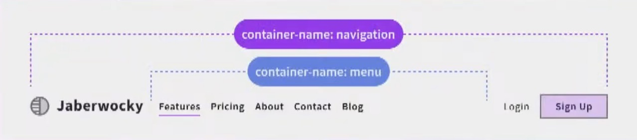
Container queries
Scroll-driven animation
View Transitions
Cascade layers
<dialog>
popover
anchoring


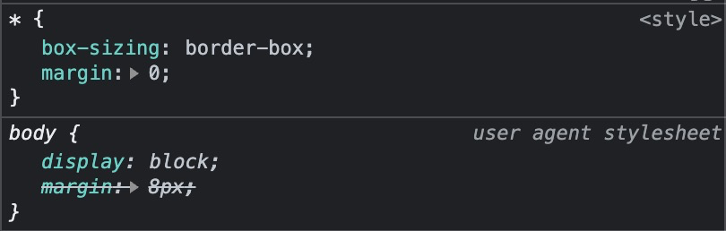
@layer theme {
  html {
    --color: oklch(80% 2 220);
  }

  * {
    text-box-trim: both;
    text-box-edge: cap alphabetic;
  }
}

@layer component {
  div {
    margin-trim: block;
    padding: 2rlh;

    :is(article):has(&) {
      --rainbow-gradient: in oklch longer hue, red 0 0;

      padding-inline: max(1rem, (100% - 800px) / 2);
      background: linear-gradient(45deg var(--rainbow-gradient));
      container: div / inline-size;
    }

    :is(article) & {
      border: 2px solid color(display-p3 1 none 1);
      background: oklch(80% .37 220 / 25%);

      @container div (inline-size > 35rem) {
        font-size: calc(1rem * pow(1.25, 1));
      }
    }

    :is(aside) {
      container: aside / sticky;
      position: sticky;
      inset-block-start: 0;

      @container aside state(stuck) {
        & h2 {
          background: red;
        }
      }
    }

    :is(h2, h3) {
      inline-size: 17ch;
      text-wrap: balance;
    }

    > h2 {
      background: hsl(from var(--color) h s calc(l + 10%));
    }

    :not(article) & :nth-child(2 of .paragraph) {
      &:first-letter {
        initial-letter: 3;
        margin-inline-end: 1ch;
      }
    }

    & section {
      max-inline-size: 400px;

      > p {
        text-wrap: pretty;
      }

    }
  }
}
@layer theme {
html {
--color: oklch(80% 2 220);
}
* {
text-box-trim: both;
text-box-edge: cap alphabetic;
}
}
@layer component {
div {
margin-trim: block;
padding: 2rlh;
:is(article):has(&) {
--rainbow-gradient: in oklch longer hue, red 0 0;
padding-inline: max(1rem, (100% - 800px) / 2);
background: linear-gradient(45deg var(--rainbow-gradient));
container: div / inline-size;
}
:is(article) & {
border: 2px solid color(display-p3 1 none 1);
background: oklch(80% .37 220 / 25%);
@container div (inline-size > 35rem) {
font-size: calc(1rem * pow(1.25, 1));
}
}
:is(aside) {
container: aside / sticky;
position: sticky;
inset-block-start: 0;
@container aside state(stuck) {
& h2 {
background: red;
}
}
}
:is(h2, h3) {
inline-size: 17ch;
text-wrap: balance;
}
> h2 {
background: hsl(from var(--color) h s calc(l + 10%));
}
:not(article) & :nth-child(2 of .paragraph) {
&:first-letter {
initial-letter: 3;
margin-inline-end: 1ch;
}
}
& section {
max-inline-size: 400px;
> p {
text-wrap: pretty;
}
}
}
}Det ligner CSS, men det føles som et nyt sprog
— "CSS4" måske?
"CSS4"

2012 - 2017
Intrinsic web
2017 -
layout?
"CSS4"
Intrinsic web
2017 -
layout?
"CSS4"
2023 -
Intrinsic web
Robust, pålidelig og fleksibel
CSS-arkitektur
- Nesting
- Cascade layers
Nesting

Nesting
meget snart!
Nesting
section {
  border: 2px solid red;


    color: red;
  }
}
❌
h2 {(✅)
Nesting
section {
  border: 2px solid red;


    color: red;
  }
}
✅
&h2 {Nesting
section {
  border: 2px solid red;


    color: red;
  }
}
✅
>h2 {Nesting
section {
  border: 2px solid red;


    color: red;
  }
}
✅
:is( )h2 {Nesting
- Red
- Blue
- The syntax is invalid
✅
Hoisted
Nesting
.feature-list {
    display: grid;
    grid: "stack";

    :is(img, ul) {
      grid-area: stack;
    }

    > ul {
      z-index: 1;
      place-self: center start;

      > li {
        animation: opacity linear both;
        animation-timeline: view();

        &:hover {
          opacity: .8;
        }
      }
    }
  }
Co-location
Nesting
Nesting

Jeres tur
Løsning
Nesting
Foreslået løsning
article {
  padding: 1rem;
  background: aliceblue;
  color: darkslateblue;

  :nth-child(even) > & {
    color: aliceblue;
    background: darkslateblue;
  }
}
Cascade layers
Reset / Normalize
Jeres tur
The cascade
Lad den være åben
Quiz
p:not(#id) {
  color: green;
}

p.class {
  color: red;
}
<p class="class">text</p>

<p id="id">last text</p>
The cascade
Author styles
0,0,0
0,0,1
🤷♂️
Cascade layers
@layer reset {
  /* ... other reset rules */

  input[type="text"] {
    border: 1px solid gray;
  }
}

@layer components {
  /* ... other component rules */

  .my-input {
    border: 4px solid blue;
  }
}
order matters
Cascade layers
@layer reset, components, utilities;

@layer reset {
  /* ... other reset rules */

  input[type="text"] {
    border: 1px solid gray;
  }
}

@layer components {
  /* ... other component rules */

  .my-input {
    border: 4px solid blue;
  }
}
configure up front
1
2
3
Cascade layers
@layer reset, components, utilities;

@layer components {
  /* ... other component rules */

  .my-input {
    border: 4px solid blue;
  }
}

@layer reset {
  /* ... other reset rules */

  input[type="text"] {
    border: 1px solid gray;
  }
}
configure up front
1
2
3
Cascade layers
@layer reset, components, states;

@layer components {
  /* Buttons, inputs etc. */
}

@layer states {
  /* Make sure stats override, no matter specificity count */
  :disabled {
    background-color: #ddd;
    color: #999;
  }

  :focus-visible {
    outline: 2px solid var(--focus-color, currentColor);
    outline-offset: 2px;
  }
}
Cascade layers
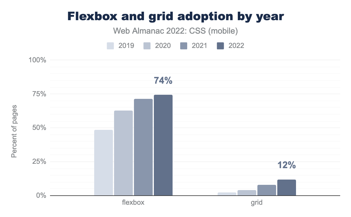
@layer reset, theme, global, layout, components, utilities, states;New responsive
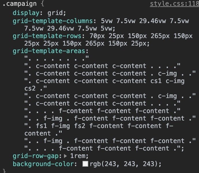
- Subgrid
- Container queries
- :has()
- (nth-child of S)
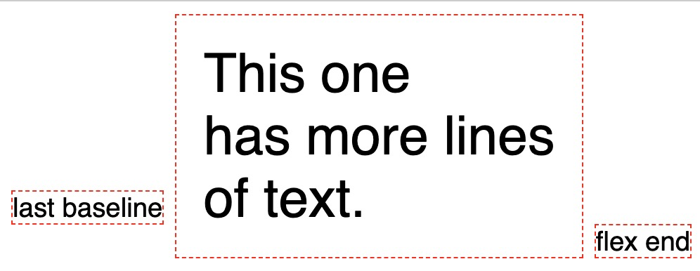
Grid
.grid {
  align-items: last baseline;
  grid-template-columns: subgrid;
}
Nye funktionaliteter
Baseline alignment
Subgrid
meget snart!
Subgrid
Loading...
Subgrid
Loading...
Subgrid
Loading...
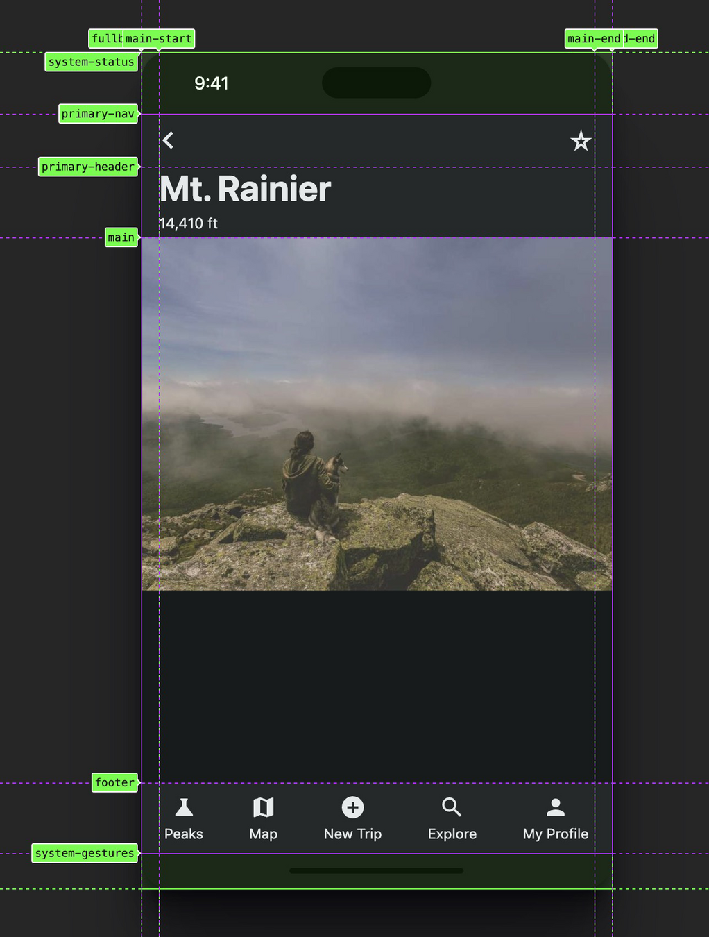
.subgrid {
  display: grid;
  grid-template-rows:
    [system-status] 3.5rem
    [primary-nav] 3rem
    [primary-header] 4rem
    [main] auto
    [footer] 4rem
    [system-gestures] 2rem;
  grid-template-columns:
    [fullbleed-start] 1rem
    [main-start] auto
    [main-end] 1rem
    [fullbleed-end];
}
Subgrid
nav {
  grid-area: primary-nav / fullbleed;

  display: grid;
  grid-template-columns: subgrid;
}

nav > .content {
  grid-area: main;
}
Subgrid
Jeres tur
Subgrid-øvelse 1
Løsning
Foreslået løsning
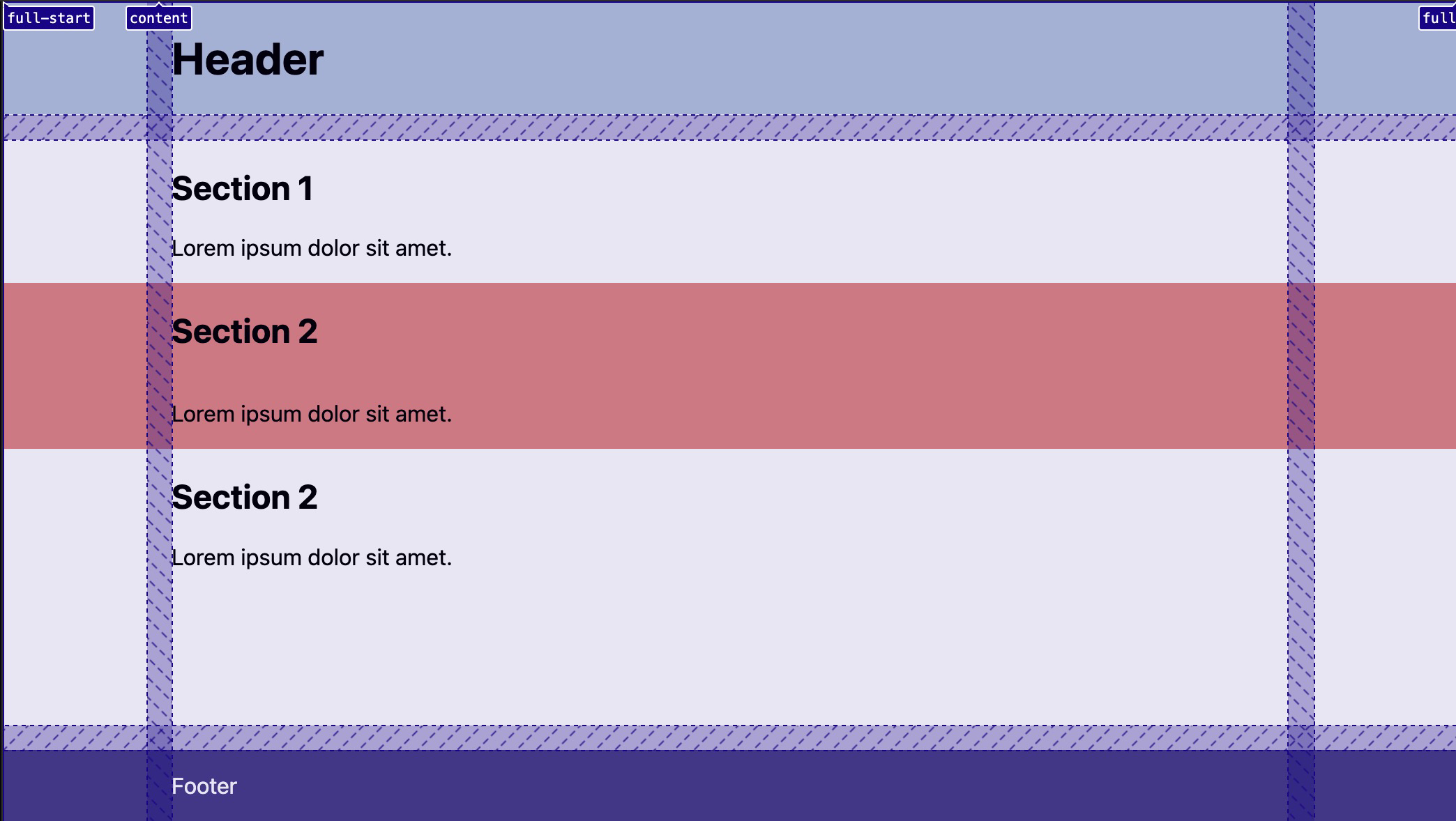
Subgrid-øvelse 1
body {
  display: grid;
  grid-template-rows: auto 1fr auto;
  grid-template-columns:
    [full-start]
      1fr
    [content-start]
      minmax(0, 800px)
    [content-end]
      1fr
    [full-end];
  gap: 1rlh;

  > * {
    grid-column: content;
  }
}

header,
main,
footer {
  display: grid;
  grid-template-columns: subgrid;
  grid-column: full;
  align-content: start;

  > * {
    grid-column: content;
  }
}

.full-bleed {
  display: grid;
  grid-template-columns: subgrid;
  grid-column: full;

  > * {
    grid-column: content;
  }
}
Jeres tur
Subgrid-øvelse 2
Løsning
Foreslået løsning
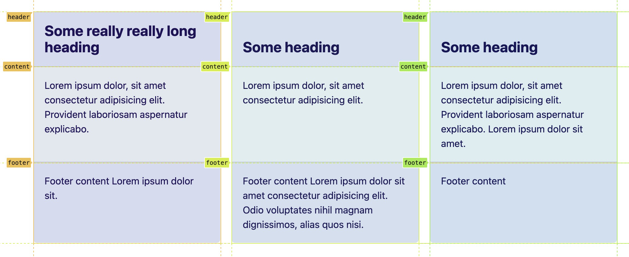
Subgrid-øvelse 2
.cards {
  display: grid;
  gap: 1rlh;

  @media (width > 600px) {
    grid-template-columns: repeat(3, 1fr);
  }
}

.card {
  display: grid;
  grid-template-rows: subgrid;
  grid-row: span 3;
}
truly flexible
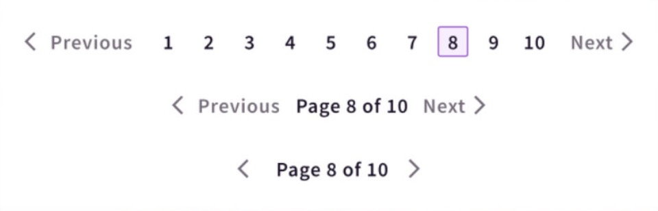
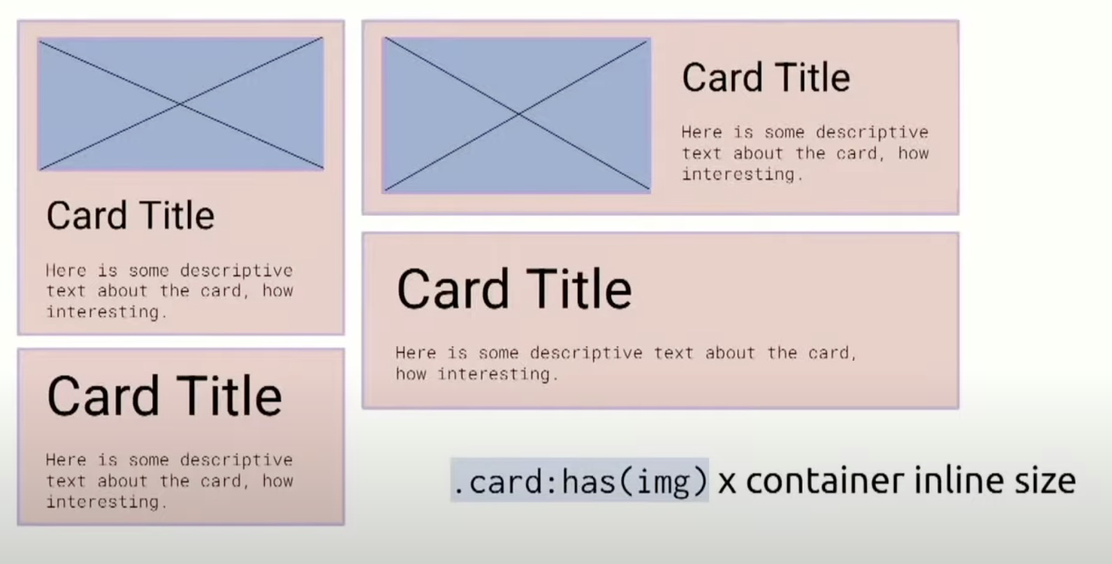
Container queries
Container queries
vs media queries
Container queries
Container queries
@container (inline-size > 40em) {
  .card {
    flex-direction: column;
  }
}
width
range
@media (20em < width <= 40em) {
  ...
}
Container queries
.card-wrapper {
  container-type: inline-size;
}

@container (inline-size > 40em) {
  .card {
    flex-direction: column;
  }
}
Container queries
Container queries
Container queries
.card-wrapper {
  container-type: inline-size;
  container-name: main;
}

@container main (inline-size > 40em) {
  .card {
    flex-direction: column;
  }
}
Container queries
.card-wrapper {
  container: main / inline-size;
}

@container main (inline-size > 40em) {
  .card {
    flex-direction: column;
  }
}
flere navne
Container queries
Container query units
.card-wrapper {
  container: main / inline-size;
}

.card {
  font-size: clamp(1.45rem, 6cqi, 1.75rem);
}
cqw, cqh, cqi, cqb, cqmin, cqmax
6 % af inline (bredden)
Container query units
Container query units
Container queries
Container queries
Jeres tur
li:nth-last-child(odd):first-child:has()
meget snart!
:has()
:has()
artcle:has(> img) {}

p:not(article > *) { ... }

article > :is(.class, #id) { ... }

:where(#article) a { ... }
:is(), :where(), :not()
:has()
article:has(h2) { ... }

article:not(:has(h2)) img { ... }

article:has(> :last-child:nth-child(3)) { ... }
:has()
Hvad styler vi her?
:has()

:has()
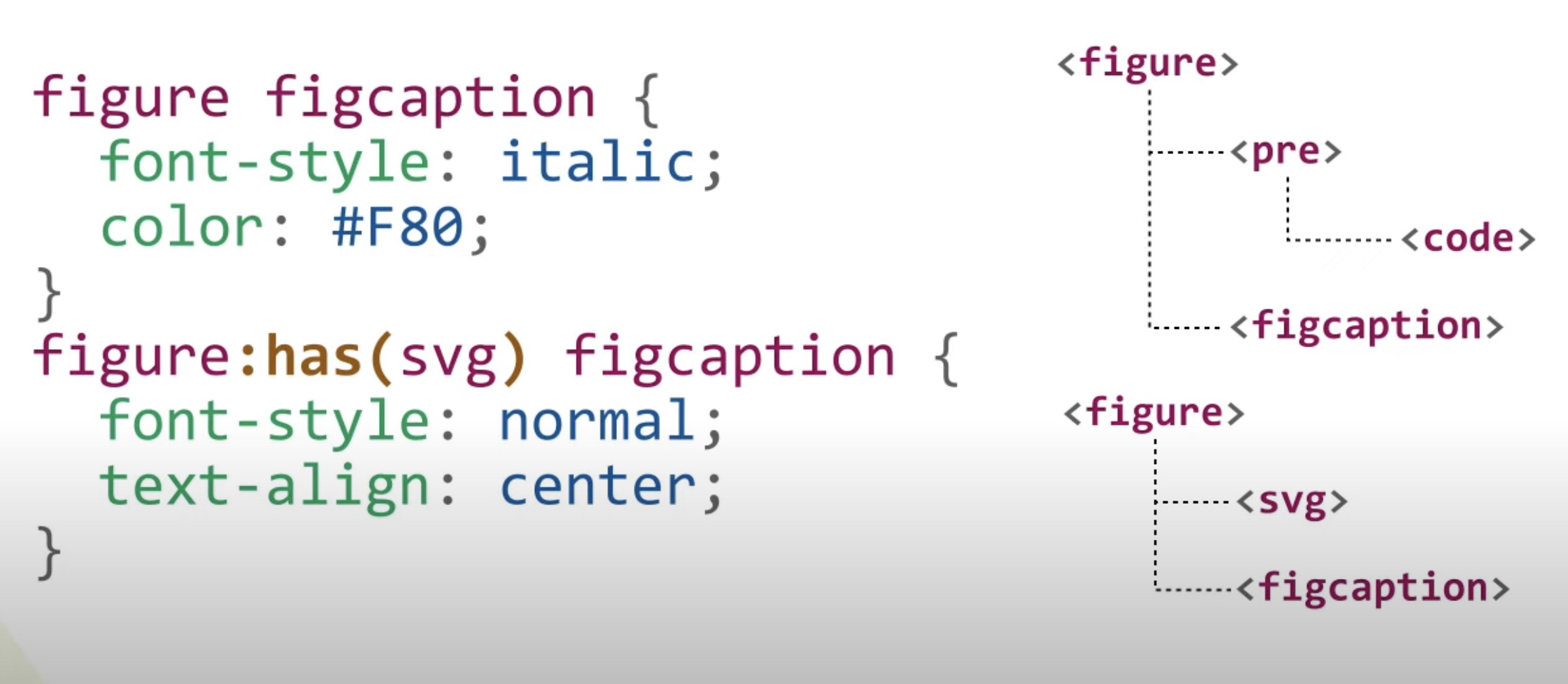
:has()
:has()
:has()
:has()
:has()
body {
  display: grid;
}

body:has(main + aside) {
  grid-template-columns: 1fr 300px;
}
body:has(aside + main) {
  grid-template-columns: 300px 1fr;
}
:has()
:root:has(dialog[open]) {
  overflow: hidden;
}
:has()
:nth of S
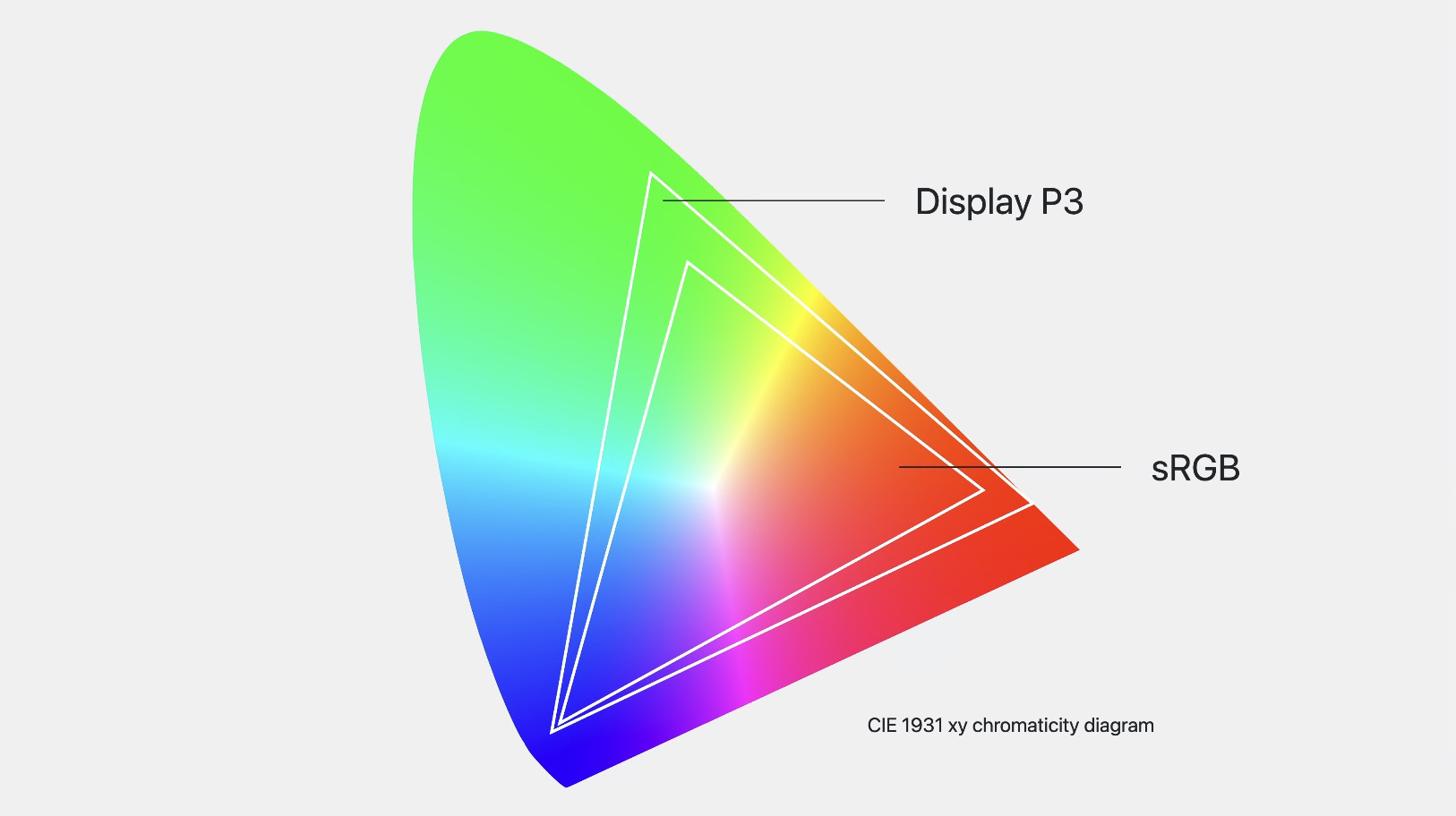
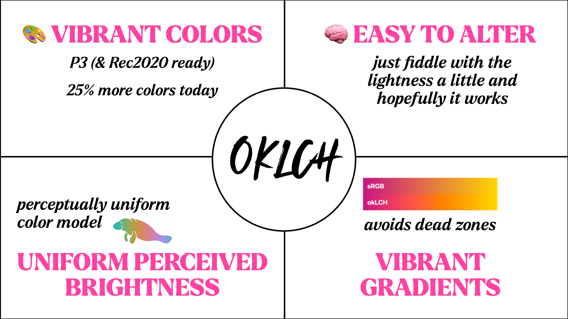
HDR Colors
- Wide color gamut
- Color functions
- Gradients

.valid-css-color-function-colors {
  --srgb: color(srgb 1 1 1);
  --srgb-linear: color(srgb-linear 100% 100% 100% / 50%);
  --display-p3: color(display-p3 1 1 1);
  --rec2020: color(rec2020 0 0 0);
  --a98-rgb: color(a98-rgb 1 1 1 / 25%);
  --prophoto: color(prophoto-rgb 0% 0% 0%);
  --xyz: color(xyz 1 1 1);
}
Color spaces
.most-hyped {
  --display-p3: color(display-p3 1 1 1);
  --rec2020: color(rec2020 0 0 0);
}
Color spaces
P3 color gamut

P3 color gamut

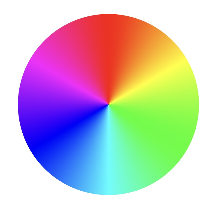
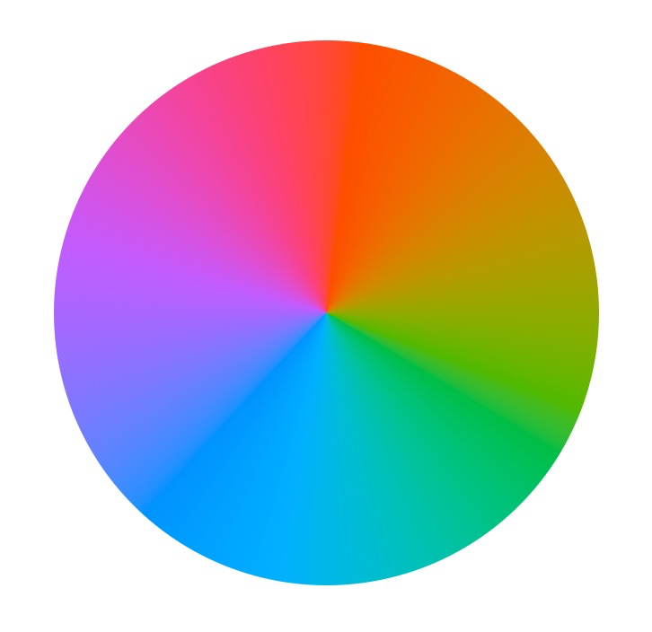
oklab, oklch
HDR colors
.element {
  background: oklch(80% .2 220);
}
lightness
chroma
hue
oklch()
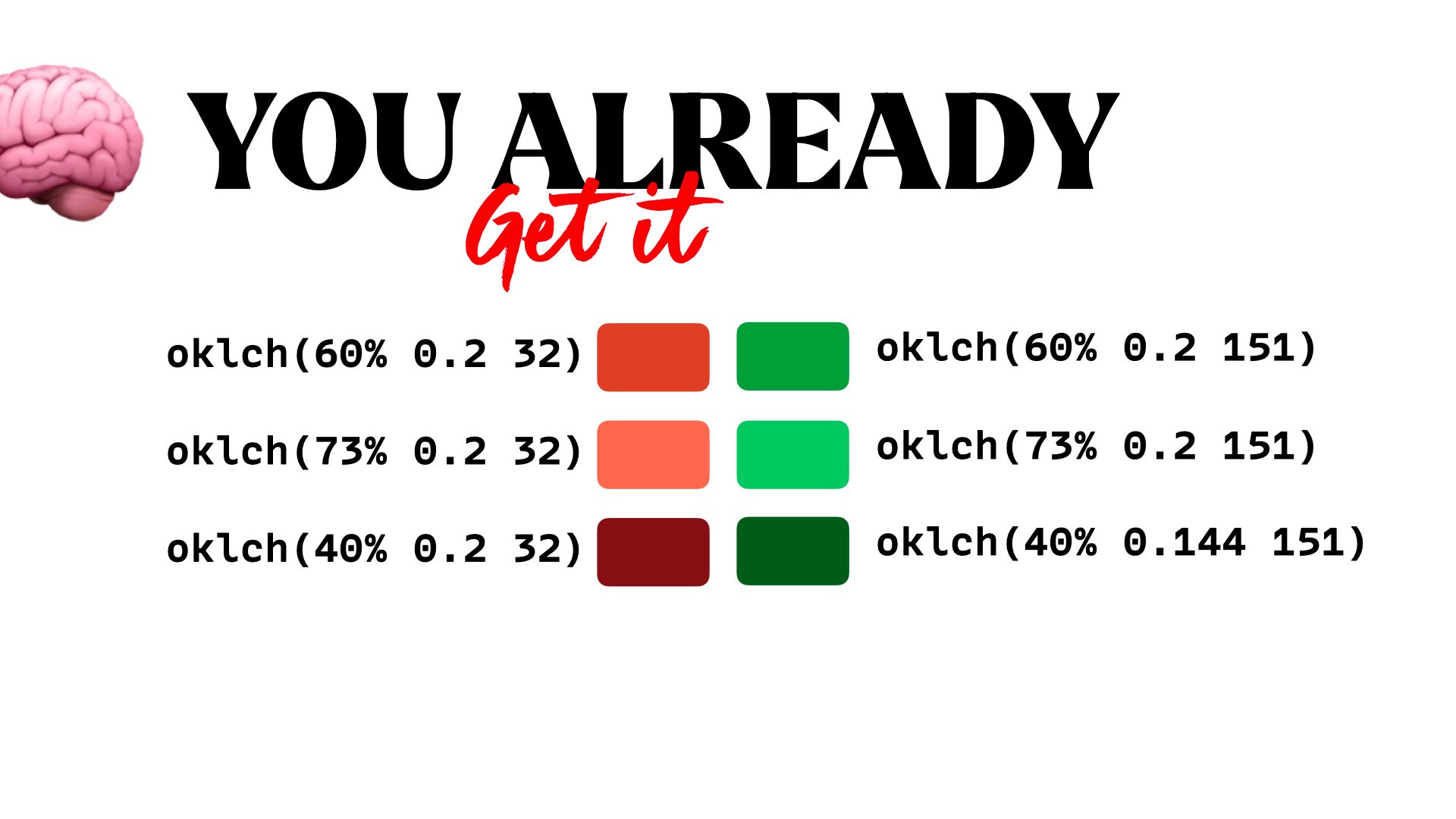
oklch()
oklch()

oklch()
In OKLCH all backgrounds with L≥87% have good contrast with black text.
oklch()
oklch()
Gradients
in oklch
Gradients
color-mix()

color-mix()
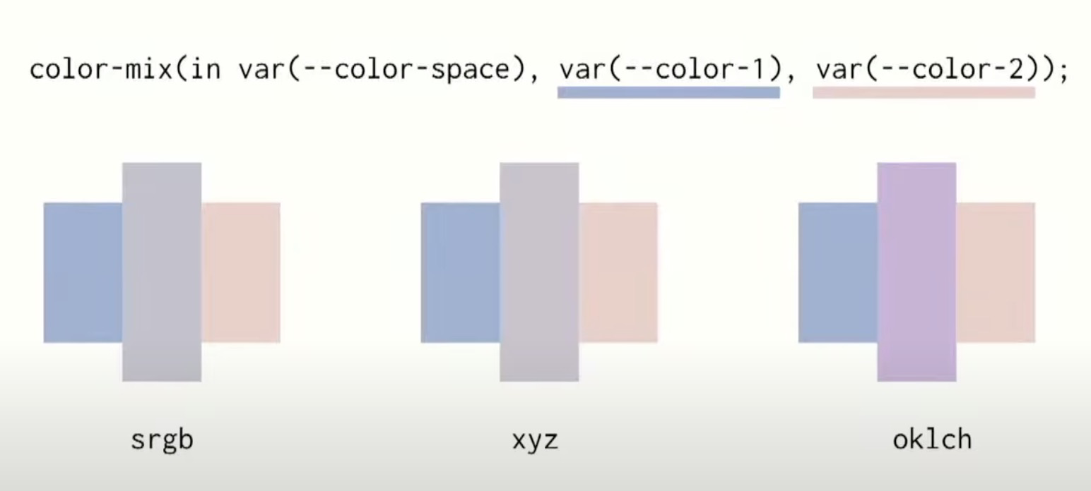
color-mix()
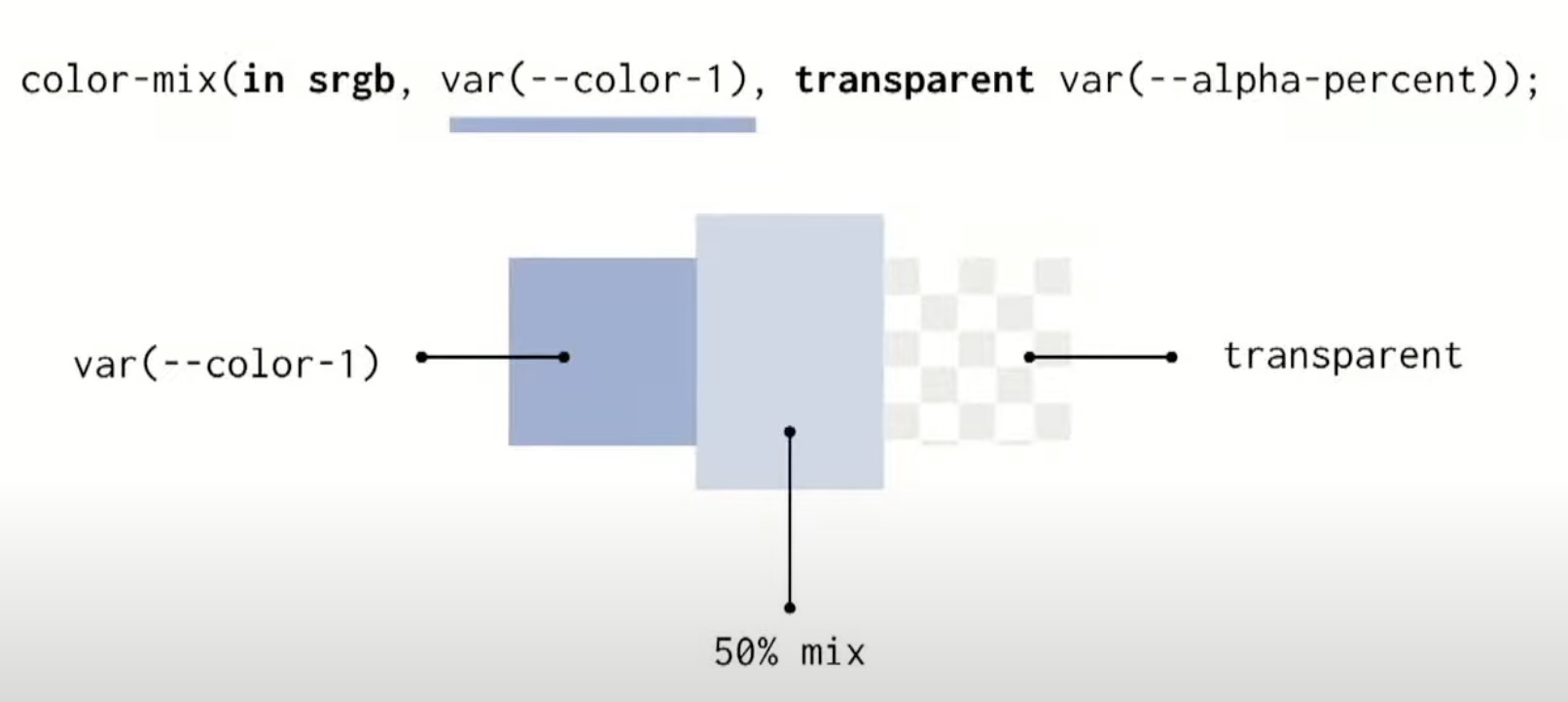
color-mix()
Linear mapping
color-mix()
Linear mapping
color-mix()
Løsning
color-mix()
Foreslået løsning
--bg:
  color-mix(
    in oklch,
    var(--color-a),
    var(--color-b) var(--percent)
  )
;
color-mix()
Typography
- text-box-trim
- margin-trim
- text-balance
- lh, rlh
- cap, rcap
How do you center a div?
Centering stuff
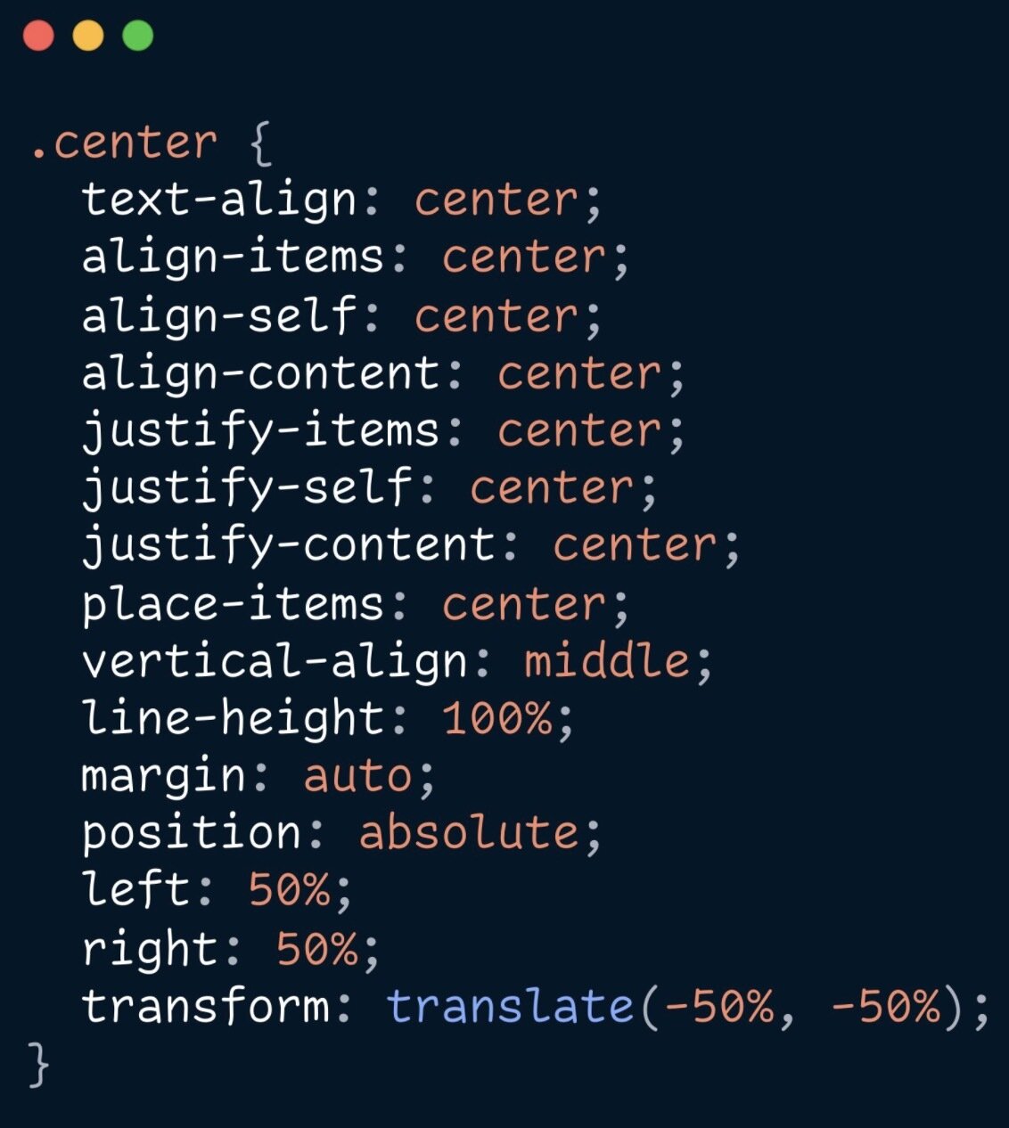
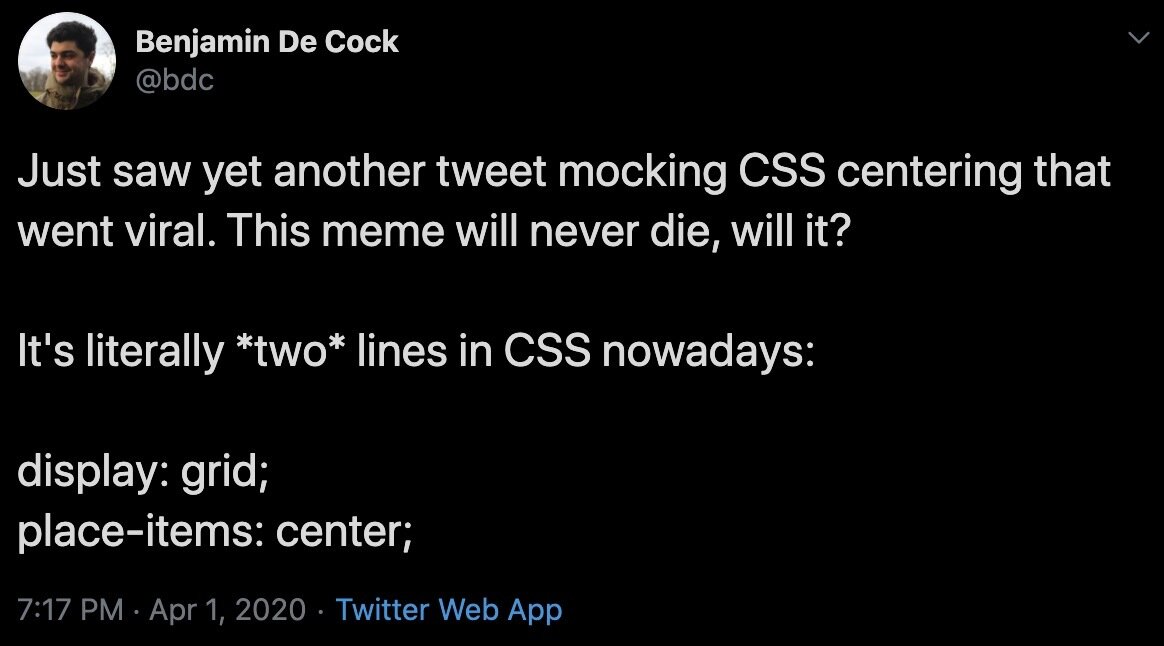

😩
.element {
  display: flex;
  gap: 1.25ch;
  align-items: center;
}
????
How do you center this?
Centering stuff
😩
Overskrift
Morbi tortor mi, semper id magna quis, auctor auctor purus. Nam pellentesque vulputate lectus, et euismod est tincidunt sed.
Overskrift
Overskrift
Overskrift
line box
giraf
Figma: Vertical trim

text-box-trim
no more alignment issues
h1 {
 text-box-trim: both;
 text-edge: cap alphabetic;
}
🥹
Overskrift
Morbi tortor mi, semper id magna quis, auctor auctor purus. Nam pellentesque vulputate lectus, et euismod est tincidunt sed.
text-box-trim
h1 {
  text-box-trim: both;
  text-edge: cap alphabetic;
  /* future? */
  /* text-box-trim: cap alphabetic; */
}
text-wrap
.balance {
  text-wrap: balance;
}

.pretty {
  text-wrap: pretty;
}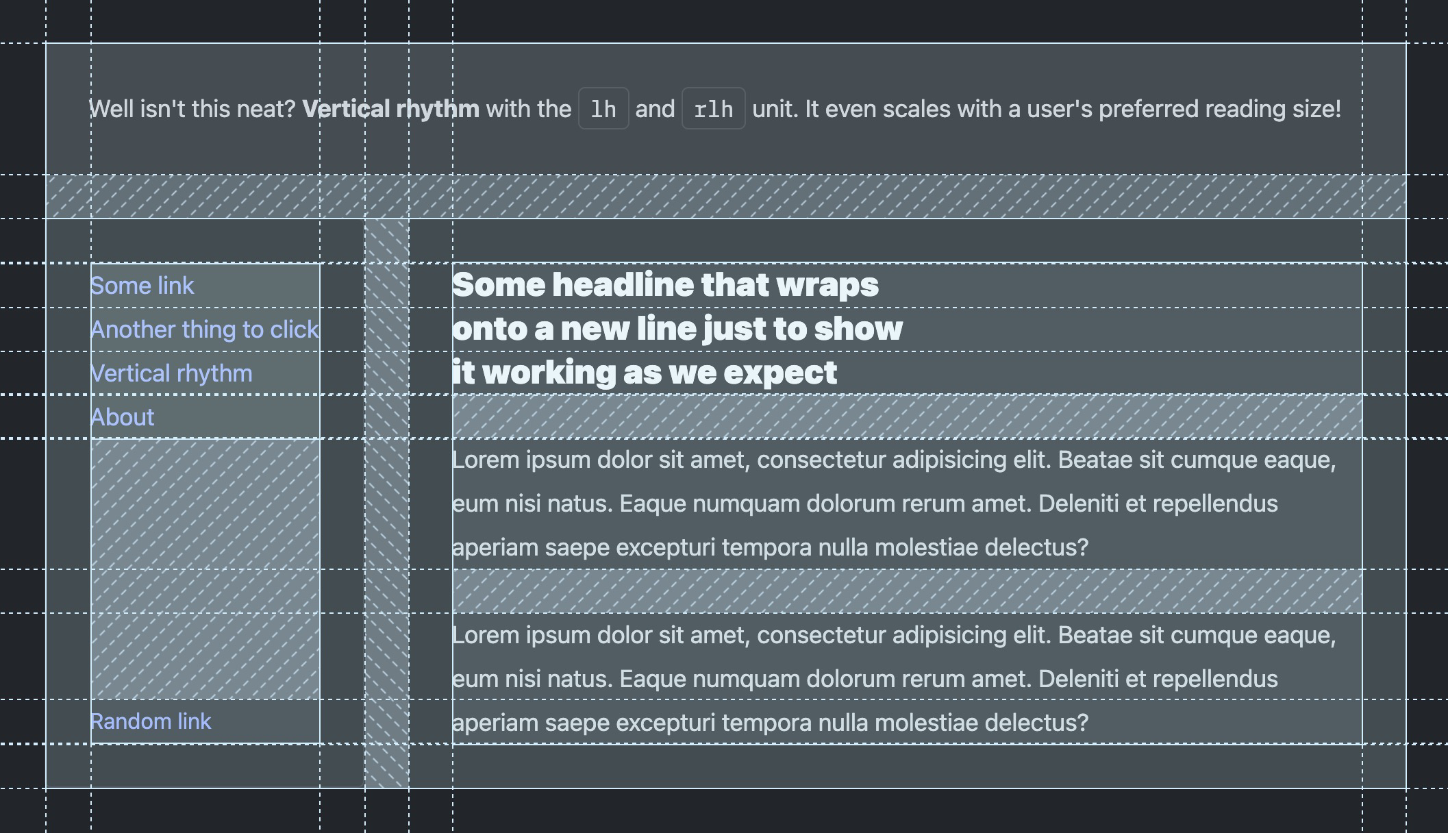
lh & rlh
Vertical rythm
article {
  padding: 2rlh;
  gap: 1rlh;
}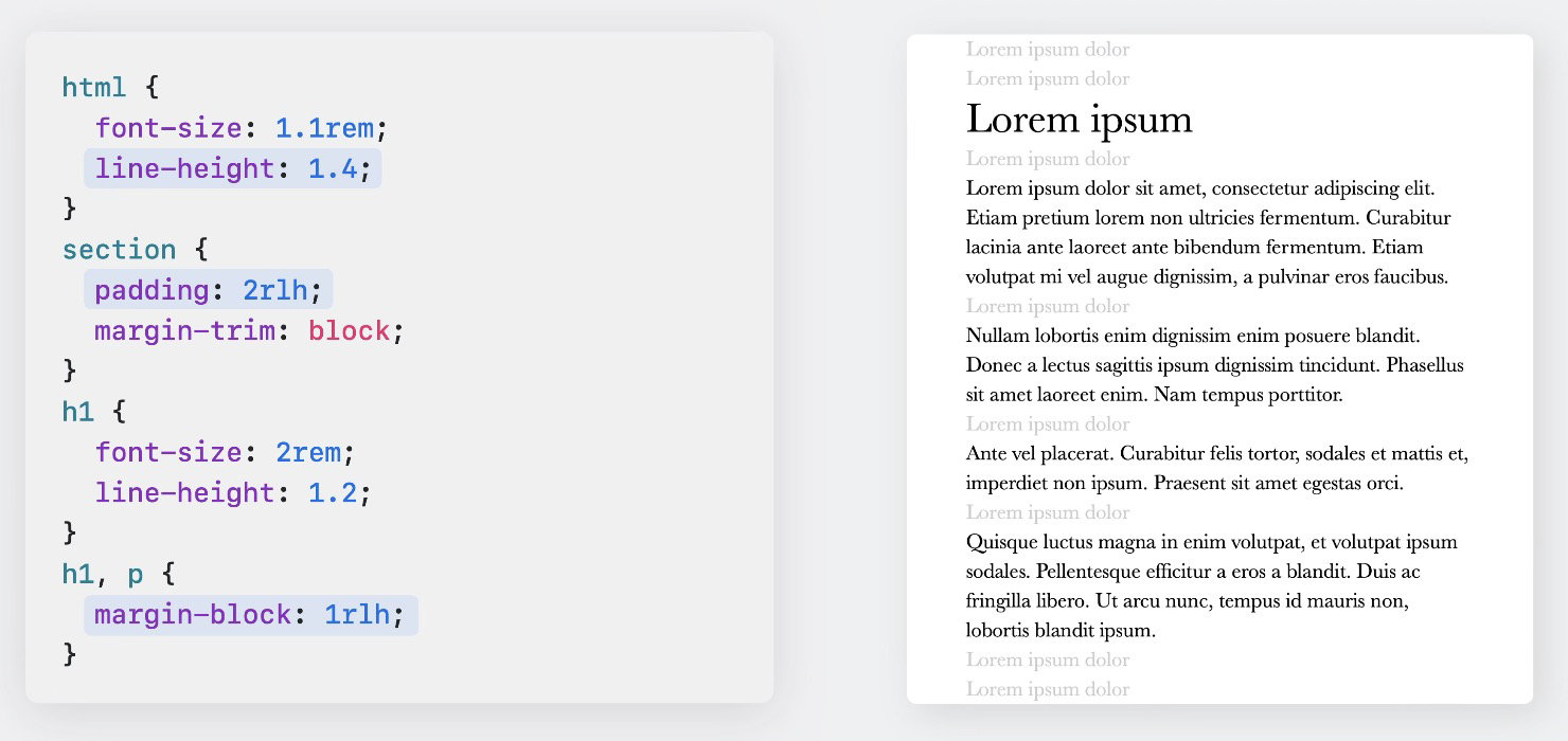
lh & rlh
Multi-line colors
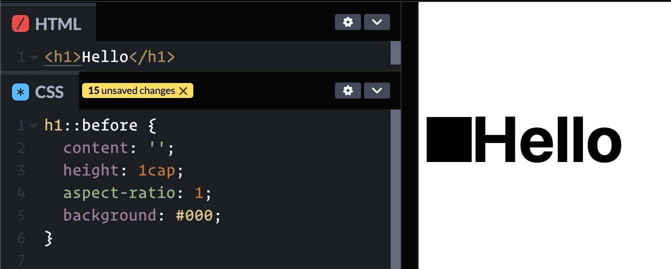
cap & rcap
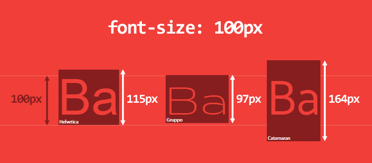
CSS Units
-
em, rem, ex, rex, cap, rcap, ch, rch, ic, ric, lh, rlh,
-
vw, vh, vi, vb, vmin, vmax,
-
cqw, cqh, cqi, cqb, cqmin, cqmax,
-
cqem, cqlh, cqex, cqch ...


Nye viewport units
Fra `vh` til `dvh`
Nye viewport units
Fra `vh` til `dvh`

CSS vs JavaScript
Intrinsic web
Hvorfor griber man typisk fat i JS?


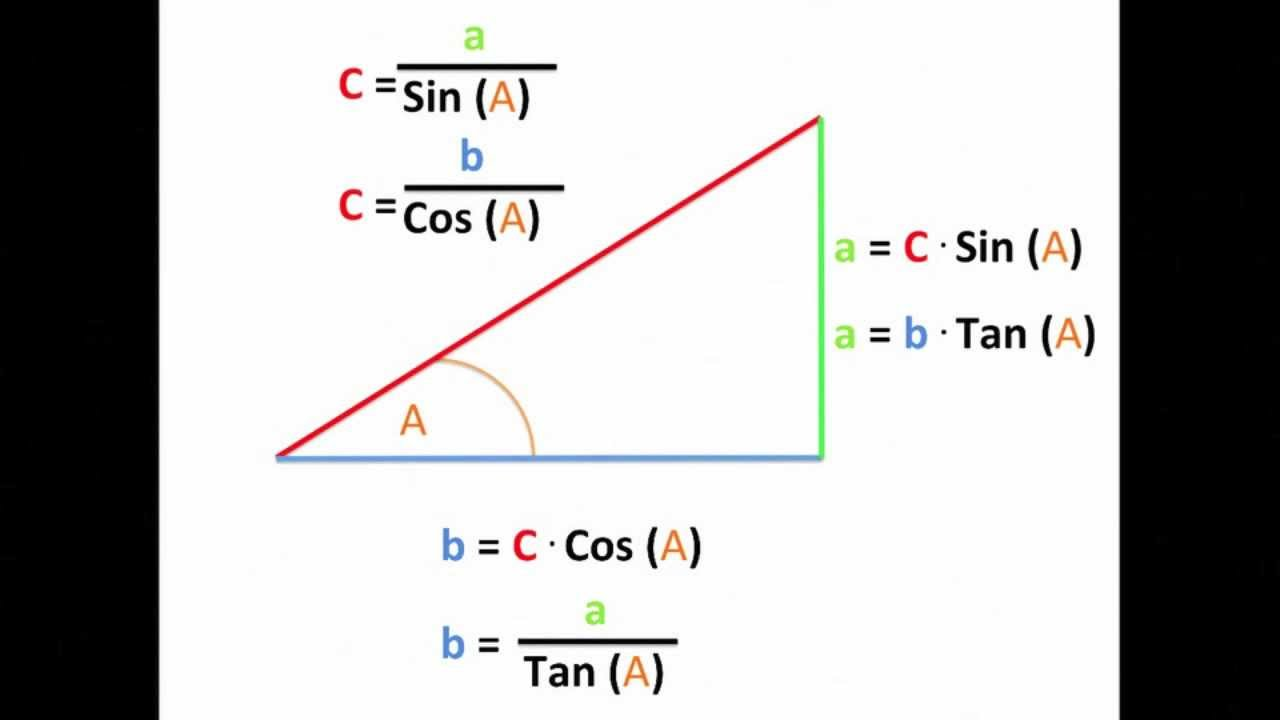
Trigonometri i CSS
Trigonometri i CSS
Trigonometri i CSS
Math Expressions
Comparison Function
min(), max(), clamp()
Stepped Value Functions
round(), mod(), rem()
Trigonometric Functions
sin(), cos(), tan(), asin(), acos(), atan(), atan2()
Exponential Functions
pow(), sqrt(), hypot(), log(), exp()
Sign-Related Functions
abs(), sign()
Numeric Constants
e, pi
Degenerate Numeric Constants
infinity, -infinity, NaN
Er CSS snart et programmeringssprog? 😉
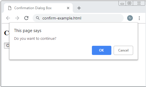
Inert, Esc dismiss,
top-layer
<dialog>
<dialog>
Loading...
Animation
- Individual transforms
- @property
- animation-composition
- linear()
- Scroll Driven Animations
- View Transitions
.box {
  rotate: 45deg;
  translate: -50% -50%;
  scale: 1.1;
}

.box:hover {
  rotate: 0deg;
}
Individual Transforms
@property --colorPrimary {
  syntax: '<color>';
}@property
@property --colorPrimary {
  syntax: '<color>';
  initial-value: magenta;
}@property
@property --colorPrimary {
  syntax: '<color>';
  initial-value: magenta;
  inherits: false;
}@property
@property
@property --colorPrimary {
  syntax: '<color>';
  initial-value: magenta;
  inherits: false;
}
— typed Custom Properties
Loading...
@property
@property --colorPrimary {
  syntax: '<color>';
  initial-value: magenta;
  inherits: false;
}
— typed Custom Properties
Loading...
@property
@property --colorPrimary {
  syntax: '<color>';
  initial-value: magenta;
  inherits: false;
}
— typed Custom Properties
Loading...
OBS! @property performance
Composition
Composition
Composition
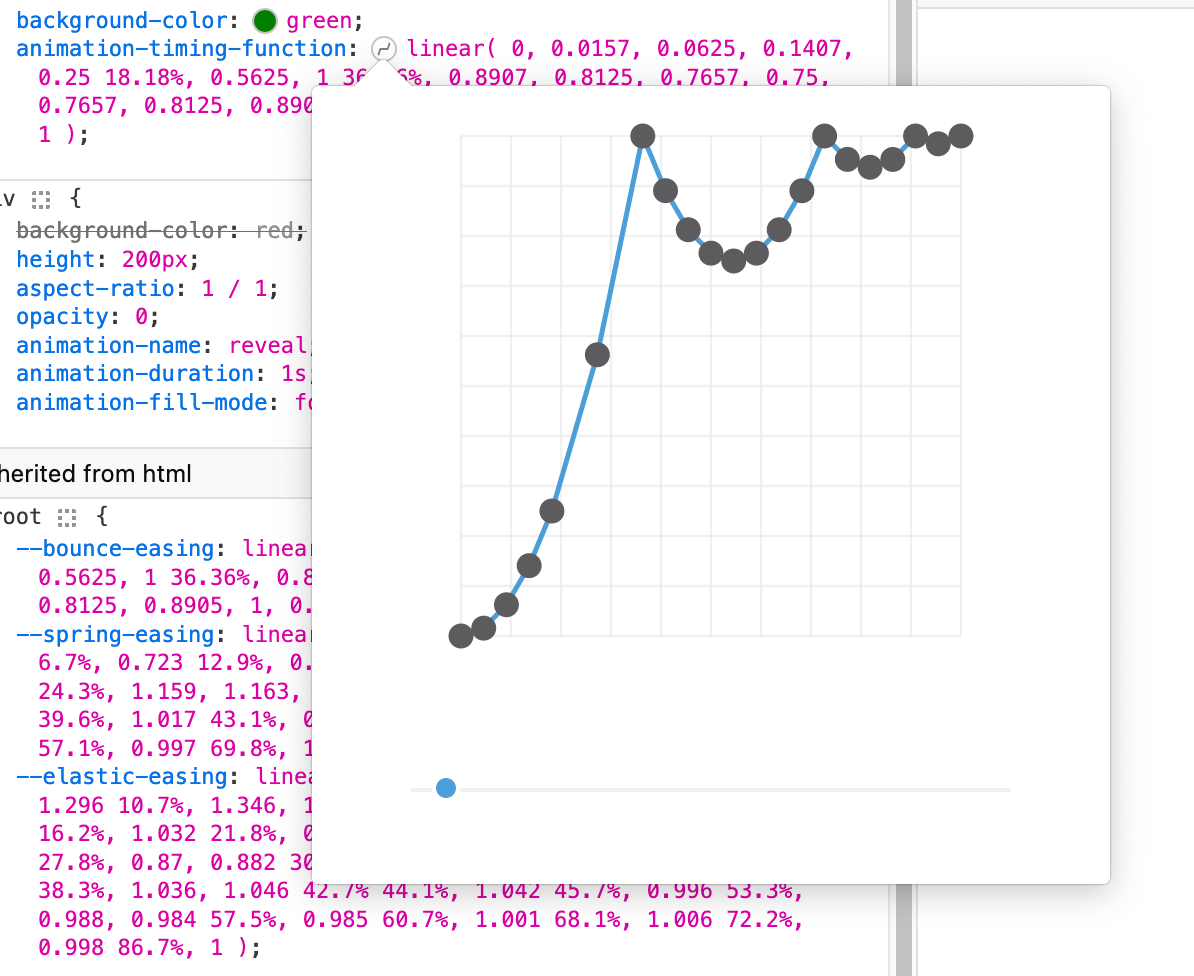
Linear()
Easing
Linear()
Easing
Linear()
Easing
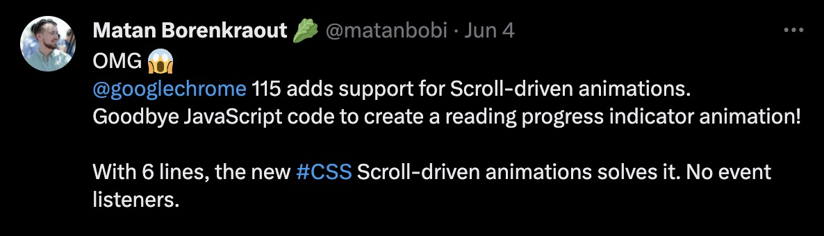
Scroll-driven animation
Optimized composited scroll animations
Not blocking main thread
Scroll-driven animation
Scroll-driven animation
Loading...
Scroll-driven animation
Loading...
Scroll-driven animation
Loading...
Scroll-driven animation
Loading...
Scroll-driven animation
Loading...
.element {
  animation: progress linear;
  animation-timeline: scroll(block root);
}
Scroll-driven animation
Brug scrollbar som tidslinje
.element {
  animation: progress linear;
  animation-timeline: scroll();
}
Scroll-driven animation
Brug scrollbar som tidslinje
.element {
  animation: reveal linear;
  animation-timeline: view();
  animation-range: cover 0% entry 100%;
}
Scroll-driven animation
Hold øje med et element ift. viewporten
Scroll-driven animation
Scroll-driven animation
Jeres tur
section > * {
  animation:
    entry linear,
    exit linear;
  animation-timeline: view();
  animation-range: [...];
}Optimized flip-animations
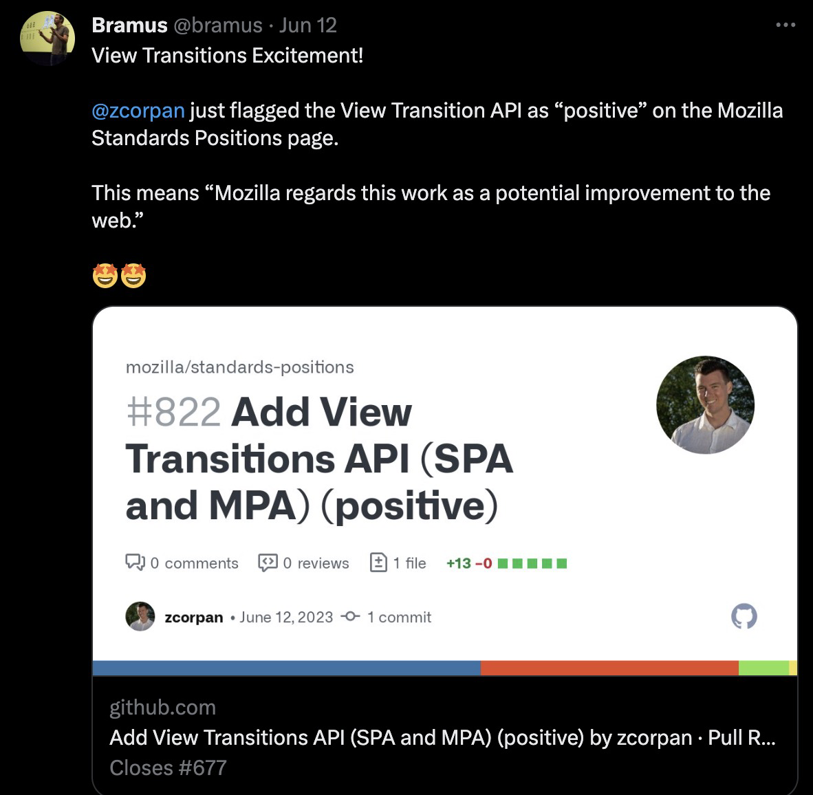
View transitions
View Transitions
Loading...
View Transitions
Loading...
View Transitions
Loading...
View Transitions
Loading...
View Transition
.box-1 {
  view-transition-name: box-1;
}

.box-2 {
  view-transition-name: box-2;
}
View Transition
.box-1 {
  view-transition-name: box-1;
}

.box-2 {
  view-transition-name: box-2;
}
btn.addEventListener("click", () => {
document.startViewTransition(_ => grid.classList.toggle("col-count"));
});View Transition
.box-1 {
  view-transition-name: box-1;
}

.box-2 {
  view-transition-name: box-2;
}
btn.addEventListener("click", () => {
if (document.startViewTransition) {
document.startViewTransition(_ => grid.classList.toggle("col-count"));
} else {
grid.classList.toggle("col-count");
}
});View Transition
.box-1 {
  view-transition-name: box-1;
}

::view-transition-new(box-1) {
  animation: scale-in .5s both;
}

::view-transition-old(box-1) {
  animation: scale-in .5s both reverse;
}View Transition
View Transition (MPA)
View Transition
CSS Workshop 2023
By Dannie Vinther
CSS Workshop 2023
Workshop KEA


