STYLING
FORMS
Frontend
Men først...
by Jonas Holbech
En omfattende gennemgang af
CORS
by Jonas Holbech
But first...
CORS
v/ Jonas Holbech
En omfattende gennemgang af
Extensions
axe Accessibility Linter

Error Lens
Styling
Search for a topic of interest...
Search
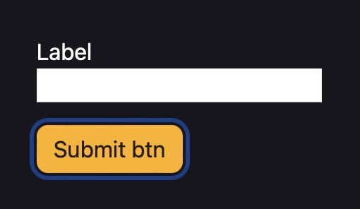
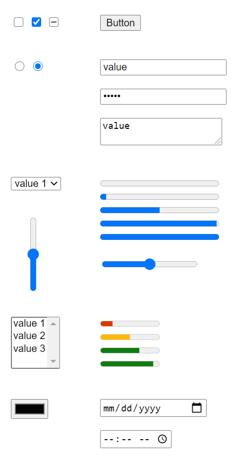
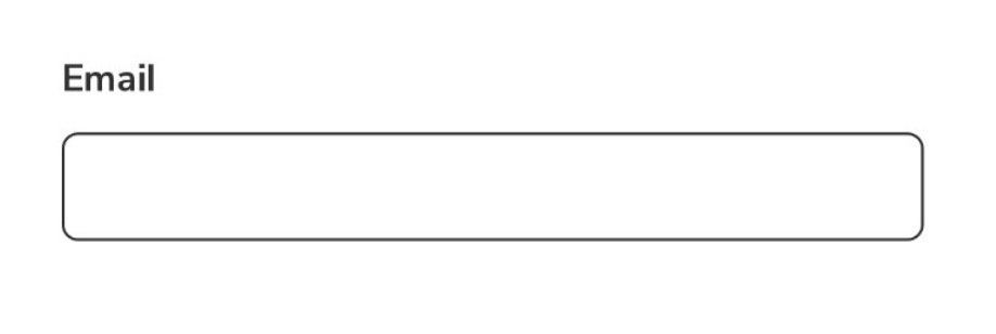
HTML forms
Styling
A better user experience
HTML forms
Frontend elective, 3rd SEM
Search
Search for a topic of interest...
HTML forms
UI States
Input states

Pseudo-classes
A CSS pseudo-class is a keyword added to a selector that specifies a special state of the selected element(s). For example, :hover can be used to change a button's color when the user's pointer hovers over it.
Pseudo-classes
Pseudo-classes
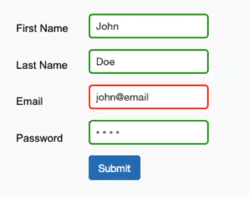
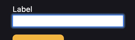
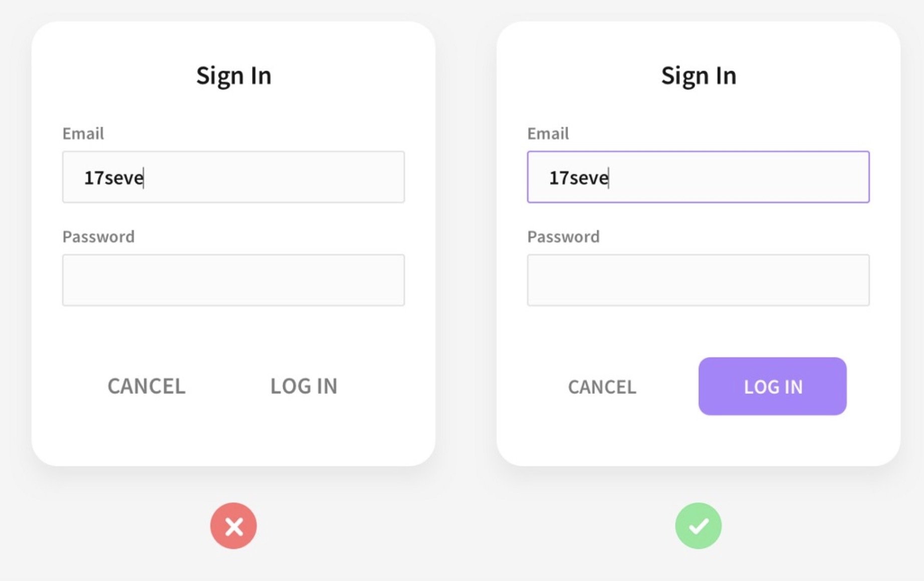
:valid
represents any <input> or other <form> element whose contents validate successfully
input:valid {
  border-color: green;
}
needs "required"
Pseudo-classes
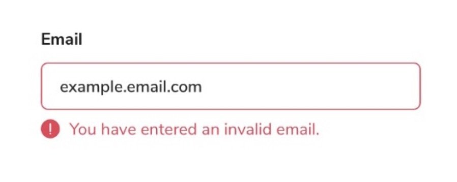
:invalid
any <input> or other <form> element whose contents fail to validate.
input:invalid {
  border-color: red;
}
needs "required"
Pseudo-classes = states

Pseudo-classes = states
Pseudo-classes = states
Pseudo-classes / states
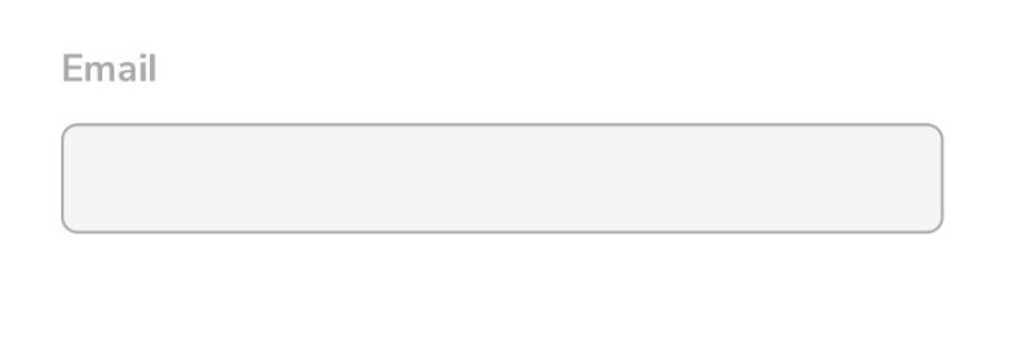
:disabled
represents any disabled element
:checked
selector represents any radio, checkbox, or option element that is checked or toggled to an on state
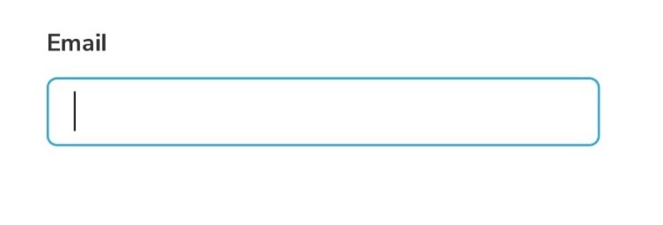
:focus/:focus-visible
represents an element that has received focus
:placeholder-shown
represents any <input> or <textarea> element that is currently displaying placeholder text.
:not(
:not(
:not(
:not(
)
)
)
)
Pseudo-classes / states
:disabled
doesn't represents any disabled element
:checked
selector represents any radio, checkbox, or option element that is not checked or toggled to an on state
:focus/:focus-visible
represents an element that hasn't received focus
:placeholder-shown
represents any <input> or <textarea> element that is currently not displaying placeholder text.
:not(
:not(
:not(
:not(
)
)
)
)
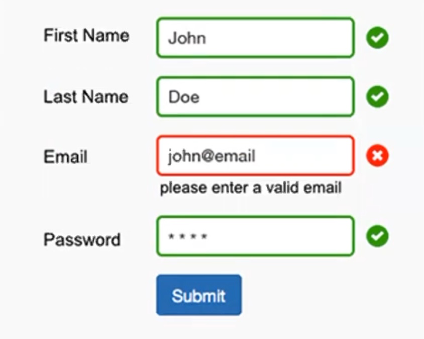
input:invalid:not(:focus, :placeholder-shown) { ... }Placeholder-shown
input:invalid:not(:focus, :placeholder-shown) ~ .error-message { ... }JS er påkrævet for at overholde A11y-standarder
:has()
.form-group:has(input:invalid) { ... }.form-group:has(input:not(:focus, :placeholder-shown):invalid) .error-message { ... }.form-group:has(input:not(:focus, :placeholder-shown):invalid) label { ... }:has()
.form-group:has(input:invalid) { ... }.form-group:has(input:not(:focus, :placeholder-shown):invalid) .error-message { ... }label:has( + input:not(:focus, :placeholder-shown):invalid) { ... }:has()
label {
  color: var(--color);
}

.form-field:has(:invalid) {
  --color: red;
}

.form-field:has(:valid) {
  --color: green;
}
:has()
:has()
Browser compatibility
🫢
:has()
Browser compatibility
form:focus-within {
  border-color: blue;
}
.form-control:focus-within .hint {
color: red;
}:focus-within
:focus-within
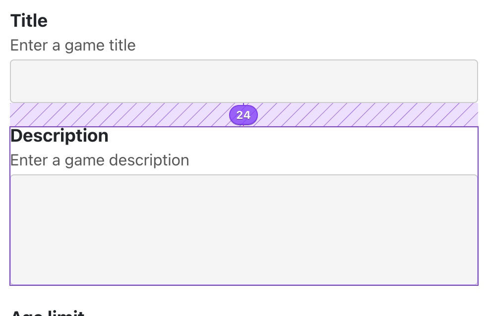
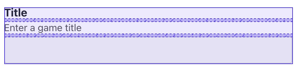
Exercise
Focus states
Focus states
Safari 💩
Focus states
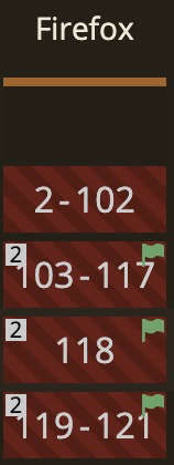
Firefox 💩
Focus states
:focus-visible {
  outline: 2px solid #000;
  outline-offset: -2px;
  box-shadow: 0 0 0 2px #fff, inset 0 0 0 3px #fff;
}

input {
  appearance: none; /* Safari fix */
}
Tilføj "states" (pseudo-klasser) til dit formular
- :focus-visible
- :valid
- :invalid (with error messages)
- :disabled
- :has
Tilføj styles for følgende pseudo-klasser:
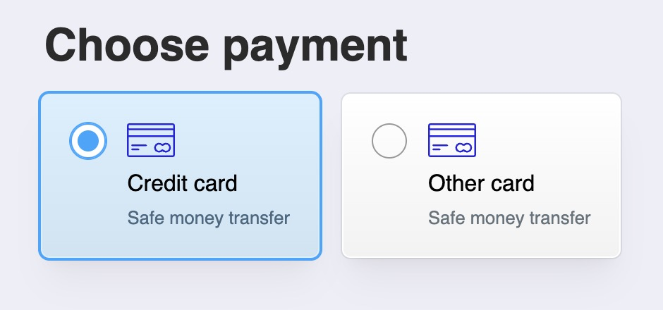
Checkbox "hack"
Custom Checkboxes / Radios
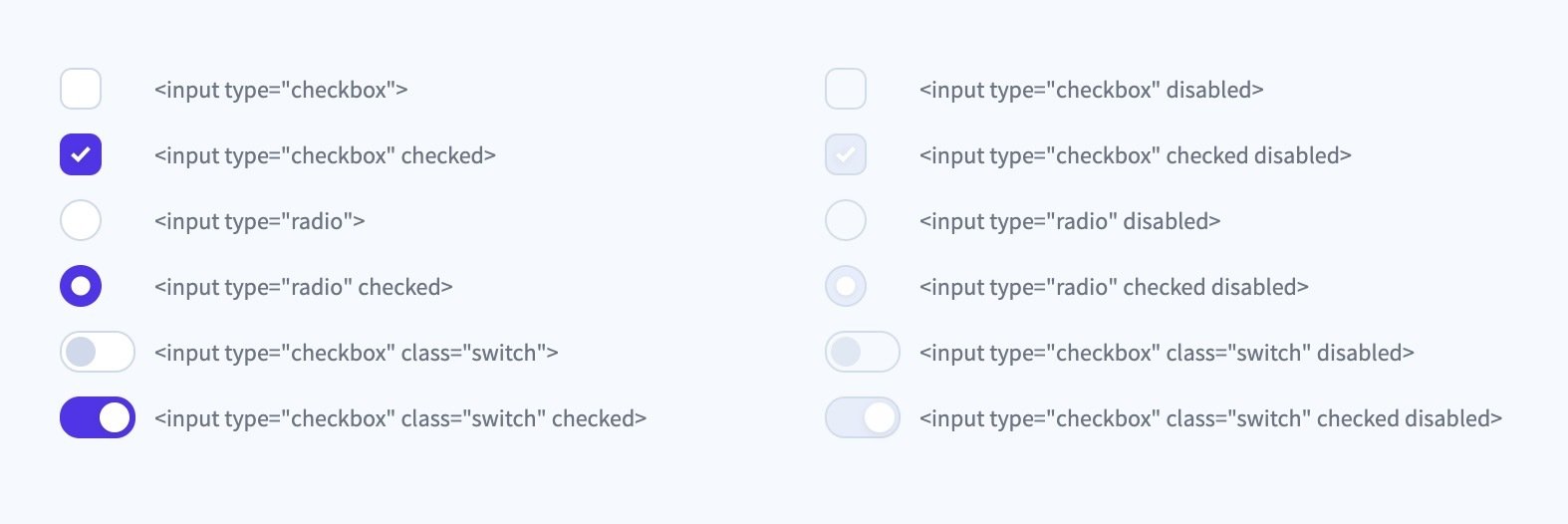
User Agent styles


UA styles
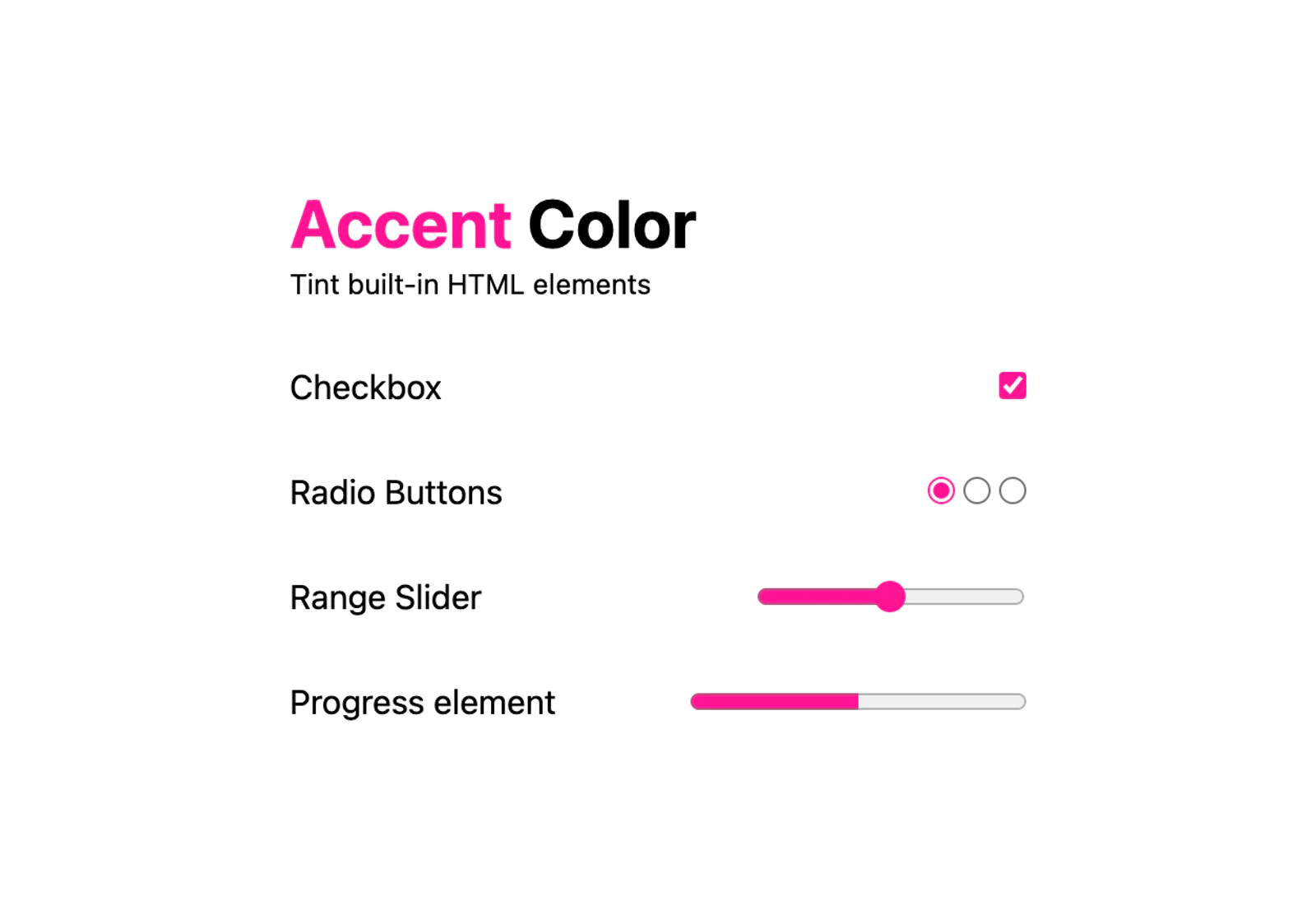
:root {
  accent-color: deeppink;
}doesn't work in Safari 💩
it does actually now (15.4) 🎊
but...
UA styles
form {
  accent-color: deeppink;
}Rule of Least Power
Customize
input[type="checkbox"] {
  appearance: none;
  ...
}

/* Checked state */
input:checked::before {
  ...
}
Remove browser styles
Style custom checkmark with pseudo-elements
Ressourcer
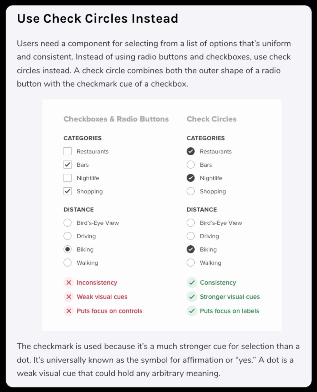
Gør det mere spændende
Reducerer cognitive load
Gør det mere spændende
Animated checkmark
Animated checkmark
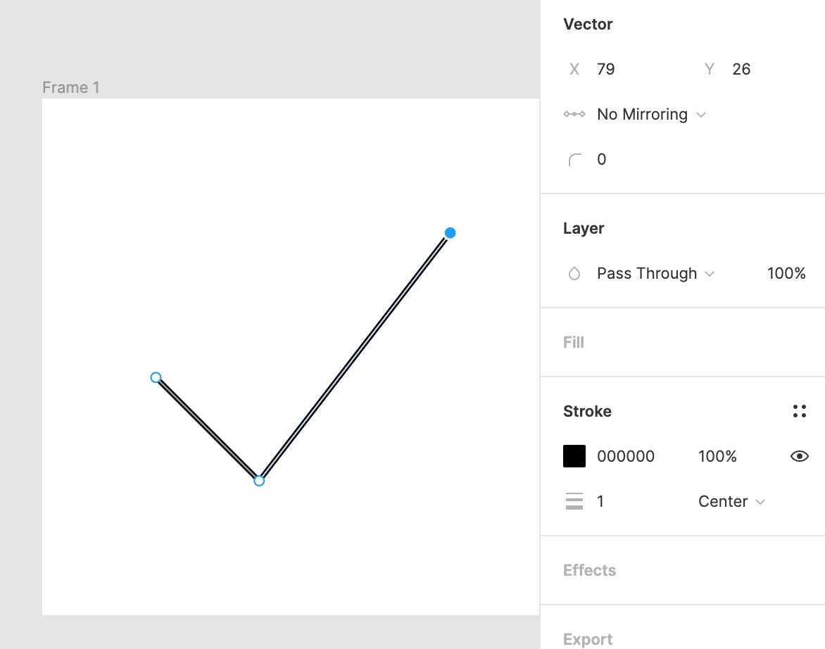
Preparing an SVG in Figma / Illustrator
Animated checkmark
Animated checkmark
Animated checkmark
Resources
Task 2 (optional)
Craft your own form design
- Style the form elements in your video game form
- Style the different states with the corresponding pseudo-classes
- Customize your form controls (e.g. radio, checkbox, etc)

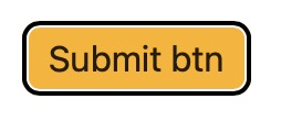
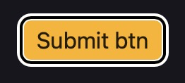
Default:
:focus
Buttons
Custom checkboxes and radio buttons
:invalid
:disabled
Craft your own form design
Craft your own form design
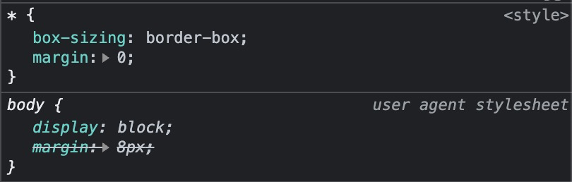
Reset / Normalize
form,
fieldset,
legend,
input,
button,
textarea,
select {
  margin: 0;
  padding: 0;
}

input,
button,
textarea,
select {
  font-family: inherit;
  font-size: max(16px, 1em);
}

button {
  appearance: none;
  border: 1px solid;
  background: transparent;
  cursor: pointer;
}

input[type="text"],
input[type="email"],
textarea {
  appearance: none;
  border: 1px solid;
  background: transparent;
}
Reset / Normalize
The cascade
Lad den være åben
Tilføj en blå border på 4px til .my-input
Kig i DevTools for at finde fejlen
Quiz
p:not(#id) {
  color: green;
}

p.class {
  color: red;
}
<p class="class">text</p>

<p id="id">last text</p>
p.test a {
color: green;
}
a:hover {
color: deeppink;
}<p class="test">
<a href="#0">Hvilken farve?</p>
</p>Quiz
The cascade
Author styles
0,0,0
0,0,1
🤷♂️
Cascade layers
@layer reset {
  /* ... other reset rules */

  input[type="text"] {
    border: 1px solid gray;
  }
}

@layer components {
  /* ... other component rules */

  .my-input {
    border: 4px solid blue;
  }
}
order matters
Cascade layers
@layer reset, components, utilities;

@layer reset {
  /* ... other reset rules */

  input[type="text"] {
    border: 1px solid gray;
  }
}

@layer components {
  /* ... other component rules */

  .my-input {
    border: 4px solid blue;
  }
}
configure up front
1
2
3
Cascade layers
@layer reset, components, utilities;

@layer components {
  /* ... other component rules */

  .my-input {
    border: 4px solid blue;
  }
}

@layer reset {
  /* ... other reset rules */

  input[type="text"] {
    border: 1px solid gray;
  }
}
configure up front
1
2
3
Cascade layers
@layer reset, components, states;

@layer components {
  /* Buttons, inputs etc. */
}

@layer states {
  /* Make sure stats override, no matter specificity count */
  :disabled {
    background-color: #ddd;
    color: #999;
  }

  :focus-visible {
    outline: 2px solid var(--focus-color, currentColor);
    outline-offset: 2px;
  }
}
Cascade layers
@layer reset, theme, global, layout, components, utilities, states;Cascade layers
@layer reset {
  ul[class] {
    margin: 0;
    padding: 0;
    list-style: none;
    text-align: start;
  }
}

@layer utilities {
  .space-top {
    margin-top: 2rem;
  }
}
eksempel
Cascade layers
A sensible CSS reset
Default styling
:root {
  --theme-color: 258 29% 43%;
  --accent-color: 180 50% 43%;
}

input {
  font: inherit;
  font-size: max(16px, 1em);
  padding: 0.25em 0.5em;
  background-color: #fff;
  border: 2px solid hsl(var(--theme-color));
}

input:is(:focus-visible, :hover) {
  border-color: hsl(var(--accent-color));
}
A sensible CSS reset
Default styling
input:is([type="checkbox"], [type="radio"]) {
  appearance: none;
  /* custom styling */
}
A sensible CSS reset
Or with accent-color
form {
  accent-color: var(--theme-color, hotpink);
  /* checkbox, radio, progress, range etc. */
}
A sensible CSS reset
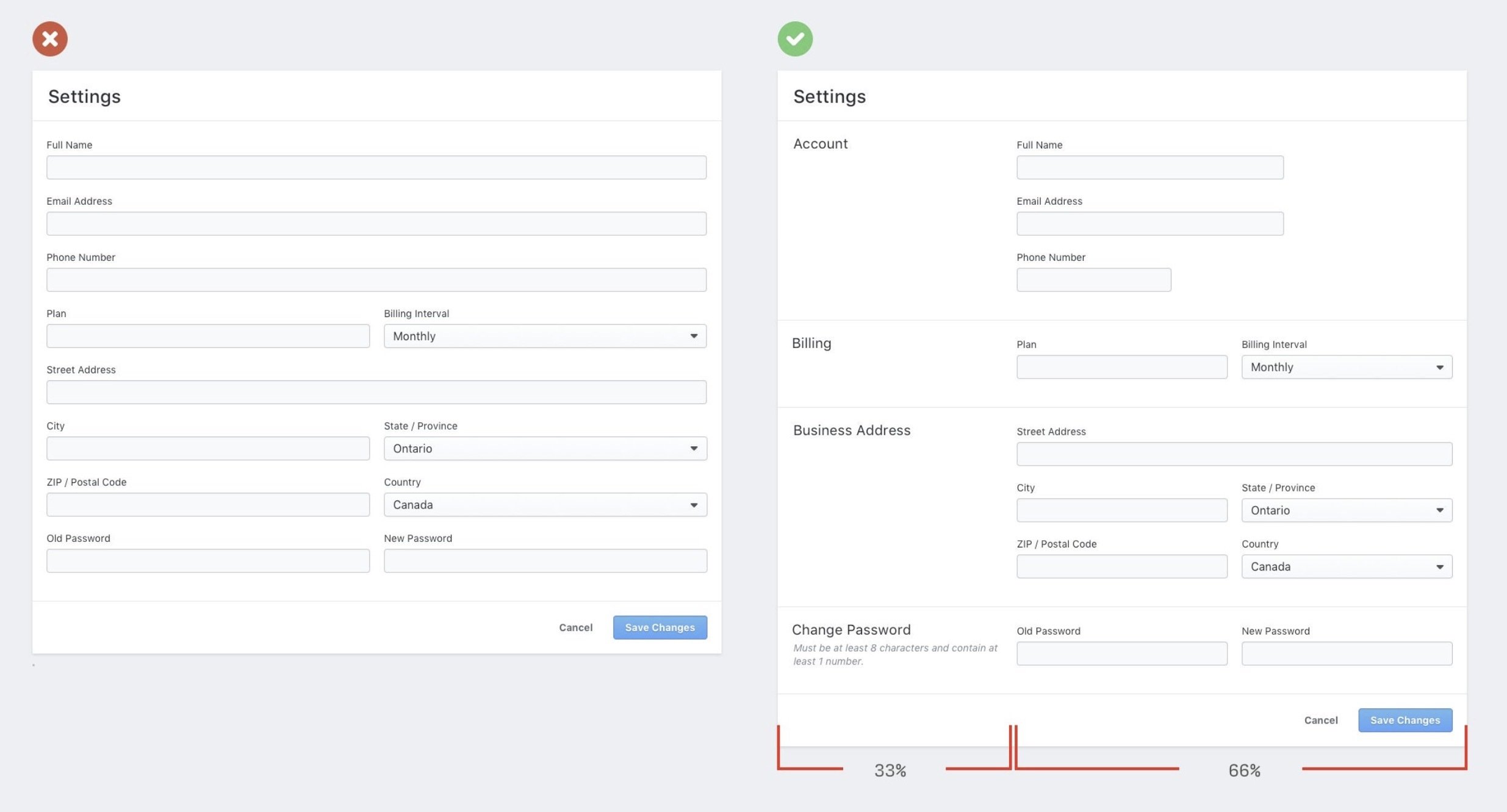
Form layout
form {
  display: grid;
  gap: 1.5rem;
}

.form-group {
  display: grid;
  gap: .3125rem;
}
form {
  display: flex;
  flex-wrap: wrap;
  gap: 1rem;
}

form > input {
  flex: 1 1 10ch;
}

input[type="email"] {
  flex: 3 1 30ch;
}.container {
container-type: inline-size;
}
@container (width > 25rem) {
.newsletter { ... }
}Forms CSS
By Dannie Vinther
Forms CSS
Styling forms


