HTML & CSS
Presenter: 崔家華
Date: 2018.11/15-22
Link: http://bit.ly/2OEX7C9
What are "HTML" and "CSS"?
● The skeleton and core of webpages.
● Basically, just a markup and a design language,
they are not really program languages.
● Epic easy


HTML - Start

● Hyper Text Markup Language
● HTML Contains a series of elements,
and elements are composed of tag and
content .

● For example:
HTML - Intro(1)
<!DOCTYPE html>
<html lang="en">
<head>
  <!-- Text encoding -->
  <meta charset="UTF-8">
  <!-- The title of a website -->
  <title>My First Website</title>
</head>
<body>
  <!-- Content to be show -->
</body>
</html>
● Declaration of HTML document type: <!DOCTYPE html>,
● The HTML document itself begins with <html> tag and
the declaration are required for legacy reasons .
ends with </html> tag.
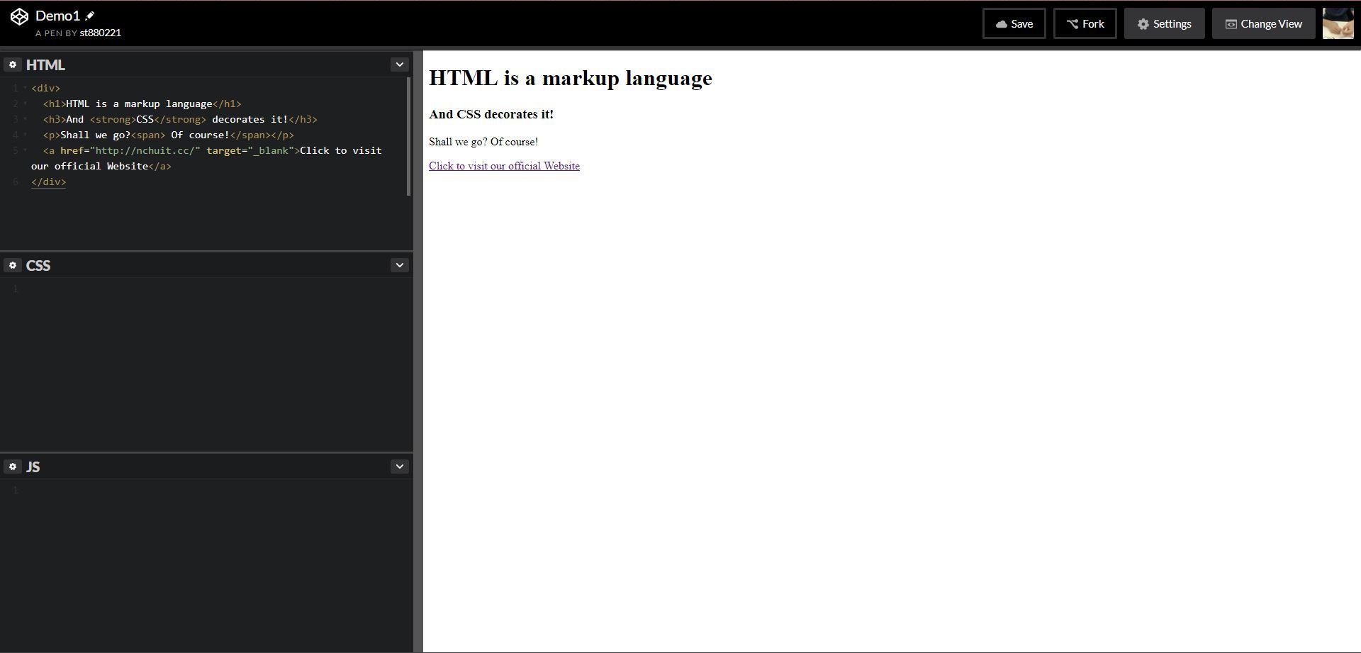
HTML - Intro(2)
<!DOCTYPE html>
<html lang="en">
<head>
  <meta charset="UTF-8">
  <!-- The title of a website -->
  <title>My First Website</title>
</head>
<body>
    <div>
        <h1>HTML is a markup language</h1>
        <h3>And <strong>CSS</strong> decorates it!</h3>
        <p>Shall we go?<span> Of course!</span></p>
        <a href="http://nchuit.cc/" target="_blank">Click to visit our official Website</a>
    </div>
</body>
</html>
● The <head> element defines some settings(or properties) of
● The <body> element consists of content in the webpage.
the html file, like "text encoding", "viewport", "title", etc.
● Again, these elements would be work rightly only if matching
the "open" and "close" tag.
HTML - Quick Demo
HTML - Intro(3)
<!DOCTYPE html>
<html lang="en">
<head>
    <meta charset="UTF-8">
    <title>Pusheen</title>
</head>
<body>
    <input type="text">   <!-- recommend this -->
    <input type="text" /> <!-- both are accepted -->
    <img src="https://goo.gl/lr477z" alt="image not found">
    <br>
    <hr>
</body>
</html>
● However, some elements are void elements
● These elements only need "start" tag.
(aka self-closing tag). Such as <input>, <img>,
<br>, <hr> and so on.
HTML - Basic(1)
Headers
<h1>PPAP</h1>
<h2>PPAP</h2>
<h3>PPAP</h3>
<h4>PPAP</h4>
<h5>PPAP</h5>
<h6>PPAP</h6>
<p>I have a pen</p>
<p>I have an apple</p>
<p>Unh, apple-pen</p>Paragraph
<p><span style="color: red">Pine</span>apple</p>
Span
Pineapple
PPAP
PPAP
PPAP
PPAP
PPAP
PPAP
I have a pen
I have an apple
Unh, apple-pen
CSS
HTML - Basic(2)
Anchor
<a href="https://www.google.com">Let's google</a>
<a href="https://www.google.com" target="_self">Let's google(Same window)</a>
<a href="https://www.google.com" target="_blank">Let's google(New window)</a>
<a href="#someAnchor">Go to X anchor</a>
<img src="https://goo.gl/6nEBX8">
<img src="https://xxx/NCHUIT_LOGO.png">Image
HTML - Basic(3)
Container
<div>
    <h1>It's Thursday</h1>
    <p>I'm thirsty</p>
    <p>I want to <a href="">play a game</a>
</div>HTML - Basic(4)
Ordered list
<ol>
    <li>87</li>
    <li>65</li>
    <li>33</li>
    <li>10</li>
</ol>
<ul>
<li>LadyGaga</li>
<li>Jessie J</li>
<li>Ariana Grande</li>
<li>The Weeknd</li>
</ul>Unordered list
- 87
- 65
- 33
- 10
- LadyGaga
- Jessie J
- Ariana Grande
- The Weeknd
HTML - Basic(5)
Table
<table>
  <caption>Pusheen自我介紹</caption>
  <thead>
    <tr>
      <th>姓名</th>
      <th>Pusheen</th>
    </tr>
  </thead>
  <tbody>
    <tr>
      <td>物種</td>
      <td>花貓</td>
    </tr>
    <tr>
      <td>性別</td>
      <td>母的</td>
    </tr>
    <tr>
      <td>興趣</td>
      <td>吃</td>
    </tr>
  </tbody>
  <tfoot>
    <tr>
      <td colspan="2">窩揪4iPusheen</td>
    </tr>
  </tfoot>
</table>| 姓名 | Pusheen |
|---|---|
| 物種 | 花貓 |
| 性別 | 母的 |
| 興趣 | 吃 |
| 窩揪4iPusheen | |
HTML - Basic(6)
small
<p>ABCD<small>E</small>FG</p><p>Someone <strong>cheats</strong></p>strong
<p>Bellybutton is also known as <em>umbilicus</em>.</p>
em
Bellybutton is also known as umbilicus.
ABCD EFG
Someone cheats
<p><ins>I am the bone of my sword</ins></p>ins
I am the bone of my sword
<p>Party Rock for <del>yee</del></p>del
Party Rock for
yee
<p>This is a <mark>banana</mark></p>mark
This is a banana
HTML - Basic(6)
br
<p>I see</p>
<br>
<p>I come</p>
<br>
<p>I conquer</p>
<p>Today</p>
<hr>
<p>Tomorrow</p>hr
I see
I come
I conquer
Today
Tomorrow
HTML - Basic(7)
iframe(Youtube)
<iframe width="560" height="315" src="https://www.youtube.com/embed/jvipPYFebWc" frameborder="0"
gesture="media" allow="encrypted-media" allowfullscreen></iframe>
HTML - Basic(7)
iframe(Webpage)
<iframe width="560" height="315" src="https://nchuit.cc/" frameborder="0"></iframe>HTML - Basic(8)
video
<video controls="controls" src="https://www.theroamer.com.tw/resources/708213662.mp4"></video>HTML - Reference
Let's have a practice!
Use what you've just learned
Wait! Something missing, right?
You need an editor to write code.
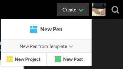
Codepen.io - Landind Page

● A online web editor, let's login with FB and create a pen!
● Besides simple web app template, there are also tons of
creation of designing, animation
Codepen.io - Works
Codepen.io - HowTo
1. Create -> New Pen
2. Change View -> Choose an "Editor layout"
The leftmost layout is recommended now.
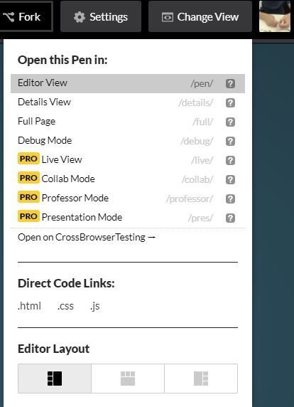
Codepen.io - Editor
CSS - Start
:fill(FFCC00,1)/182147263-56a9f69f3df78cf772abc6aa.jpg)
● Cascading Style Sheets, is a simple de-
sign language to make web pages
presentable.
CSS - Intro(1)
● Some most used properties about Text
color, font-size, letter-spacing, line-height, font-family...
CSS - Intro(2)
● Some most used properties about Box Model
display, position, margin, padding, width, height, background, border, box-shadow, border-radius...etc
CSS Selectors(1)
● Define the elements to which a set of CSS rules apply.
There are five kinds of selectors:
- Type selector
- Class selector
- ID selector
- Universal selector
- Attribute selector
CSS Selectors(2)
● Type selector
Selects all elements match the given element name.
CSS Selectors(3)
● Class selector
Selects all elements that have the given class attribute.
CSS Selectors(4)
● ID selector
Selects an element based on the value of its id attribute. There should be only one element with a given ID in a document.
CSS Selectors(5)
● Universal selector
Selects all elements. Optionally, it may be restricted to a specific namespace or to all namespaces.
CSS Selectors(6)
● Attribute selector
Selects elements based on the value of the given attribute.
CSS - Selectors(7)
○ A website to make you understand CSS selector
Practice makes better, right?
CSS Pseudo Family
● Pseudo Classes
○ :hover, :visited, :checked
● Pseudo Elements
○ ::before, ::after
CSS Specificity(1)
● Not only choose the right selector, but you shall need
to know how the specificity of style works.
1. style with suffix => !important
2. inline style => <span style="color: red"></span>
3. id selector
4. class, attribute, pseudo-classes selector
5. type selector and pseudo-elements selector
6. the latter where the style declare
● Each same style in different selectors would
be compared with the order below:
CSS Specificity(2)

每一層都是獨立的階級,不同階級就算數量上較多也贏不過上一層階級的;而當同階級同分時就會比對下一階層的總分,以此類推。
若依舊同分,則相同的屬性會以CSS stylesheet中最後設定的為主。
○ A website to make you calculate css specificity
CSS Layout - position(1)
● In order to make more complex layout, position is neccessary.
● There are four position value: static, relative, fixed and
absolute. By default, static is set.
CSS Layout - position(2)
● Très Bien, it's time to look at
margin and (top, right, bottom, left)
CSS Layout - display(1)
● The property display is most important in layout, each
HTML element has a default value. Most of them are set
to be block, some others are inline instead.
● display: block V.S display: inline
| display | block | inline |
|---|---|---|
| content | render at next line | render in same line |
| elements | div, p | span, a |
CSS Layout - display(2)
● Besides block and inline, there are inline-block, flex, inline-
flex, grid and so on. A quick demo is below.
CSS Layout - display(3)
● Wanna hide elements?
○ display: none
Also hide the space of the hidden elements.
○ visibility: hidden
The space of hidden elements remains.
CSS Layout - display(4)
● Nowadays, display: flex is one of the most import-
ant layout method in the modern web design.
○ A website to make you understand flex.
Let's Froggyee!
CSS Layout - box-sizing


● box-sizing: content-box;
● box-sizing: border-box;
CSS Layout - Reference
● The Basic Concept of Layout
● More practice about flex
● A great tutorial site again
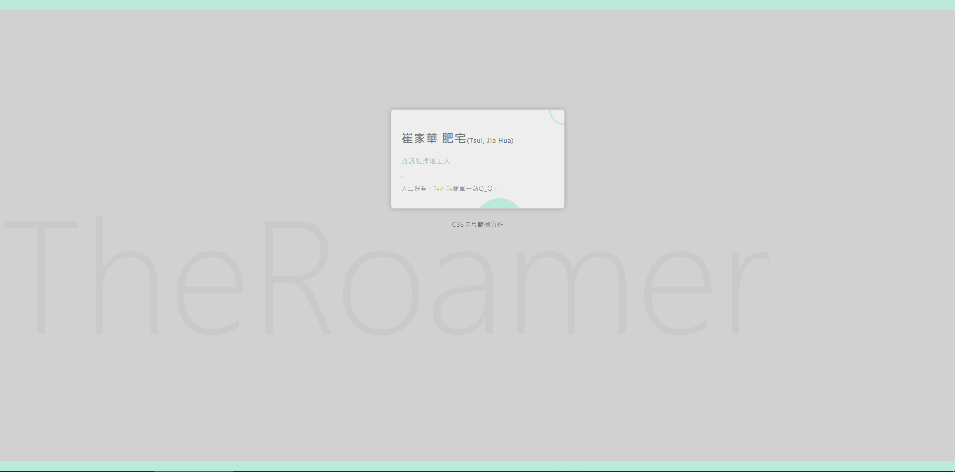
Practice - Make a profile card
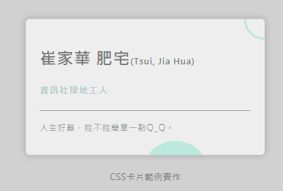
Make a profile card - Step 1
<!-- 首先,填入HTML部分 -->

<div class="mark">[要放在背景的潮Name]</div>
<div class="namecard">
    <h2>[您的名字]<span>([您的暱稱])</span></h2>
    <h5 class="job">[您的職稱]</h5>
    <hr/>
    <p>[您的座右銘]。</p>
    <div class="circle circle1"></div>
    <div class="circle circle2"></div>
</div>
<h2>CSS卡片範例實作</h2>
Make a profile card - Step 2
* {
  box-sizing: border-box;
}

html, body {
  width: 100%;
  height: 100%;
  padding: 0px;
  margin: 0px;
  color: #757A79;
}
● Add some global style at first
Make a profile card - Step 3
/*
  1. 增加body selector區塊
  2. 將背景顏色設為#d1d1d1
  3. 將body容器上下方增加框線,寬度為20px,顏色為#BBE9DB
  4. 再設定字體為"微軟正黑體"
*/

[selector] {
  [property1]: [value1];
  [property2]: [value2];
}

/* Hint */
/* 背景顏色: background-color */
/* 框線   : border           */
/* 字體   : font-family      */
● Follow the instructions below...
Make a profile card - Step 4
/*
  1. 選擇卡片區塊,設定其寬度為350px,高度為200px,背景顏色為#eee
  2. 接著設定內距為20px
  3. 將其水平置中,再與上邊外距200px
  4. 設定卡片邊圓角為6px
  5. 最後設定卡片陰影為0 0 15px rgba(0, 0, 0, 0.2)
*/

.namecard {
  /* Add some style here */
  /* --- */
  letter-spacing: 1px;
  font-weight: 100;
  overflow: hidden;
  border: solid 1px rgba(0, 0, 0, 0.15);
}

/* Hint */
/* 寬度: width                       */
/* 高度: height                      */
/* 內距: padding                     */
/* 外距: margin (水平置中為左右各50%)  */
/* 圓角: border-radius               */
/* 陰影: box-shadow                  */
● Follow the instructions below...
Make a profile card - Step 5
/*
  1. 以namecard為parent,增加其下h2, h5, p之樣式
  2. 設定h2字體大小為24px,字體粗細為700
  3. 再以該h2為parent,對其內部span設定字體大小為12px
  4. 設定p之行高為22px
*/

.namecard h2 {
  /* try it */
}

.namecard h2 span  {
  /* try it */
}

h5.job {
  color: #AECCC6;
  font-weight: 700;
}
p {
  font-size: 12px;
  /* add something */
}


/* 高度: height                      */
/* 內距: padding                     */
/* 外距: margin (水平置中為左右各50%)  */
/* 圓角: border-radius               */
/* 陰影: box-shadow                  */
● Follow the instructions below...
Make a profile card - Step 6
/*
  1. 接下來要來搞定兩個圓形圖案,先定義好circle的基本樣式
  2. 接著把circle變成圓形(border-radius)
  3. 把circle1擺在卡片底部;把circle2擺在卡片右上(offset)
  4. circle2改為僅有相同顏色之框線,背景色改為透明
*/

<!-- Step1, Step2 -->
.circle {
  position: absolute;
  width: 100px;
  height: 100px;
  background-color: #BBE9DB;
  border-radius: ???;
}

<!-- Step3, Step4 -->
.circle.circle1 {
  right: ???;
  bottom: ???;
}

.circle.circle2{
  width: 60px;
  height: 60px;
  right: ???;
  top: ???;
  background-color: ???;
  border: ???;
}
● Follow the instructions below...
Make a profile card - Step 7
/*
  1. 最後,我們要來處理背景的文字
  2. 請選擇背景文字區塊,將文字大小改為300px(或自行調整)
  3. 再來把其位置固定在背景區塊,離底部200px處
  4. 最後設定字體粗細為100,顏色為帶有透明度之黑色
  5. 大功告成! 把你的傑作分享到社團裡吧~
*/

.mark {
  /* Add some style */
}
● Follow the instructions below...
Make a profile card - More
Too easy?
Of course, I know, this practice merely shows a little part of your talent. Why not create your card with a new style?
CSS - Transition(1)
CSS - Transition(2)
CSS - Animation(1)
Let's Practice!!
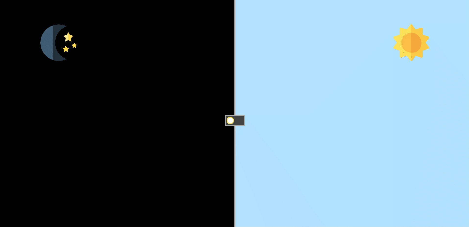
Switch Between Day&Night
The Origin Pen:
Author: Alberto Hartzet
Day&Night Switch - Step 1
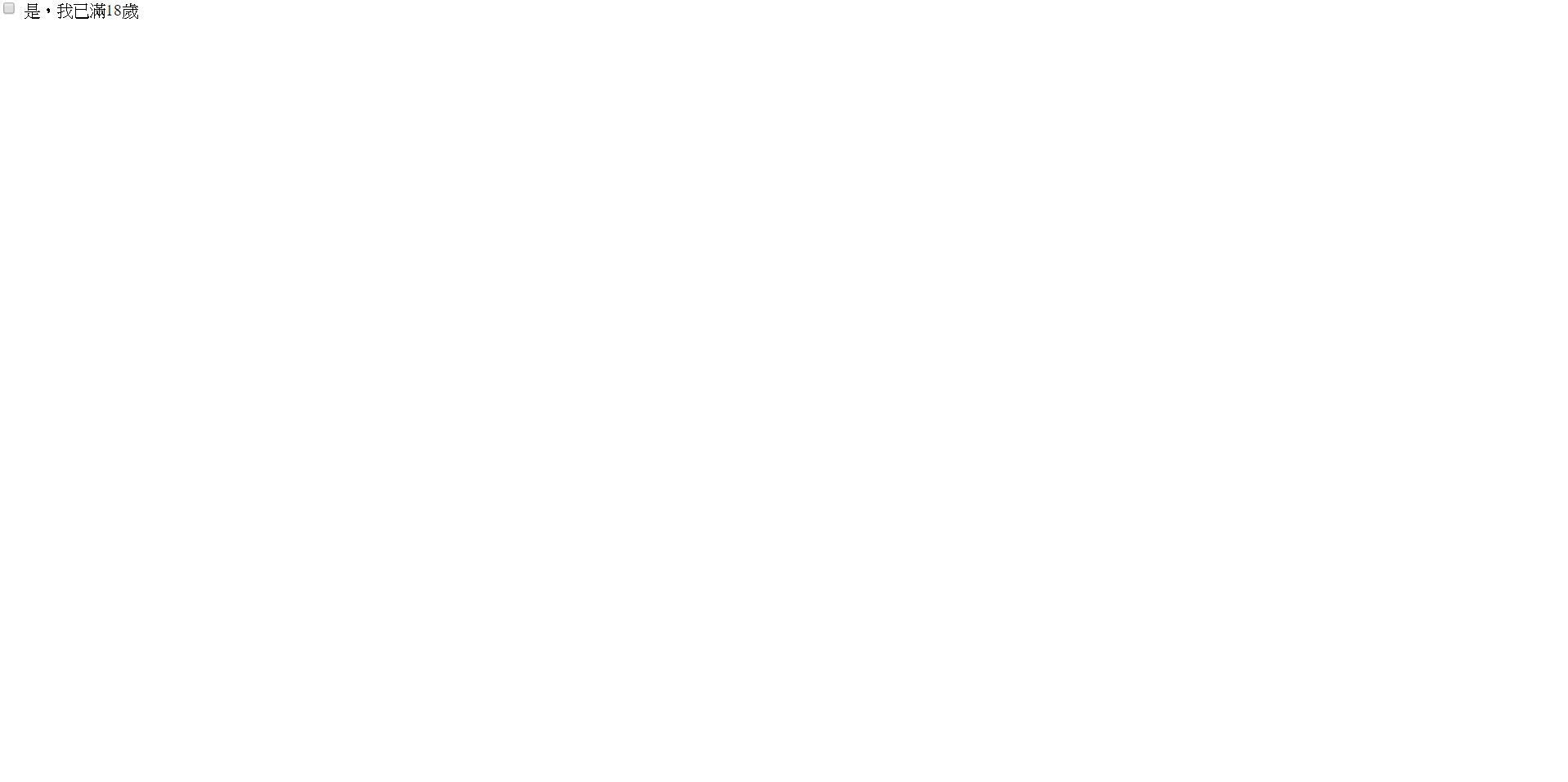
<!-- 請新增一個id為switch的核選方塊
     hint: <input> -->
<input ...>
<!-- 並在下方新增一個label,屬性for的值為
     核選方塊的id -->
<label>是,我已年滿18歲</label>
/* Initialize */
* {
box-sizing: border-box;
}
html, body {
margin: 0;
padding: 0;
height: 100%;
min-height: 100%;
}
● First, create a new "pen" to practice, copy the code below and paste to the right place.
html
css
Attribute for="switch" does something, try to figure out. (Hint: Change the value of "id" of the input element.)
Tips:
Result:
Day&Night Switch - Step 2
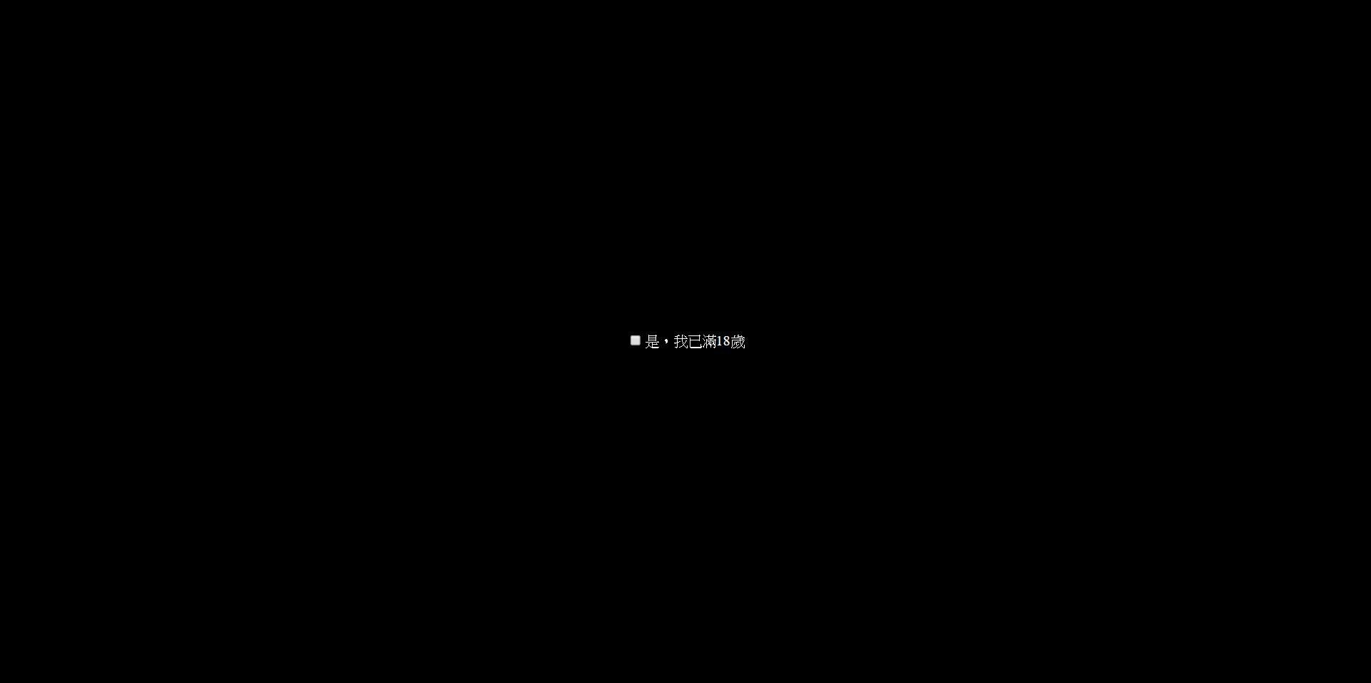
body {
  /*
    使用flex,將checkbox置中吧
  */

  /* 將高度設為 100% view height */
  min-height: 100vh;
  max-height: 100vh;

  /* 設定背景顏色為 #111 */
  background-color: #111;

  /* 字體顏色設定為白色 */
  color: white;

  /* 任何超出頁面的部分都將被隱藏 */
  overflow: hidden;
}
● You got a checkbox right? Try to center it both horizontal and vertical.
css(with comment)
body {
  /*
    使用flex,將checkbox置中吧
  */

  min-height: 100vh;
  max-height: 100vh;
  background-color: #111;
  color: white;
  overflow: hidden;
}
css(use this)
Result:
Day&Night Switch - Step 3
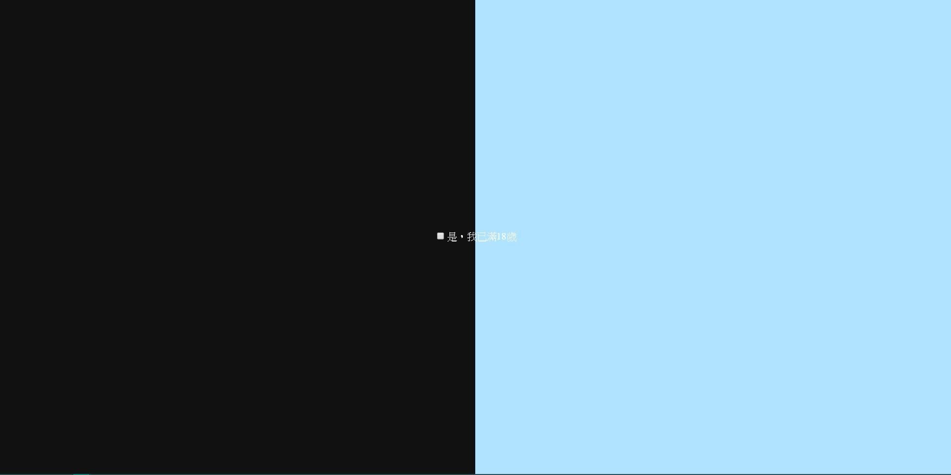
● Then add the day&night background
.back {
  /* Add something */

  /* Fixed to whole page */
  position: fixed;
  top: 0;
  left: 0;
  right: 0;
  bottom: 0;
}
.back div {
  width: 50%;
}
.back .left {
  background-color: #111;
}
.back .right {
  background-color: #B0E3FF;
}
css
<input type="checkbox" class="toggle" id="switch">
<label for="switch">是,我已年滿18歲</label>
<div class="back">
  <div class="left"></div>
  <div class="right"></div>
</div>
html
Result:
Day&Night Switch - Step 4
● Before customizing the checkbox, we would like to check one thing, how to change background by clicking the checkbox?
.toggle:checked ~ .back .left {
  background-color: #B0E3FF;
}
.toggle:checked ~ .back .right {
  background-color: #111;
}
css
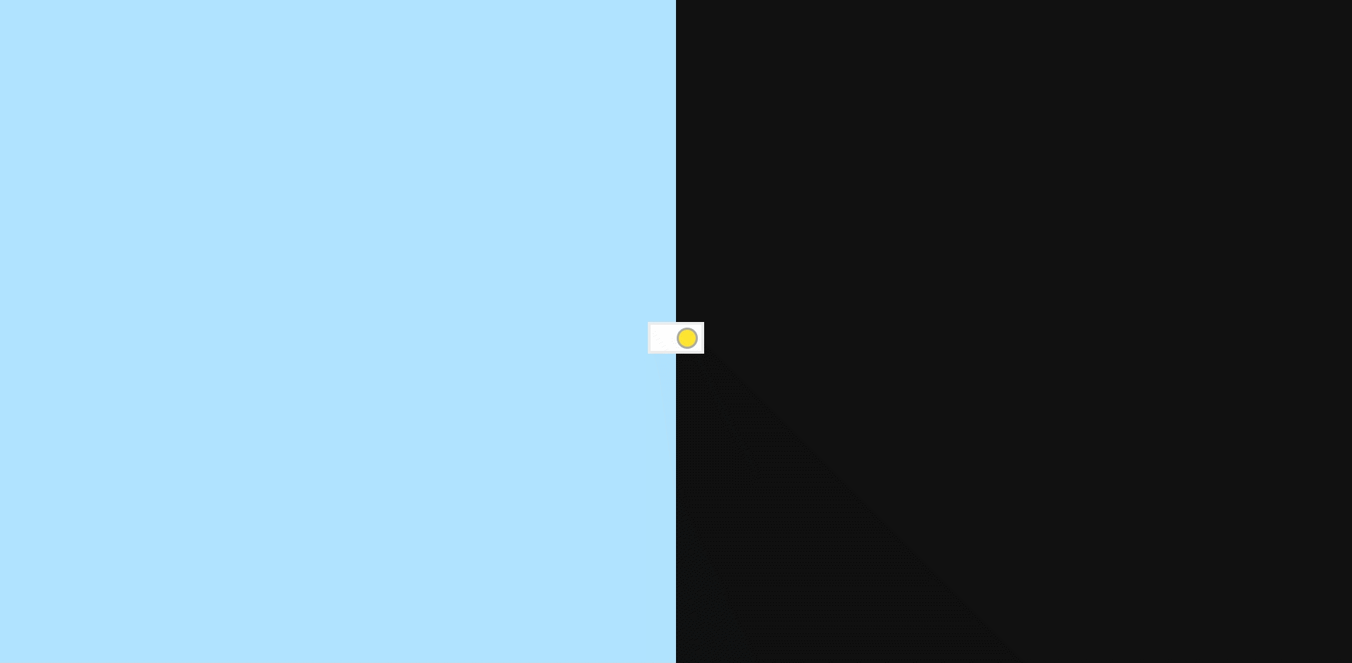
Day&Night Switch - Step 5
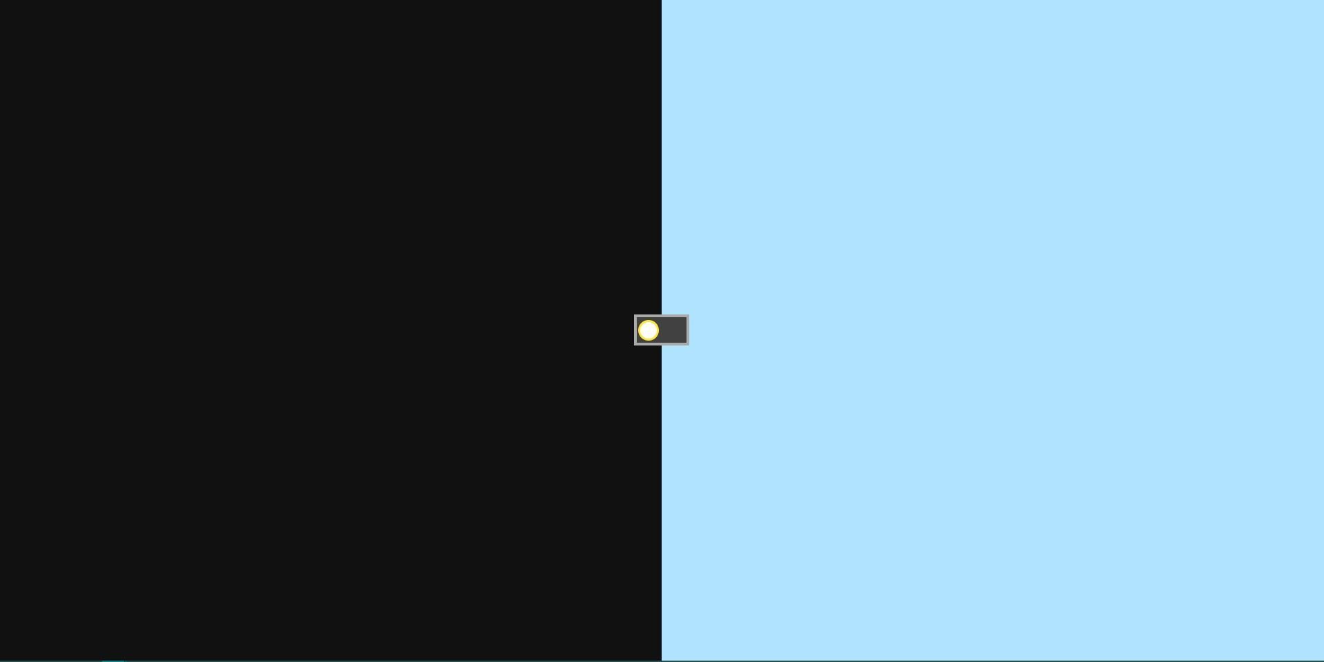
● Okay, having the switch, now we need to customize the switch. Place the switcher in the right place.
/* Hide the checkbox */
.toggle {
  display: none;
}

/* Make the switch */
label {
  /* Add some styles below */

  width: 64px;
  height: 36px;
  background-color: #414141;
  border: 3px solid #aaa;
  z-index: 1;
  cursor: pointer;
}
label .switcher {
  box-sizing: border-box;
  width: 24px;
  height: 24px;
  margin-left: 2px;
  background: #fff;
  border-radius: 50%;
  border: 2px solid #ffe633;
}
css
<input type="checkbox" class="toggle" id="switch">
<label for="switch">
  <div class="switcher"></div>
</label>
html
Result:
Day&Night Switch - Step 6
● Handle the style after clicked the switch
/* Handle the style after the checkbox has been checked */
.toggle:checked ~ label {
  background: #fff;
  border-color: #eee;
}
.toggle:checked ~ label .switcher {
  background: #ffe633;
  border-color: #aaa;
  transform: translateX(28px);
}
css
Result:
Day&Night Switch - Step 7
● Handle the style after clicked the switch
/* Handle the style after the checkbox has been checked */
.toggle:checked ~ label {
  background: #fff;
  border-color: #eee;
}
.toggle:checked ~ label .switcher {
  background: #ffe633;
  border-color: #aaa;
  transform: translateX(28px);
}
css
CSS - RWD

@media (min-width: 350px) and (max-width: 700px) {
  .switch-container {
    height: 100px;
    width: 32px;
  }

  label {
    transform: rotateZ(90deg);
  }

  .back {
    flex-direction: column;
  }
  .back::before {
    transform: rotateZ(90deg);
  }
  .back div {
    width: 100%;
    height: 50%;
  }
}
CSS - Practice(Enhanced)
CSS - Animation(1)
CSS - Animation(2)
@keyframes moonSlideIn {
  from {
    transform: translateY(-400px);
    opacity: 0;
  }
  to {
    transform: translateY(0);
    opacity: 1;
  }
}
@keyframes moonSlideOut {
  from {
    transform: translateY(0);
    opacity: 1;
  }
  to {
    transform: translateY(-400px);
    opacity: 0;
  }
}
@keyframes sunSlideIn {
  from {
    transform: translateY(100vh);
    opacity: 0;
  }
  to {
    transform: translateY(0);
    opacity: 1;
  }
}

@keyframes sunSlideOut {
  from {
    transform: translateY(0);
    opacity: 1;
  }
  to {
    transform: translateY(100vh);
    opacity: 0;
  }
}
CSS - Practice(Finished)
Thanks for your listening!
HTML&CSS-1(2018/11/15)
By David Tsui


