Drawing with CSS
By- Deepak Verma
Consultant UI/UX, Equal Experts
Agenda
2. Pure CSS Images
i. Box model
ii. Common CSS Properties
iii. Basic Geomerty
4. Demo 1
5. Benefits
6. SVG vs CSS
7. References
1. Why this talk?
3. What we need to know before we start.
Why this talk?
What's my motivation for this talk?
7. References

Why this talk?
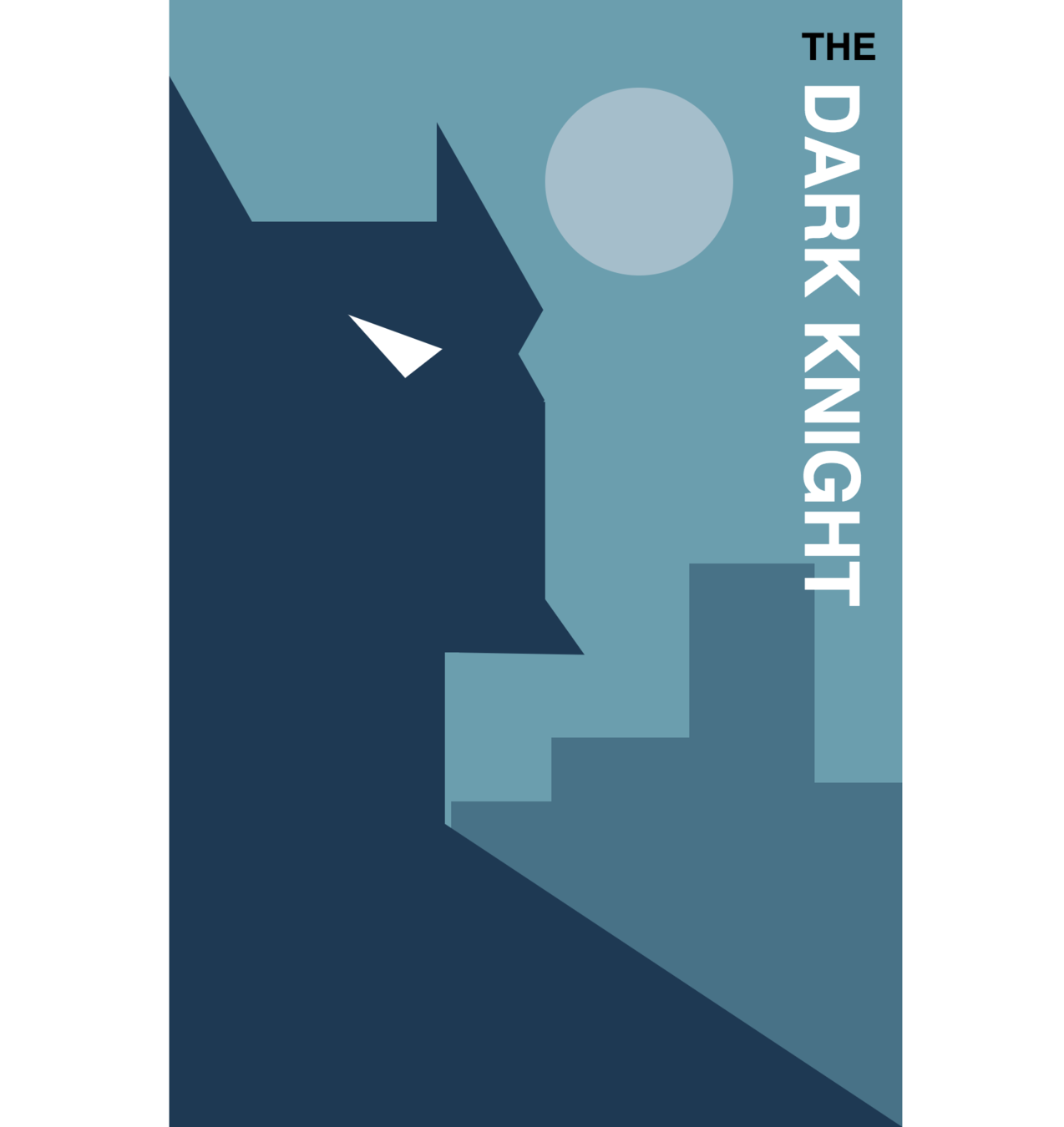
Made in SCSS as exemplar for OOCSS, SMACSS & BEM.
Why this talk?
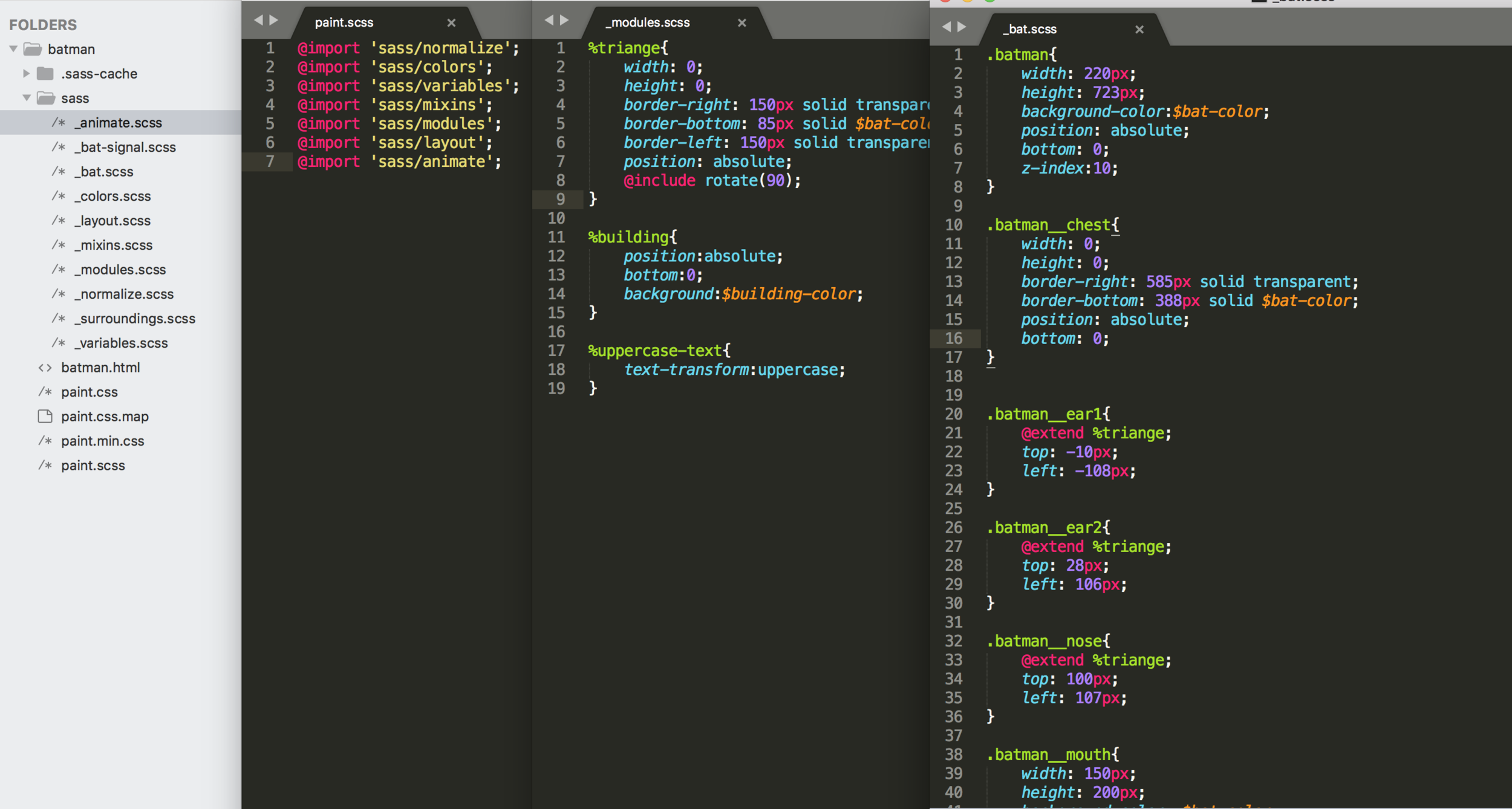
SCSS code for BATMAN
- Learning and showcasing complex things in a fun way.
- Bring out our artistic side and motivates to explore more.
Why this talk?
It helped me in -
Pure CSS examples
Pure CSS examples
A pen by Wontem
Pure CSS examples
A pen by Julia Muzafarova
Pure CSS examples
A pen by Fabrizio Bianchi
Pure CSS examples
What we need to know before starting
i. Box model
ii. Common CSS Properties
iii. Basic Geomerty
CSS Box Model
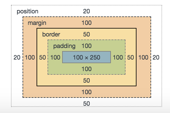
(Transparent)
Content
Padding
Border
Margin
CSS Box Model
.container{
  width: 200px;
  height: 200px;
  background: red;
  padding: 20px;
  margin: 50px;
  border: 30px solid blue;
}
.container{
  width: 200px;
  height: 200px;
  background: red;
  padding: 20px;
  margin: 50px;
  border: 30px solid blue;
  box-sizing: border-box;
}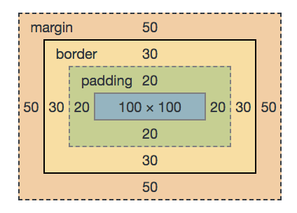
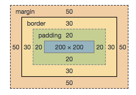
Box-sizing
With box-sizing: border-box, padding and border widths are taken out of content widths.
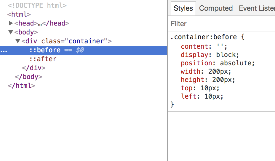
Common CSS Properties
Psudo Elements
:before
:after
Border-radius
Box-shadow
Background
linear-gradient
Radial-gradient
Common CSS Properties
Psudo Elements

:before
:after
div
:before
:after
Common CSS Properties
Psudo Elements
:before
:after
.container:before{
    content:"";
    width:300px;
    height:150px;
    position:absolute;
    display:block;
    top:50px;
    left:20px;
}
.container:after{
content:"";
width:200px;
height:200px;
position:absolute;
display:block;
top:10px;
left:20px;
}
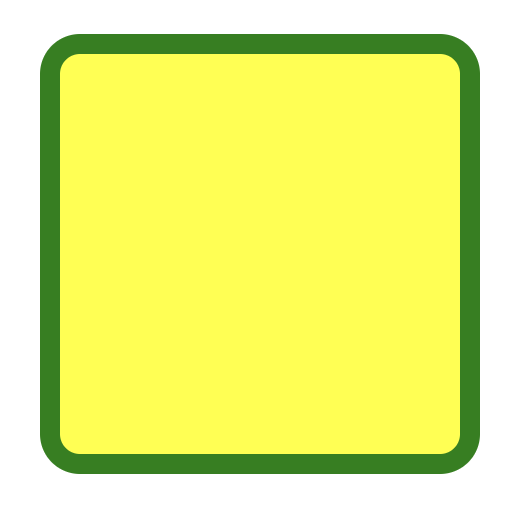
Common CSS Properties
Border-radius
.container{
  width:200px;
  height:200px;
  border:10px solid green;
  margin:0 auto;
  background:yellow;
  border-radius:20px;
}
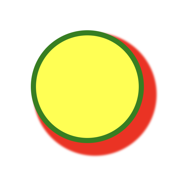
Common CSS Properties
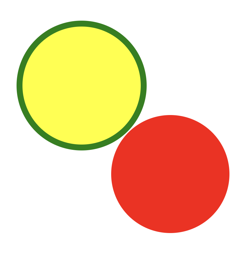
Box-shadow
.container {
    background-color: yellow;
    width: 200px;
    height: 200px;
    border: 10px solid green;
    border-radius: 50%;
    box-shadow: 15px 15px 5px 10px red;
}
.container {
background-color: yellow;
width: 200px;
height: 200px;
border: 10px solid green;
border-radius: 50%;
box-shadow: 150px 150px 0px -10px red;
}
.container {
    background-color: yellow;
    width: 200px;
    height: 200px;
    border: 10px solid green;
    border-radius: 50%;
    box-shadow: 150px 150px 0px -10px red,
                150px -150px 0px -20px blue,
                -150px 150px 0px 10px magenta,
                -150px -150px 0px -30px cyan;
}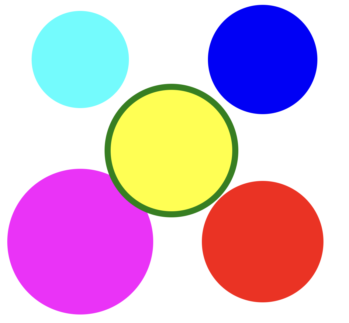
This property that can be exploited!!
X co-ordinate
Y co-ordinate
Blur
Spread
Color
Common CSS Properties
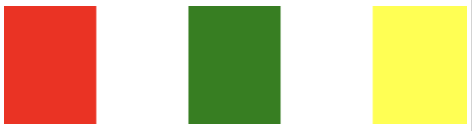
.container {
    width: 200px;
    height: 200px;
    background:
        linear-gradient(red,yellow);
}

.container {
    width: 200px;
    height: 200px;
    background:
        linear-gradient(
            to right,
            red, yellow
        );
}
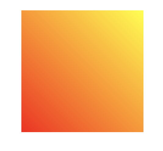
.container {
    width: 200px;
    height: 200px;
    background:
        linear-gradient(
            45deg, red, yellow);
}
.container {
    width: 200px;
    height: 200px;
    background:
        linear-gradient(
            45deg,
            red 25%,
            yellow 50%,
            blue 75%,
            green 100%
        );
}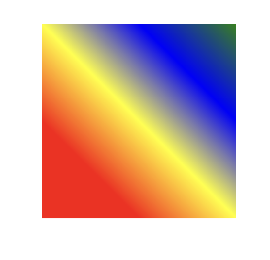
Background -linear gradient
Common CSS Properties
.container{
height: 100px;
border: 5px solid blue;
    background:
        linear-gradient(
            to right,
            red 20%,
            transparent 20%,
            transparent 40%,
            green 40%,
            green 60%,
            transparent 60%,
            transparent 80%,
            yellow 80%,
            yellow 100%
           );
}
Background -linear gradient
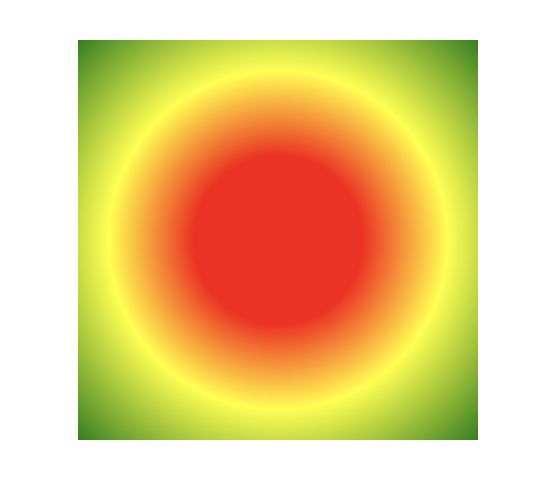
.container {
    width: 200px;
    height: 200px;
    background:
        radial-gradient(
            red 30%,
            yellow 60%,
            green 100%
        );
}
Common CSS Properties
Background -radial gradient
Common CSS Properties
Background -radial gradient
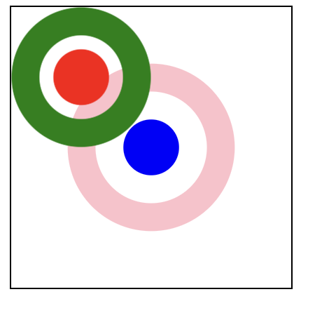
.container{
    width:200px;
    height:200px;
    border:1px solid #000;
    background:
        radial-gradient(
          circle at 50px 50px,
          red 20px,
          transparent 20px,
          transparent 30px,
          green 30px,
          green 50px,
          transparent 50px),
        radial-gradient(
          circle at center center,
          blue 20px,
          transparent 20px,
          transparent 40px,
          pink 40px,
          pink 60px,
          transparent 60px);
}
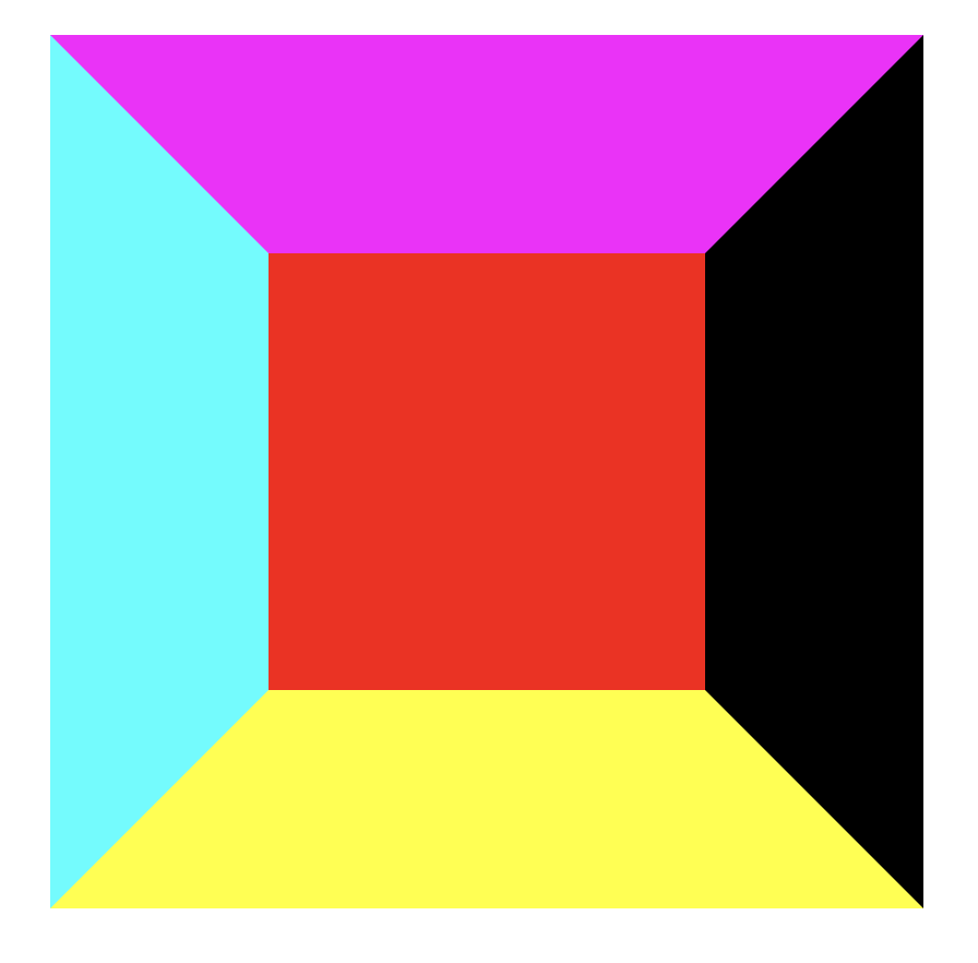
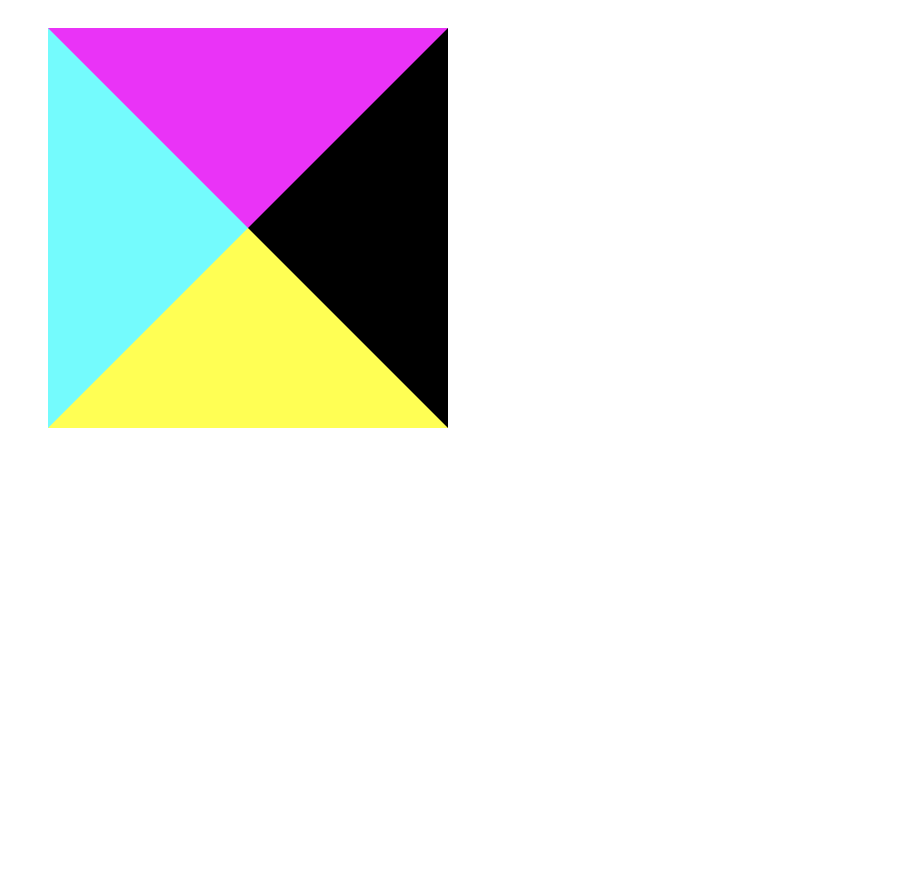
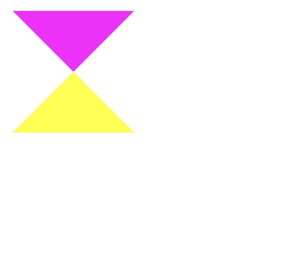
Basic Geometry
Every thing is a rectangle.
Basic Geometry
Basic Geometry
.container {
    border:
        100px solid rgba(0, 255, 255, 1);
    width: 200px;
    height: 200px;
    background: red;
}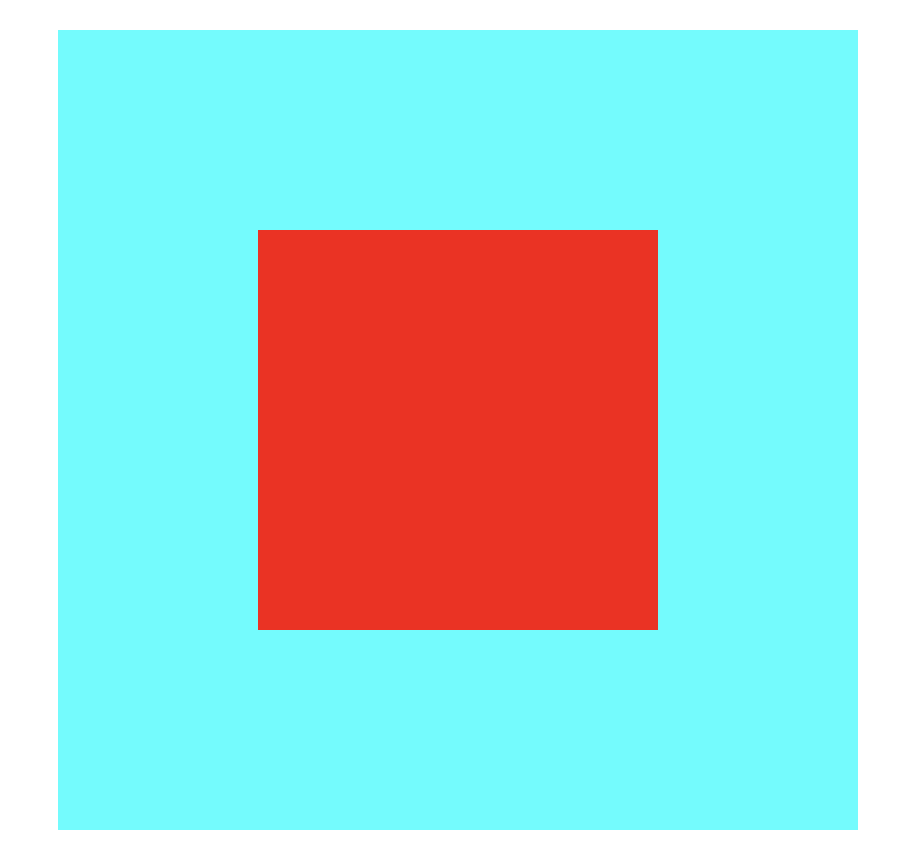
.container {
    border-top:
        100px solid rgba(255, 0, 255, 1);
    border-right:
        100px solid rgba(0, 0, 0, 1);
    border-bottom:
        100px solid rgba(255, 255, 0, 1);
    border-left:
        100px solid rgba(0, 255, 255, 1);
    width: 0;
    height: 0;
    background: red;
}
.container {
    border-top:
        100px solid rgba(255, 0, 255, 1);
    border-right:
        100px solid rgba(0, 0, 0, 0);
    border-bottom:
        100px solid rgba(255, 255, 0, 1);
    border-left:
        100px solid rgba(0, 255, 255, 0);
    width: 0;
    height: 0;
    background: transparent;
}
.container {
    border-top:
        100px solid rgba(255, 0, 255, 1);
    border-right:
        100px solid rgba(0, 0, 0, 0);
    border-bottom:
        100px solid rgba(255, 255, 0, 0);
    border-left:
        100px solid rgba(0, 255, 255, 0);
    width: 0;
    height: 0;
    background: transparent;
}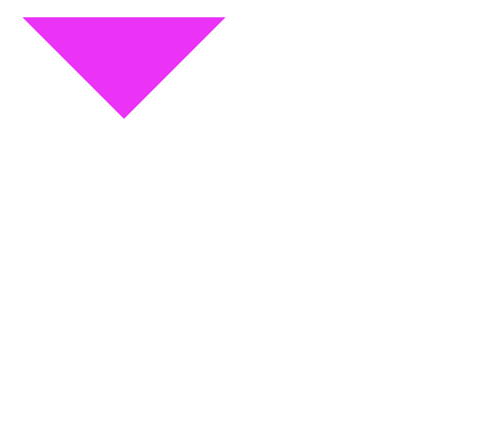
Transform
Basic Geometry
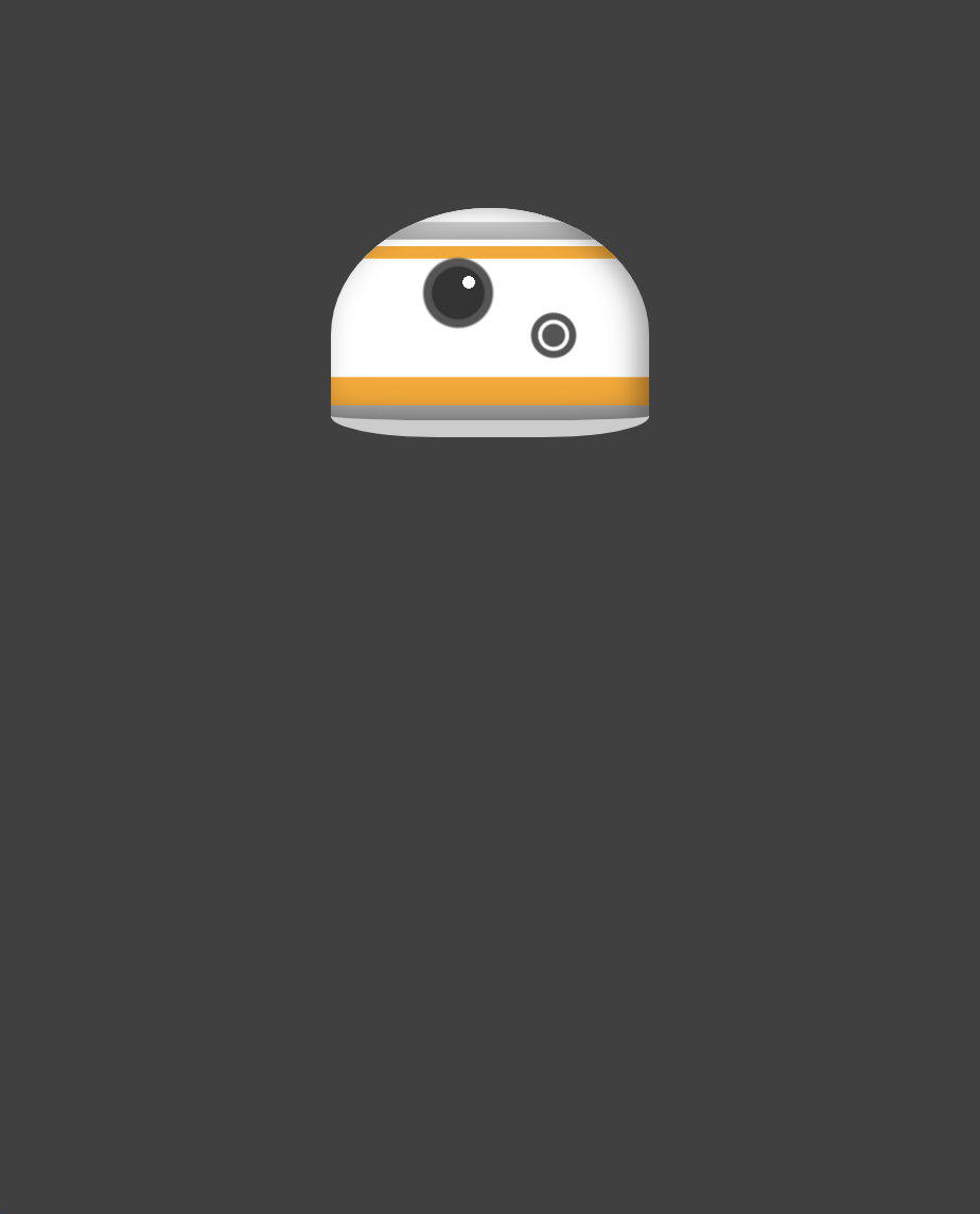
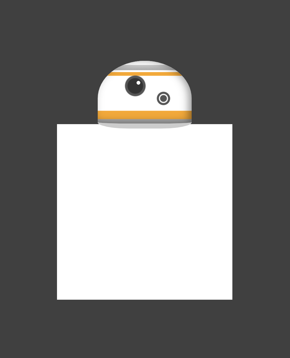
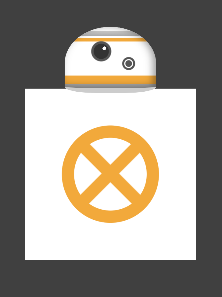
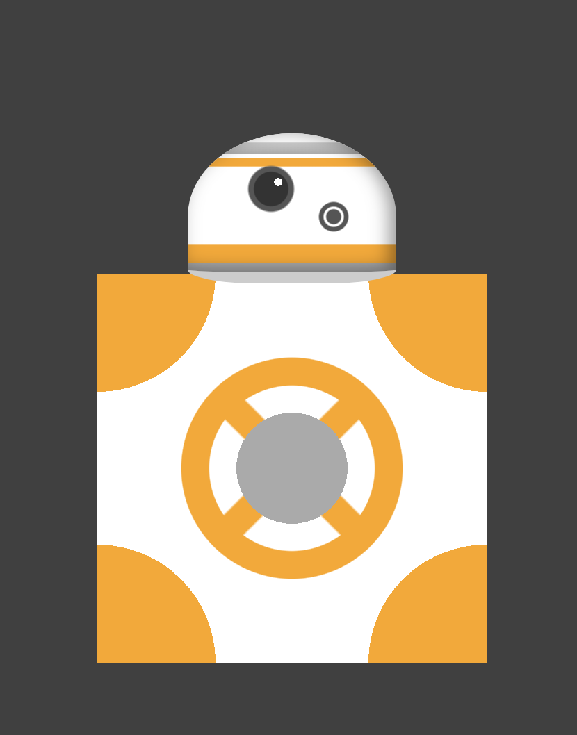
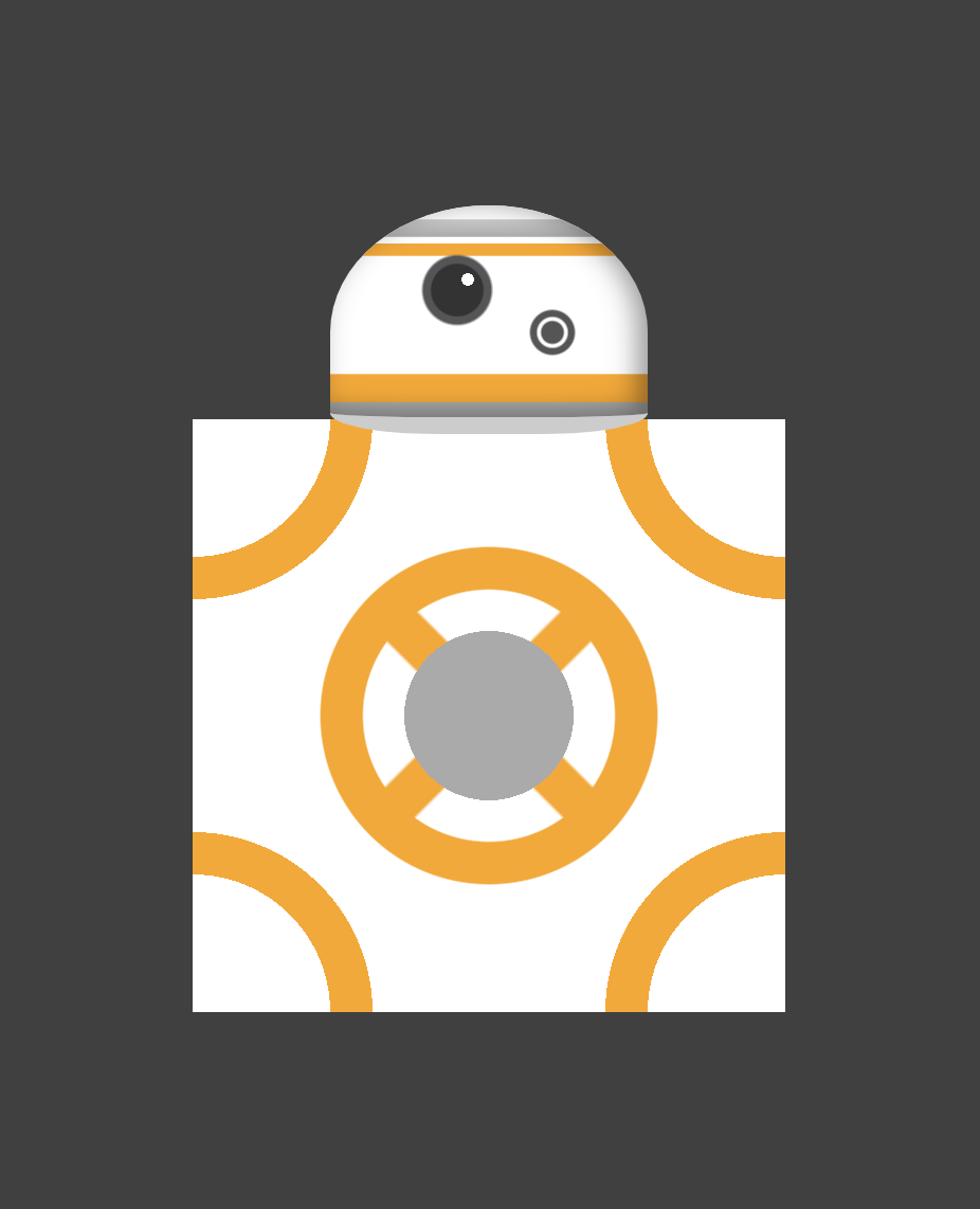
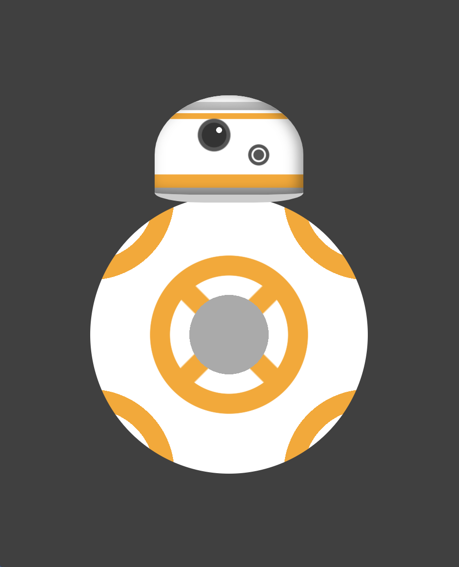
Demo 1
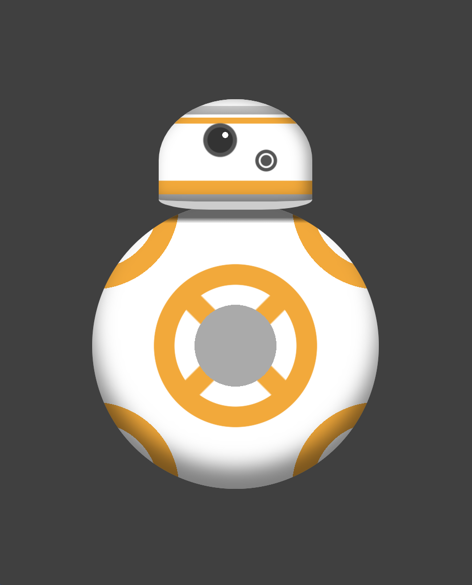
Star Wars BB-8
We will make it with one div
Demo1 - BB-8

Demo1 - BB-8

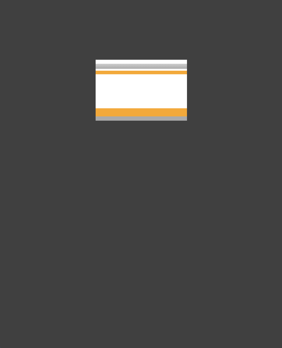
.bb-8{
    width: 150px;
    height: 100px;
    background: #fff;
    margin: 100px auto;
}
.bb-8{
    width: 150px;
    height: 100px;
    background: #fff;
    margin: 100px auto;
    background:
        linear-gradient(
            to bottom,
            white 7px,
            #ccc 7px,
            #aaa 15px,
            white 15px,
            white 18px,
            #ffa500 18px,
            #ffa500 24px,
            transparent 24px,
            transparent 80px,
            #ffa500 80px,
            #ffa500 93px,
            #aaa 93px);
}
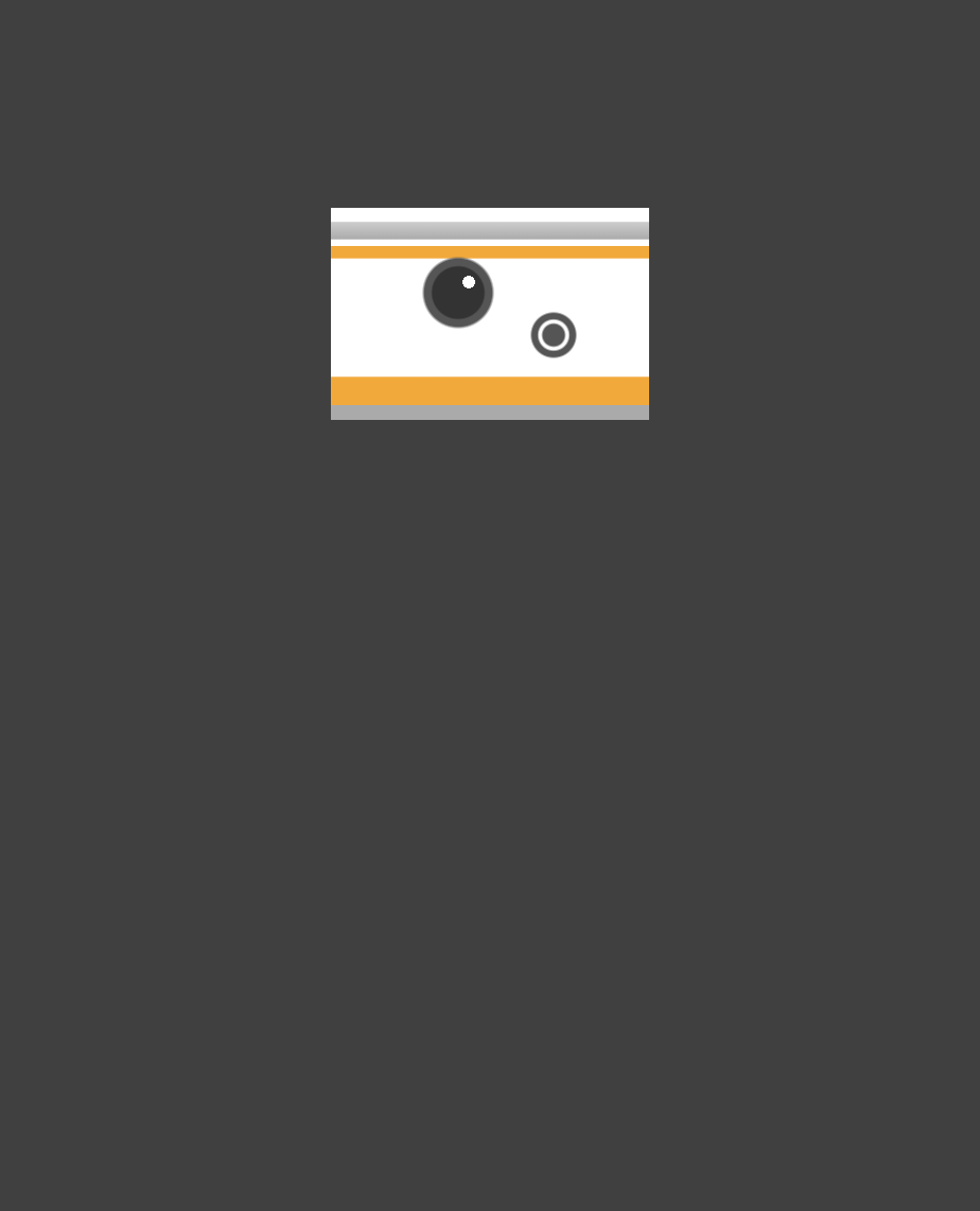
.bb-8{
    width: 150px;
    height: 100px;
    background: #fff;
    margin: 100px auto;
    background:
        radial-gradient(
            circle at 105px 60px,
            #555 5px,
            trans 6px),
         radial-gradient(
            circle at 105px 60px,
            white 7px,
            trans 8px),
         radial-gradient(
            circle at 105px 60px,
            #555 10px,
            trans 11px),
         radial-gradient(
            circle at 65px 35px,
            #fff 3px,
            trans 3px),
         radial-gradient(
            circle at 60px 40px,
            #333 12px,
            trans 13px),
         radial-gradient(
            circle at 60px 40px,
            #555 16px,
            trans 17px),
     linear-gradient( to bottom...,
}
Demo1 - BB-8

.bb-8{
    width: 150px;
    height: 100px;
    background: #fff;
    margin: 100px auto;
    background:
     linear-gradient(to bottom...,
     radial-gradient(circle at...
     ...
     radial-gradient(circle at...
     border-radius: 50%/60px;
}
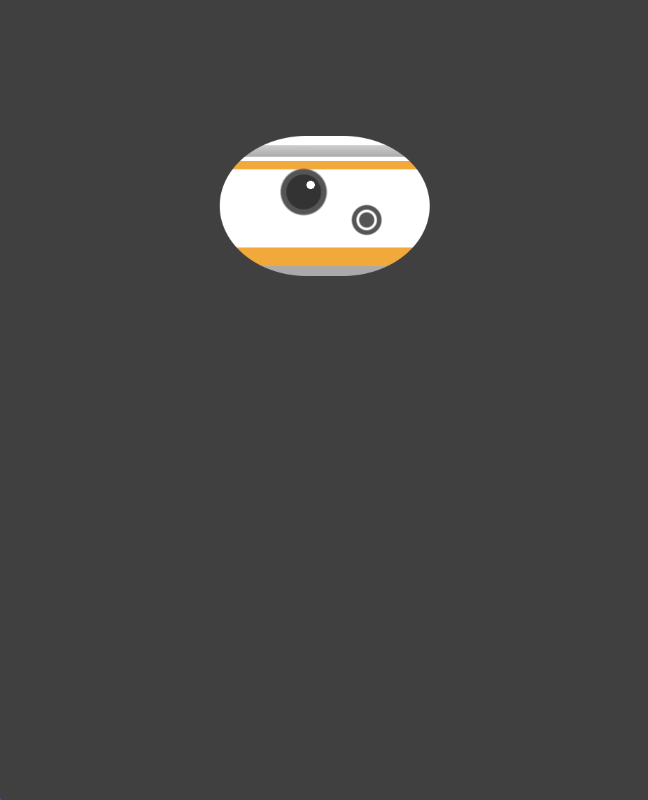
.bb-8{
    width: 150px;
    height: 100px;
    background: #fff;
    margin: 100px auto;
    background:
     linear-gradient( to bottom...,
     radial-gradient(circle at...
     ...
     radial-gradient(circle at...
     border-radius: 50%/60px;
     border-bottom-right-radius:
                            50px 10px;
     border-bottom-left-radius:
                            50px 10px;
}
.bb-8{
    width: 150px;
    height: 100px;
    background: #fff;
    margin: 100px auto;
    background:
     linear-gradient( to bottom...,
     radial-gradient(circle at...
     ...
     radial-gradient(circle at...
     border-radius: 50%/60px;
     border-bottom-right-radius:
                            50px 10px;
     border-bottom-left-radius:
                            50px 10px;
     border-bottom: 8px solid #ccc;
     box-shadow:
            inset -5px -2px 20px 0px
                  rgba(0, 0, 0, 0.4);
}
Demo1 - BB-8

.bb-8{
    ...
}
.bb8:before, .bb8:after {
    content: '';
    display: block;
    position: absolute;
    width: 280px;
    height: 280px;
    margin-top: 101px;
    z-index: -1;
    margin-left: -65px;
}
&:before{
    background-color: #fff;
}
.bb-8{
...
}
.bb8:before, .bb8:after {
...
}
&:before{
background-color: #fff;
background:
linear-gradient(
45deg,
transparent 190px,
#ffa500 190px,
#ffa500 210px,
transparent 210px),
linear-gradient(
-45deg,
transparent 190px,
#ffa500 190px,
#ffa500 210px,
transparent 210px);
}
.bb-8{
    ...
}
.bb8:before, .bb8:after {
    ...
}
&:before{
    background-color: #fff;
    background:
      radial-gradient(
          circle at center center,
          transparent 60px,
          #ffa500 60px,
          #ffa500 80px,
          #fff 80px,
          #fff 100px),
      radial-gradient(circle...);
      linear-gradient(45deg...),
      linear-gradient(-45deg...),

}
Demo1 - BB-8

.bb8:before, .bb8:after {
    ...
}
&:before{
    background-color: #fff;
    background:
      radial-gradient(
        ellipse at top right,
        #ffa500 85px,
        transparent 85px),
      radial-gradient(
        ellipse at bottom right,
        #ffa500 85px,
        transparent 85px),
      radial-gradient(
        ellipse at top left,
        #ffa500 85px,
        transparent 85px),
      radial-gradient(
        ellipse at bottom left,
        #ffa500 85px,
        transparent 85px),
      radial-gradient(circle...),
      radial-gradient(circle...),
      linear-gradient(45deg...),
      linear-gradient(-45deg...),

}
.bb8:before, .bb8:after {
...
}
&:before{
background-color: #fff;
background:
radial-gradient(
circle at center center,
#aaa 40px,
transparent 40px),
radial-gradient(circle...);
linear-gradient(45deg...),
linear-gradient(-45deg...),
}
.bb8:before, .bb8:after {
    ...
}
&:before{
    background-color: #fff;
    background:
      radial-gradient(
        ellipse at top right,
        #fff 65px,
        transparent 65px),
      radial-gradient(
        ellipse at bottom right,
        #fff 65px,
        transparent 65px),
      radial-gradient(
        ellipse at top left,
        #fff 65px,
        transparent 65px),
      radial-gradient(
        ellipse at bottom left,
        #fff 65px,
        transparent 65px),
      radial-gradient(ellipse...),
      radial-gradient(ellipse...),
      radial-gradient(ellipse...),
      radial-gradient(ellipse...),
      radial-gradient(circle...),
      radial-gradient(circle...),
      linear-gradient(45deg...),
      linear-gradient(-45deg...),

}
Demo1 - BB-8
.bb8:before, .bb8:after {
    ...
    border-radius: 50%;
}
&:before{
    background-color: #fff;
    background:
      radial-gradient(ellipse...),
      radial-gradient(ellipse...),
      radial-gradient(ellipse...),
      radial-gradient(ellipse...),
      radial-gradient(ellipse...),
      radial-gradient(ellipse...),
      radial-gradient(ellipse...),
      radial-gradient(ellipse...),
      radial-gradient(circle...),
      radial-gradient(circle...),
      linear-gradient(45deg...),
      linear-gradient(-45deg...);

}
.bb8:before, .bb8:after {
...
border-radius: 50%;
}
&:before{
...
background:
radial-gradient(ellipse...),
...
linear-gradient(-45deg...);
}
&:after{
background-image:
linear-gradient(
to bottom,
rgba(0, 0, 0, 0.6) 15px,
transparent 20px
);
box-shadow:
inset 0 -20px
30px 30px
rgba(0, 0, 0, 0.5);
}Demo1 - BB-8
.bb8:before, .bb8:after {
    ...
    border-radius: 50%;
}
&:before{
    background
      ...
      linear-gradient(-45deg...);

    animation: spin 2s infinite linear;
}
@keyframes spin {
    0% {
        transform: rotate(0)
    }
    100% {
        transform: rotate(-360deg)
    }
}
&:after{
    background-image:
        linear-gradient(...);
    box-shadow:
        inset 0 -20px
        30px rgba(0, 0, 0, 0.5);
}
Benefits
Exploration
High fidelity prototypes
Makes learning fun
SVG vs CSS
Use SVG for web graphics and icons
References
https://codepen.io/deepakverma05/pen/ERQqbe
https://developer.mozilla.org/en-US/docs/Web/CSS/border-radius
https://developer.mozilla.org/en-US/docs/Web/CSS/box-shadow
https://www.w3.org/TR/css3-images/
https://a.singlediv.com/
https://webdesign.tutsplus.com/articles/15-inspiring-examples-of-css-animation-on-codepen--cms-23937
https://codepen.io/tag/pure-css/
https://www.youtube.com/watch?v=qo69d609fnk
https://www.youtube.com/watch?v=l7VUhEdM2aY
Thank You!
drawing with css
By deepakux
drawing with css
This presentation explains how to draw using css. Presented at Equal Experts on ExpertTalks meetup group.
