CSS Media Queries
Learning Objectives
- Describe in your own words the idea of Responsive Web Design
- Explain the history of RWD (Ethan Marcotte)
- Explain the principle of mobile first
- Explain that CSS media queries require a type and a feature
- Explain the concept of breakpoints and how to determine them
- Describe how CSS media queries function like a conditional/”if” statement
- Describe the importance of the viewport meta tag
- Test responsive pages using a tool like Screenfly
- Explain the difference between the CSS declarations display:none, visibility:hidden, & opacity: 0;
"Everybody Writes"
- Describe in your own words the idea of Responsive Web Design
- Explain history of Responsive Web Design (Ethan Marcotte)
/* Phones ----------- */
 @media only screen and (max-width : 767px) {
    p {
      font-size: 18px;
    }
}

/* Tablets ----------- */
 @media only screen and (min-width : 768px) {
    p {
      font-size: 16px;
    }
}
@media queries
≅
if statements
if320 px—Mobile portrait
480 px—Mobile landscape
600 px—Small tablet
768 px—Tablet portrait
1024 px—Tablet landscape & Laptop
1280 px and up—Desktop
Common Breakpoints
- Explain in your own words the concept of Mobile First
Mobile First
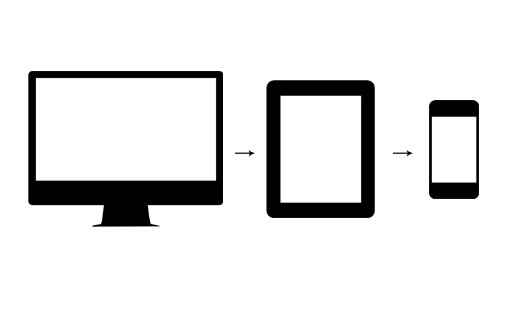
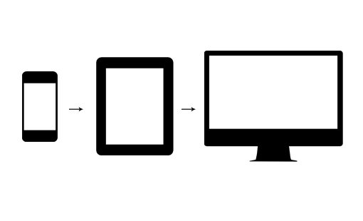
Why do we care about Mobile First?
Viewport Meta Tag
<meta name="viewport" content="width=device-width, initial-scale=1">display: none
visibility: hidden
opacity: 0
vs
vs
Homework
Use media queries to create a stacked navigation at a specified breakpoint
CSS Media Queries
By Dize Hacioglu