1. Keep the Design Simple
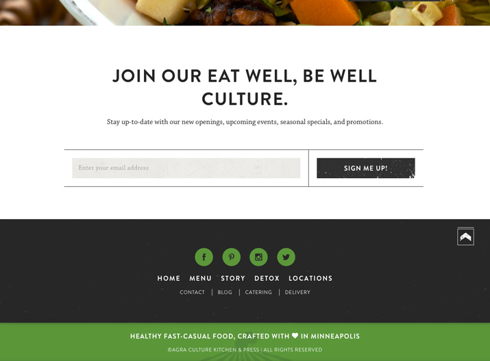
- agra 在 footer 使用有條理且清楚的元素
- 資訊愈多,設計要愈簡單。
- 利用足夠的空間,來突顯內容。
2. Link to Your Information
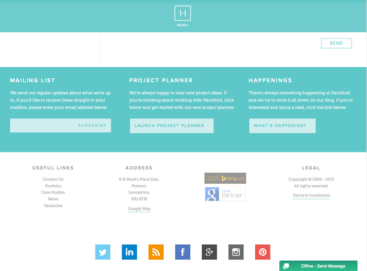
- Heckford 使用了非常大量的連結資訊。
- 大家習慣在 footer 尋找 About Us、Contact Us。
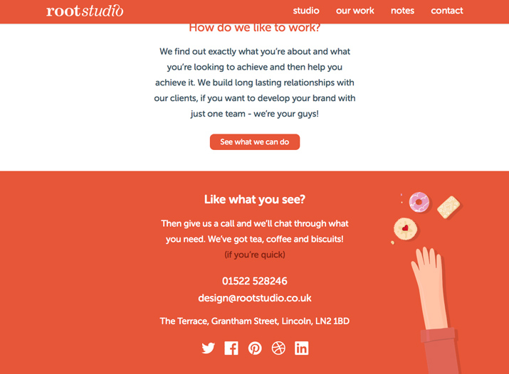
3. Include Basic Contact Information
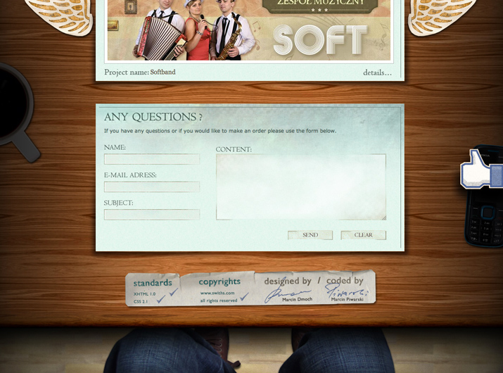
- Root Studio 在footer放了很完整的聯絡資訊
- 在 footer 留基本的聯絡資料,會比給使用者一個連結好。
4. Organize Footer Links
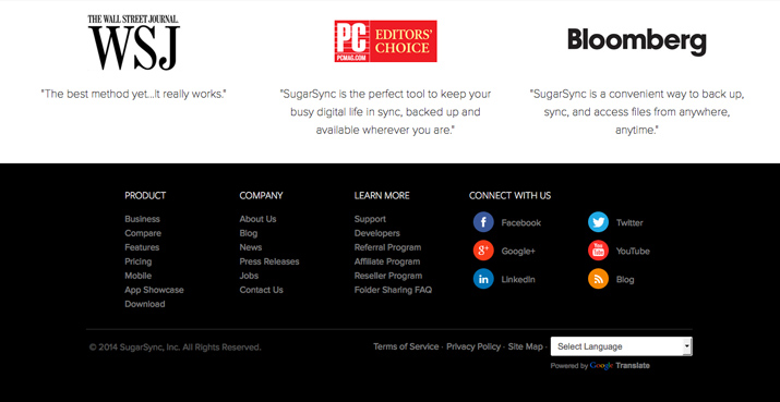
- sugar sync 使用分類的方式,整理了龐大的資訊
- 將最熱門的資訊連結,分類整理在footer中
5. Include a Copyright Notice
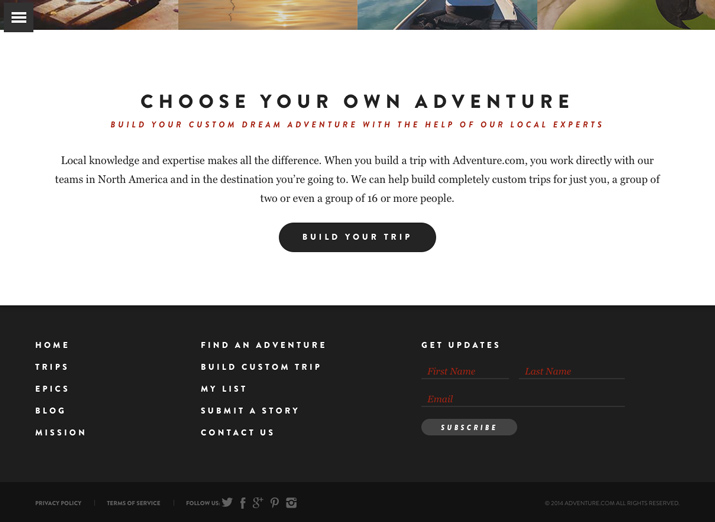
- adventure 在右下角的地方留下了版權聲明。
- 利用低對比的方式,讓他不影響到其它的資訊。
6. Include a Call to Action
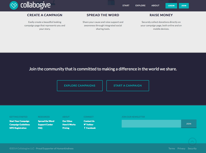
- collabogive 用了非常大的空間給「加入我們」這個主題。
- 用明顯的按鈕導引使用者,在看完網站後,去做些什麼。
- http://iing.tw/ 最底下有很好的 call to action。
7. Use Graphic Elements
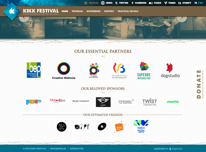
- Kikk Festival 在 footer 放進合作夥伴的 logo。
- 需避免太多的圖片會影響讀取。
8. Be Aware of Contrast and Readability
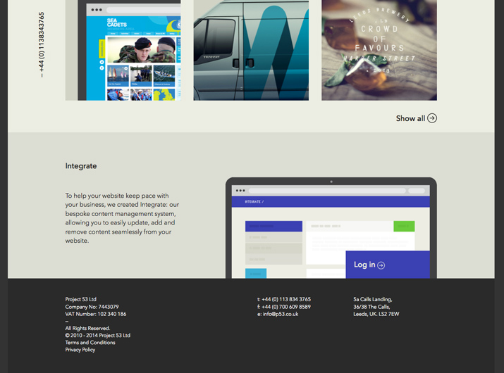
- p53 用最簡單的黑白配色,讓資訊容易閱讀。
9. Maintain Site’s Design Theme
- Swiths Interactive Group 在 footer的地方維持了設計的一致性
10. Think Small (But Not Too Small)
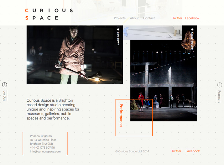
- Curious Space 的 footer設計,精緻卻不會難以閱讀。
- Footer 的文字應該要小。
- 但不要小到難以閱讀。
- 也不要小到難選。
11. Use Plenty of Space
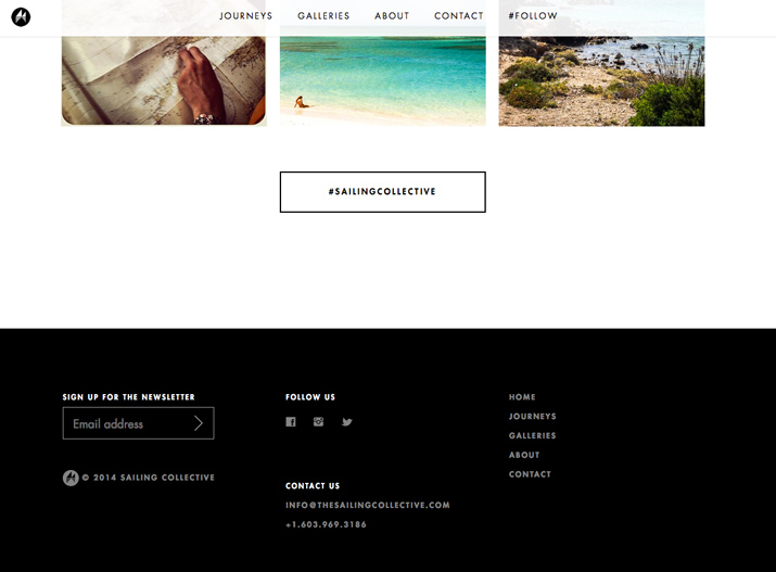
- Sailing Collective 的間距和行距設計,讓連結聚焦且容易點擊。
- 不夠的空間,會讓footer太過擁擠,而且不好點。
12. Be Wary of Too Many Objects
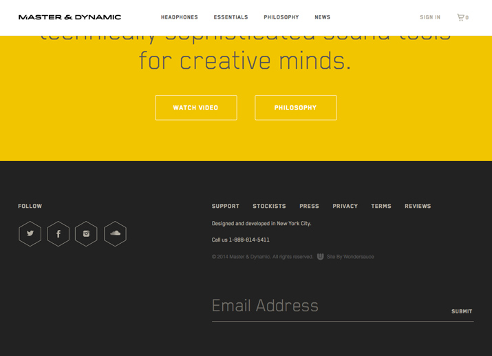
- 簡單的icon和單純的文字
- Master & Dynamic 達成了少就是多的設計
13. Create a Sense of Hierarchy
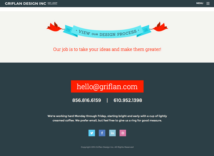
- Griflan Design Inc. 清楚告訴用戶要做什麼。
- 以及可以怎麼做。
14. Consider a Sub-Footer
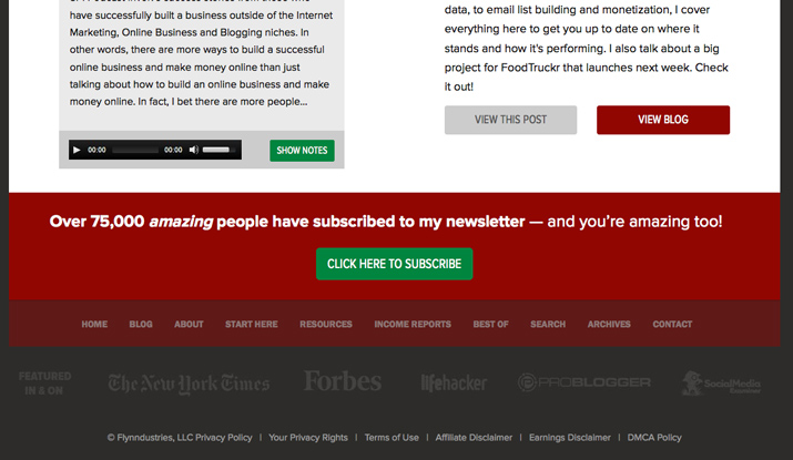
- The Smart Passive Income Blog 用多層的footer處理複雜的資訊。
15. Don’t Underline All Those Links
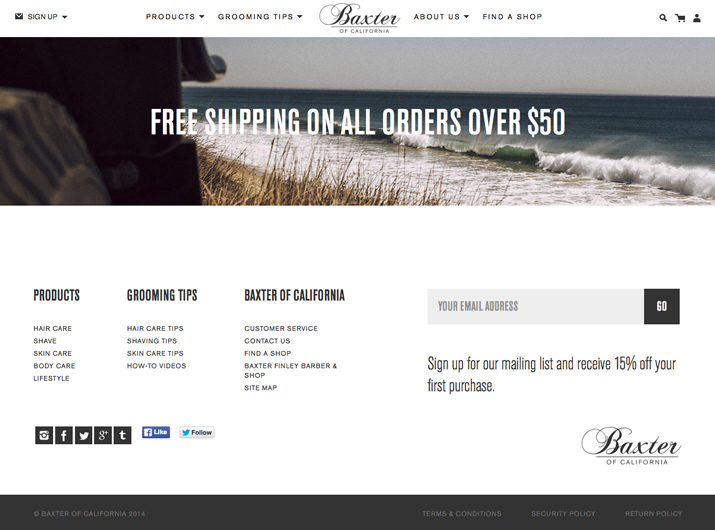
- 讓 footer 的連結有底線是不合時宜的網頁設計。
- Baxter of California 的連結清楚大方,沒有底線。
Thanks
15 Tips for Creating a Great Website Footer
By drawtide hu


