


Cyrille Perois
Front-end architect @ w3r.one
Conception de documents et d'interfaces numériques
Alignement
Direction
Ordre
Taille
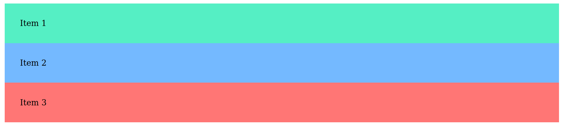
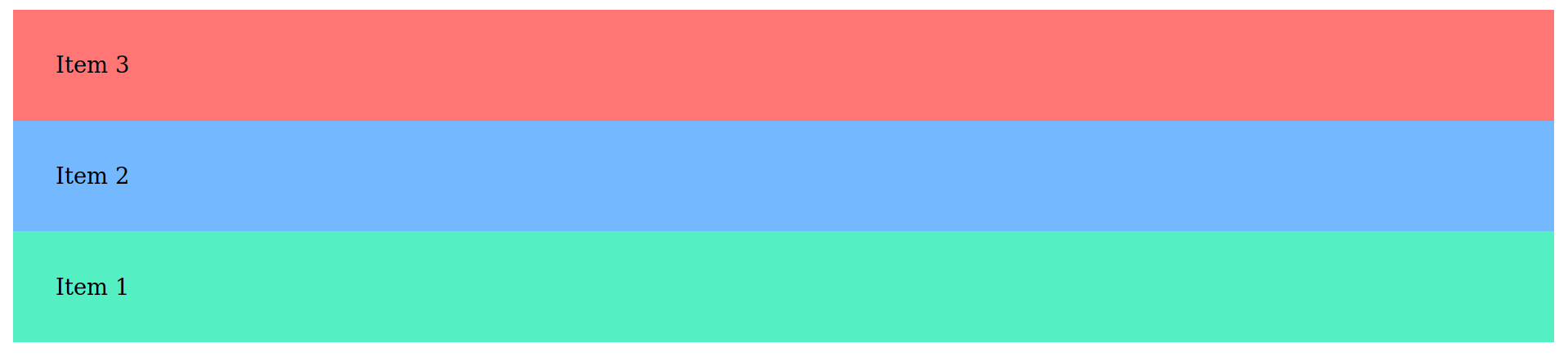
<div class="container">
  <div class="item">Item 1</div>
  <div class="item">Item 2</div>
  <div class="item">Item 3</div>
</div>
.item {
padding: 30px;
}
.item:nth-child(1) { background-color: #55efc4; }
.item:nth-child(2) { background-color: #74b9ff; }
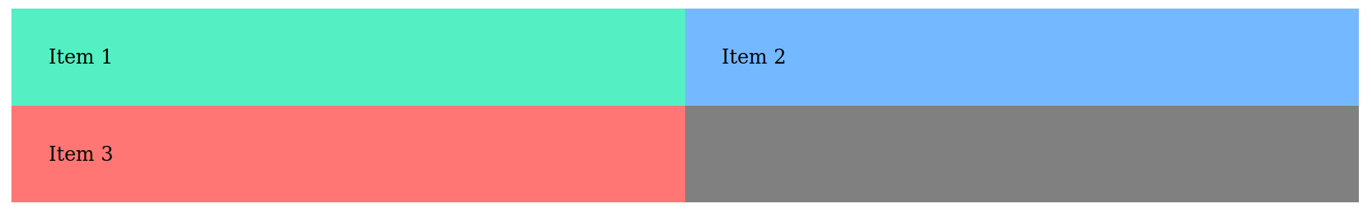
.item:nth-child(3) { background-color: #ff7675; }<div class="container">
<div class="item">Item 1</div>
<div class="item">Item 2</div>
<div class="item">Item 3</div>
</div>.container {
display: flex;
background-color: grey;
}
.item {
  padding: 30px;
}

.item:nth-child(1) { background-color: #55efc4; }
.item:nth-child(2) { background-color: #74b9ff; }
.item:nth-child(3) { background-color: #ff7675; }
<div class="container">
<div class="item">Item 1</div>
<div class="item">Item 2</div>
<div class="item">Item 3</div>
</div>.container {
display: flex;
background-color: grey;
}
.item {
padding: 30px;
flex-basis: calc(100% / 3);
}
.item:nth-child(1) { background-color: #55efc4; }
.item:nth-child(2) { background-color: #74b9ff; }
.item:nth-child(3) { background-color: #ff7675; }<div class="container">
<div class="item">Item 1</div>
<div class="item">Item 2</div>
<div class="item">Item 3</div>
</div>.container {
display: flex;
background-color: grey;
}
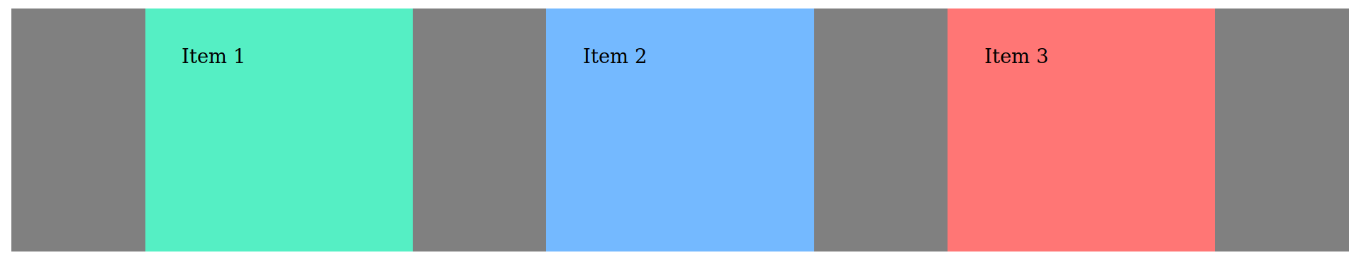
.item {
padding: 30px;
flex-basis: 50%;
}
.item:nth-child(1) { background-color: #55efc4; }
.item:nth-child(2) { background-color: #74b9ff; }
.item:nth-child(3) { background-color: #ff7675; }flex-basis est une taille « idéale ». Par défaut, le navigateur réduit la taille des éléments pour qu'ils soient tous affichés sur la même ligne
<div class="container">
  <div class="item">Item 1</div>
  <div class="item">Item 2</div>
  <div class="item">Item 3</div>
</div>
.container {
display: flex;
background-color: grey;
flex-wrap: wrap;
}
.item {
padding: 30px;
flex-basis: 50%;
}
.item:nth-child(1) { background-color: #55efc4; }
.item:nth-child(2) { background-color: #74b9ff; }
.item:nth-child(3) { background-color: #ff7675; }<div class="container">
<div class="item">Item 1</div>
<div class="item">Item 2</div>
<div class="item">Item 3</div>
</div>.container {
display: flex;
background-color: grey;
}
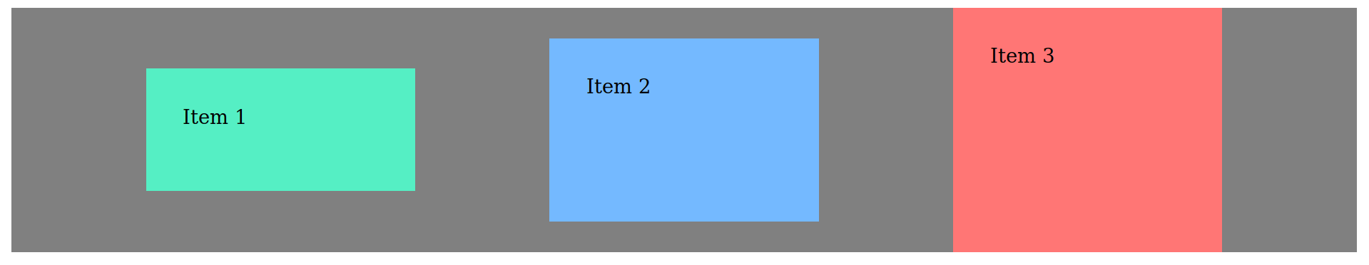
.item {
padding: 30px;
flex-basis: 50%;
flex-shrink: 0;
}
.item:nth-child(1) { background-color: #55efc4; }
.item:nth-child(2) { background-color: #74b9ff; }
.item:nth-child(3) { background-color: #ff7675; }<div class="container">
<div class="item">Item 1</div>
<div class="item">Item 2</div>
<div class="item">Item 3</div>
</div>.container {
display: flex;
background-color: grey;
}
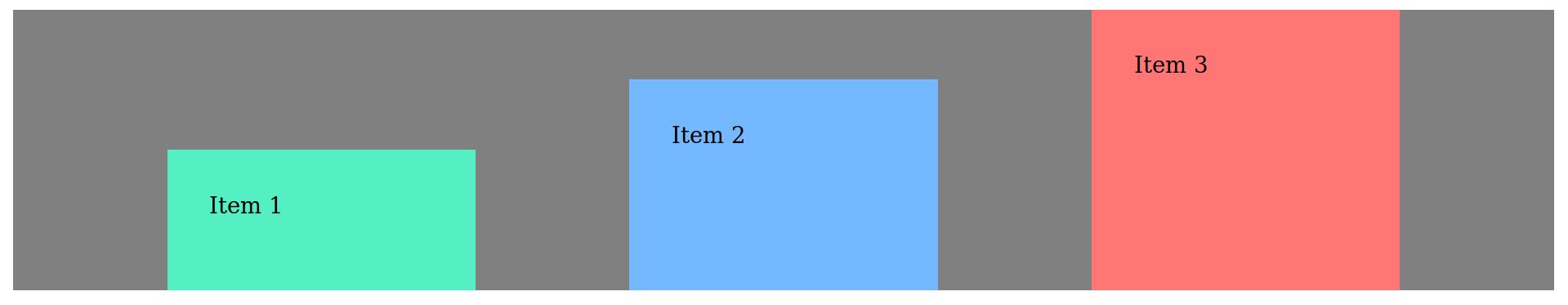
.item {
padding: 30px;
flex-basis: 20%;
flex-grow: 1;
}
.item:nth-child(1) { background-color: #55efc4; }
.item:nth-child(2) { background-color: #74b9ff; }
.item:nth-child(3) { background-color: #ff7675; }Les valeurs de flex-shrink et flex-grow sont des facteurs de rétrécissement et d'aggrandissement. Pour visualiser l'effet de ces deux propriétés : Flexulator
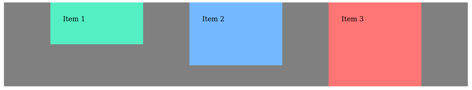
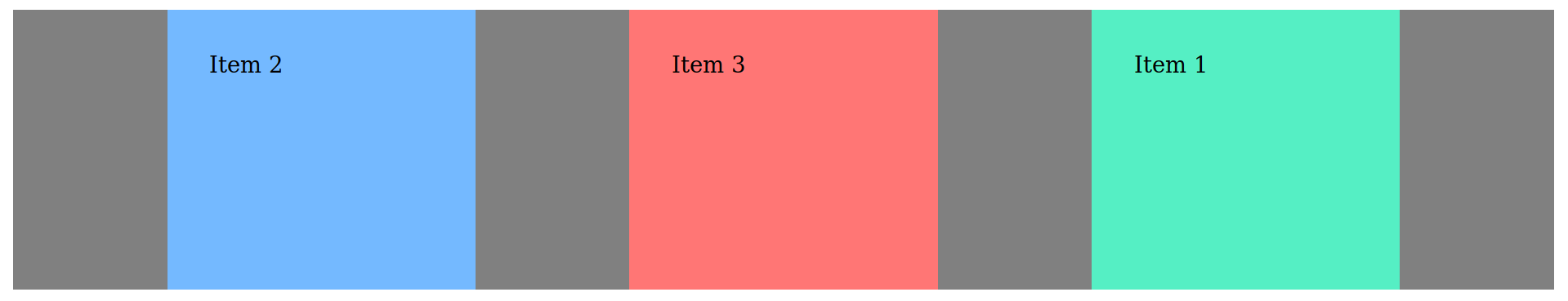
<div class="container">
  <div class="item">Item 1</div>
  <div class="item">Item 2</div>
  <div class="item">Item 3</div>
</div>
.container {
display: flex;
background-color: grey;
justify-content: flex-start;
}
.item {
padding: 30px;
flex-basis: 20%;
}
.item:nth-child(1) { background-color: #55efc4; }
.item:nth-child(2) { background-color: #74b9ff; }
.item:nth-child(3) { background-color: #ff7675; }<div class="container">
<div class="item">Item 1</div>
<div class="item">Item 2</div>
<div class="item">Item 3</div>
</div>.container {
display: flex;
background-color: grey;
justify-content: flex-end;
}
.item {
padding: 30px;
flex-basis: 20%;
}
.item:nth-child(1) { background-color: #55efc4; }
.item:nth-child(2) { background-color: #74b9ff; }
.item:nth-child(3) { background-color: #ff7675; }<div class="container">
<div class="item">Item 1</div>
<div class="item">Item 2</div>
<div class="item">Item 3</div>
</div>.container {
display: flex;
background-color: grey;
justify-content: center;
}
.item {
padding: 30px;
flex-basis: 20%;
}
.item:nth-child(1) { background-color: #55efc4; }
.item:nth-child(2) { background-color: #74b9ff; }
.item:nth-child(3) { background-color: #ff7675; }<div class="container">
<div class="item">Item 1</div>
<div class="item">Item 2</div>
<div class="item">Item 3</div>
</div>.container {
display: flex;
background-color: grey;
justify-content: space-between;
}
.item {
padding: 30px;
flex-basis: 20%;
}
.item:nth-child(1) { background-color: #55efc4; }
.item:nth-child(2) { background-color: #74b9ff; }
.item:nth-child(3) { background-color: #ff7675; }<div class="container">
<div class="item">Item 1</div>
<div class="item">Item 2</div>
<div class="item">Item 3</div>
</div>.container {
display: flex;
background-color: grey;
justify-content: space-around;
}
.item {
padding: 30px;
flex-basis: 20%;
}
.item:nth-child(1) { background-color: #55efc4; }
.item:nth-child(2) { background-color: #74b9ff; }
.item:nth-child(3) { background-color: #ff7675; }<div class="container">
<div class="item">Item 1</div>
<div class="item">Item 2</div>
<div class="item">Item 3</div>
</div>.container {
display: flex;
background-color: grey;
justify-content: space-evenly;
align-items: flex-start;
}
.item {
padding: 30px;
flex-basis: 20%;
}
.item:nth-child(1) { background-color: #55efc4; }
.item:nth-child(2) { background-color: #74b9ff; }
.item:nth-child(3) { background-color: #ff7675; }<div class="container">
<div class="item">Item 1</div>
<div class="item">Item 2</div>
<div class="item">Item 3</div>
</div>.container {
display: flex;
background-color: grey;
justify-content: space-evenly;
align-items: flex-end;
}
.item {
padding: 30px;
flex-basis: 20%;
}
.item:nth-child(1) { background-color: #55efc4; }
.item:nth-child(2) { background-color: #74b9ff; }
.item:nth-child(3) { background-color: #ff7675; }<div class="container">
<div class="item">Item 1</div>
<div class="item">Item 2</div>
<div class="item">Item 3</div>
</div>.container {
display: flex;
background-color: grey;
justify-content: space-evenly;
align-items: center;
}
.item {
padding: 30px;
flex-basis: 20%;
}
.item:nth-child(1) { background-color: #55efc4; }
.item:nth-child(2) { background-color: #74b9ff; }
.item:nth-child(3) { background-color: #ff7675; }<div class="container">
<div class="item">Item 1</div>
<div class="item">Item 2</div>
<div class="item">Item 3</div>
</div>.container {
display: flex;
background-color: grey;
justify-content: space-evenly;
align-items: stretch;
}
.item {
padding: 30px;
flex-basis: 20%;
}
.item:nth-child(1) { background-color: #55efc4; }
.item:nth-child(2) { background-color: #74b9ff; }
.item:nth-child(3) { background-color: #ff7675; }<div class="container">
<div class="item">Item 1</div>
<div class="item">Item 2</div>
<div class="item">Item 3</div>
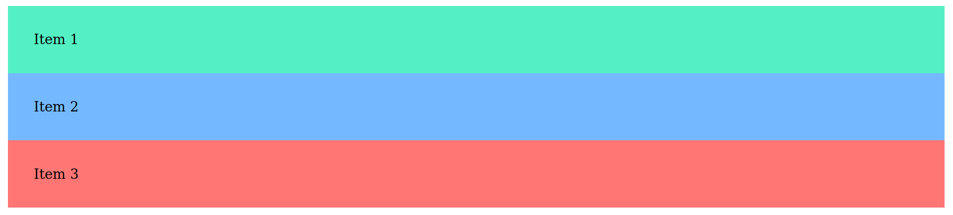
</div>.container {
display: flex;
background-color: grey;
flex-direction: column;
}
.item { padding: 30px; }
.item:nth-child(1) { background-color: #55efc4; }
.item:nth-child(2) { background-color: #74b9ff; }
.item:nth-child(3) { background-color: #ff7675; }Axe principal (main axis)
Axe secondaire (cross axis)
Axe principal (main axis)
Axe secondaire (cross axis)
flex-direction: row;
flex-direction: column;
| flex-direction | flex-basis | align-items | justify-content |
|---|---|---|---|
| row | Largeur de l'élément | Alignement vertical | Distribution horizontale |
| column | Hauteur de l'élément | Distribution verticale | Alignement horizontal |
<div class="container">
  <div class="item">Item 1</div>
  <div class="item">Item 2</div>
  <div class="item">Item 3</div>
</div>
.container {
display: flex;
background-color: grey;
flex-direction: row-reverse;
}
.item {
padding: 30px;
flex-basis: 20%;
}
.item:nth-child(1) { background-color: #55efc4; }
.item:nth-child(2) { background-color: #74b9ff; }
.item:nth-child(3) { background-color: #ff7675; }<div class="container">
<div class="item">Item 1</div>
<div class="item">Item 2</div>
<div class="item">Item 3</div>
</div>.container {
display: flex;
background-color: grey;
flex-direction: column-reverse;
}
.item {
padding: 30px;
flex-basis: 20%;
}
.item:nth-child(1) { background-color: #55efc4; }
.item:nth-child(2) { background-color: #74b9ff; }
.item:nth-child(3) { background-color: #ff7675; }<div class="container">
<div class="item">Item 1</div>
<div class="item">Item 2</div>
<div class="item">Item 3</div>
</div>/* ... */
.item:nth-child(1) {
background-color: #55efc4;
order: 3;
}
.item:nth-child(2) {
background-color: #74b9ff;
order: 1;
}
.item:nth-child(3) {
background-color: #ff7675;
order: 2;
}By Cyrille Perois


