Web Design
The Web
| HTML | Meaning and Content |
| CSS | Presentation & Style |
| JavaScript & jQuery | Scripting, manipulating the DOM |
Excellent resource: W3 Schools
Styling and Layout with CSS
CSS (Cascading Style Sheet)
- Style sheet language
- Associates style rules with HTML elements
- Reusable
- Styles "cascade", or have known order of precedence
- 2 Parts: selection of elements to apply style property values
(w3schools)
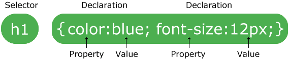
Syntax
- Each rule has one or more selectors and a declaration block
- Declaration block contains a set of properties with their values
body {
    font-family: Arial, Verdana, sans-serif;
    font-size: 12px;
    color: #6605AA;
}
body {
background-color: lightblue;
}
h1 {
color: white;
text-align: center;
}
p {
font-family: verdana;
font-size: 20px;
}Selectors
How to access specific elements
/* Select specific elements, here all <h1>, <h2> and <h3>
(using grouping syntax) */
h1, h2, h3 { }

/* Select all elements where class attribute has value
 * "questions" */
.questions { }

/* Select all <p> elements where class attribute has value
 * "questions" */
p.questions { }

/* Select all elements where id attribute has value
 * "topstory" */
#topstory { }
id Attribute
A global attribute. Used to uniquely identify an element (from CSS or Javascript).
Common use of id attribute
<!DOCTYPE html>
<html>
<head>
<style>
#myHeader {
  background-color: lightblue;
  color: black;
  padding: 40px;
  text-align: center;
}
</style>
</head>
<body>

<h1 id="myHeader">My Header</h1>

</body>
</html>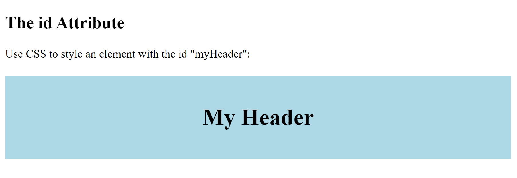
Output from the id attribute code
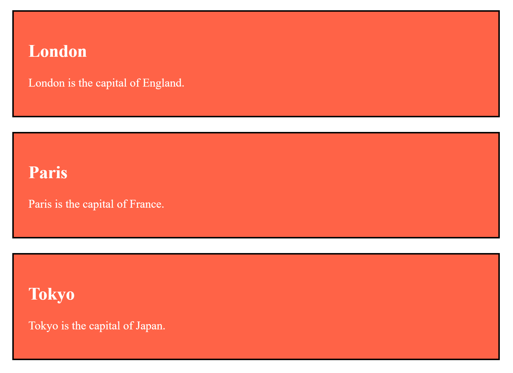
class Attribute
Used to make this element a member of a named class. Also a global attribute.
Common use of class attribute
<!DOCTYPE html>
<html>

  <head>
      <style>
          .city {
              background-color: tomato;
              color: white;
              border: 2px solid black;
              margin: 20px;
              padding: 20px;
          }
      </style>
  </head>

  <body>

      <div class="city">
          <h2>London</h2>
          <p>London is the capital of England.</p>
      </div>

      <div class="city">
          <h2>Paris</h2>
          <p>Paris is the capital of France.</p>
      </div>

      <div class="city">
          <h2>Tokyo</h2>
          <p>Tokyo is the capital of Japan.</p>
      </div>

  </body>

</html>
Output from the class attribute code
| Selector | Example | Example description |
|---|---|---|
| #id | #firstname | Selects the element with id="firstname" |
| .class | .intro | Selects all elements with class="intro" |
| element.class | p.intro | Selects only <p> elements with class="intro" |
| * | * | Selects all elements on a page |
| element | p | Selects all <p> elements |
| element,element,.. | div, p | Selects all <div> elements and all <p> elements |
Properties
Just about anything you can think of. Properties for:
- Colors
- Fonts, font weight
- Borders
- Spacing, position, margins, alignment
- Layout of elements and flow
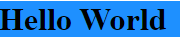
CSS Colors
Colors can be applied using:
name ->
<h1 style="background-color:DodgerBlue;">Hello World</h1>
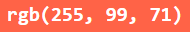
rgb value ->
<h1 style="background-color:rgb(255, 99, 71);">rgb(255, 99, 71)</h1>
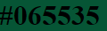
hex value ->
<h1 style="background-color:#065535;">#065535</h1>
Where to put it?
- In the element
- In the head of the document
- In a separate file, "imported" via a link element
Precedence (Cascading)
When two or more selectors match an element, the rule closest to the element is applied.
In most cases:
Inline style - will be closest.
<h2 style="color: red;">This text will be red always</h2>
In the header - will be next.
<head>
<style type="text/css">
h2{
style="color: blue;"
}
</style>
In an external style sheet will be furthest. Two rules in the same style sheet - the one furthest down (it is closer)
h2{
style="color: purple;" }
<!--index.html-->>
<head>
<link rel="stylesheet"href="css/styles.css">
</head>
In the element
<p style="font-family:tahoma"> Lorem ipsum dolor sit
amet consectetur adipisicing
<span style="vertical-align:sub;border-style:dotted;
border:3px dotted rgb(255, 0, 212);border-radius:20px;
font-size:120%;font-family:Impact, sans-serif">elit.</span>
</p> 
In the head of the document
<head>
    <style type="text/css">
        body {
          background-color: silver;
          color: white; }
    </style>
</head>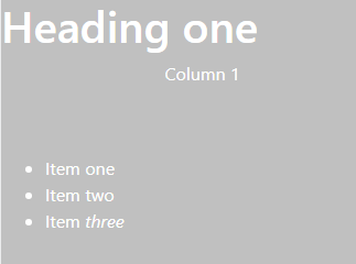
In a separate file
/* File: css/styles.css */
body {
  background-color: purple;
  color: white;
}

ul li {
   list-style-type: square;
}
<!--index.html-->
<head>
    <link rel="stylesheet" href="css/styles.css">
</head>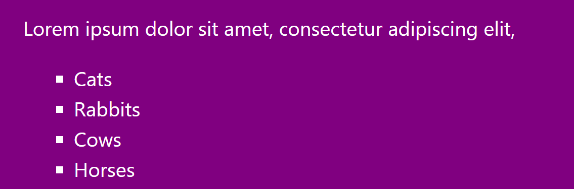
Bootstrap
-
Get Bootstrap - include via CDN (Content Delivery Network)
- We will copy the links under
- We will focus on the grid system
- Easy to use, implemented with basic HTML and CSS knowledge
- There are a lot of examples with code
What is Bootstrap?
- A framework that makes layout design easy
- Makes responsive design automatic
- Many copy and paste elements, but you need to know what you are doing ;)
As always, an excellent resource: W3 Schools
Constructing a Grid Layout
<!DOCTYPE html>
<html lang="en">
<head>
    <meta charset="UTF-8">
    <meta http-equiv="X-UA-Compatible" content="IE=edge">
    <meta name="viewport" content="width=device-width, initial-scale=1.0">
    <title>Document</title>
</head>
<body>

</body>
</html>
Start with basic HTML
<!DOCTYPE html>
<html lang="en">
<head>
    <meta charset="UTF-8">
    <meta http-equiv="X-UA-Compatible" content="IE=edge">
    <meta name="viewport" content="width=device-width, initial-scale=1.0">
    <title>Document</title>
    <!-- Latest compiled and minified CSS -->
    <link rel="stylesheet" href="https://cdn.jsdelivr.net/npm/bootstrap@4.6.2/dist/css/bootstrap.min.css">
    <script src="https://cdn.jsdelivr.net/npm/bootstrap@4.6.2/dist/js/bootstrap.bundle.min.js"></script>
    <script src="https://cdn.jsdelivr.net/npm/jquery@3.6.4/dist/jquery.slim.min.js"></script>

</head>
<body>


</body>
</html>
Add the links to the CDN (Content Delivery Network)
<link rel="stylesheet" href="https://cdn.jsdelivr.net/npm/bootstrap@4.6.2/dist/css/bootstrap.min.css">
<script src="https://cdn.jsdelivr.net/npm/jquery@3.6.4/dist/jquery.slim.min.js"></script>
<script src="https://cdn.jsdelivr.net/npm/popper.js@1.16.1/dist/umd/popper.min.js"></script>
<script src="https://cdn.jsdelivr.net/npm/bootstrap@4.6.2/dist/js/bootstrap.bundle.min.js"></script>
Next Create the Grid Structure (showing just the content of the body tag)
<body>
  <!--First create the container, it holds the grid.
	The container can also be fluid-->
  <div class="container">
    <!--Inside the container there are 1 or more rows that stack-->
    <div class="row">
      <!--Inside the rows there are columns dividing the width of the row-->
      <div class="col">This is</div>
      <div class="col">my fancy</div>
      <div class="col">layout.</div>
    </div>
    <!--Inside the container there are 1 or more rows that stack-->
    <div class="row">
      <!--Inside the rows there are columns dividing the width-->
      <div class="col">Again I</div>
      <div class="col">am soooo</div>
      <div class="col">fancy.+</div>
    </div>
  </div>
</body>CS Web Design - CSS
By drmorgan


