Responsive Web Design
Dustin Tauer, Easel Solutions
e: Dustin@easelsolutions.com
t: @dtauer
RWD - Setup
- Workshop Files
- http://bit.ly/hdc2014-rwd
- Unzip the "rwd" folder
- Development Server (If you want)**
- Not required, but will help with testing
- Windows: XAMPP
- https://www.apachefriends.org/
- Mac: MAMP
- http://www.mamp.info/en/
**You don't need to have a server running
Dustin Tauer
Dustin@easelsolutions.com
@dtauer
https://github.com/dtauer/hdc2014-rwd/
Roll Call
Why RWD?
Mobile vs. Desktop
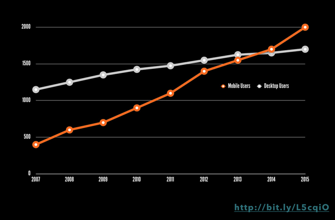
https://speakerdeck.com/bencallahan/build-responsively-2013-converge-fl-jacksonville-fl
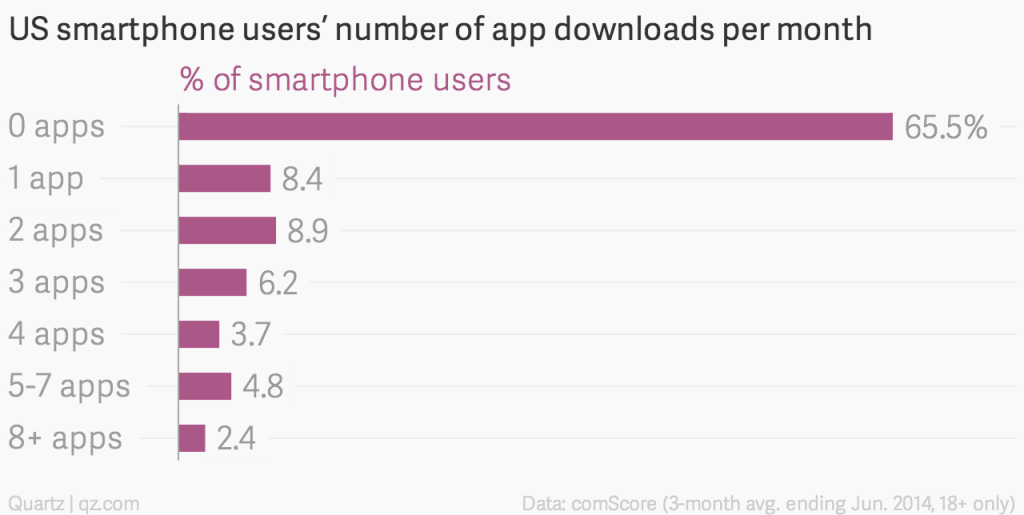
Apps are not the answer
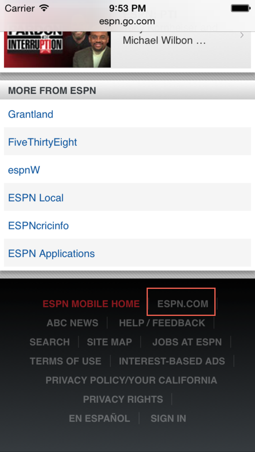
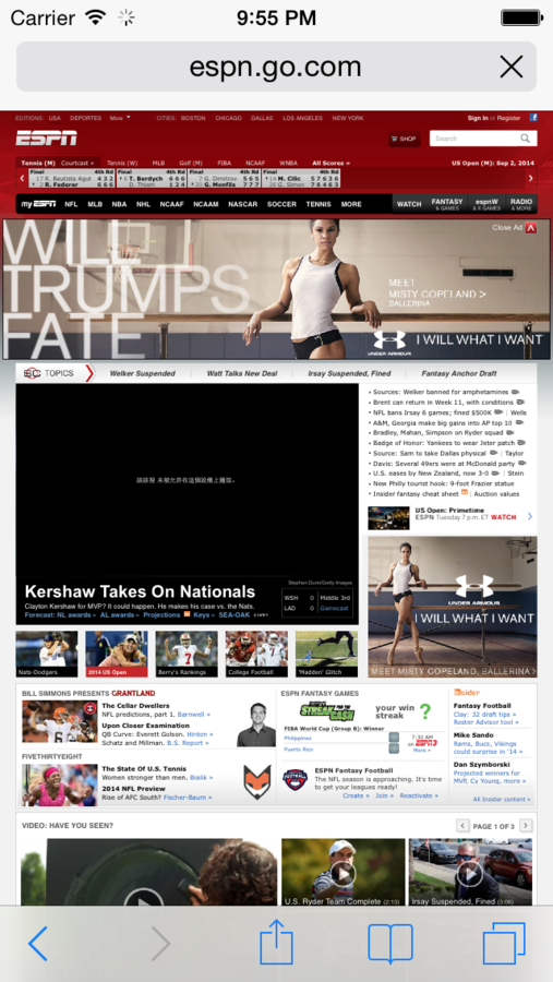
m. is not the answer
http://m.espn.com
One Deliverable
The Verge
http://www.theverge.com/2014/9/2/6096609/welcome-to-verge-2-0

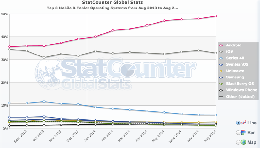
iOS Fragmentation
Android Fragmentation
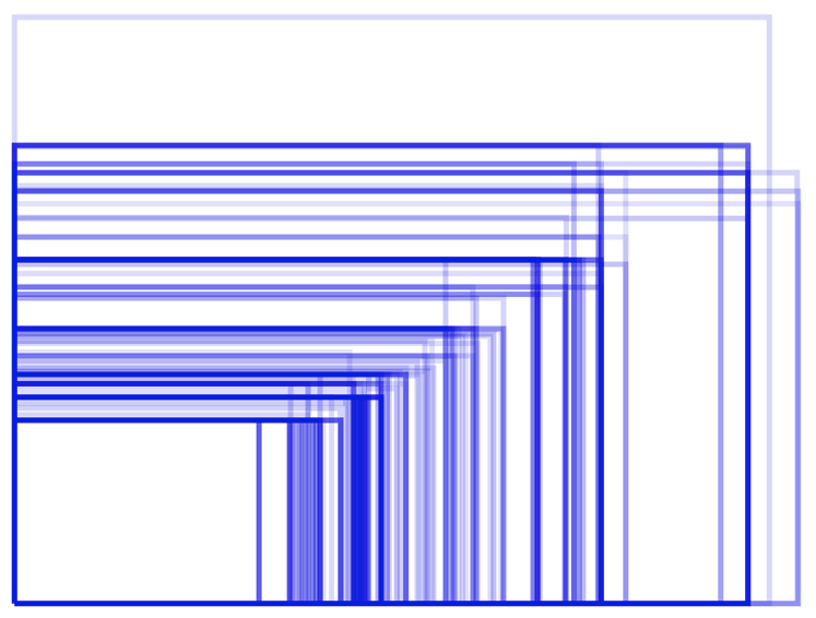
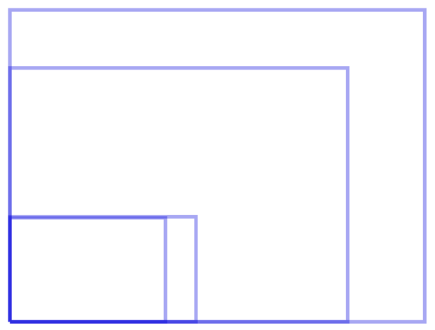
The web is not fixed width
Skinny Ties
http://skinnyties.com
Media Queries
http://mediaqueri.es/
The Plan
- RWD 101
- Responsive Content
- Images, Video, etc.
- Optimization
- Testing
- Resources
RWD 101
- Fluid Layout
- Flexible Content
- Media Queries
Before any of this will work...
<!-- meta tag in head -->
<meta name="viewport" content="width=device-width;initial-scale=1.0;">
Code
rwd/01
Fluid Layout
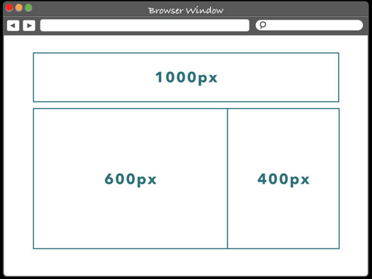
Fluid Layout
Fluid Layout
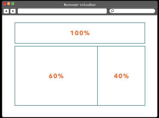
target / context = %
1000 / 1000 = 100%
600 / 1000 = 60%
400 / 1000 = 40%
http://rqrwd.com/
Code
rwd/01
Flexible Content
<!-- Text is easy -->
<p>This text will wrap based on the width of the container</p>

<!-- Images that aren't flexible -->
<img src="banner.jpg" width="800" height="200" />

<!-- percentage with will help  -->
<img src="banner.jpg" width="100%" />


<!-- This is better -->
<style>
img{
    max-width:100%;
}
</style>
<img src="banner.jpg" />
Flexible Media
http://embedresponsively.com/
Code
rwd/01
Media Queries
Conditionally Included Styles
<!-- In HTML -->
<link media="print" href="print.css">

<link media="screen and (max-width: 767px)" href="small.css">

<link media="screen and (min-width: 1024px)" href="large.css">
/* In CSS */
.content{
width: 600px;
}
.sidebar{
width: 400px;
}
@media screen and (max-width: 767px){
.content, .sidebar{
width: 100%;
}
}Code
rwd/01
More Code!
rwd/02/
Responsive Images
http://responsiveimages.org/
How do I know what I can (and should) use?
http://caniuse.com/
http://html5please.com/
SVG
Scalable Vector Graphics
<!-- In HTML -->
<svg width="100" height="100">
  <circle cx="50" cy="50" r="40" stroke="green" stroke-width="4" fill="yellow" />
</svg>


<!-- in <img> -->
<img src="logo.svg" />
http://snapsvg.io/
Testing
- On Desktop
- http://bbc-sport.github.io/viewporter/
- http://www.browserstack.com/
- Simulators
- iOS Simulator Application (http://bit.ly/1hpuR2l)
-
Android SDK (http://bit.ly/IKeIqs)
-
On Devices
-
Adobe Edge Inspect
-
Live-Reload with Grunt & Yeoman
-
https://github.com/yeoman/generator-mobile
-
-
Use IP Address
-
Optimization
- HTTP Requests - as few as possible
- Combine and Minify - both for CSS and JavaScript
- Image Format & Compression - use the right format & REALLY compress them CSS Sprites - combine UI elements into as few as possible
- CSS Image Downloads - it might not be displayed, but make sure the user isn’t getting hit
Resources
http://bradfrost.github.io/this-is-responsive/
- Design Workflow
- Development Workflow
- CSS Preprocessing
- Testing Tools
- Much, much more
Node.js
http://nodejs.org/
http://nodeschool.io/**
**or check out my session tomorrow
Use a Framework
- getbootstrap.com
- foundation.zurb.com
- http://usablica.github.io/front-end-frameworks/compare.html
Questions?
Thanks!
dustin@easelsolutions.com
@dtauer
https://github.com/dtauer/hdc2014-rwd
AIM | HDC - Responsive Web Design Workshop
By Dustin Tauer


