Self Assessment of Print Work
Layout and Design
We tried to copy the layout and design of film magazines already out there, such as Empire, as then ours would be easily recognised as a film magazine. We chose to put a skyline at the top as this would entice people to buy this issue as it is special and specific to our film. Then underneath, we placed the title of our magazine so that readers would be able to easily spot the name. We made the title of the film almost as big as the name of the magazine as we could entice people who liked the film to buy this issue. The promotional puff would also help with this aspect. We also included information about other actors and films to also gain audiences from those fan bases.
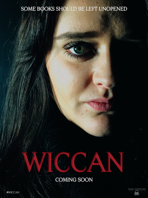
Poster
We looked at various different horror film posters and noted down the common conventions before we decided how to layout our poster. We chose to place the title of the film at the bottom of the poster as it is easy to view without covering any of the poster itself. We then chose to have the tagline at the top of the poster because we thought the sentence would catch peoples attention and make them want to view the rest of the poster. We put "coming soon" under the title of the film so that audiences know to look out for it. The hashtag is included in the bottom left hand corner so that people will begin to talk about it online.
Fonts and Text Sizes
It is important to have a variety of fonts so that the important information stands out to audiences. I feel we have used very basic fonts and could do with changing a few around to make them stand out more, even by making them italic or bold. We chose to have the title of the magazine and film the biggest because these are two things that would easily draw in an audience because they will either have an interest through the name of the magazine or the fact that a new film is being focussed on. We chose to have the actresses quote in white to make it stand out against her black costume so that audiences can easily read what she thought about acting in the film.
Poster
There is not much text on our poster, but it is still important to consider how to size certain pieces of information and what kinds of fonts are needed. The title of film is the biggest because this is the most important information that audiences need to remember. The title of the film is in a deep red to represent blood and anger. It is a very sharp font which could suggests violence and pain. The rest of the text is in white to make it stand out against the dark background. It is more of a simple font compared to the title of the film because it is not meant to be focussed on.
Use of Language
We tried to copy the language already used on the covers of film magazines to make it apparent that this magazine is about the film industry. We used lines such as "first look" and "world exclusive" because then audiences will believe that they are the first ones who are being allowed to view this information and it will then feel more personal. We also chose sentences like "worlds best movie reviews" because then readers will believe that we are the best source of information when reading about the movie reviews. The language that we have used on the poster is fairly formal and straight to the point. The tagline is short and makes it obvious to the audience that this film is about a book that causes problem for possibly to girl on the poster.
Image and Text
When looking at film magazine covers, especially Empire, it became apparent that the image to them is the most important thing on the front cover and you must fit the text around said image. They often put the photo of the actor in front of the title whereas we have put the title over the image. I feel we would benefit more if we placed the photo of Christy in front of the text as then we would be following the common conventions of well known film magazines like Total Film and Empire. The film title is over the middle of the image and this is often where it is placed within existing film magazines as audiences eyes are often drawn to the middle. The cover story lines fit nicely around the image as they are not what the magazine is focussing on.
Poster
We chose to place the title of the text on the poster in the same position as the magazine as then audiences would easily relate the two to each other. The text also fits in nicely against the dark background and doesn't interfere with the image. We placed the rest of the text around the image so that it didn't distract either. However, if we were to improve our poster we would include a billing block and also smooth out the image a bit so that it is to a professional standard.
Framing
When taking the picture of Christy, we asked her to stand in multiple poses so that we were able to pick the right image. We chose to have a bit of the wall showing above her head so that we could fit in the skyline and the title of the film without covering her up. We chose to frame her in a mid shot so that the audience would be focussed on her face and expression rather than what she was wearing. We also chose this shot because that seems conventional within existing pieces when photos of actors are included. We went through the same proves with the poster and ultimately ended up with a close up to show her stern yet worried expression.
Shooting Material
We decided to keep our image simple when taking the photos. We wanted the focus to be on Christy as she is the main character of the film so we made the background white. We decided to dress her in black as although she is herself in the poster, there are still hints of her character, Violet. We used the production lights and positioned them either side of her to make the image look a higher, professional standard quality. They also serve to brighten her up, almost as if she is under a spotlight as the magazine is all about her and her role. For the poster, we wanted Christy to be her character in the film Violet so people would recognise her in the film. We got her to wear black to look intimidating and made her stare straight into the camera to look stern.
Manipulation of Image
As the photo that we took is quite simple, the only thing we had to do to it was crop it to make sure that the text fit nicely around it. We also brightened it a little more to put even more emphasise on her. We chose not to filter it as we wanted the photo to be as professional and natural as possible because Christy is supposed to be herself and not her character. We decided to filter the poster photo to make it look dramatic and frightening. We darkened one side of her face to make it look like she was half in the image and half out; almost like in the film when she is slowing losing herself to Wicca.
Self Assessment of Print Work
By elliechampion


