IN WHAT WAYS DO YOUR PRODUCTS USE, DEVELOP OR CHALLENGE FORMS AND CONVENTIONS OF REAL MEDIA PRODUCTS?
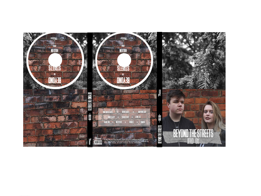
DIGIPAK

FRONT COVER
MY PRODUCT
MAIN IMAGE - My main image challenges the conventions of an Indie Rock magazine. Although it is a conventional image in the sense that it is a medium close up, with direct address, digipaks from the Indie Rock genre typically don’t have an image of the artist on the front cover. They usually have an image of a location, or some abstract artwork, as it does’t draw attention to the artist, but the music, which is what matters.
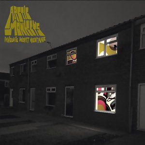
Other Indie Rock album covers with this convention.
ARTIST NAME - My artist name is conventional, as is diplayed in large, clear and simple font. It is the largest text on the page, as it is the most important. If the audience see my artist name whilst they are in a store, or on spotify and other download and streaming sites, they will be automatically drawn to it.
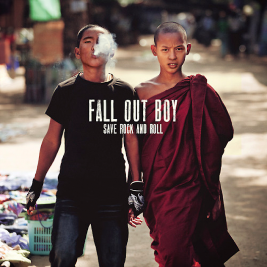
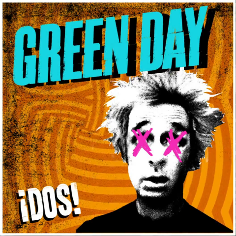
Other Indie Rock album covers with this convention.
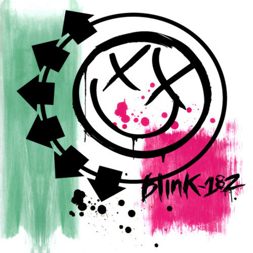
ALBUM NAME - I have used an album name in my digipak, which is conventional. Once again, it is in a clear, simple font.I have used it as it is important that the audience know what the album is called, so that they can search for it.
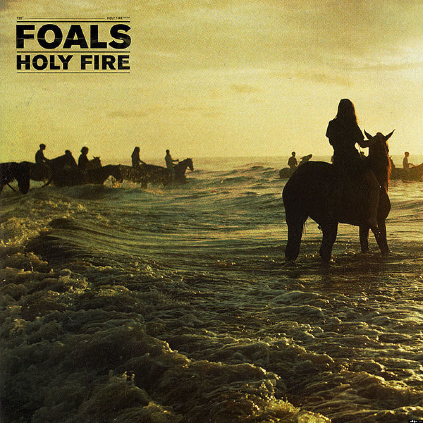
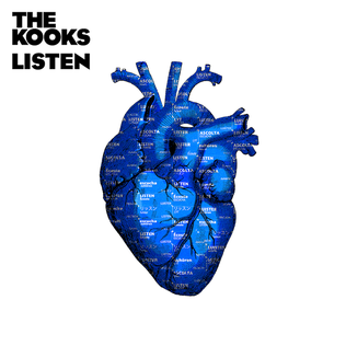
Other Indie Rock album covers with this convention.
INSERT PANELS
MY PRODUCTS

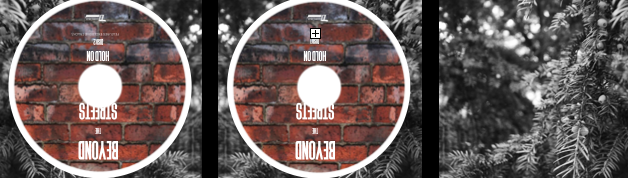
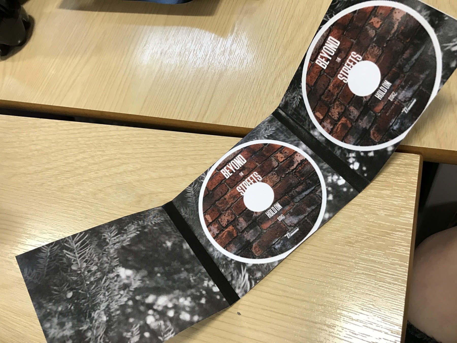
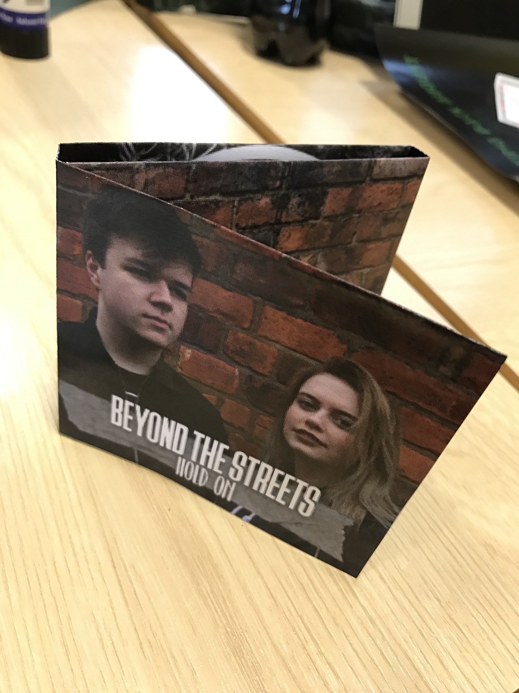
My insert pannels are quite conventional in comparison to existing Indie Rock digipaks. Insert panels are typically just an image, of a location, artwork, or other things. My insert panels are images of locations. My first insert panel, which will be seen as soon as the front cover is opened, is an image of a brick wall. This gives quite an industrial feel, and it goes with the image of my artists on the front cover. My panels on the actual inside are where they begin to relate to my music video. They are all shots a tree that has been taken from my music video. I chose to keep them all the same, as then my digipak would not look too busy and overwhelming. My CD’s are made up of the image of the brick wall, which I decided to use as I felt that it made everything tie in together and it created a house style.
BACK COVER
MY PRODUCT
MAIN IMAGE - My image is a conventional image for an Indie Rock digipak back cover. It is a simple image, of a brick wall. This provides an insdustrial look, and shows that it is Indie Rock, as they typically have a low budget, so this location isn’t expensive to shoot. It is also the image that I have used for an insert panel and on the CD’s, which creates a house style within the product.
Other Indie Rock album covers with this convention.
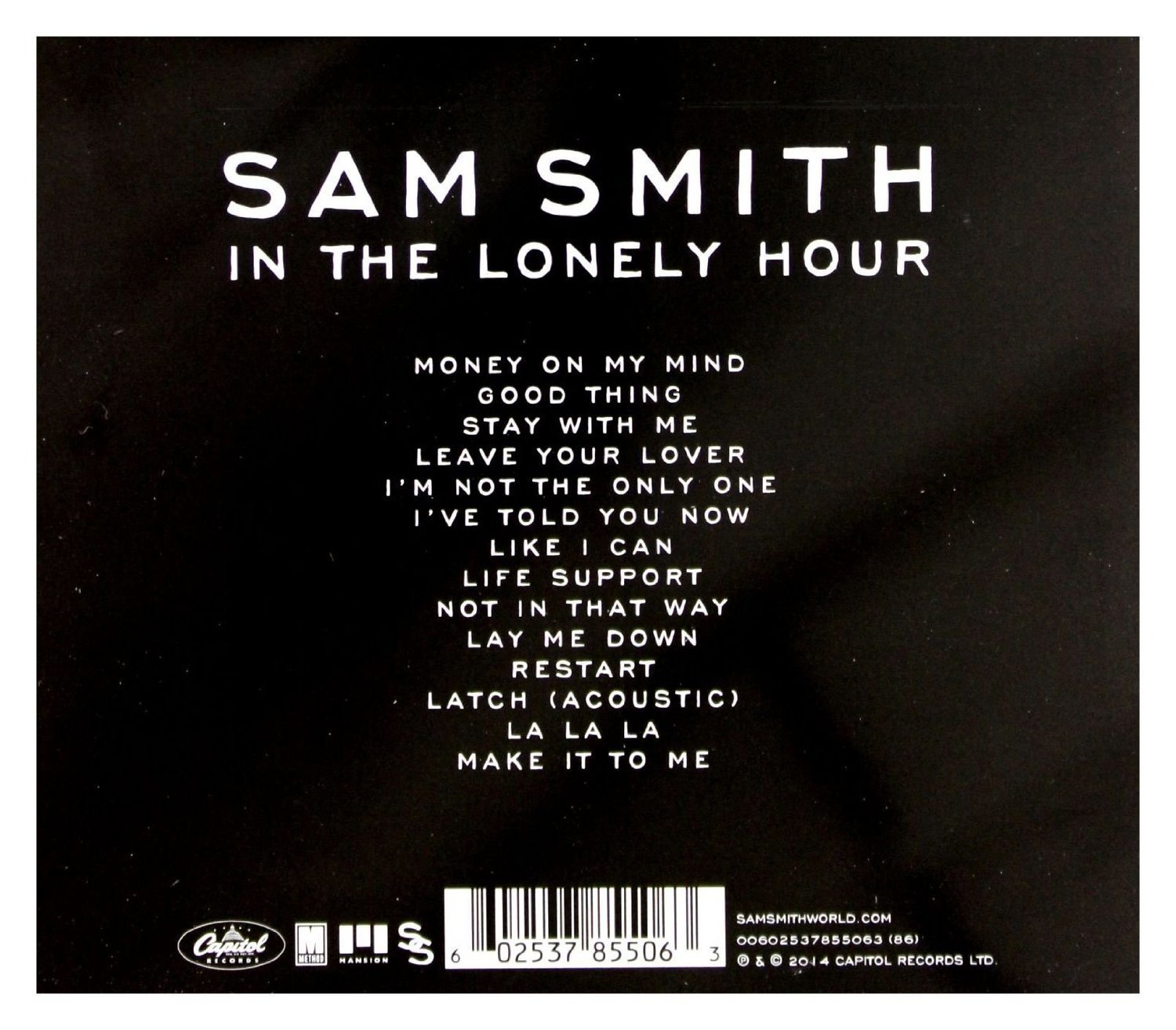
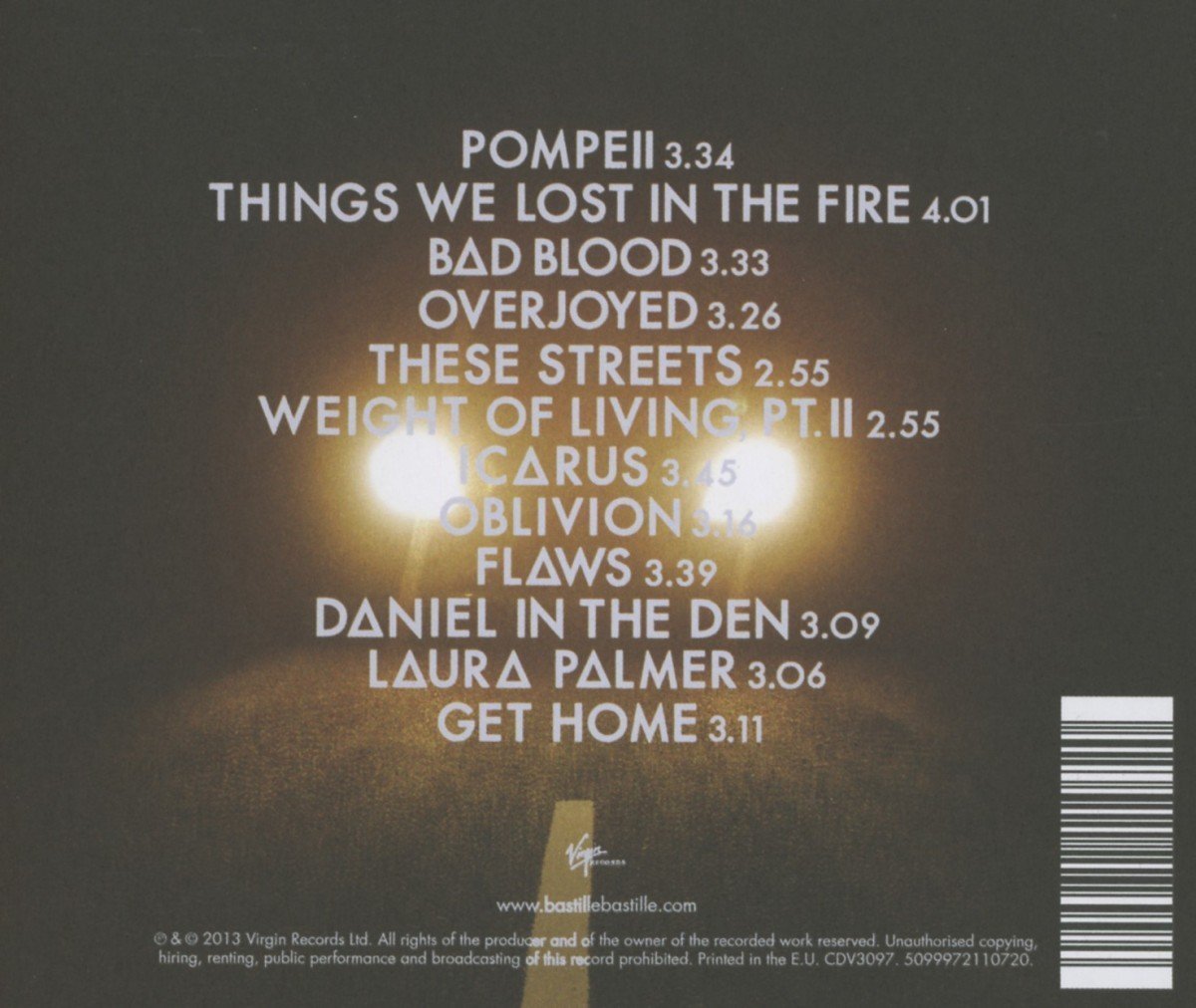
TRACK LIST - I used a track list in my digipak, to make it conventional. I placed my track list in the center of my page, with the tracks in clear font. I used a track list as it allowed my audience to see what songs are included in my digipak. If they recognise any singles from the album that they like, they are more likely to buy it.
Other Indie Rock album covers with this convention.
INSTITUTION LOGO - I have used the logo of my institution, Domino Records, on my back cover, just like existing artists do. This is mainly for the audience’s and institutions benefit, as it allows the audience to research into other artists that are signed by the institution. It also gives the institution credit.
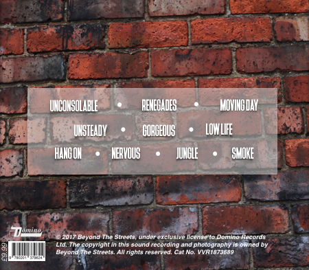
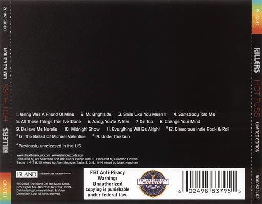
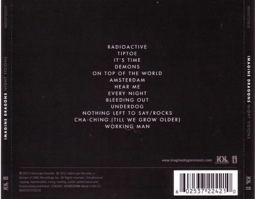
BARCODE & PRICE - The use of a barcode and album price is an essential convention. The barcode allows the album to be scanned so that the audience can purchase it. The price is there so that the audience know how much it is, so they can decide whether to purchase it or not.
COPYRIGHT CLAIM - The copyright claim is also an important convention of digipak back covers. It gives credit to the creaters and owners of the album. It also ensures that nobody can claim it as their own.
SPINE
MY PRODUCT

EXISTING PRODUCTS
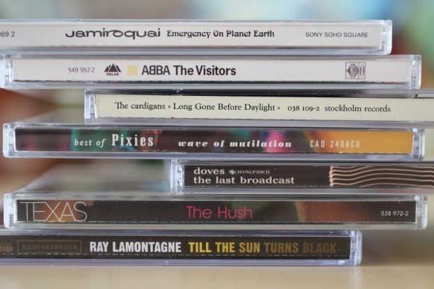
My spine follows the conventions of general and Indie Rock spines. I have used the artist and album name, as if it is on the spine and the digipaks aren’t stacked with the front cover showing, my audience can still identify the digipak. They are both in the same font that I have used for my front cover, and on my digipak, to maintain the house style. As well as the artist and album name, I have also included the institution logo, to give them credit.
I
By Emily Campbell