Question 2: How does your media product represent particular social groups?
Mise-en-scene
I have represented certain social groups on my magazine using mise-en-scene. On my front cover I haven't used a lot of writing to create a simplistic style. When researching indie magazines, targeted at older teenagers/ young adults, I noticed many of them didn't have a lot of text explaining what was in the magazine. I think magazines could be doing this because the magazines is relying on the cover artist and the overall style of the cover to draw people in.
Props and costumes
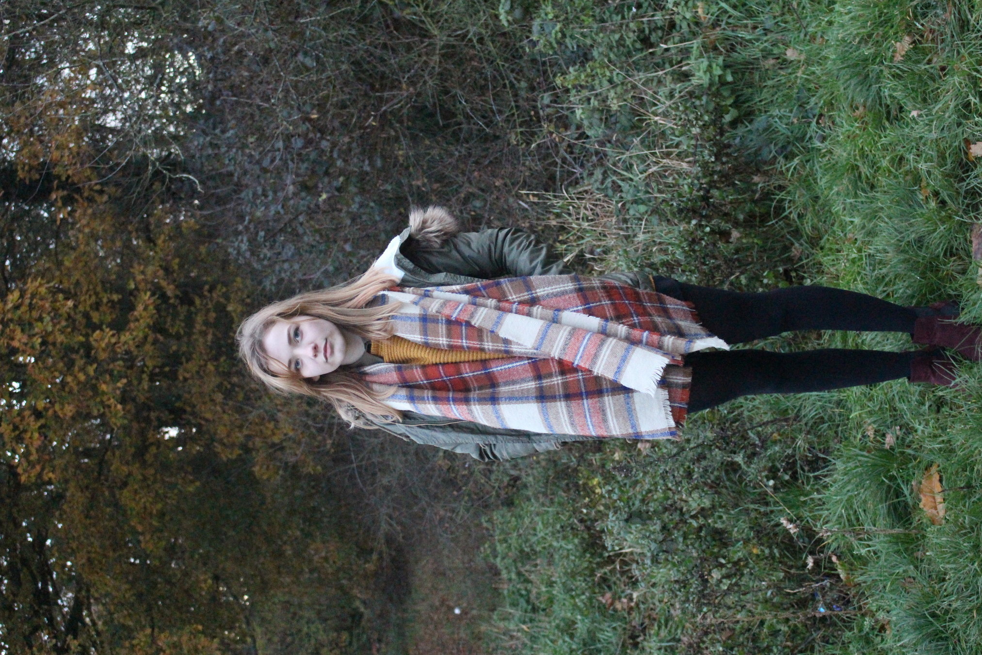
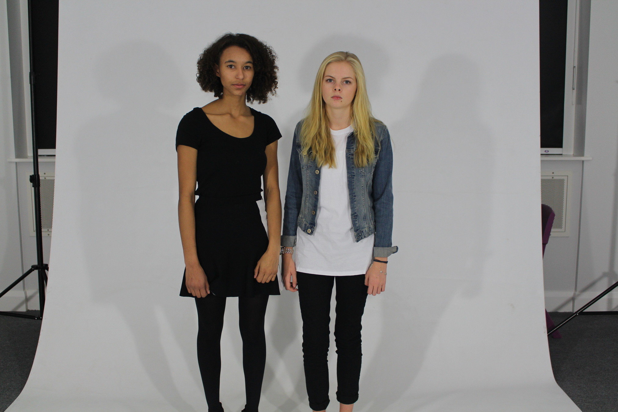
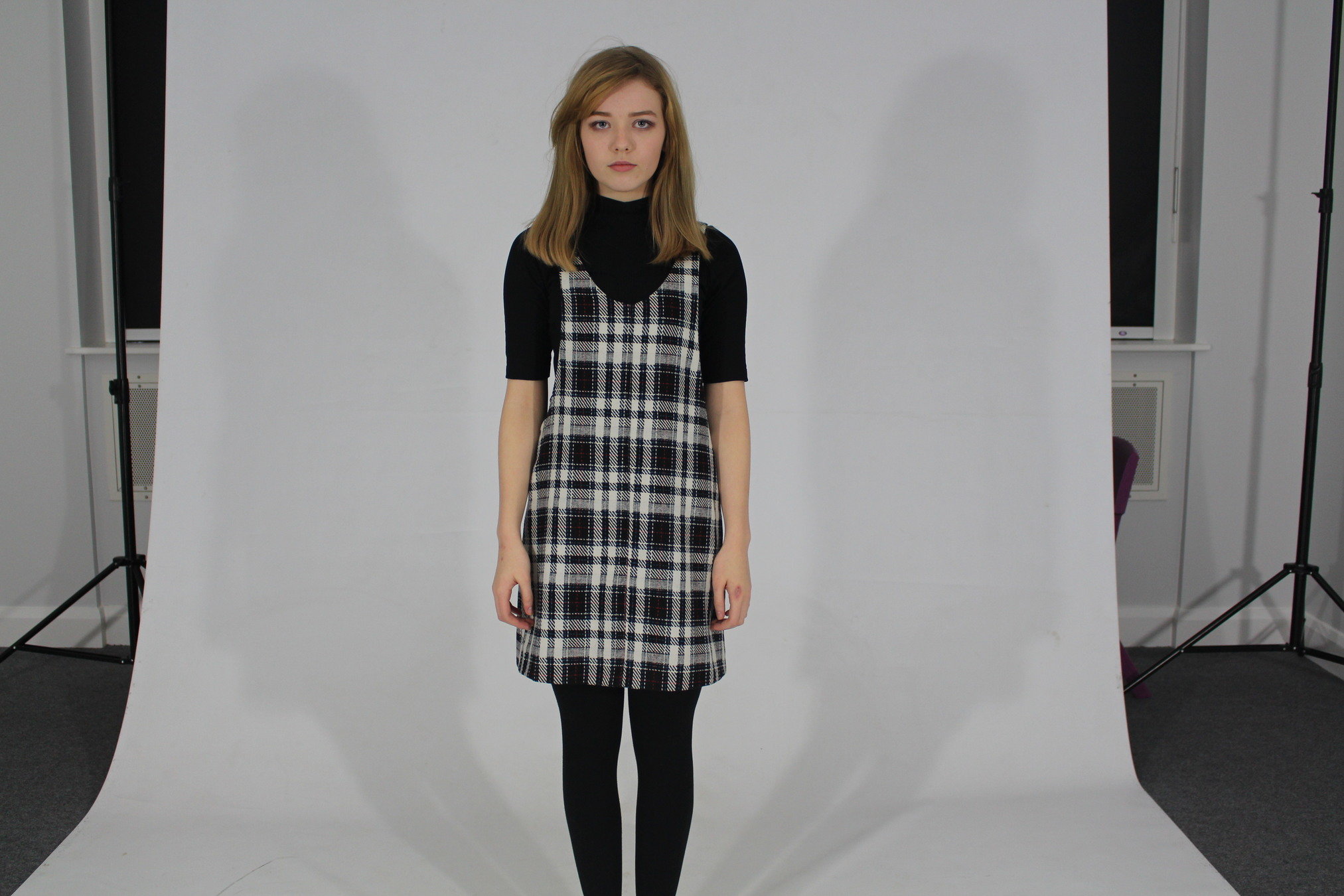
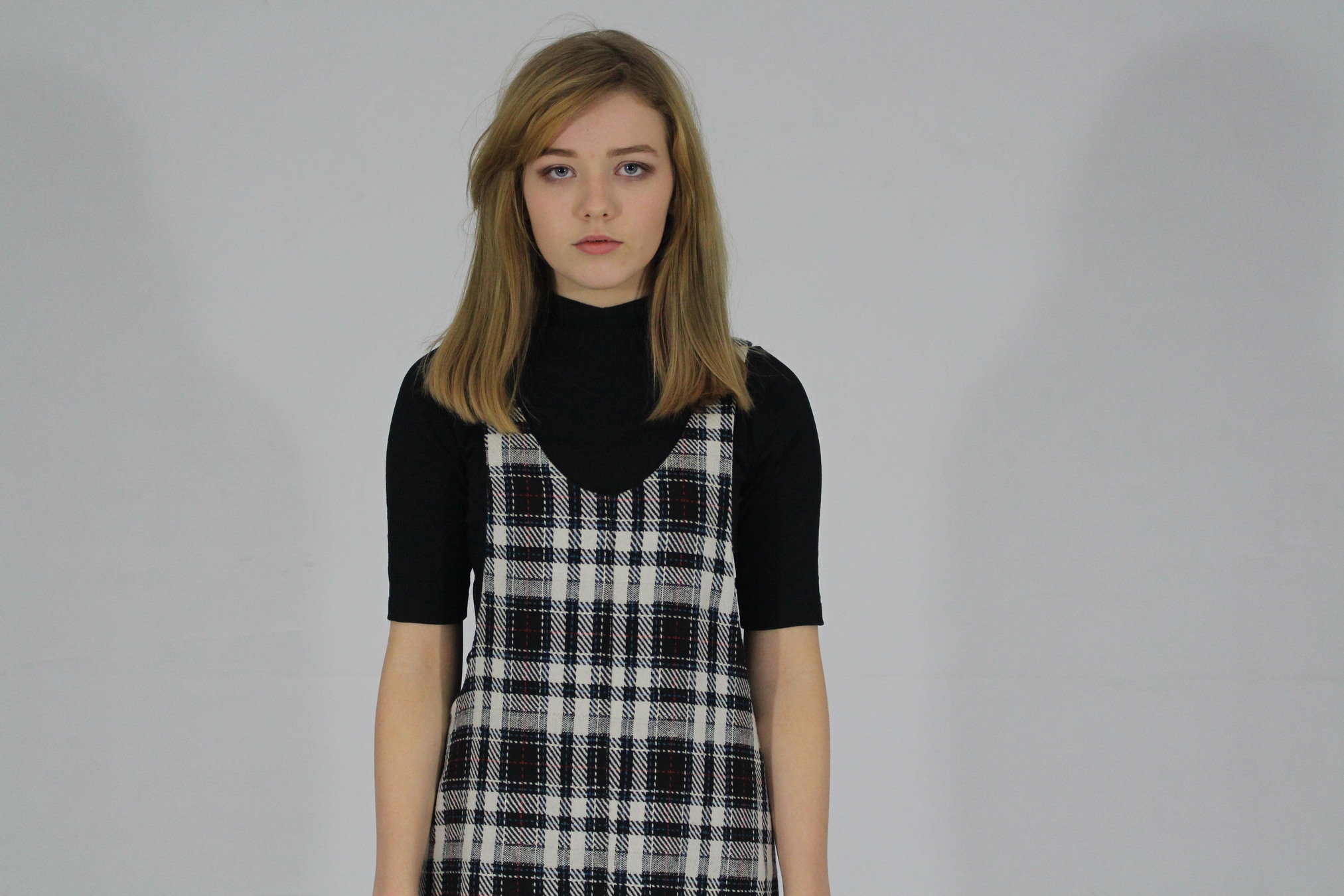
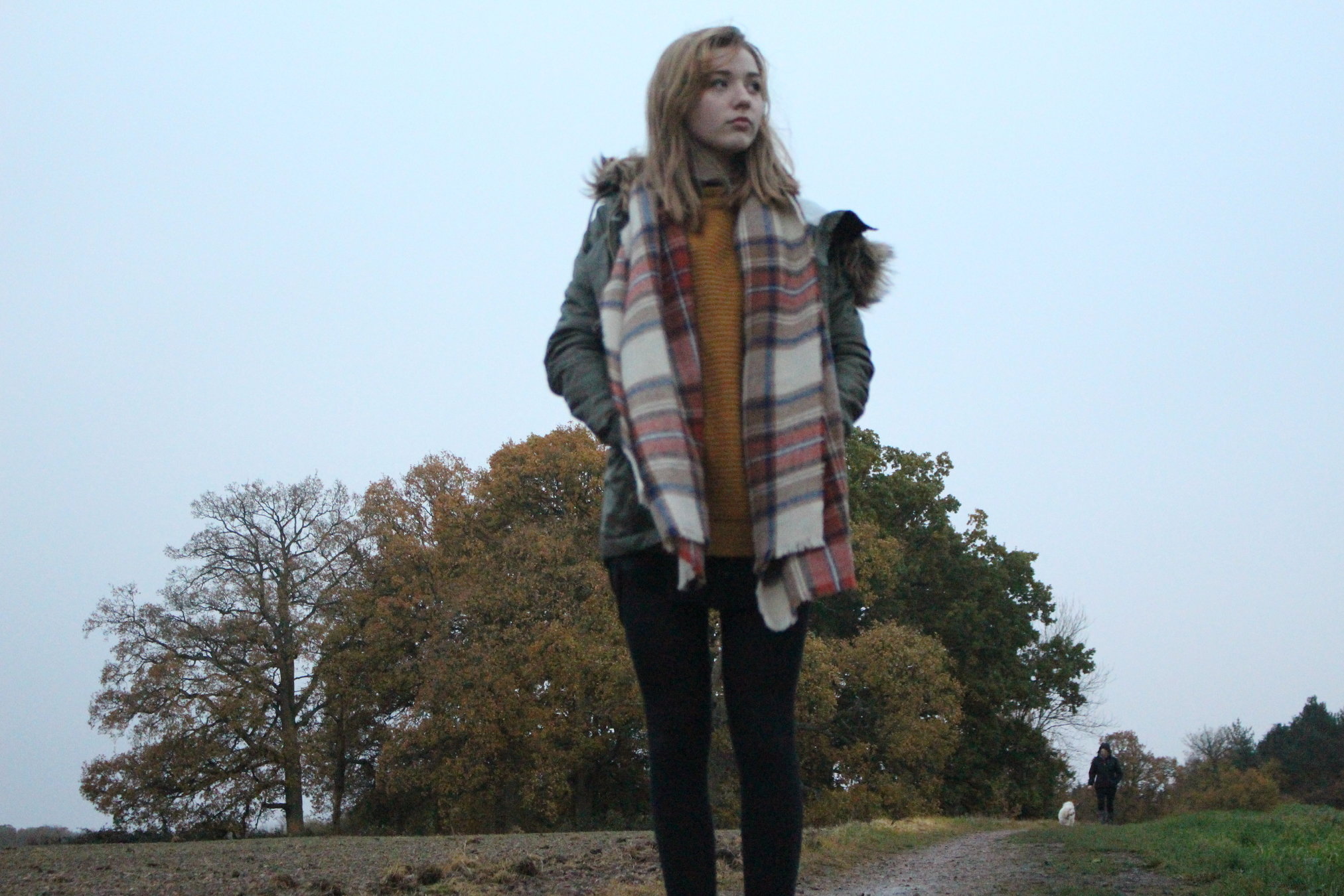
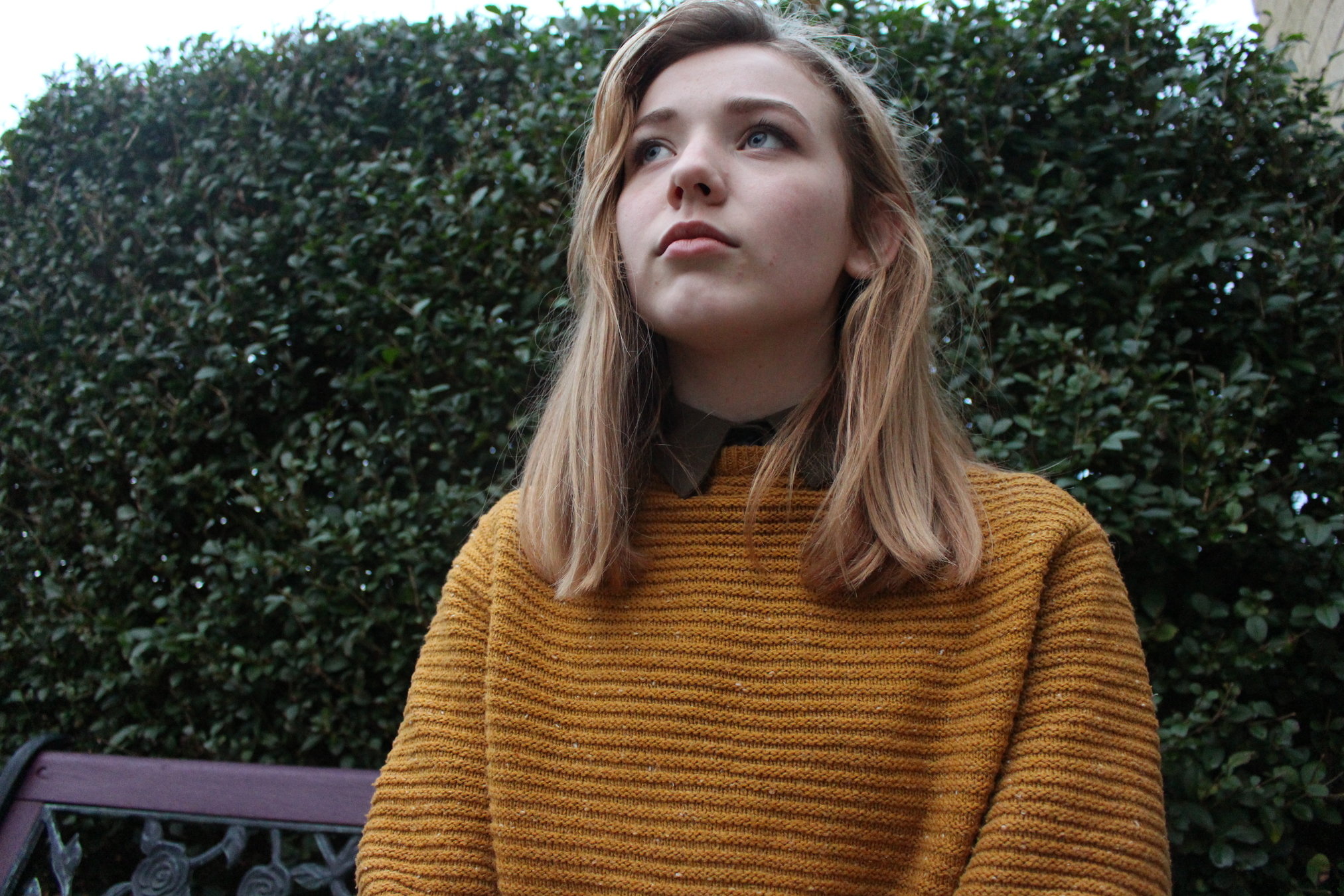
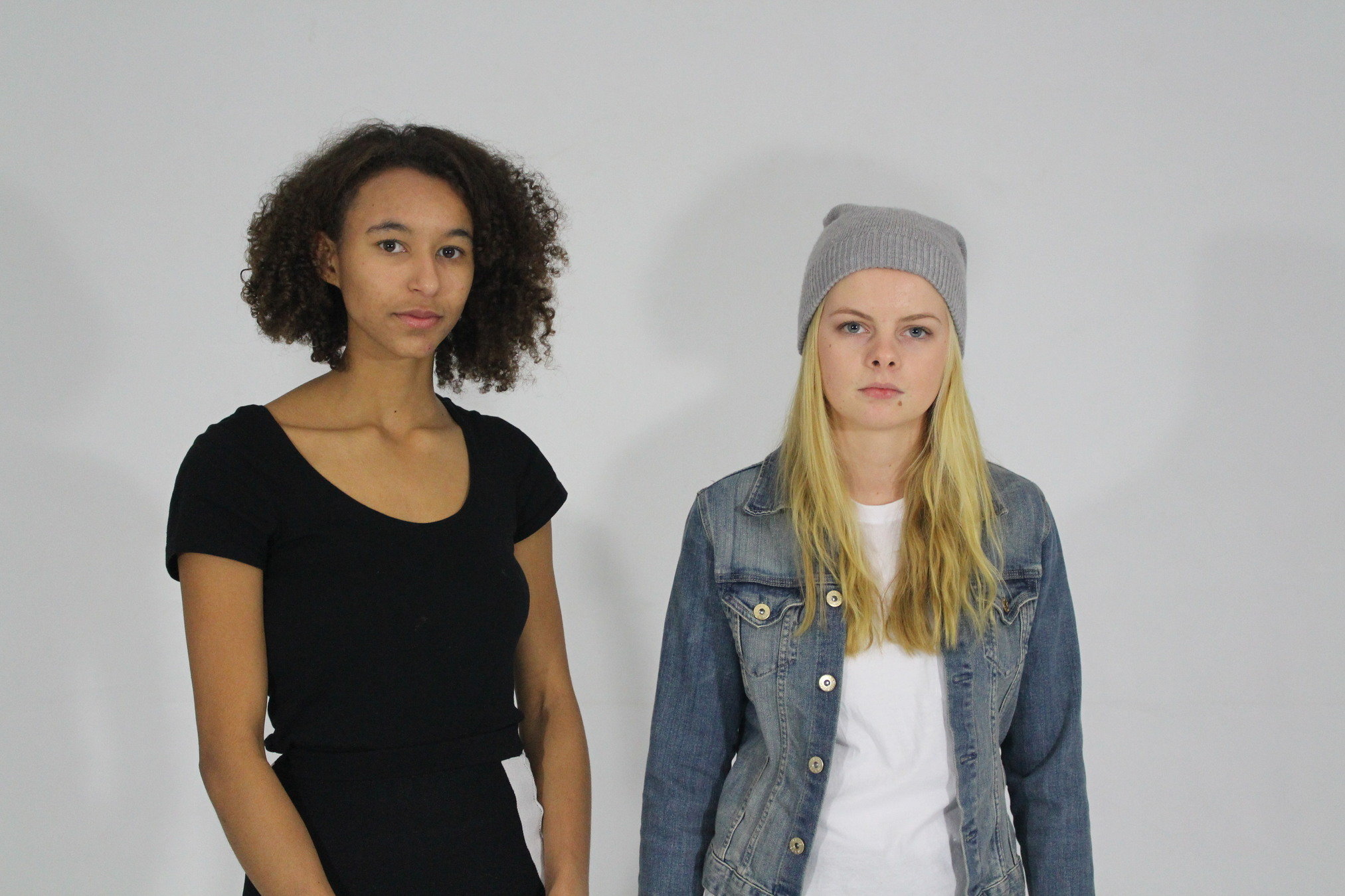
I barely used any props because I wanted to let my models costumes take a lot of the focus but to also let the models look as natural and 'everyday' as possible, so my target audience could relate. I made sure all the costumes I chose all had a moody and unique style to them, as I have seen on websites, like pinterest this is often how the indie culture dresses. I used mostly blacks, blues and whites, because of the images I have seen and that these are the stereotypical colours that my audience would wear. Although I also added in some more colourful pieces of clothing as I am aware not everyone is that stereotype. It was also beneficial for my photos as the colourful outfit to let my model stand out against the earthy background. Unlike the studio shoot, theres may things in the background of the outside shoot
Lighting
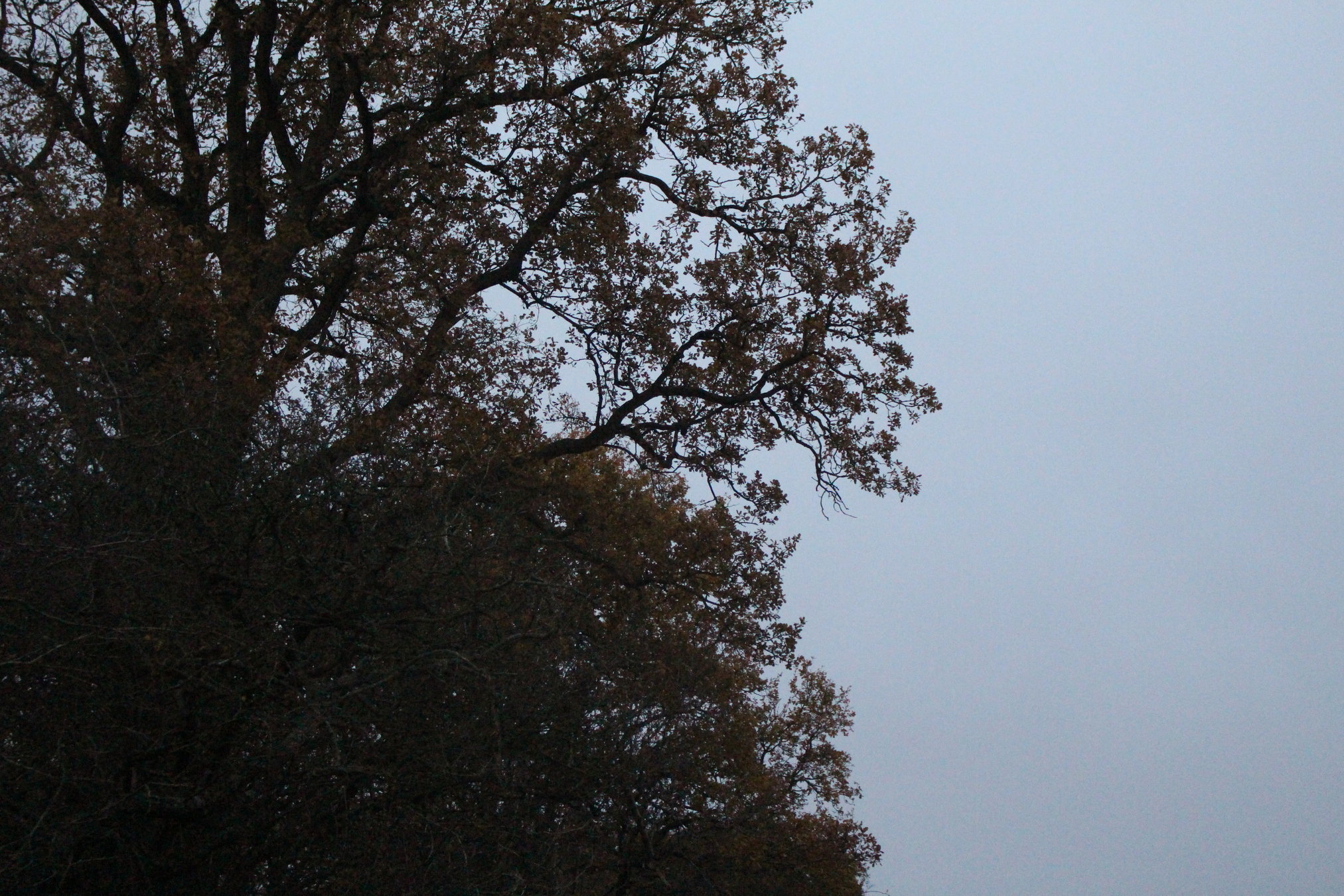
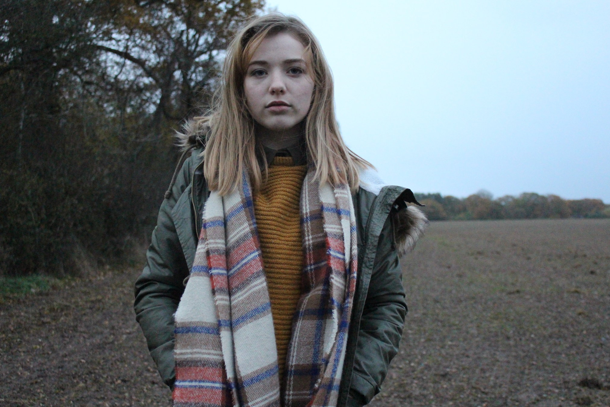
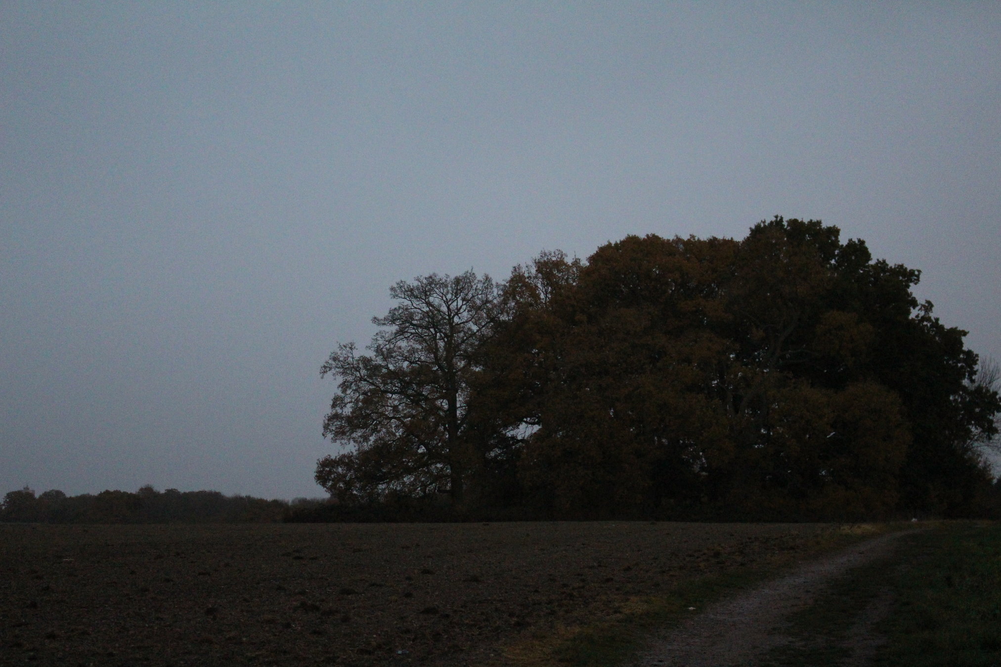
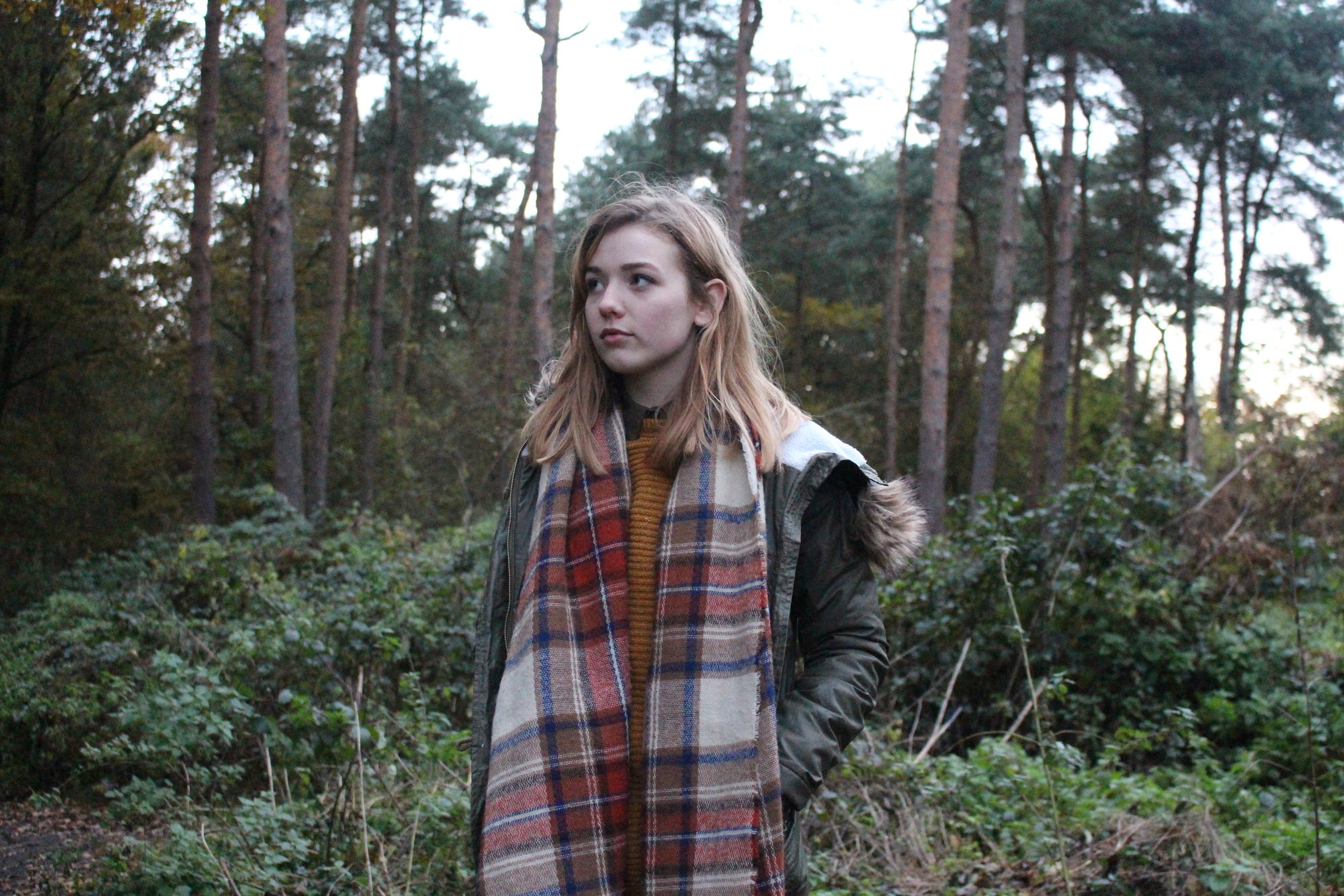
The lighting I used was never too bright as I wanted it to create a dark toned mood and grungy feel to my pictures. I used very natural lighting which was often dark enough, and with photoshop it looked how I wanted it to. I decided on this type of lighting as the social group I was trying to represent often seems to have a moody aura around them, which I think I could represent through the lighting. I also think that the darker lighting made the model stand out, especially with costume. The pictures of the trees I took had a good gloomy lighting and feel to them as the tree itself is almost like a shadow.
Location
I needed to use the studio to get the best quality photos I could for my front cover as this would be the first thing the audience would see and been draw into. The locations I chose, apart from the studio shoot, were related to indie culture, especially the woods. I found that nature seems to be a popular topic within the culture, so I made sure my model was in a natural location for many of my photos. Even if I wasn’t taking photos in an indie specific location, such as the photo shoot backdrop, I edited the photos to look grungy and still have the same vibe as the wood located pictures did.
Use of language
The language isn't formal in any way but it's not completely informal either, it's pretty everyday and basic. I can imagine it's how a lot of my target audience would talk audience would walk and would be able to relate to.
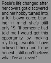
This is a snippet of my double page spread. I wrote my double page spread as more of a conversation, which is popular in indie/ rock magazines. I didn't want to use a Q&A styled double page spread as I have seen many of these in pop magazines, which isn't the genre I was creating my magazine for.
Camera angle
My camera angles where mostly straight on, although I did use some lower angles as well. I used these types of angles to create a slightly intimidating vibe to my model and create the, again, moody atmosphere. A stereotypical view on the indie culture is that they're intimidating, so I didn't take so many of these photos because I want the audience to feel like they're relatable and I know that because its just a stereotype, it's not necessarily true. These images are a few examples of the angles I used
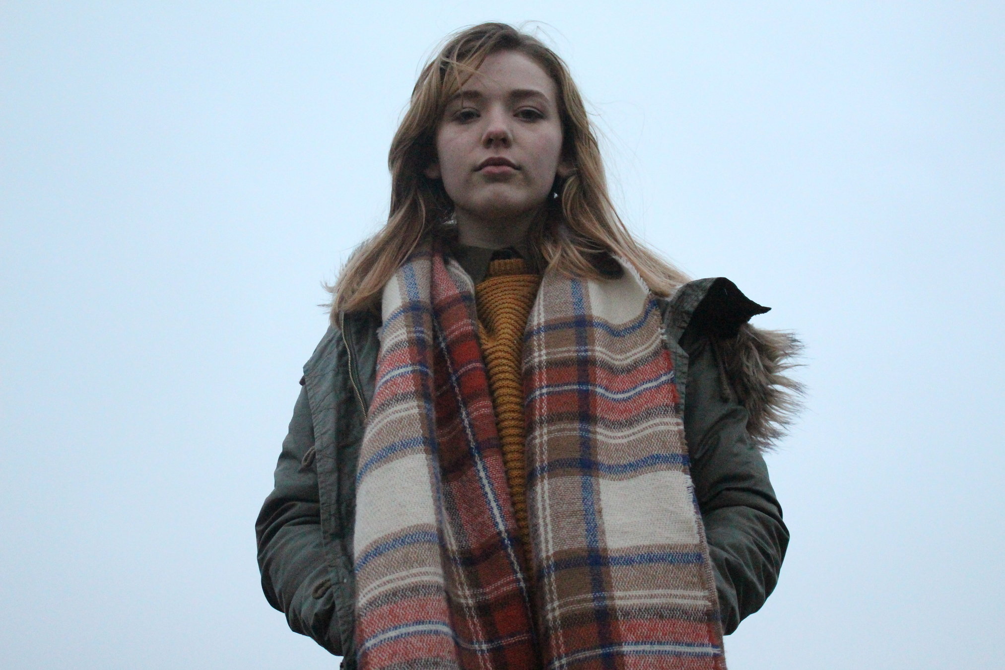
Low angled shot
Long shot
Mid shot
Type of pose
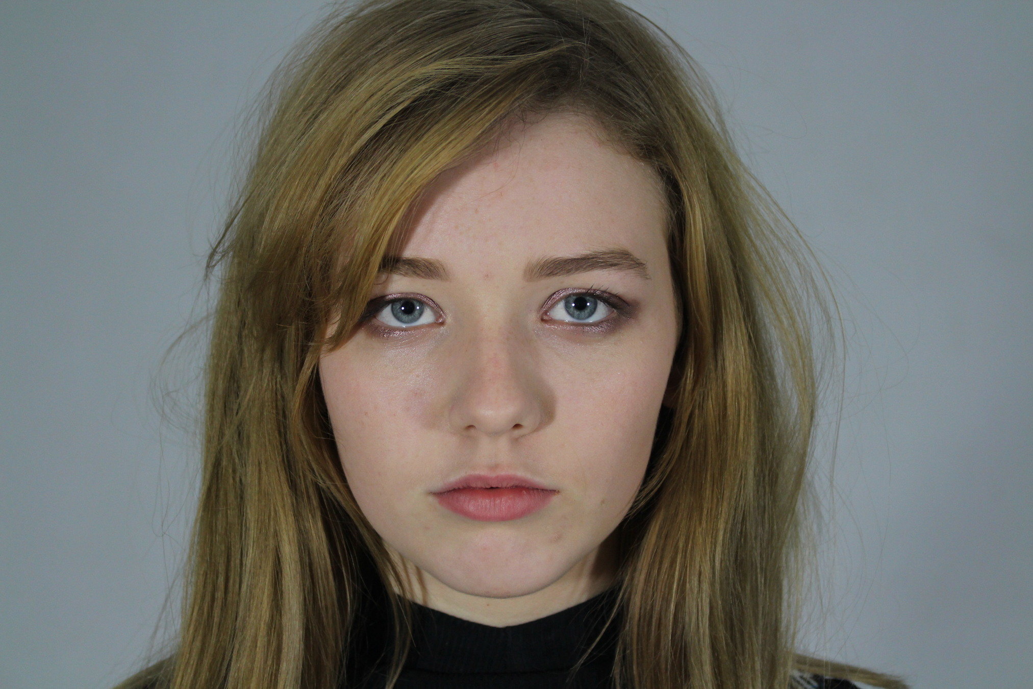
Most of the poses featured are quite stiff, which could be seen as quite intimidating, similarly to the camera angles. I chose these poses as I wanted the models to give off that type of vibe to the reader, easily. I also wanted the body language overall is natural and not too staged. I didn't want the photos I took to come across this way as they may have looked better suited to a pop magazine where the artists poses seem very fake.
Mode of address
Most of my pictures have mode of address through eye contact directly at the camera. Eye contact was important to include in my magazine as I focused a lot on the models drawing the audience in with the simplicity of my magazine. Photos like these I felt could really captivate a reader.
Is there an attitude coming across that reflects the social groups and music genre?
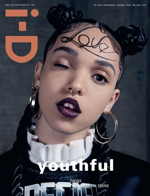
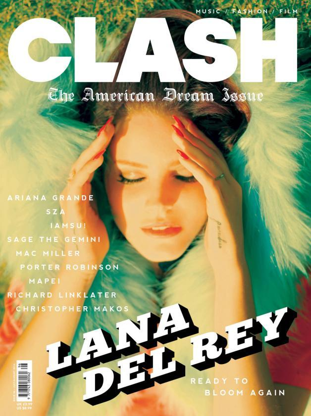
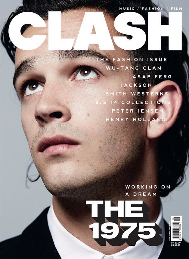
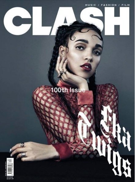
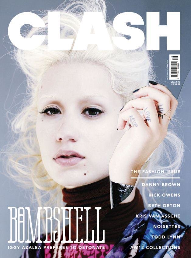
There’s definitely a moody attitude coming across in my magazine. A good example doing this would be the facial expressions of my models. At one point I was considering putting a happier photo in, to break up all of the glum faces, but all of my models have straight moody faces. This gives of a strong vibe of the indie culture’s irritable atmosphere. I think with my photos I have chosen conform the stereotype. ‘Clash’ uses a similar simplistic style in their photos and a comparable over all look of their magazine. Some examples I like below.
Question 2
By emilyrmedia