The art of
Data Visualisation

Ujang Fahmi, M.P.A
Who am I?


Founder and Co-Founder of:
Knowledge is not power. Power is what is done with this knowledge and the decisions and actions taken as a result of understanding the information.
Content Lists
- Knowing the data
- Knowing the message
- Knowing the audience
- Knowing the option
- Knowing how to make

Know the Data
- What data types are in the data set?
- Are the variables mostly categorical, e.g., regions and departments?
- Do the data have geospatial variables, such as country, city, address or postal codes?
- What about dates?
- What are the quantitative variables? Is the categorical data nominal, ordinal, hierarchical or interval (≥ 70 points, < 70 and ≥ 50 points, and < 50) in nature?

Know the Data
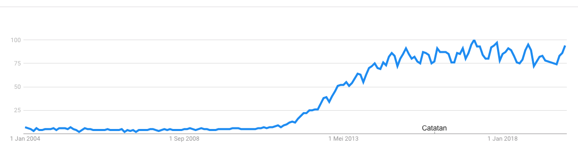
Tren pencarian kata kunci big data di google search
Data yang sama dengan elemen/variabel yang berbeda bisa memberikan informasi yang berbeda pula.
Know the Message
- What is being conveyed?
- Is the purpose to find the story the data are telling or simply to provide an explanation of a known issue?
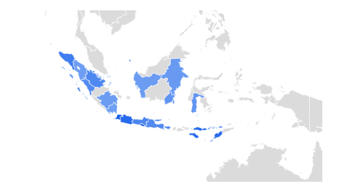
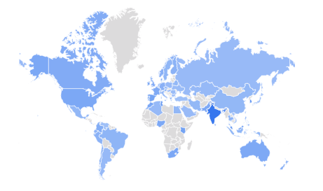
- Di mana saja pencarian di lakukan?
- Dimana asal daerah yg paling banyak melakukan pencarian?
- Pesan/informasi apa yang bisa didapatkan dari visualisasi tersebut?
Know the Audience
- What experience, skill and understanding of the subject will the audience members have?
- What is their ability to focus?
- How interested are they?

Paralel Coordinates plot
Parallel Coordinates Plots are ideal for comparing many variables together and seeing the relationships between them.
Know the Options
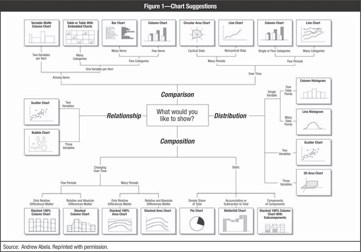
One of four things with the data should be shown:
- Relationship between data points
- Comparison of data points
- Composition of data
- Distribution of data or the geospatial location of data points.
Know the Options
What makes those chart good/not good?
A chart should be able to give an information to the audience at the first sight
How to make
1. Know the data
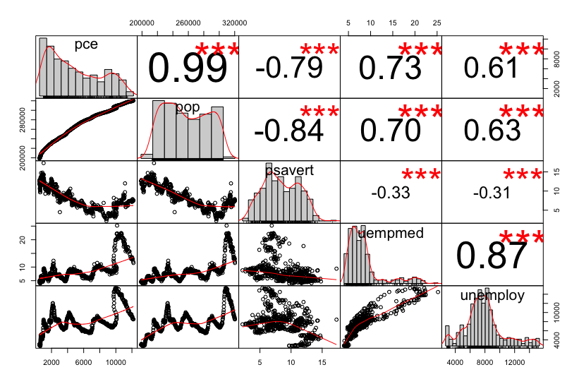
  date         pce    pop psavert uempmed unemploy
   <date>     <dbl>  <dbl>   <dbl>   <dbl>    <dbl>
 1 1967-07-01  507. 198712    12.6     4.5     2944
 2 1967-08-01  510. 198911    12.6     4.7     2945
 3 1967-09-01  516. 199113    11.9     4.6     2958
 4 1967-10-01  512. 199311    12.9     4.9     3143
 5 1967-11-01  517. 199498    12.8     4.7     3066
 6 1967-12-01  525. 199657    11.8     4.8     3018
 7 1968-01-01  531. 199808    11.7     5.1     2878
 8 1968-02-01  534. 199920    12.3     4.5     3001
 9 1968-03-01  544. 200056    11.7     4.1     2877
10 1968-04-01  544  200208    12.3     4.6     2709
2. Know the data types
Observations: 574
Variables: 6
$ date     <date> 1967-07-01, 1967-08-01, 1967-09-01, 1967-10-01, 1967-11-01, 1967-12-01, 1968-01-01, 1968-02-01, 1968-03-01, 1968-04-01, 1968-05-01, 1968-06-01, 1968-07-01, 19…
$ pce      <dbl> 506.7, 509.8, 515.6, 512.2, 517.4, 525.1, 530.9, 533.6, 544.3, 544.0, 549.8, 556.3, 563.2, 567.0, 568.2, 571.6, 576.7, 576.5, 583.5, 588.7, 588.9, 593.9, 600.3…
$ pop      <dbl> 198712, 198911, 199113, 199311, 199498, 199657, 199808, 199920, 200056, 200208, 200361, 200536, 200706, 200898, 201095, 201290, 201466, 201621, 201760, 201881,…
$ psavert  <dbl> 12.6, 12.6, 11.9, 12.9, 12.8, 11.8, 11.7, 12.3, 11.7, 12.3, 12.0, 11.7, 10.7, 10.5, 10.6, 10.8, 10.6, 11.1, 10.3, 9.7, 10.2, 9.7, 10.1, 11.1, 11.8, 11.5, 11.6,…
$ uempmed  <dbl> 4.5, 4.7, 4.6, 4.9, 4.7, 4.8, 5.1, 4.5, 4.1, 4.6, 4.4, 4.4, 4.5, 4.2, 4.6, 4.8, 4.4, 4.4, 4.4, 4.9, 4.0, 4.0, 4.2, 4.4, 4.4, 4.4, 4.7, 4.5, 4.8, 4.6, 4.6, 4.5,…
$ unemploy <dbl> 2944, 2945, 2958, 3143, 3066, 3018, 2878, 3001, 2877, 2709, 2740, 2938, 2883, 2768, 2686, 2689, 2715, 2685, 2718, 2692, 2712, 2758, 2713, 2816, 2868, 2856, 304…- date: Month of data collection
- psavert: personal savings rate
- pce: personal consumption expenditures, in billions of dollars
- unemploy: number of unemployed in thousands
- uempmed: median duration of unemployment, in weeks
- pop: total population, in thousands
How to make
3. What information do you want to put on the chart?
e.g. an increase in population from year to year
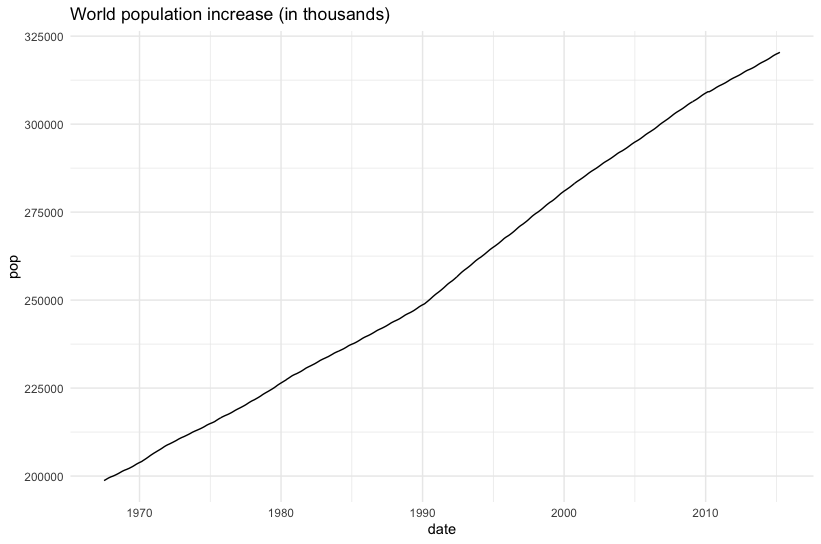
Is that really the information that the audience doesn't know yet?
Consider to plot more valuable information on the plot
How to make
3. What information do you want to put on the chart?
e.g. relation among variables
Is the chart easy to read?
Consider to plot more valuable information on the plot and background of your audience
How to make
3. What precisely the data tell?
e.g. relation between two variables
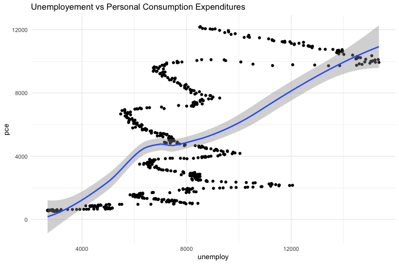
Is the chart easy to read?
Is the information valuable?
Trendline provides more direct information
How to make
Concluding Remarks
- Visualisasi adalah salah satu langkah penting dari sebuah proses pencarian informasi
- Visualisasi bisa sangat bermanfaat baik dalam tahapan eksplorasi maupun pengkomunikasian hasil
- Visualisasi yang baik adalah visualisasi yang bisa memberikan informasi dengan mudah
- Sebelum membuat visualisasi sebaiknya tahu lebih dulu jenis atau tipe data, audiens yang ditarget, dan pesan/informasi yang ingin disampaikan
Visualisasi adalah ilmu seni yang multidisiplin, karena Ia perlu dibuat dengan teknik, didasari dengan pengetahuan serta perlu memiliki rasa yang biasanya ditentukan oleh pemilihan warna.
Reference
- Koch, K., “How Much the Eye Tells the Brain,” Current Biology, 25 July 2006; 16(14): p. 1428–1434, www.ncbi.nlm.nih.gov/pmc/articles/PMC1564115/
- Few, Stephen, “Effectively Communicating Numbers,” Perceptual Edge, November 2005
- Steele, Julie; “Why Data Visualization Matters,” Radar, 15 February 2012, http://radar.oreilly.com/2012/02/why-data-visualization-matters.html
UAD, 17 Nov2019
By Eppofahmi
UAD, 17 Nov2019
UAD-data visualisation, 17 Nov 2019


