How to DataViz
Prologue
Why DataViz?
People don't read papers any more ...
... they just look at the graphs
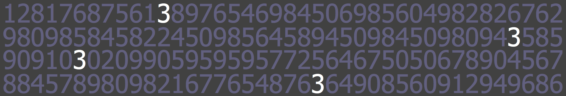
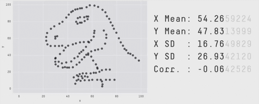
How many 3s?
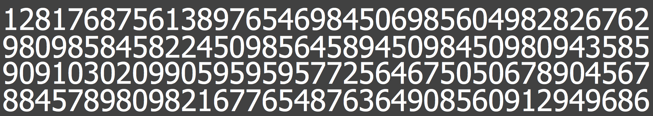
Data is hard to Understand
How many 3s?
Slide from Heer, Stasko
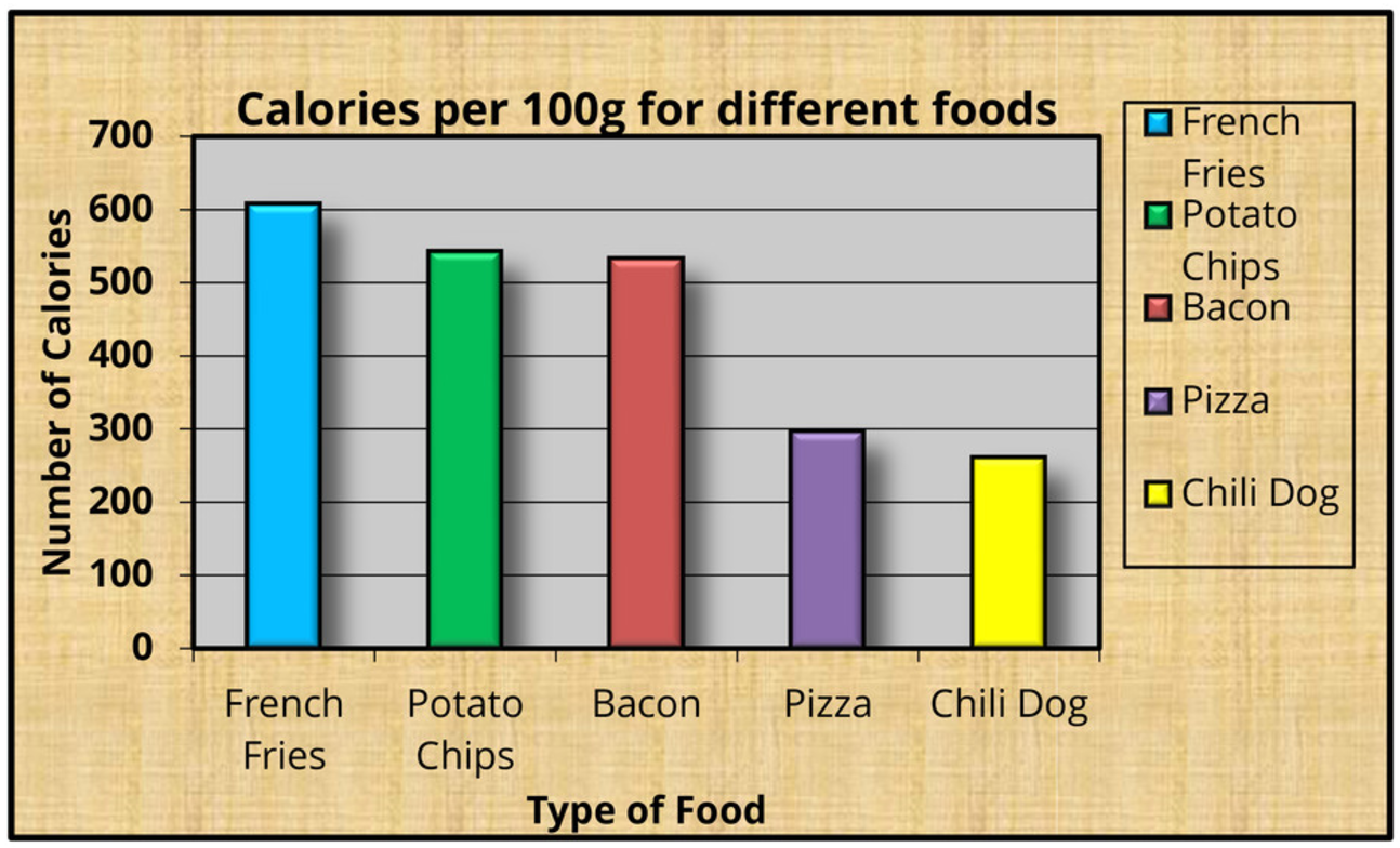
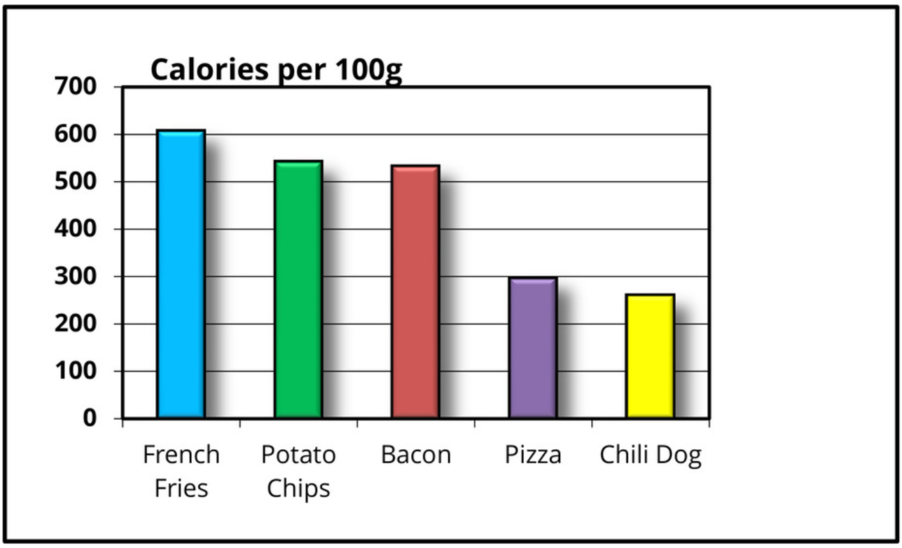
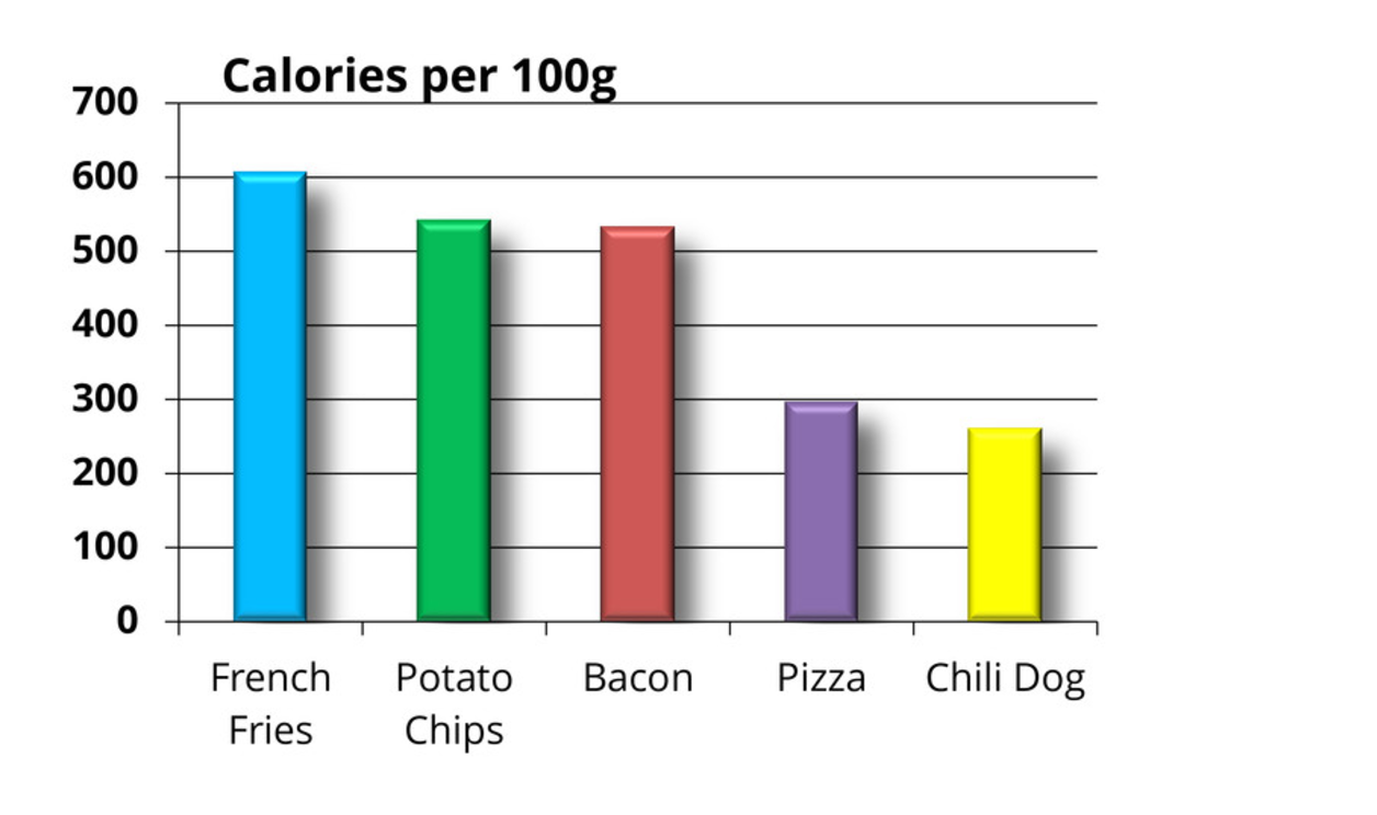
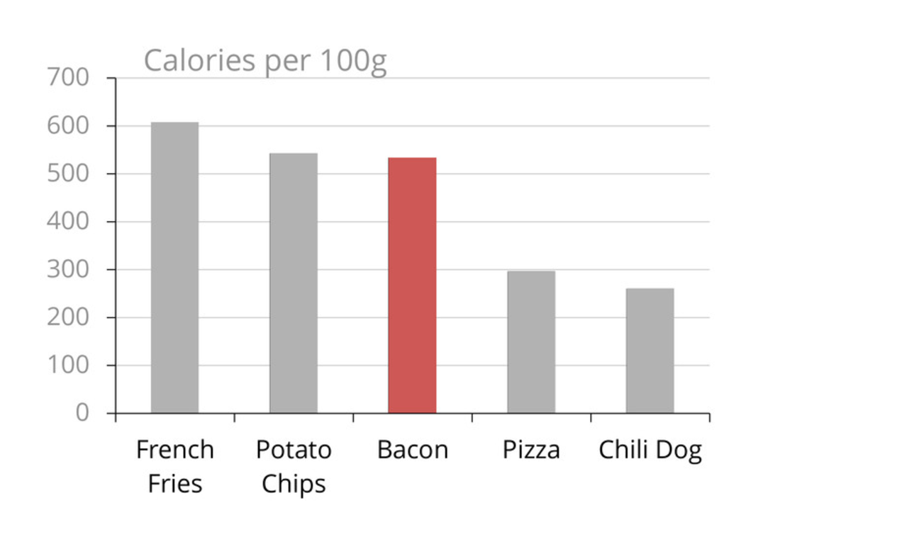
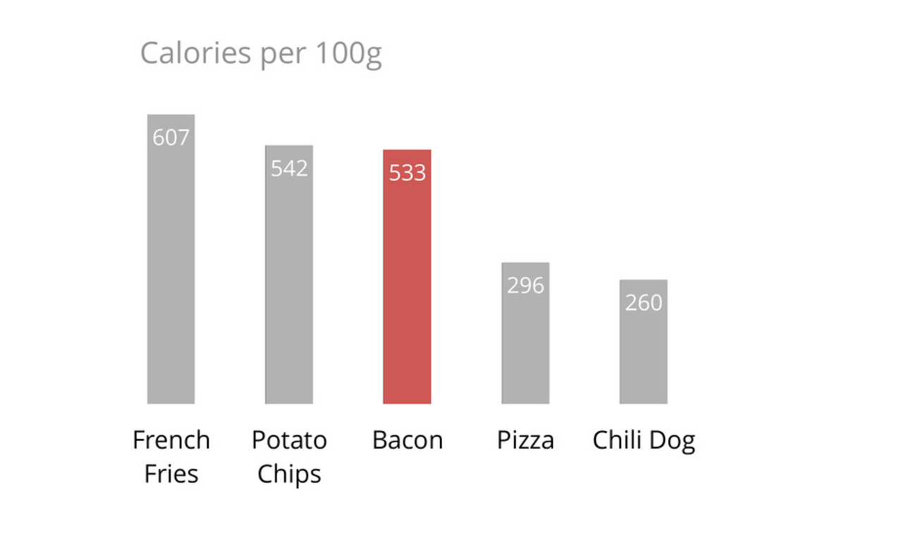
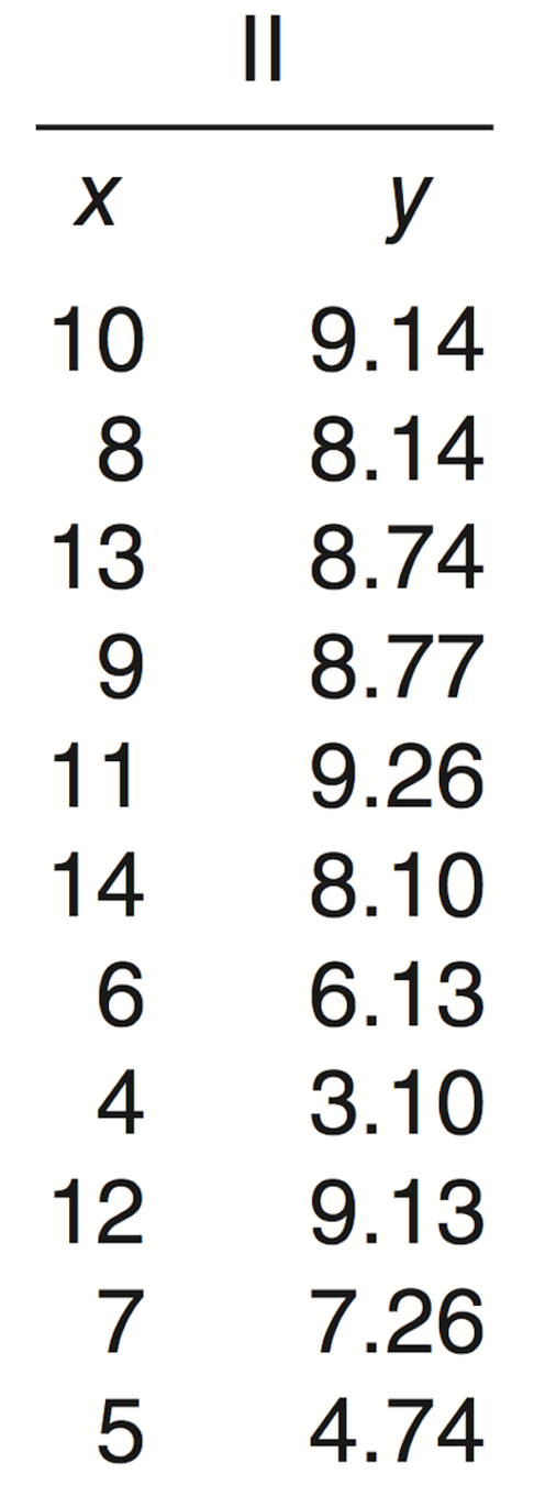
Better than Tables
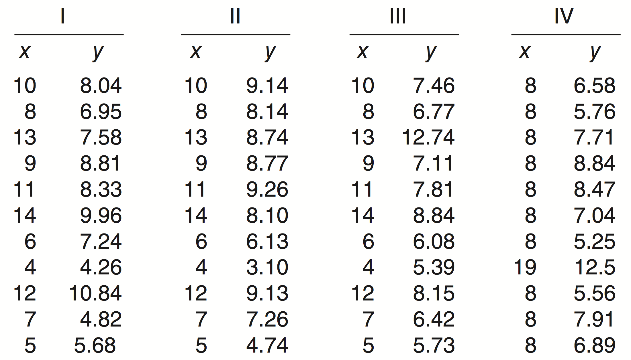

Even Stats Can Fail
1, 2, 3, 4, ...
DataViz works because Vision is Powerful
Numbers —> 1 Dimensional
Vision —> 5-8 Dimensions
Why This Talk?
“Perception is a fantasy that (tries to) coincide with reality”

Straight or Bent lines?
... they're straight

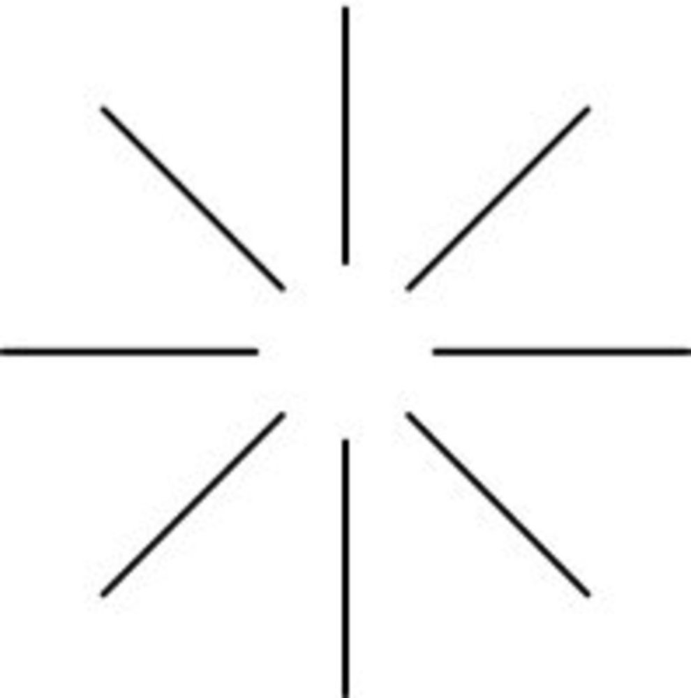
See the Triangle?
... it's not really there
DataViz is Hard
is Design
(Good)

No Formulae
No Rules
Many Requirements
Design
Creative
Iterative
M Bostock, https://youtu.be/fThhbt23SGM
Guiding Principles
Provide Insight
"Through the graph ... we should see something that would have been harder to see otherwise."
Be Minimalistic
Be Clear
Use as little ink or as few pixels for every bit of data as possible.
Keep the ink/data ratio low.
Attention Bottleneck
"You can pay attention to only one aspect of an image at a time ... neural networks in your brain constantly compete for limited attentional resources."
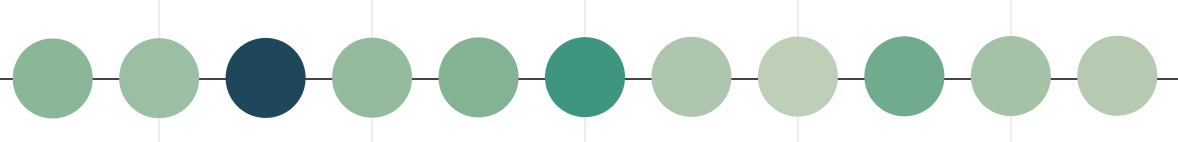
Red Circle
Left | Right
Attention Bottleneck ...

Purple Circle
Left | Right

Purple Circle
Left | Right

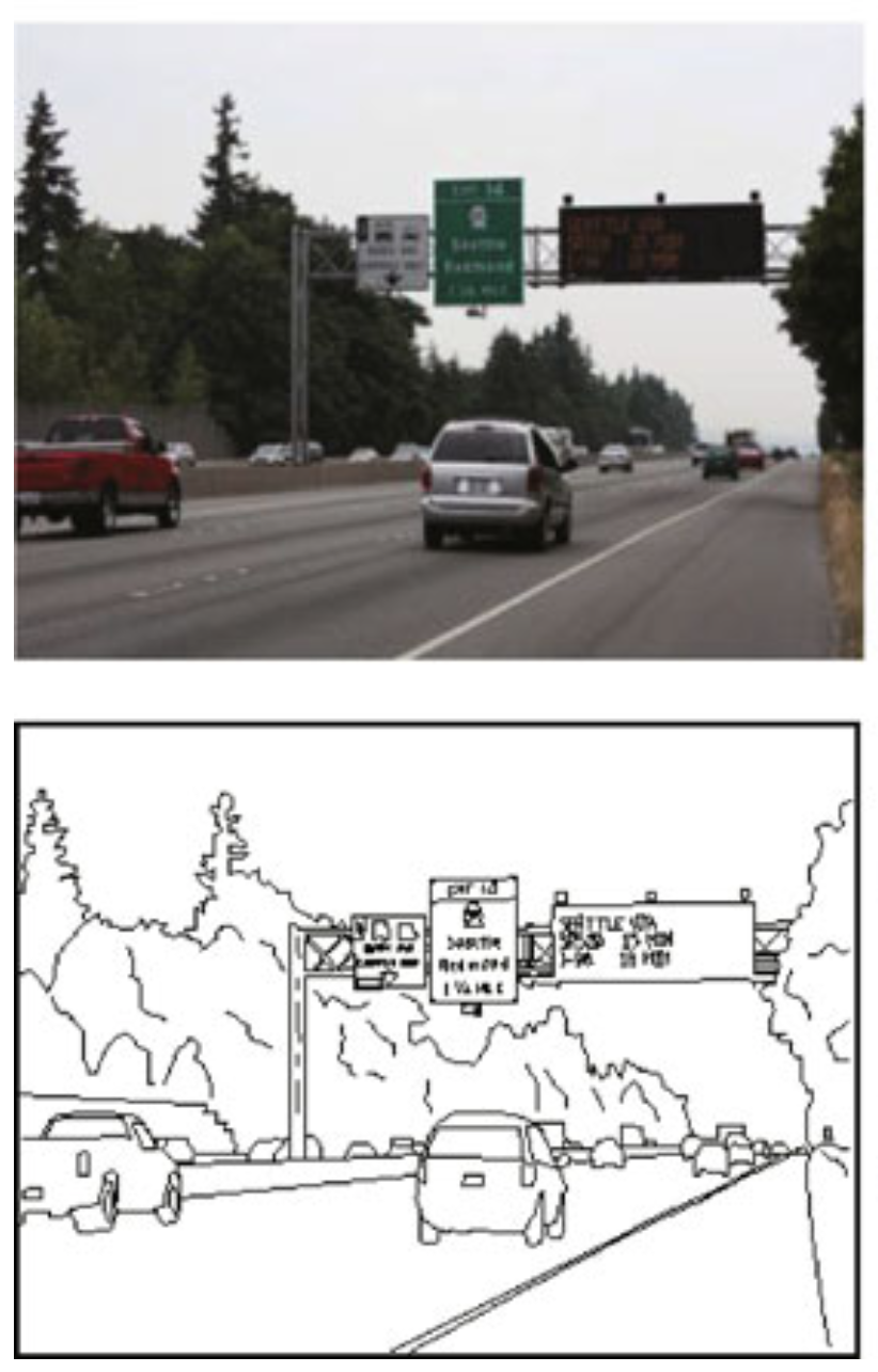
Simplified Information is Surprisingly Effective
Simplified Information is Surprisingly Effective
Simple lines and edges are actually what your brain is looking for.
And so vision works quite well without all of the visual detail.
Which also frees up the attentional bottleneck
Removing "Chart Junk"
Rethinking your Graph
MakeComparisons Accurately
Different visual qualities have different accuracies.
Use the one appropriate to your data.
Visual Qualities
Position
Length
Angle
Area
Colour / Brightness
Visual Qualities
Table ... Counts too
Visual Qualities
Sometimes a visualisation doesn't do any better than a table.
Tables are the baseline for assessing the quality of a visualisation.
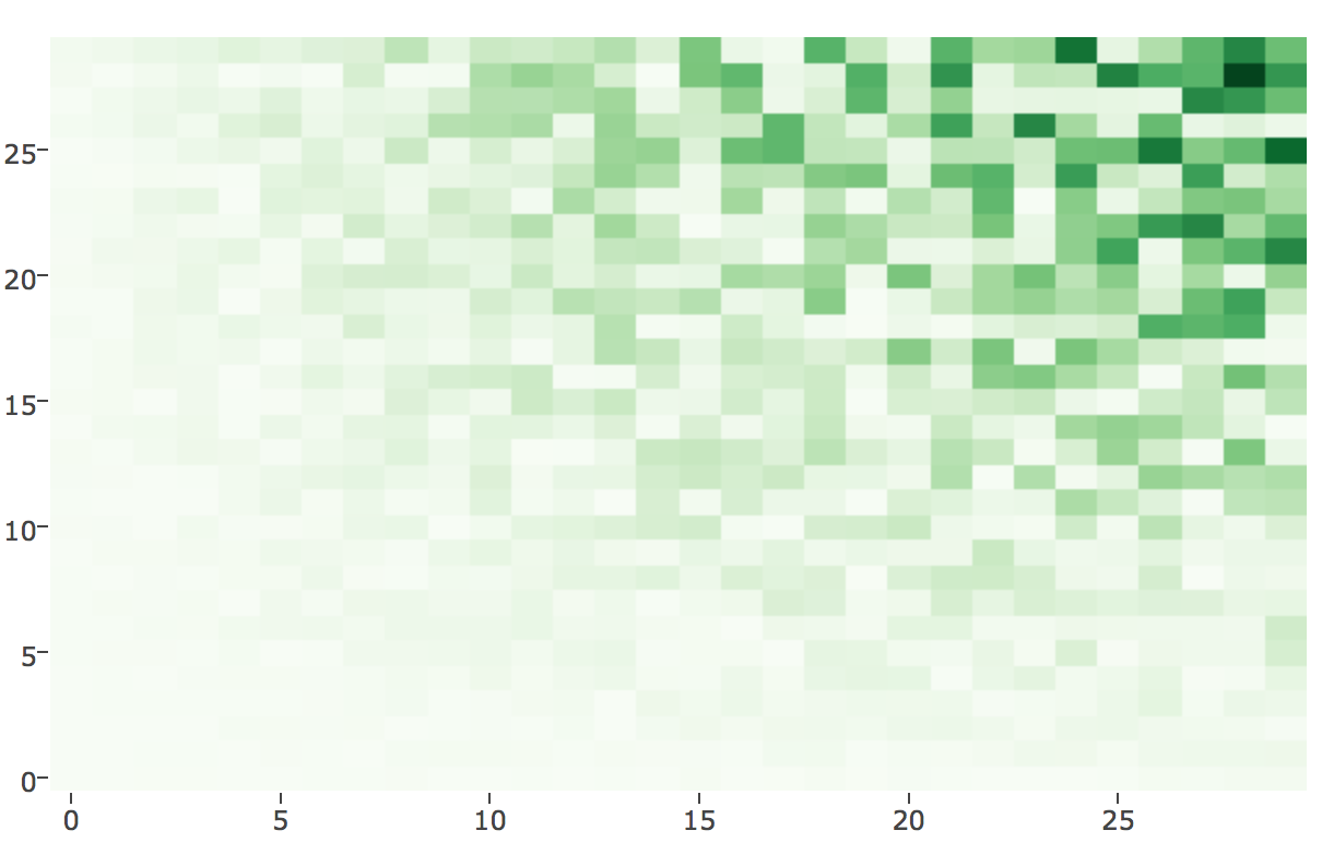
Colour
A B C D E F G H I J K
.... which is the FOURTH Darkest?
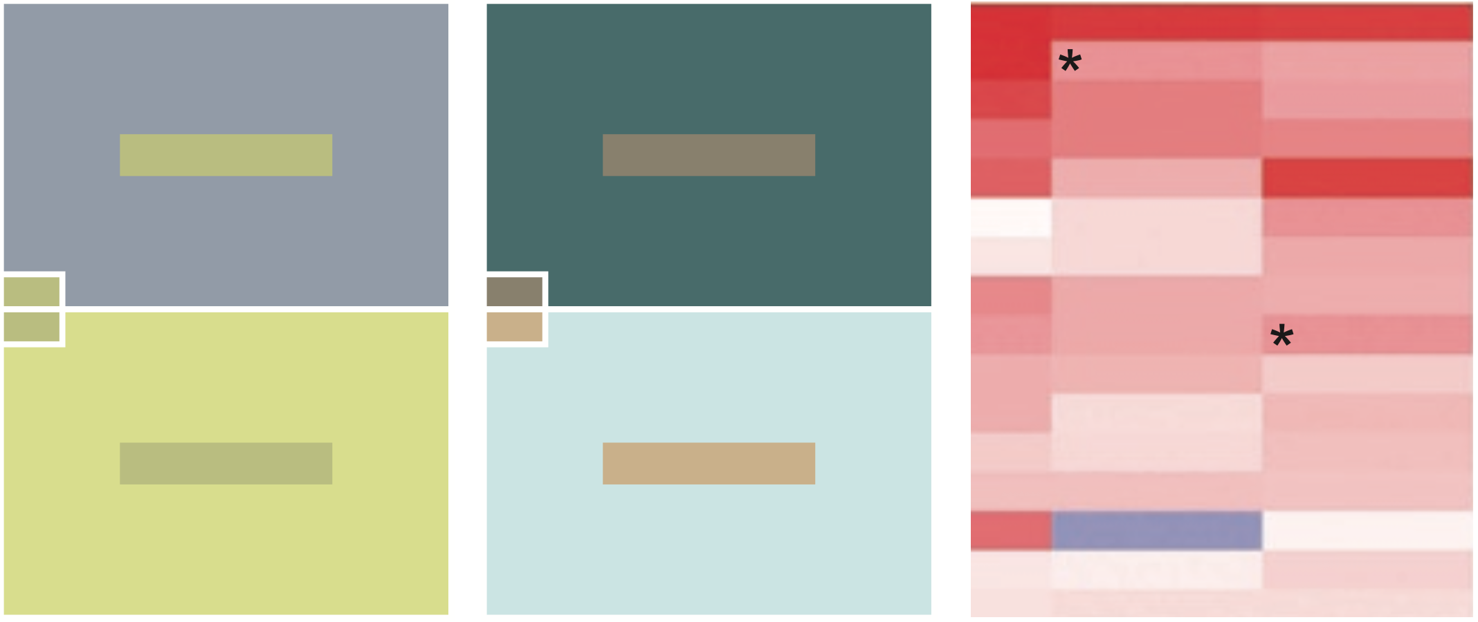

Colour
Colour can suffer from illusions
Which bars are the same and which are different?
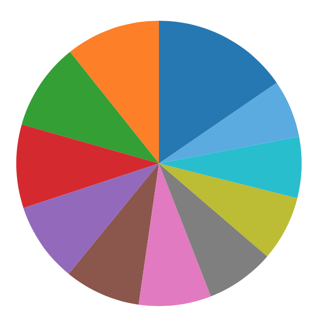
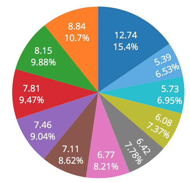
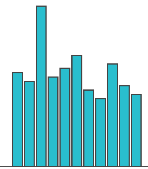
Area
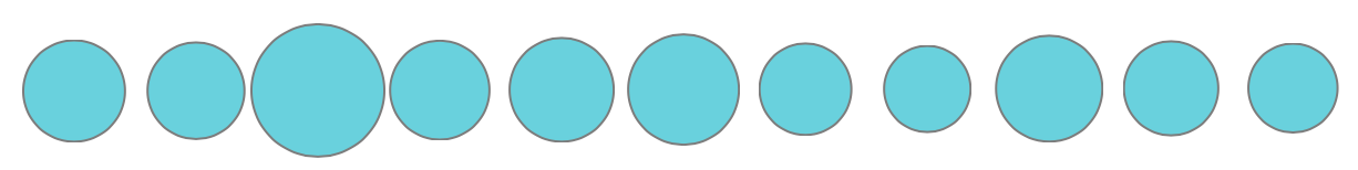
A B C D E F G H I J K
.... which is the FOURTH Smallest?
Unfortunately, currently popular ... for example
Angles
Which is second smallest?
Third Smallest?
Angles
Slope Comparisons
Can be relatively accurate when optimised
Slope Comparisons
Differences easier to see when angle is ~45 degrees.
Slope Comparisons
Slope is greater or lesser for the increase or decrease?
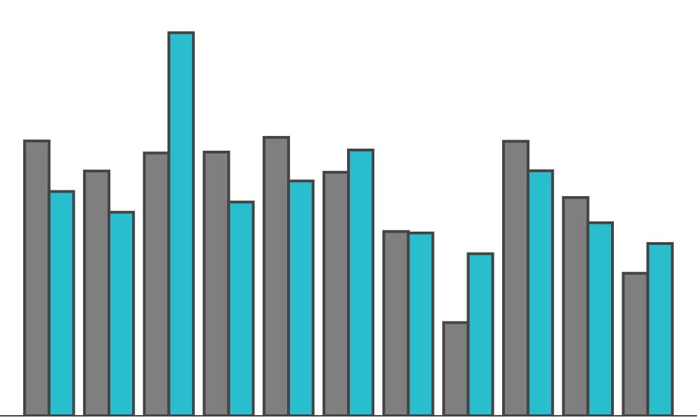
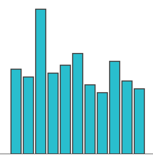
Length
Of the blue ... which is the second smallest?
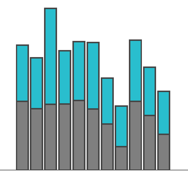
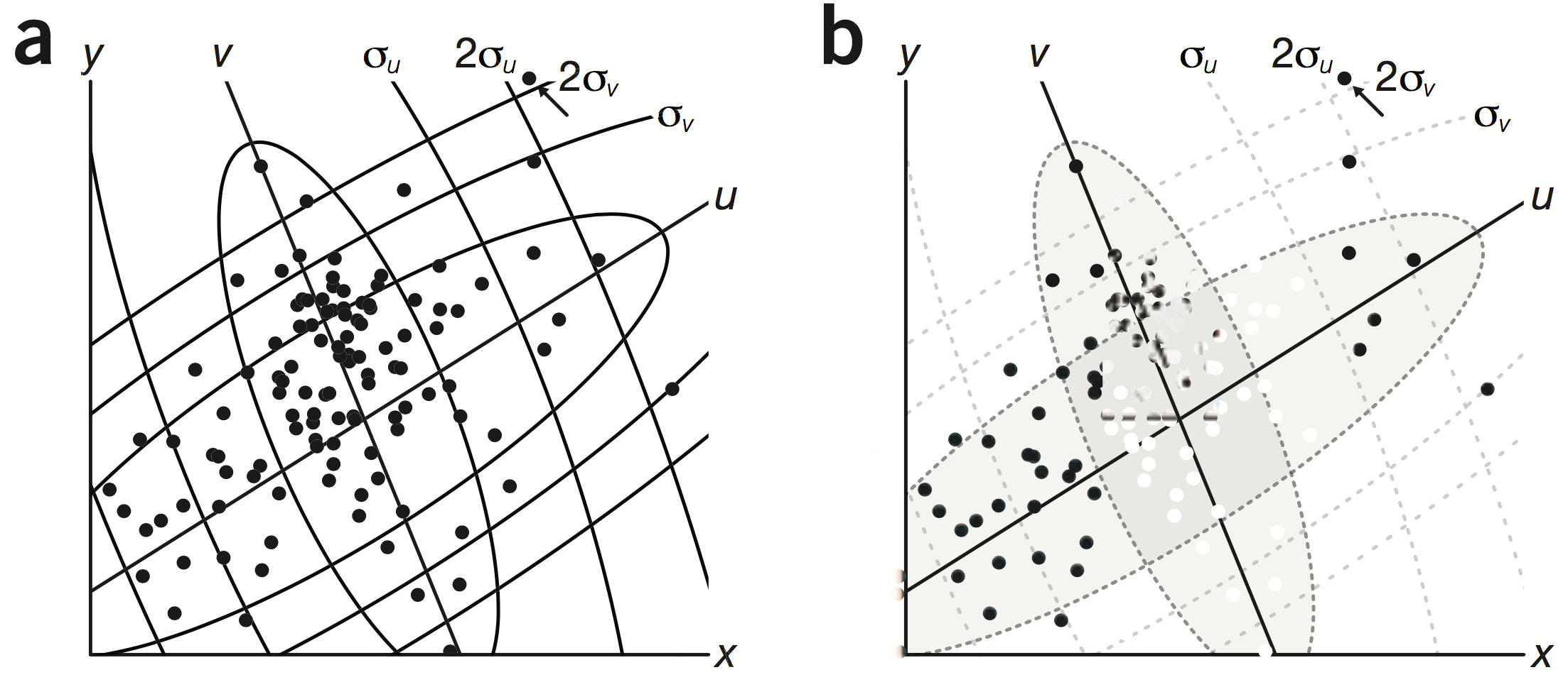
Position
Grey v Blue is easy & clear
Comparing Blue with Blue is harder ...
... Distance makes position accuracy worse
Position
Position
Position
Accurate
Inaccurate
Impressionistic
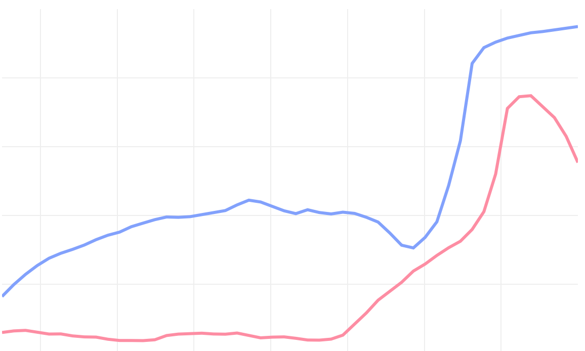
Less accurate doesn't mean bad
Use less accurate visual forms when the differences being compared are large, or there is a large structure in the data to be shown.
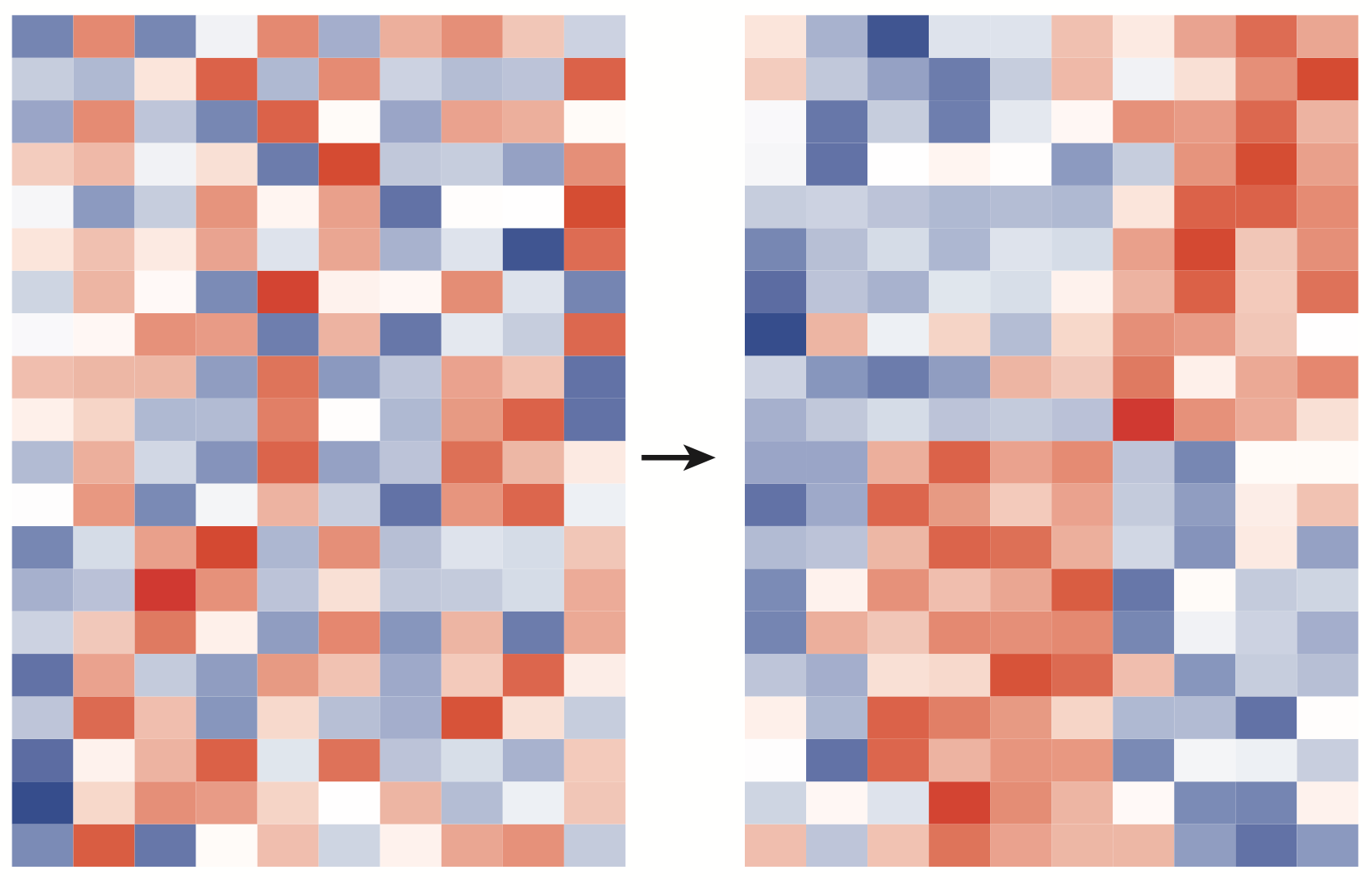
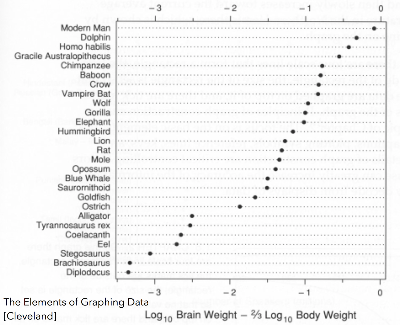
Sometimes you have order your data for the structure to be apparent
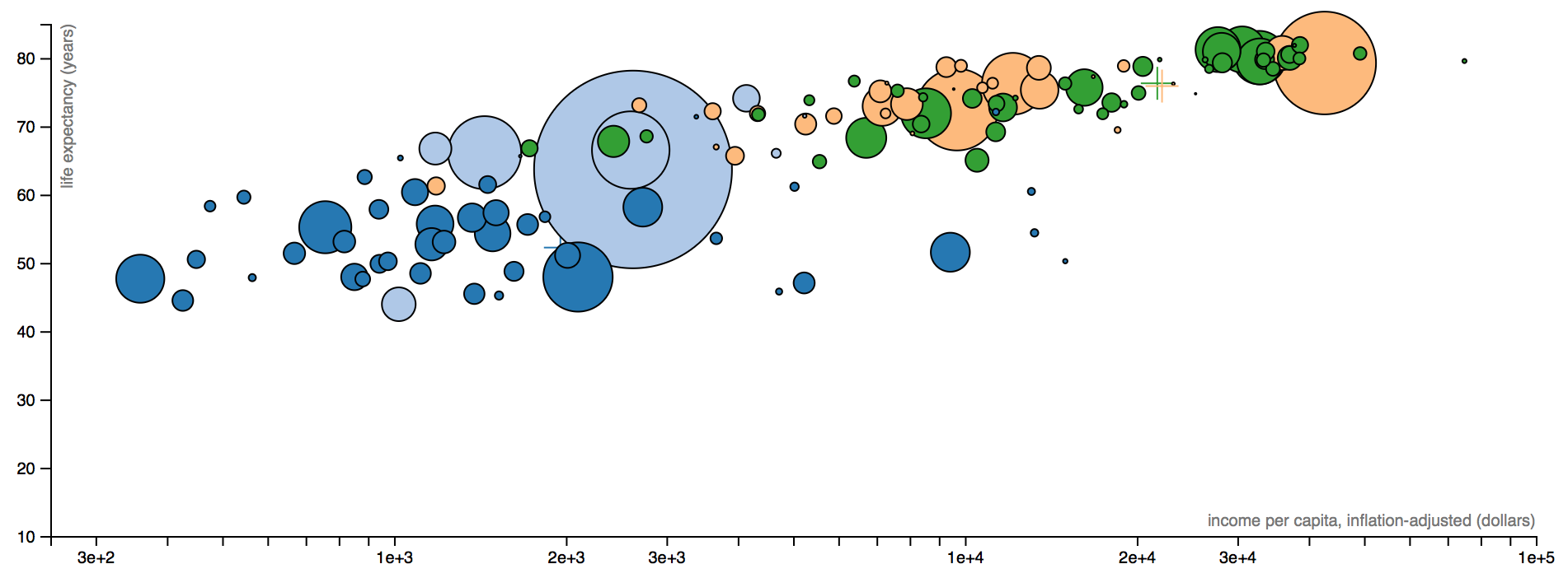
Sometimes it is useful to make inaccurate comparisons when the intention is to simply make it evident that there is substantial variation in a measurement, not to allow direct one-to-one comparisons
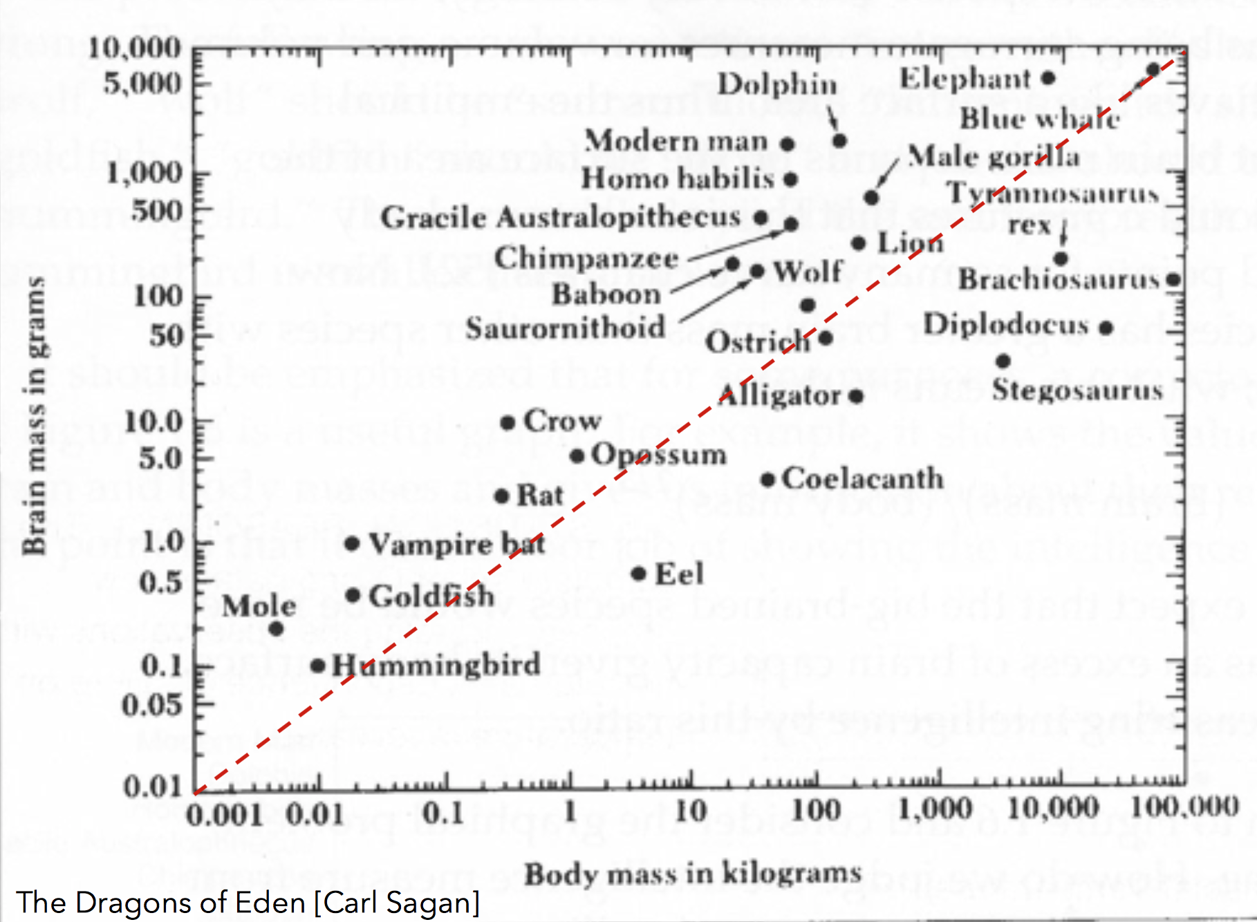
Here area encodes population for various nations of the world. The idea is that there are large differences in population, and that it doesn't affect the correlation.
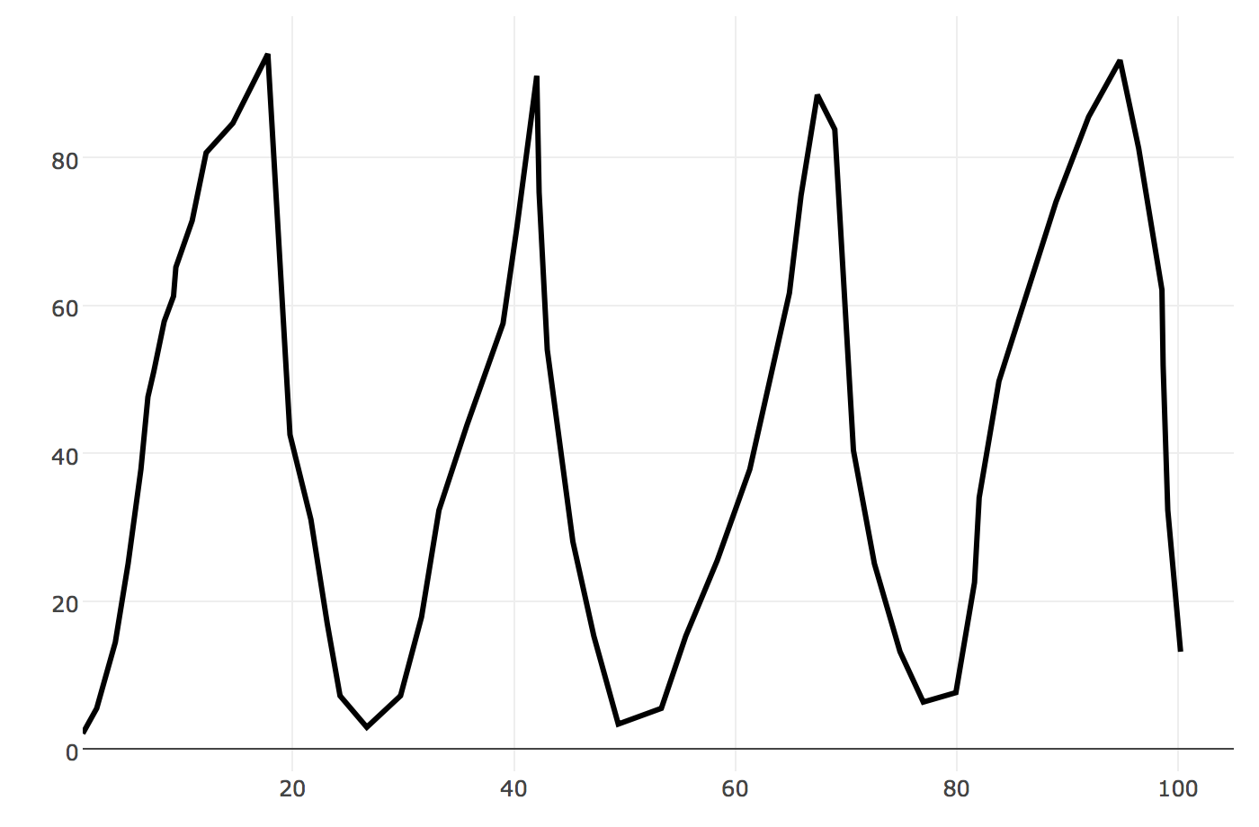
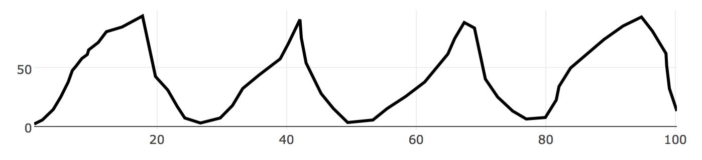
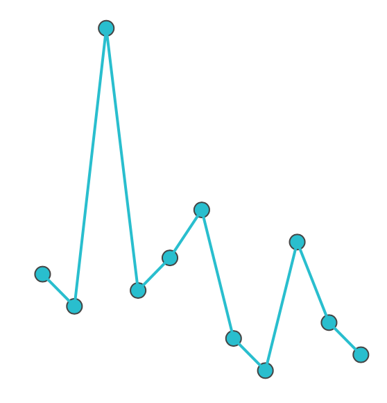
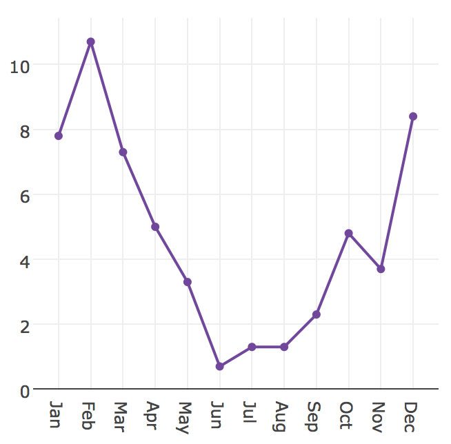
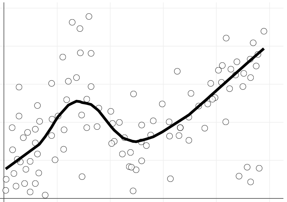
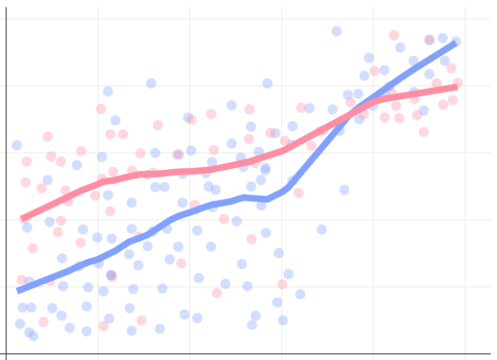
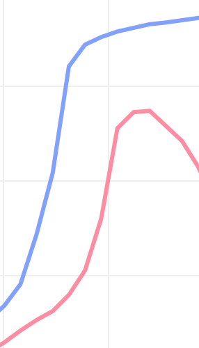
Show Structure with Shapes & Curves
The eye is looking for shapes and curves.
Use that.
These shapes don't exist
But your brain wants to see them
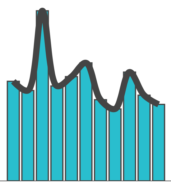
Though position is accurate, you often see and remember the structure as a line / curve / shape
Which shows the structure (insight) most clearly and easily?
Links
Which shows the comparison most clearly and easily?
Which shows the comparison, structure and insight most clearly and easily?


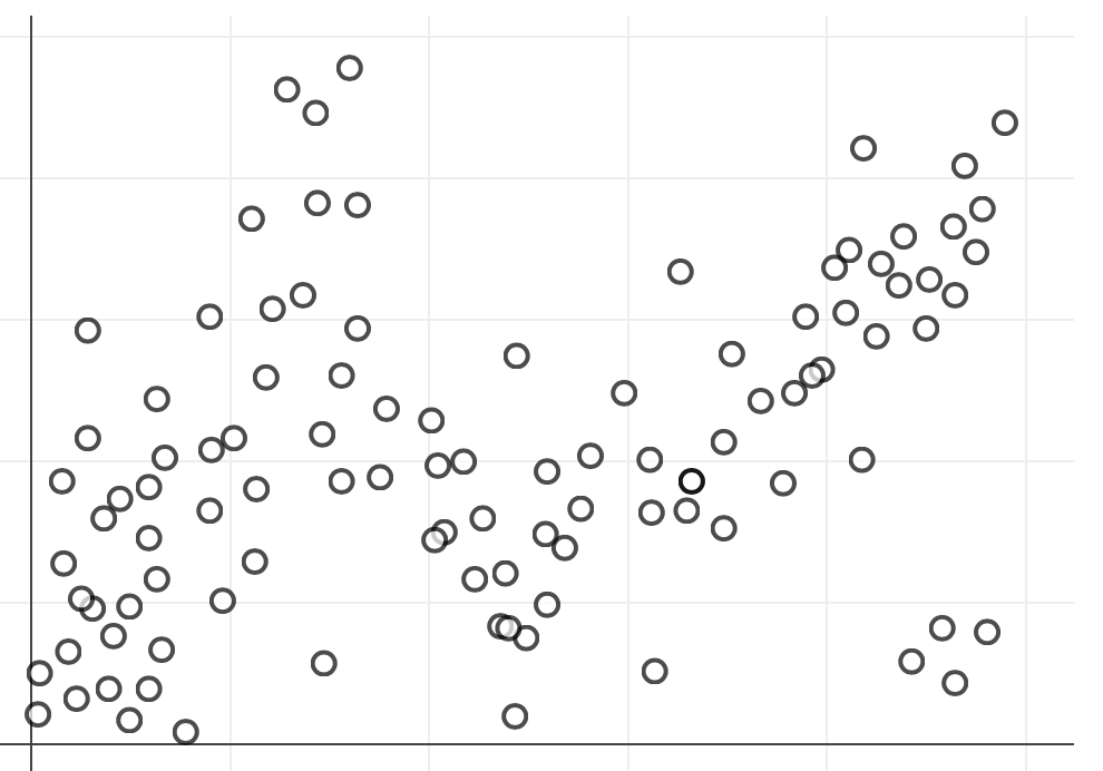
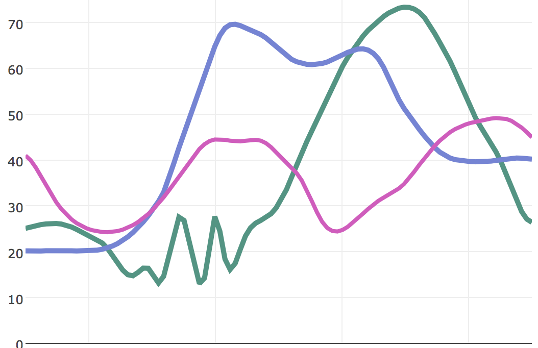
Smoothing in 2D


Shape perception can be dangerous
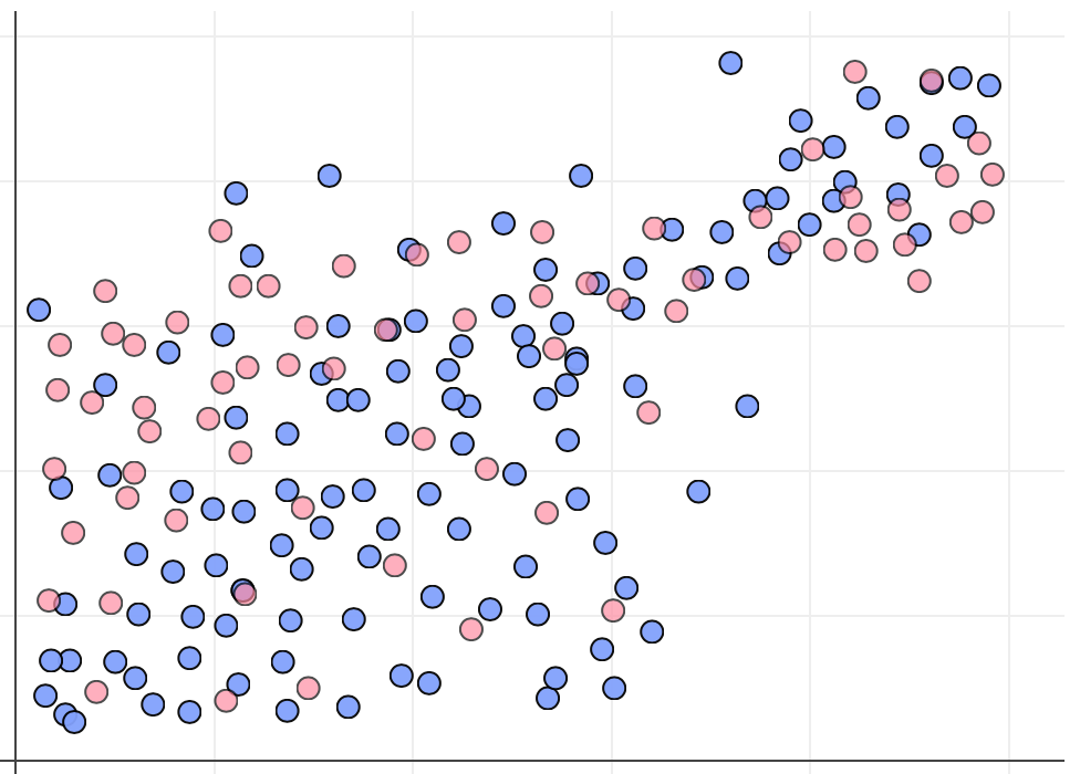
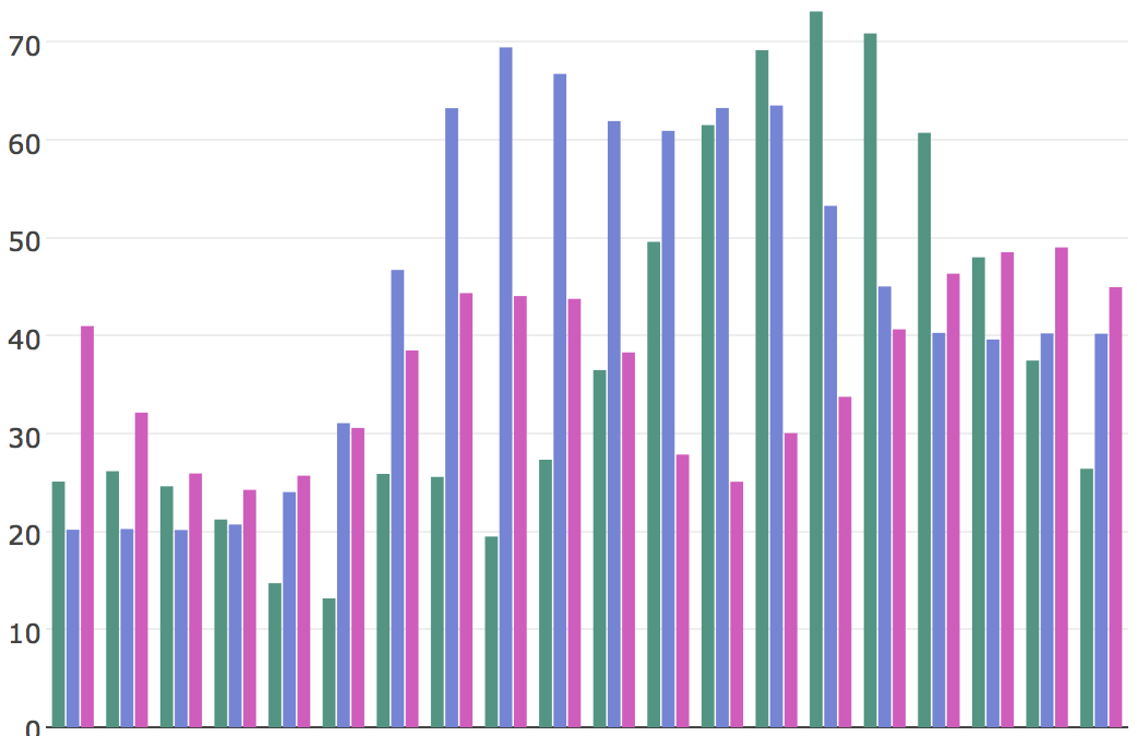
What are the differences between these two data sets?
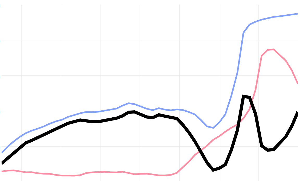
How predictable was the differences curve?
Often, graphing the differences is better or necessary
As, when curves are close and of similar slopes, we begin to see new shapes, not the axial distance between them.
Visually Group Layers of Information
The eye can focus on and ignore visual elements depending on shared visual qualities.
Differences in some visual features Pop Out
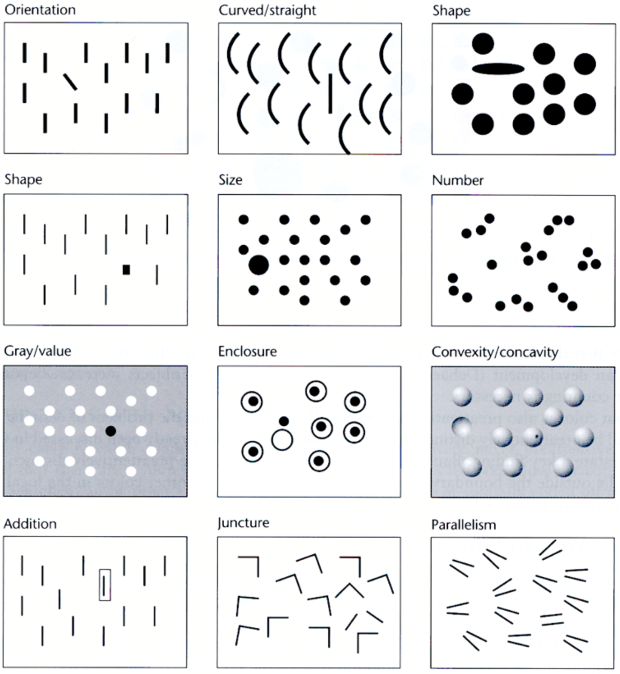
Angle
Size
Shape (many variations)
Colour / Brightness
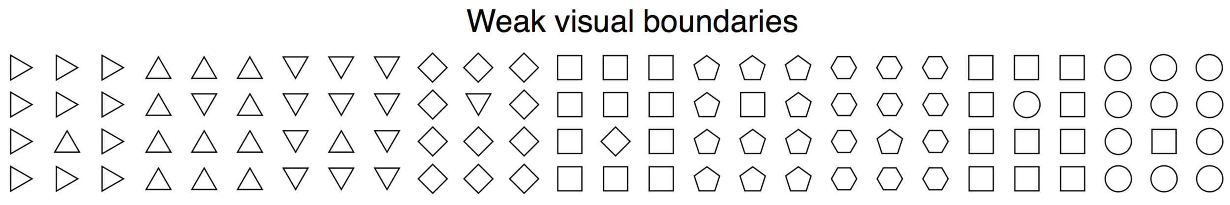
Using Pop Out leads to the ability to focus on different groups
Different elements stand out
Different groups stand out
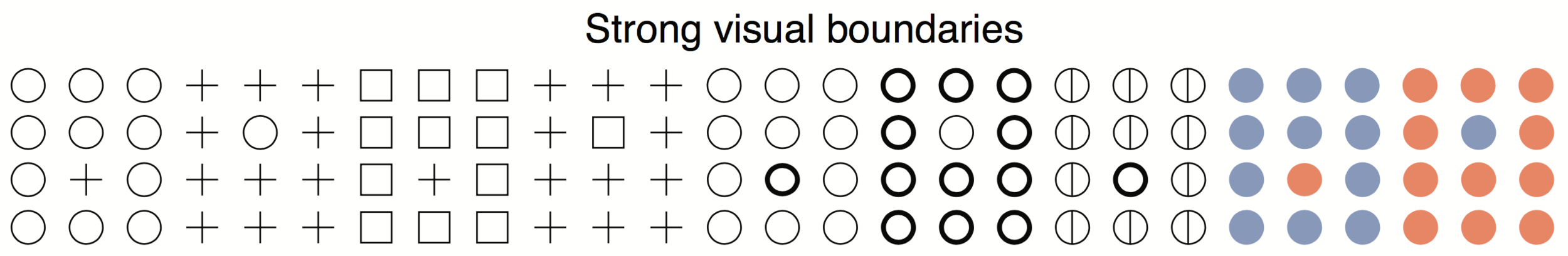
Maximising Pop Out aids grouping
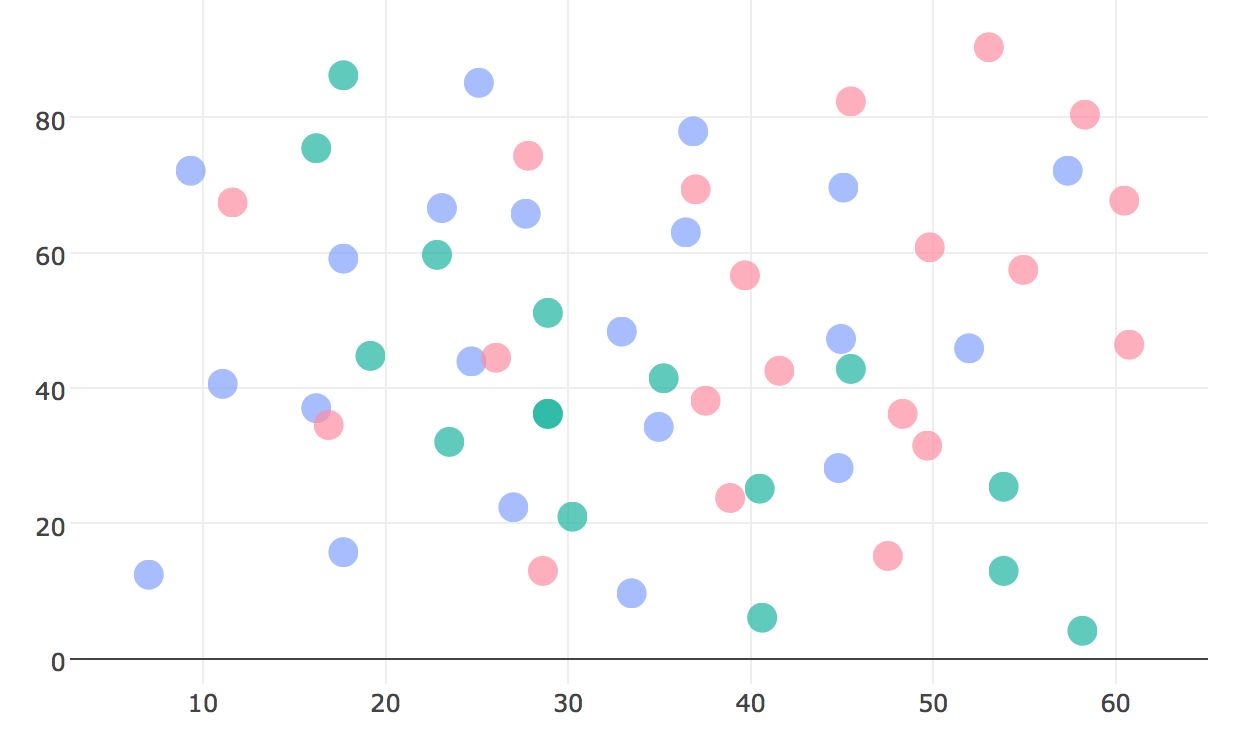
Using different colors helps
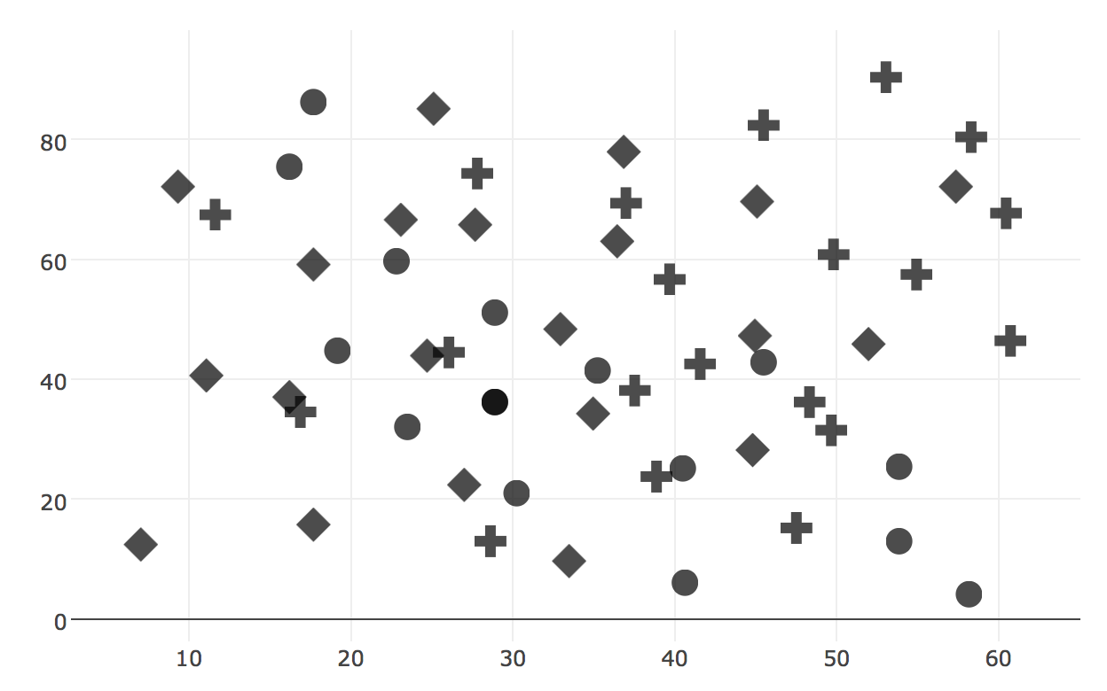
Using different shapes helps
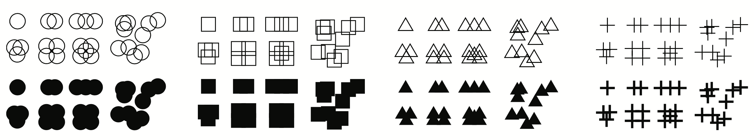
The crosses are the most different and pop out the most
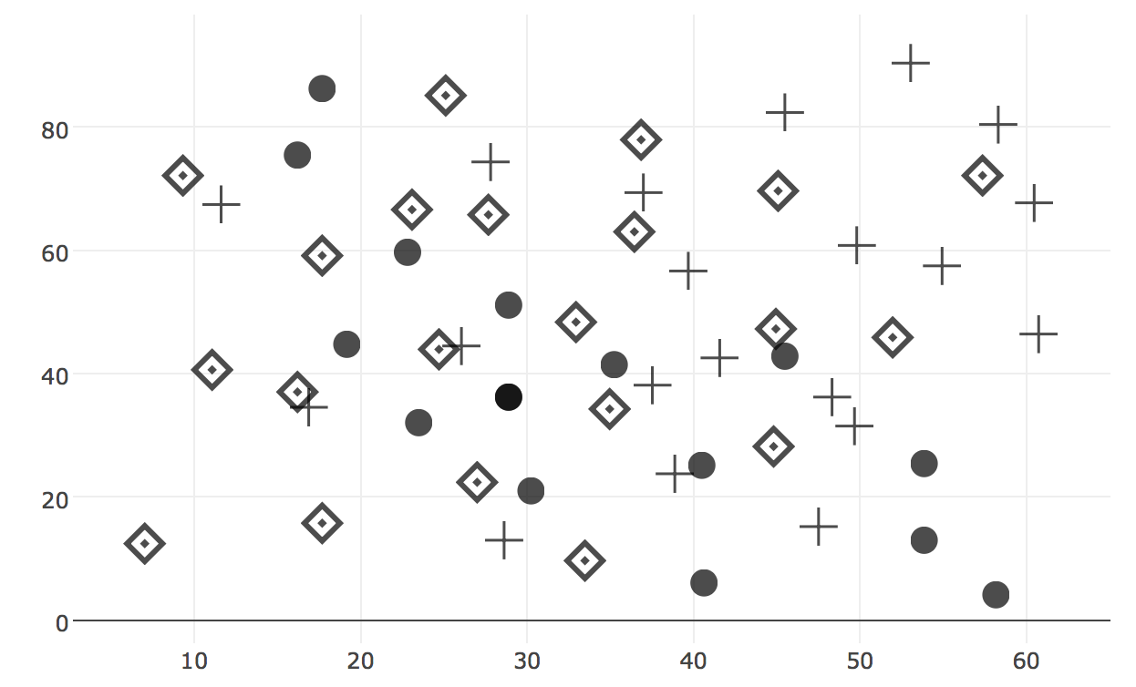
Using different shapes + thickness/size/darkness is better
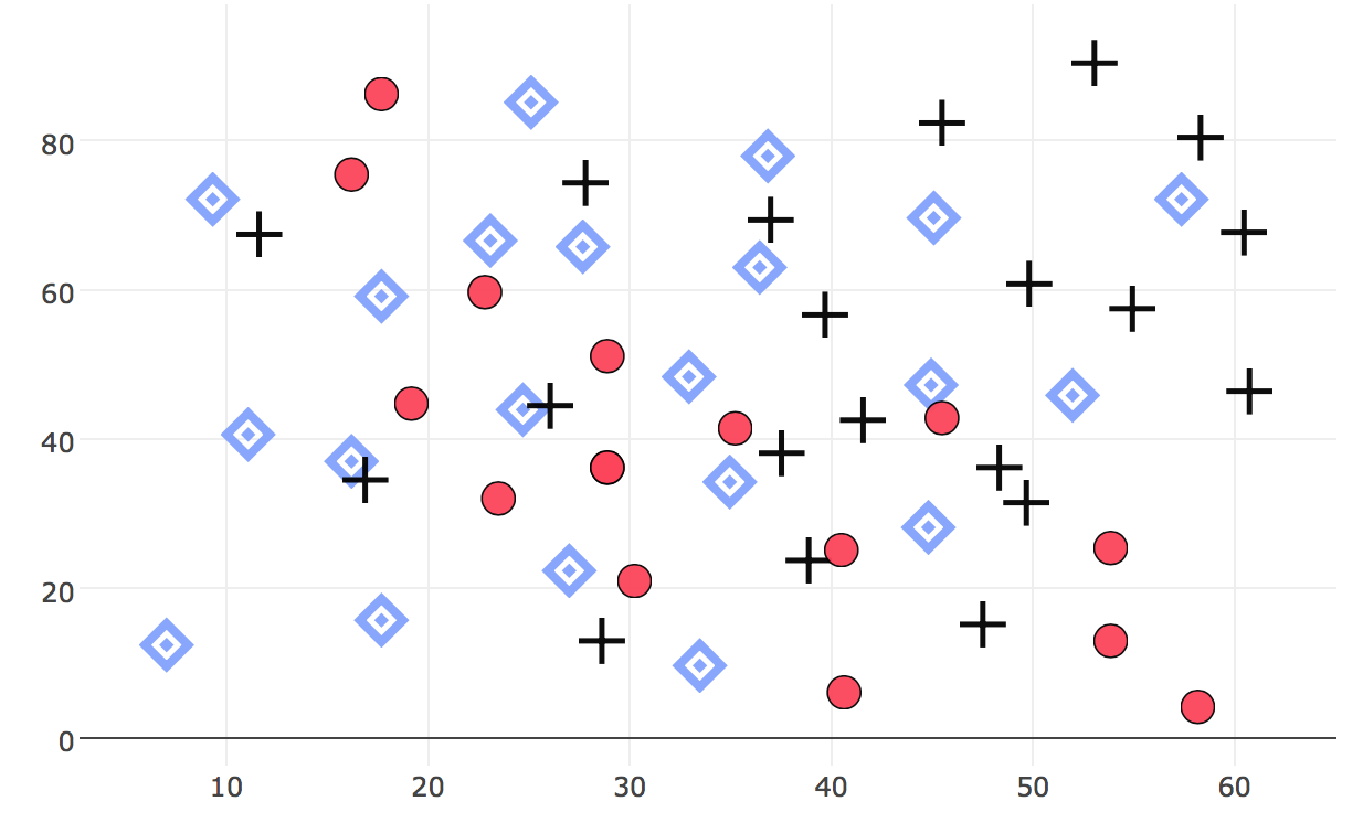
Combining differences in colour + shape + darkness + size is best
Allowing for maximal density and shape perception is good too
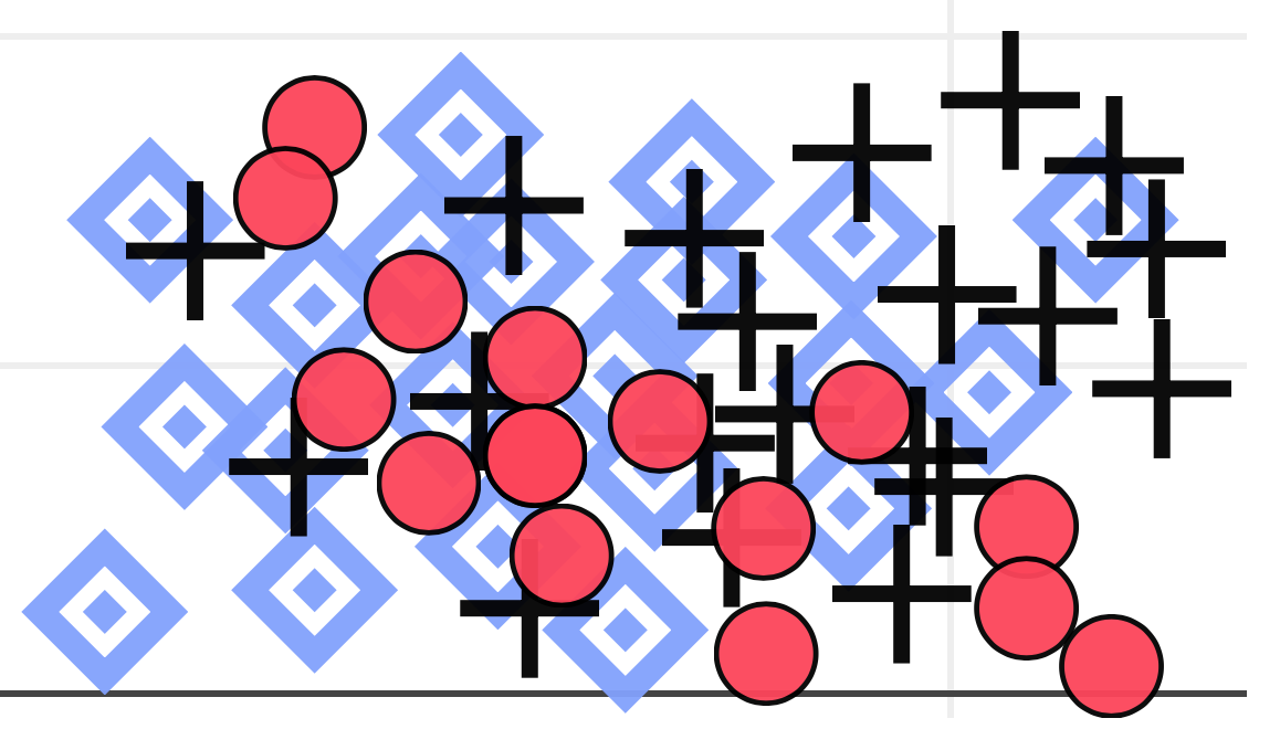
Overlapping Symbols
Open circles are the best ...
Their intersections are visually different from circles.
Overlapping squares unfortunately create new squares etc.
Layered Annotations
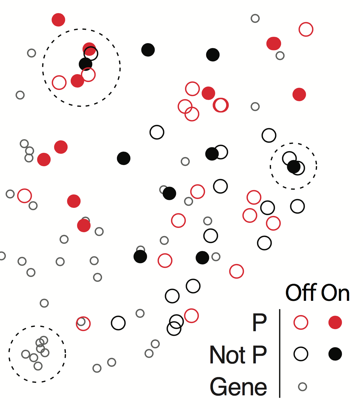
Don't be afraid to add annotations or guiding graphics.
Use popping out features to make them distinguishable from the actual dataViz.
Layered Reference Grids
Differences in thickness result in differences in apparent brightness. Grid lines and dataViz become easy to distinguish.
ggPlot style


Traditional style
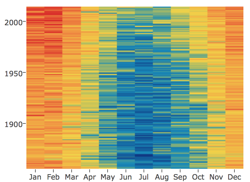
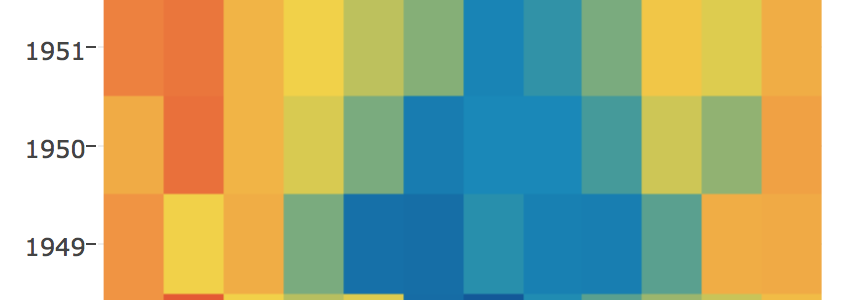
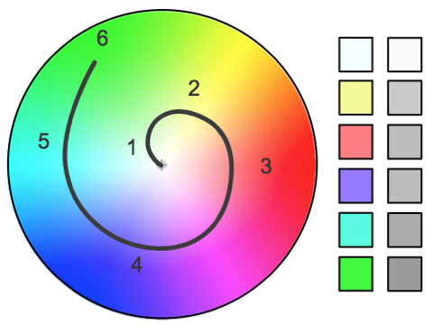
Understand Colour
Colour is beautiful but easy to use badly.
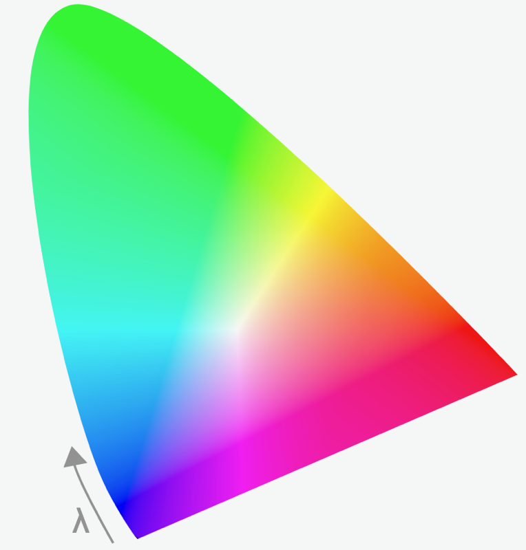
What is Colour
Colour is three things ...
Hue
Saturation
Lightness / Brightness
Links
What is Colour Good For?
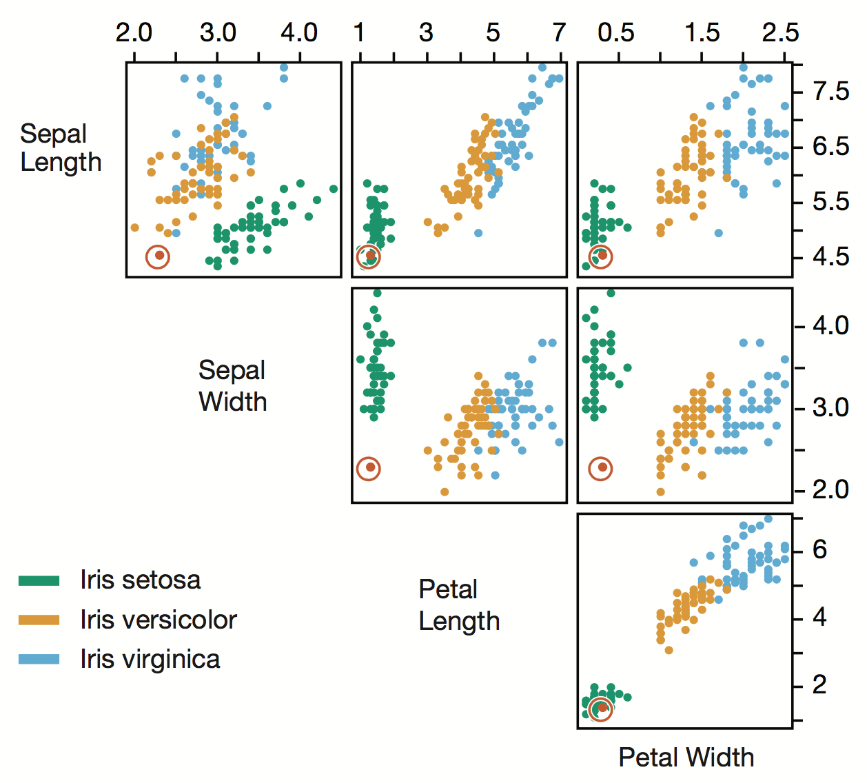
... CATEGORIES (nominal)
What is Colour Good For?
... CATEGORIES (nominal)
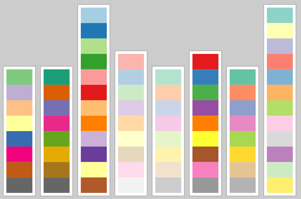
Bottleneck issues.
Use < 9 colours.
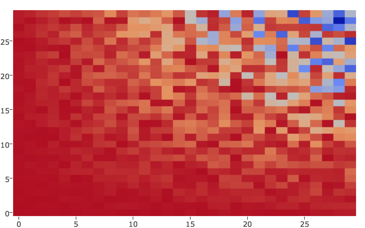
What is Colour NOT Good For?
... QUANTITATIVE
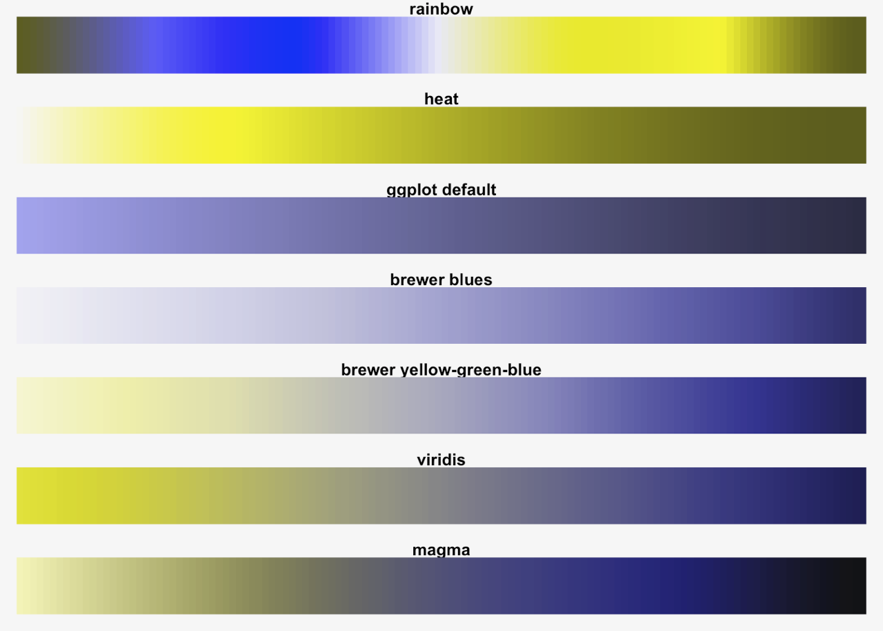
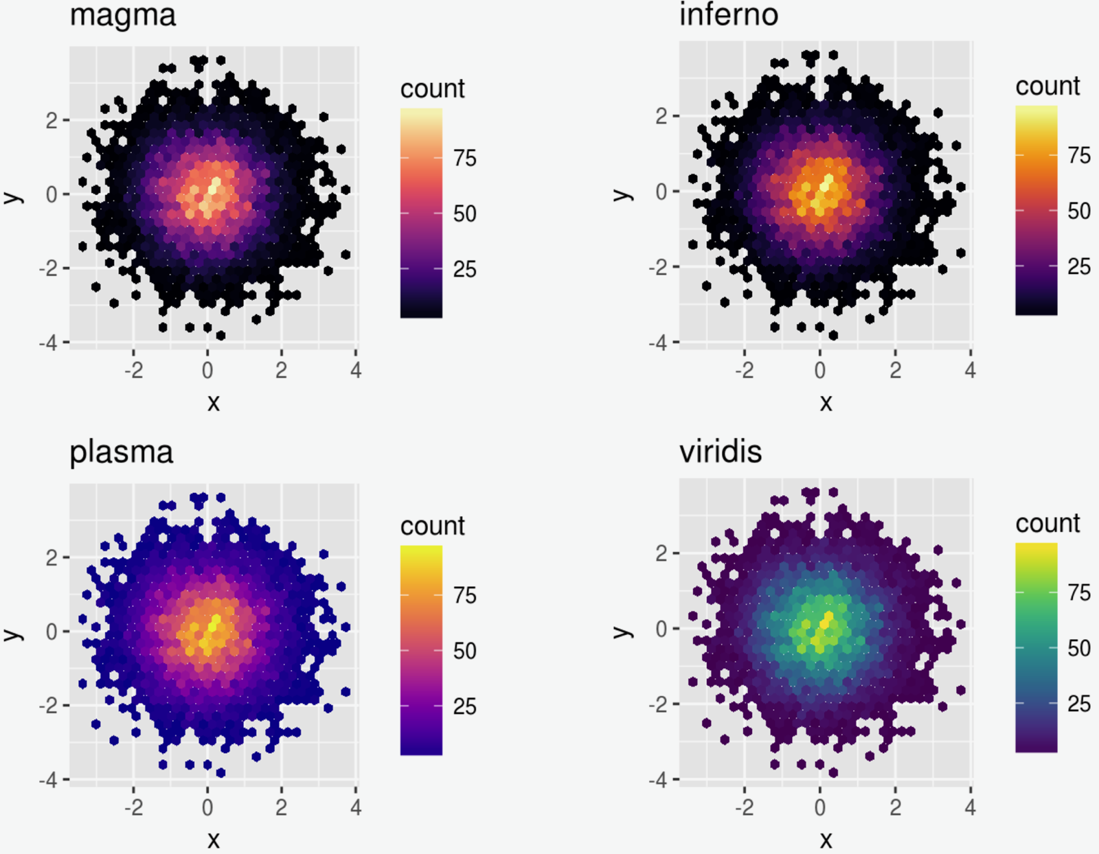
Color for Quantitative ...
still useful
Color for Quantitative
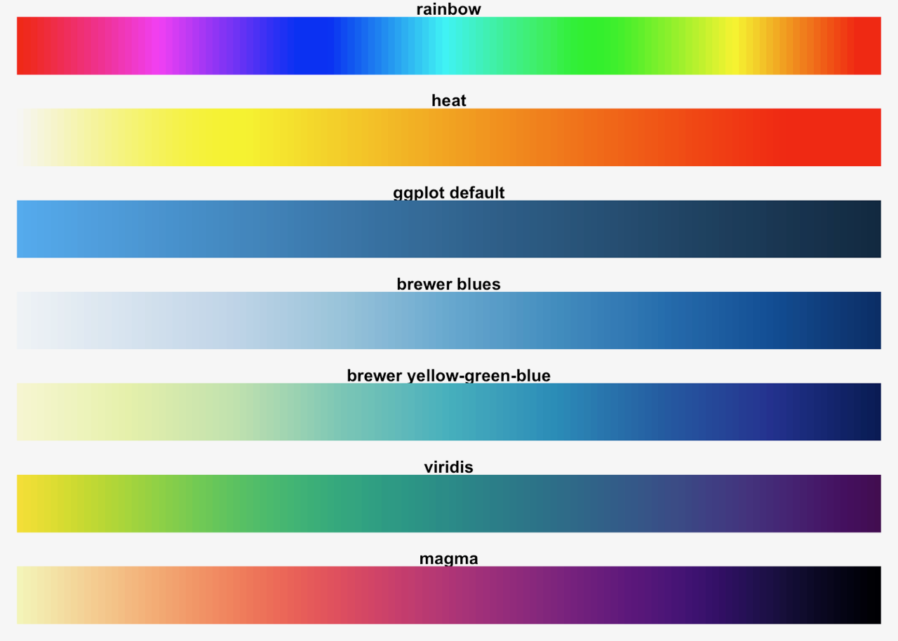
Illogical &
uneven
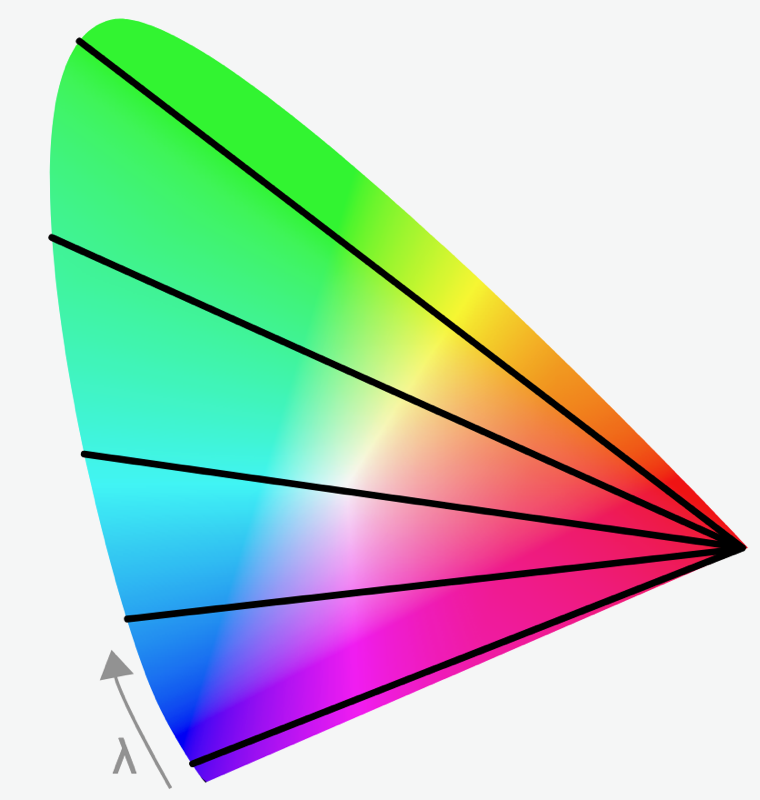
What is Colour
Even & Linear
Even & Linear
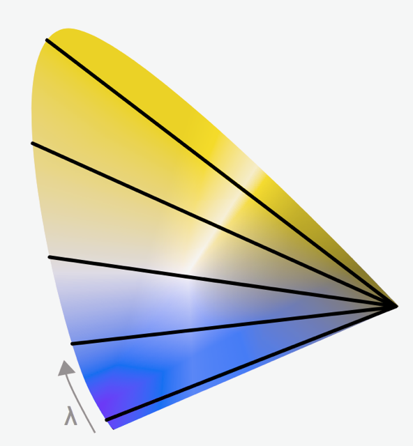
Color for Quantitative
Illogical &
uneven
Color for Quantitative
Illogical &
uneven
Diverging Color for Quantitative


Zero
Max
Min
Divergine Color for Quantitative
... quantitative + Categorical
Divergine Color for Quantitative
... make sure there is a reason or a zero point for diverging scales
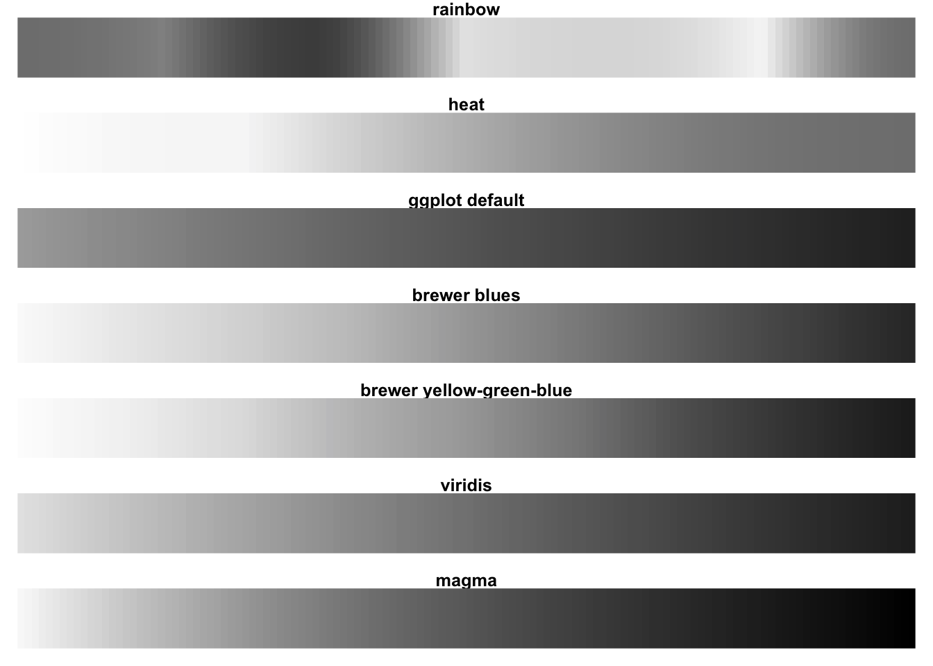
Color Blindness
... or Color Confusion
Color Blindness
... or Color Confusion
Color Blindness
... or Color Confusion
Color for Color Blindness
Illogical &
uneven
Color for Color Blindness
... Categorical
Color for Color Blindness
Illogical &
uneven
... Quantitative
Maximum Range
Color for Color Blindness
Illogical &
uneven
... Quantitative
Maximum Range
&
Still Pretty!
-
Insight
-
Clarity & Minimalism
-
Comparison
-
Shapes, Lines & Curves
-
Grouped Elements
-
Careful Colour
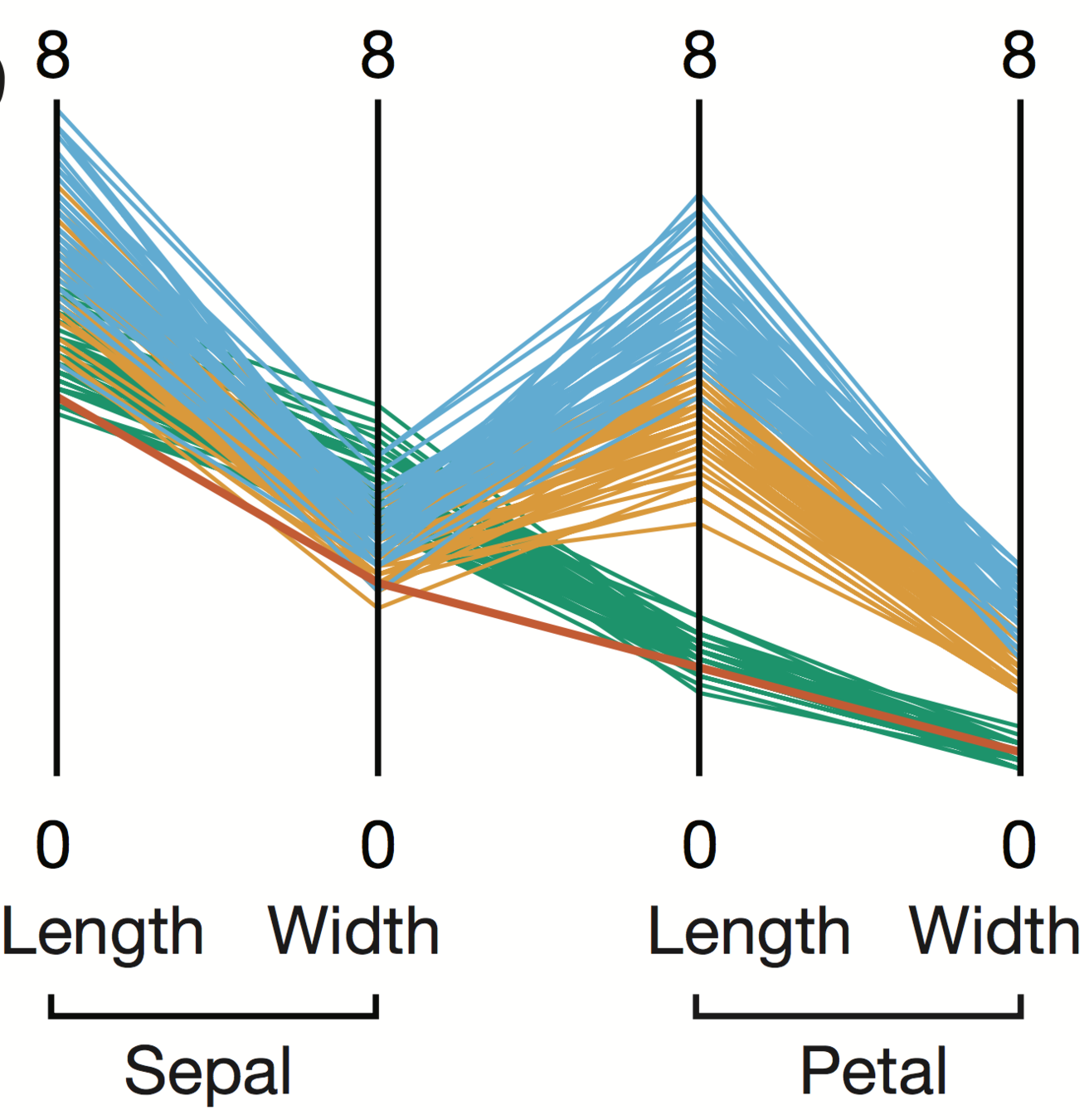
Parallel Coordinate Plot
Effective Application of these Guiding Principles
Position encodes values
Colour encodes categories
Curves display correlations
Angles display correlation size
Thank you!
Credits
- Isabell (@Isa_Kiko)
- The elements of graphing data / William S. Cleveland.
- Information visualization : perception for design / Colin Ware.
How to DataViz
By Errol Lloyd


