
Component based theming in Drupal 8
by Evgenii Nikitin
What is it about?
- Analysis of existing theming approaches.
- Explanation how components work.
- How integrate Drupal and with component libraries.
- Best practises that we use.
Roles on the project
| Project manager | Back-end developer | Front-end developer | QA tester |
|---|---|---|---|
| thinks about budget | provides logic, prepares data | implements representation | ensures that everything works properly |
| needs clear vision on a project | needs easy way to integrate design in application | has to think about: platforms, browsers, accessibility, performance | needs time, tools for automated testing |
Theming approaches
-
"Classic": back-end first, styles are added after it directly to theme.
-
Layout first: HTML markup is prepared separately, then it is copied to Drupal.
- Component based approach: elements are prepared as separate components.
Theming approaches: "Classic"
Back-end first, styles are added after it directly to theme.
Simplest, fastest. Good to use if only one developer works on the project.
Key features
All pages have to be prepared in advance. FE dev can't work if templates aren't ready.
Result is visible when BE and FE parts are completed. Long process, poor visibility.
FE dev are limited by existing html markup that template provides

BE:
FE:

PM:
QA:
BE:
FE:
Pages with examples can be removed. Difficult to provide variations of templates.
PM:
QA:
FE:
Conclusion
Theming approaches: Layout first
HTML markup is prepared separately, then it is copied to Drupal.
Starting point for teams with few developers that works simultaneously.
Key features
Easiest for FE developer. He does everything as he wants. No need additional libraries and tools.
HTML markup can be tested separately from BE part.
Developers can work simultaneously.
BE:
FE:
PM:
QA:
BE:
FE:
Conclusion
PM:
PM:
Need to add changes in HTML markup and BE part separately. Difficult support.
BE:
FE:
PM:
QA:
FE:
Theming approaches: Component based
All elements are prepared as separate components.
Key features
Developers can work simultaneously.
BE:
FE:
PM:
HTML markup can be tested separately from BE part.
PM:
QA:
We need additional tools for it. Complexity increases.
PM:
FE:
BE:
FE:
Easy way to support theme during project life. As many variations of templates as we want.
BE:
FE:
PM:
Industrial method with division of labor for long-life projects.
Conclusion
Component "Button"
context:
  button_color: ''
  button:
    href: '#'
    title: 'title text'
    value: 'link text'
<a class="{{ button_color }}"
href="{{ button.href }}"
title="{{ button.title }}">
{{ button.value }}
</a>
Configuration (Fractal):
Template (Twig)
View

.button {
  border: 1px solid $color-darker;
  background: $color-darker;
  color: $color-lightest;
  width: 100%;
  display: block;
  line-height: 1.2;
  padding:0.65em 20px;
  margin: 0;
  cursor: pointer;
  @include font-family(2);
  font-weight: 700;
  font-size: 15px;
  text-align: center;
  text-decoration: none;
  text-transform: uppercase;
  box-sizing: border-box;
  transition: background $duration-medium ease, color $duration-medium ease, border-color $duration-medium ease;
}
Styles (css/sass/scss)
JS (optional)
(function ($, Drupal, drupalSettings) {
  ...
})(jQuery, Drupal, drupalSettings);
Component "Button". Variations
context:
  button_color: ''
  button:
    href: '#'
    title: 'title text'
    value: 'link text'
variants:
- name: 'Red button'
  context:
    button_color: 'red'
- name: 'Green button'
  context:
    button_color: 'green'
Configuration (Fractal):
.button--fill--veo-green {
  color: green;
}
.button--fill--veo-red {
  color: red;
}
Styles (scss)
View


{% for index, scheme_name in theme_colors %}
<div class="background-color--{{scheme_name}}">
{%
include 'components/button'
%}
</div>
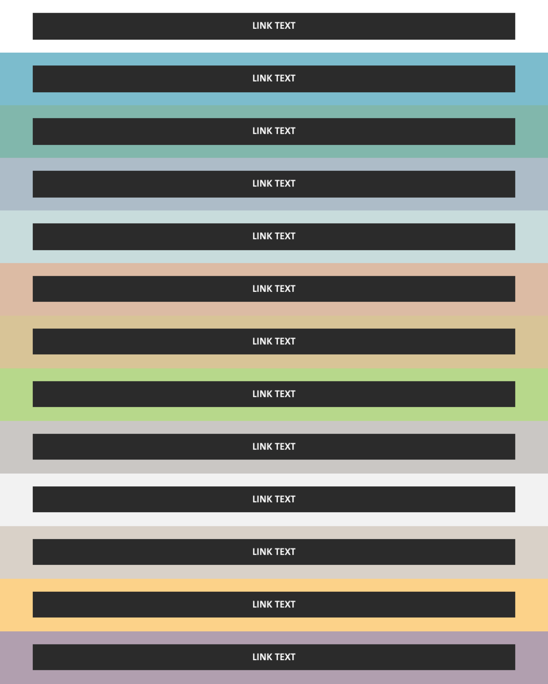
{% endfor %}Component "Button". Multiple examples
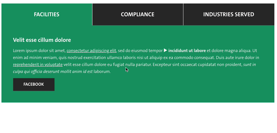
Nesting of components. Tabs example
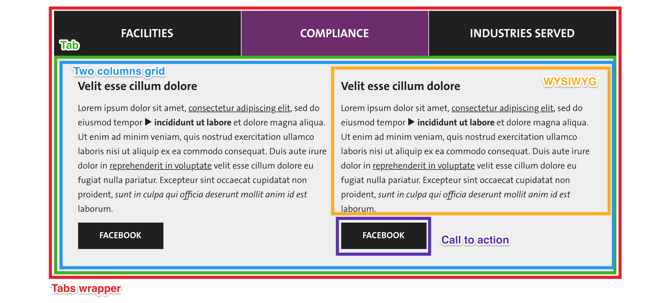
Nesting of tabs
Variants of pages
Components support in Drupal
Add to *.info.yml:
component-libraries:
  myLib:
    paths:
      - path/components
Usage in twig template *.html.twig:
{% include "@myLib/box/box.twig" %}{% include "@myLib/box/box.twig" with {
'value_1': 'some value 1',
'value_2': 'some value 2',
} %}Passing variables to component in twig template *.html.twig:
Components structure for Drupal
1 Drupal template = at least 1 component.
Exceptions:
- field.html.twig
- img.html.twig
Integration of components assets with Drupal
global-styling:
  version: 1.x
  css:
    theme:
      build/assets/styles/main.css: {}
global-scripts:
  version: 1.x
  js:
    build/assets/scripts/main.js: {}
THEME.libraries.yml
THEME.info.yml
libraries:
  - THEME/global-styling
  - THEME/global-scripts
box-library:
version: VERSION
js:
build/assets/scripts/box/box.js: {}
css:
theme:
build/assets/styles/box/box.css: {}
We should not add all assets to all pages!
THEME.libraries.yml
{{ attach_library('THEME/box-library') }}

{% include "@myLib/box/box.twig" %}
*.html.twig
function yourmodule_some_hook(array &$vars) {
  $vars['#attached']['library'][] = 'THEME/box-library';
}
*.module
MODULE.libraries.yml
module_library:
  js:
    js/script.js: {}
  dependencies:
    - THEME/box-library
Component library has to support Drupal's Twig extensions
Drupal Twig filters:
-
t -
trans -
placeholder -
drupal_escape -
safe_join -
without -
clean_class -
clean_id -
render -
format_date
Drupal Twig functions:
-
render_var -
url -
path -
link -
file_url -
attach_library -
active_theme_path -
active_theme -
create_attribute
Remember about Drupal template attributes variable
{%
  set classes = [
    'webform',
    'container',
    'container--webform',
    'container--width--narrow',
    'container--space-outer--v-m',
  ]
%}
<form {{ attributes.addClass(classes) }}>
  {{ title_prefix }}
  {{ children }}
  {{ title_suffix }}
</form>
Component webform.twig
Links - are objects
label: 'Link'
context:
  link: "<a href='#' title='' rel='nofollow'>Link</a>"
Configuration (Fractal):
{{ link }}Template (Twig)
Component content should contain variables only. No need to place data there
label: 'HTML examples'
context:
  link: "<a href='#'>Link</a>"
  title: "Title"
Configuration (Fractal):
{% set title = 'Title'|t %}

{% include "@myLib/component/component.twig" with {
  'link': link_object,
  'title': title,
} %}
<div class="title">{{ title }}</div>
<div class="link">{{ link }}</div>Template (Twig)
Drupal template *.html.twig
Check that data isn't empty
{% if title is not empty %}
  <div class="container">
    {{ title }}
  </div>
{% endif %}
Component
{% set title = '' %}

{% if content.field_title.0 is not empty %}
  {% set title = content.field_title
{% endif %}

{% include @myLib/component.twig with {
  title = title
} %}
Drupal template *.html.twig
Component libraries
Fractal (https://fractal.build)
- Bad support of Twig (https://github.com/Adyax/fractal-twig-drupal-adapter/).
- v1 is old.
Patternlab (https://drupal-pattern-lab.github.io/)
- Very good support of community.
- Atomic design methodology.
Component based theming in Drupal 8
By Evgenii Nikitin
