Responsive Web Design
Definition: A collection of techniques for progressively
enhancing a website that enables a quality
experience for different contexts.
Responsive Web Design
Collection of Techniques:
- Flexible Grid Layout
- Fluid Media (images and video)
- Media Queries
http://goo.gl/yOpBTV
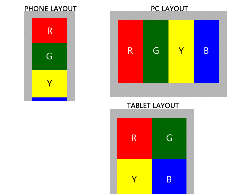
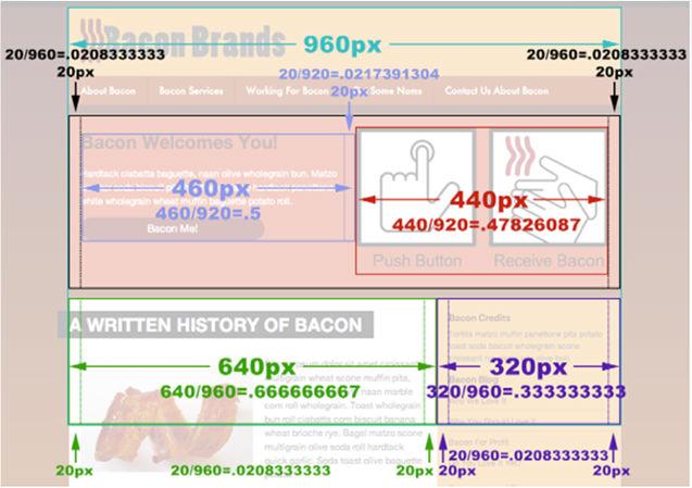
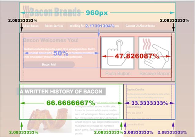
Flexible Grid Layout
target / context = Result
Result is the percentage equivalent that
will represent the elements width in our CSS.
Non-fluid image
<div id="static-image">
<img src="picture.jpg" width="300" height="400" />
</div>
<img src="picture.jpg" width="300" height="400" />
</div>
Fluid image
<div id="static-image">
<img src="picture.jpg" />
</div>
<img src="picture.jpg" />
</div>
img { max-width : 100% ; }
Non-fluid video embed
<iframe width="400" height="250" src="http://www.youtube.com/embed/abcd" frameborder="0" allowfullscreen />
Fluid video embed
http://embedresponsively.com
Allows a website to specify "breakpoints"
where new CSS rules should be applied

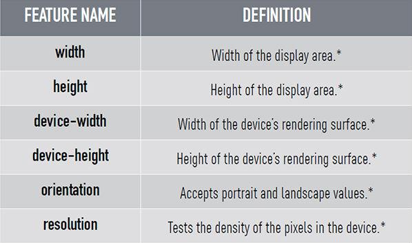
This CSS statement queries the device for
media type and specific feature value
media type and specific feature value
@media screen and (min-width: 768px) {
}
Media Queries
Combined with "and" CSS statements with
multiple queries can be chained together
multiple queries can be chained together
@media screen and (min-width: 768px) and
(orientation:portrait) {
}
THINK MOBILE FIRST...
- Create Base CSS treatment
- Define CSS for different Media Queries
Typical Device Specific Media Queries:
@media screen and (min-width: 480px) {
}
@media screen and (min-width: 768px) {
}
@media screen and (min-width: 960px) {
}
@media screen and (min-width: 1200px) {
}
In the html <head> the mobile viewport zoom scale needs to be set to 1.0, and the width set to the
device width inside a <meta>tag.
<meta name="viewport" content="initial-scale=1.0,
width=device-width" />
width=device-width" />
Responsive Web Design
By fdu