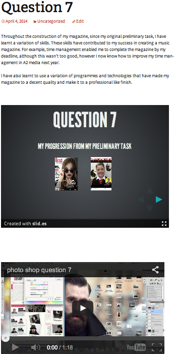
Question 7
My progression from my preliminary task and waht I have learnt along the way
my school magazine front cover
Looking back at my school magazine now I can see that it is of a very poor quality. For example, I did no editing to any of the images, including the main image. Also I used a blurring tool to fade them into the background of the front cover as opposed to adjusting different levels of the hue and saturation, etc. The blurring tool give's the images an unprofessional look to them.
My lack of fonts also makes the front cover look more like a poster than a magazine. I used two fonts, both of which were already stored on the computer and didn't really have any relevance to the magazine. I picked them purely out of choice, not suitability. Therefore not actually targeting the magazines audience.
Another thing that I failed to think of was spacial awareness, as I left a lot of unused room on the page, again making it look 'poster like'. You can see this at the top and bottom of the page, although I used text at the bottom, it still looks very empty. The positioning of the images also leaves a lot of spare room.
Finally the cover could use conventions, such as plugs, pull quotes, flash etc, to inform it's readers and target more specific audiences.
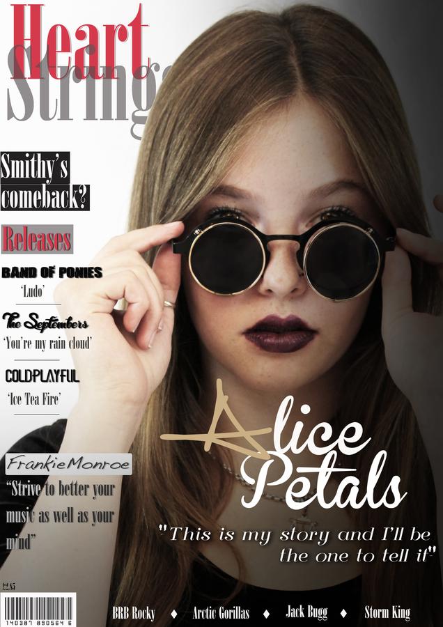
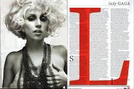
mY music magazine front cover
My music magazine front cover is extremely different to my school magazine in many ways. These include photo editing, a variation of downloaded fonts, features like plugs and pull quotes, spacial awareness, a barcode and price. All of these features add up to make a successful, recognizable and professional magazine front cover.
The variation of fonts has enabled me to represent different genres (artists) and making the name of the magazine look more like a logo.
I have learnt how to edit images, using hue and saturation, how to add effects and adjust tints and lighting of the page to create effect and how to and shapes, for example to create a white box to place the barcode.
The importance of all of these features has become clear throughout the process of my construction, this has enabled , me to create a magazine of a decent quality.
using other resources
I have learnt how to take inspiration from other music magazines and various other media forms.
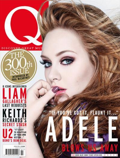
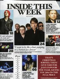
For example I have analyzed magazines such as Q, Kerrang and GQ. I have come to realise that it is beneficial to observe the ways in which these magazines present their information, images etc, without copying the layout design, but simply using it as an inspiration. This also taught me to include things such as page numbers, dates and 'written by' information.
This has most definitely improved since my preliminary task as, although I looked at previous school magazines, I did not take inspiration from them as much as I should have. This resulted in my school magazine looking more 'poster like' than like a magazine.
Over the period of my magazine construction time management has become incredibly important important as I had a lot of tasks to complete in not a very long space of time.
At the start of the course I was not very efficient with organizing my time, however after a few months I became aware that I needed to complete both my magazine construction and my blog coursework. I was able to do this by creating a timetable of when and where I will complete my work.
As well as this, I had to arrange times in which I would shoot my models and have back up's ready in case they couldn't make it. This wasn't a problem for myself, however with classroom clashes it was a threat and I therefore made sure that I was prepared for any cancelations etc.
This has improved since my preliminary task as, unlike then, I now had to shoot my models in my OWN time as apposed to during class time.
using the camera
Since my preliminary task I have learnt how to use the camera in a way to retrieve images of the highest possible quality.
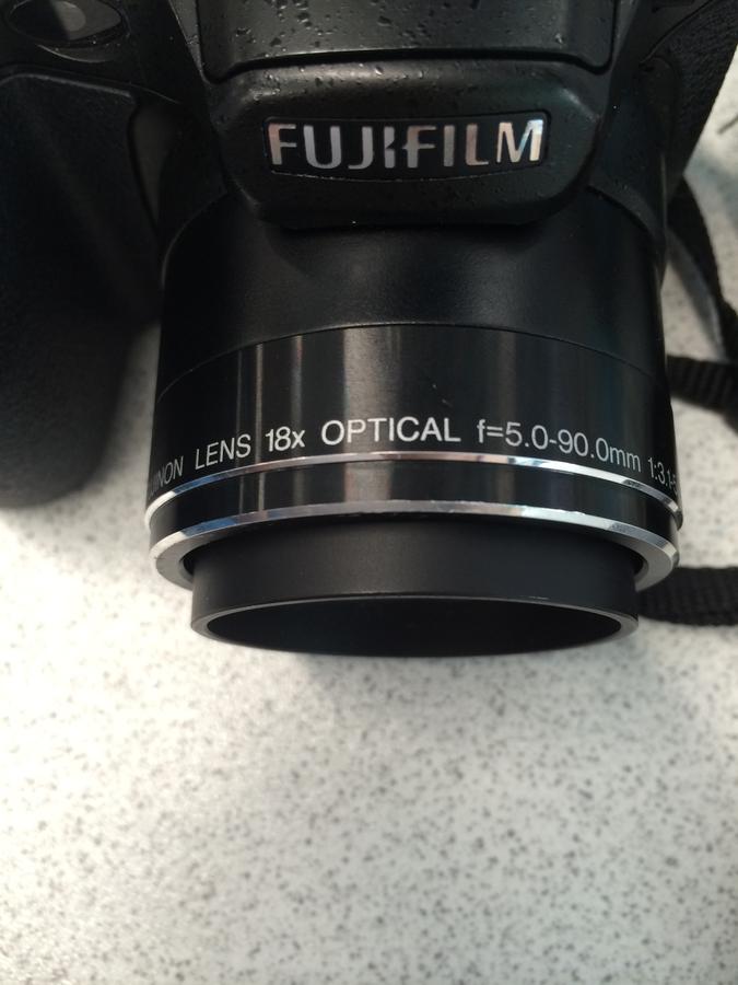
I have learnt that, when twisted, this part of the camera zooms in and out of the focused image. This is useful for taking
mid-shot and close up images from a distance.
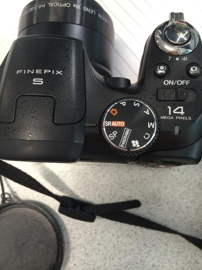
This wheel enables you to capture images to fit your surroundings, for example if you're in an overexposed environment. It also allows you to film a video. The 'panorama' option also allows you to slowly film your surroundings and then creates a wide shot image, that may not fit in the actual lens.
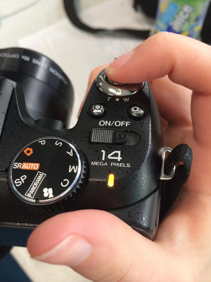 Before pressing this button you must....
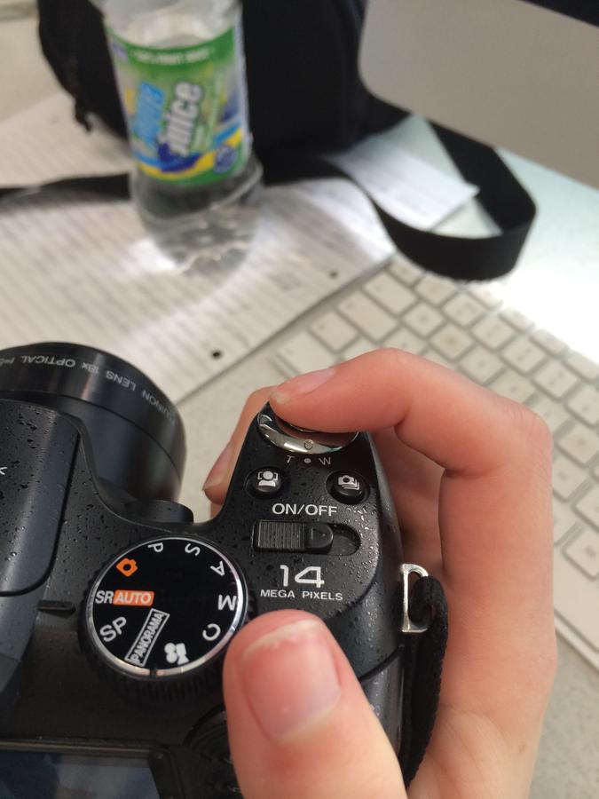
Lightly hold the button,without clicking it, to focus the image, making sure it is the best quality possible.
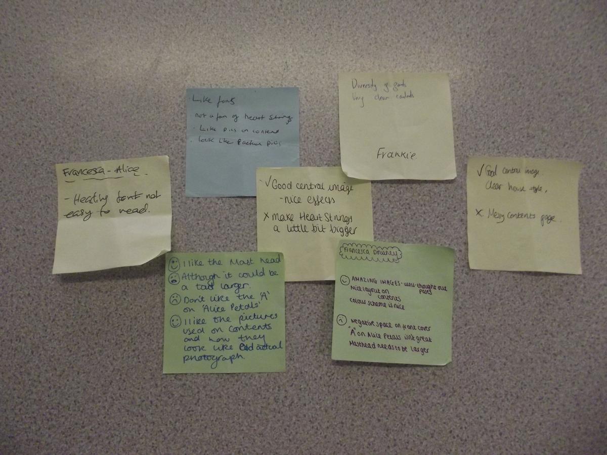
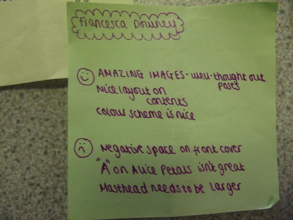
Audience feedback
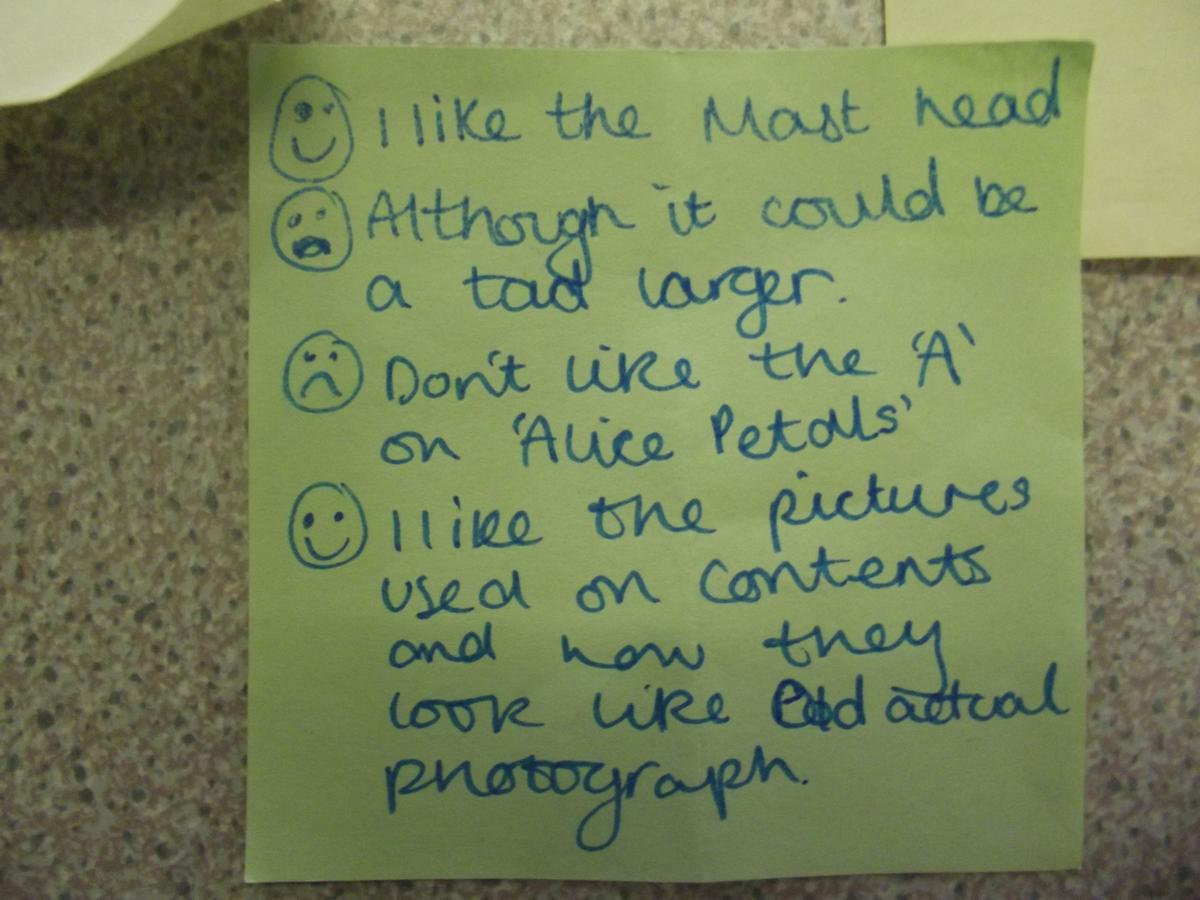
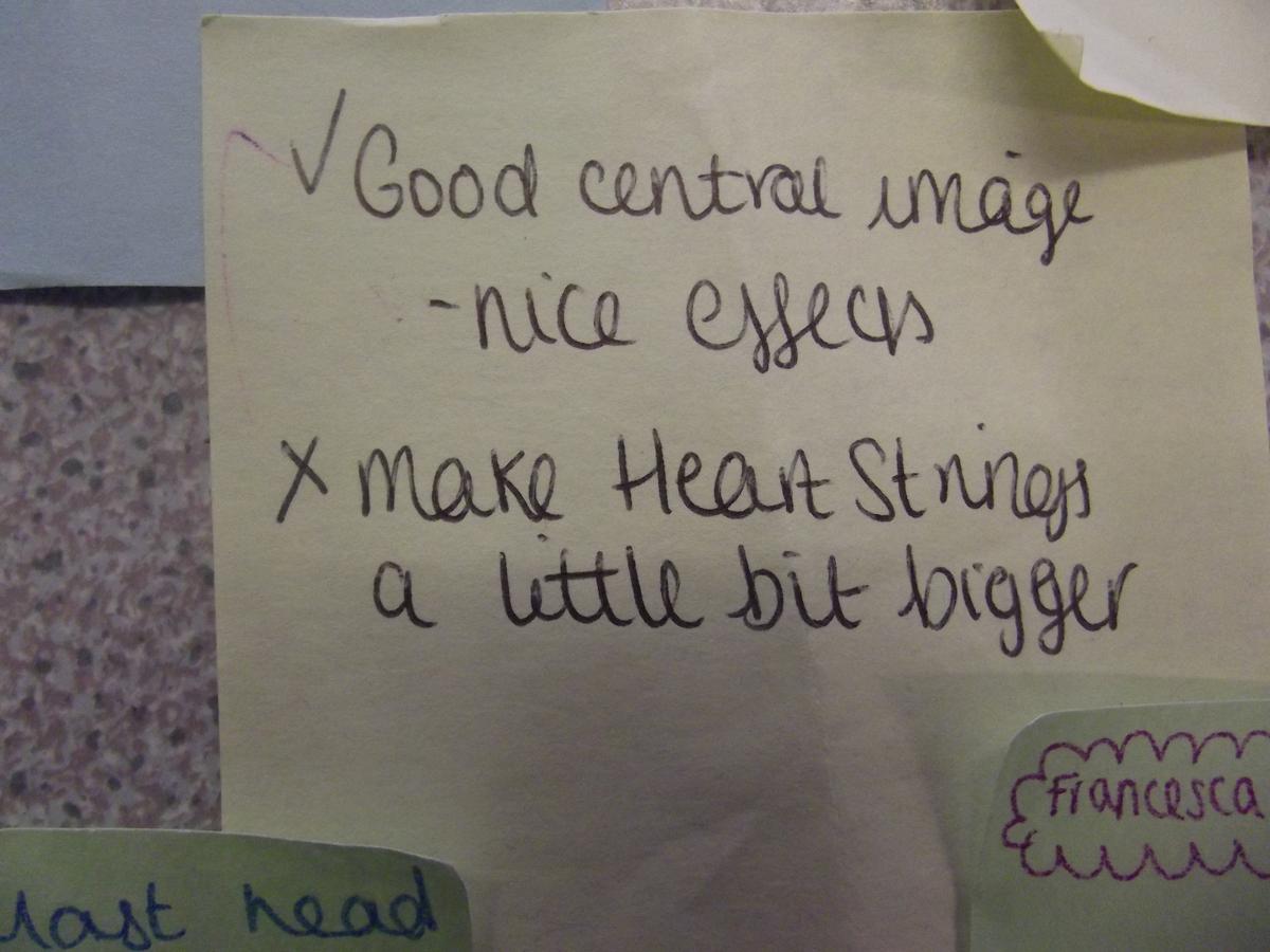
Receiving audience feedback was incredibly helpful as it enabled me to see my magazine through somebody else's eyes, therefore making the opinion unbiased. By asking my class mates to assess my magazine and give both positive and negative feedback, I knew what I had done successfully and should keep as well as what needed adjustments and improving.
I tried to take these comments and apply them in the most effective way possible. For example I did increase the size of the masthead slightly, as well as trying to fill some of the 'empty' space on the front cover.
It was useful to get feedback from those in my class as they knew exactly what had to be included in the magazine, however it was also very useful to retrieve the opinion of those not doing AS media, such as my friends and family. This allowed my magazine to be seen through a completely fresh pair of eyes and also allowed it to be seen in a 'non exam' way, for example they mostly advised me on colour, genre and images, whereas those in my class advised on structure etc.
This was not as important during the construction of my preliminary task as I did not rely on the final product to receive a good AS grade, however since then I have realized that the opinion of my peers, both those making a magazine and those not, is imperative to the success of my music magazine.
Blog&media websites
Learning to use the blog properly has enabled me to present my coursework neatly and fairly quickly. It is simple to embed media and sites that I have used to present my work.
I have learnt that you can embed multiple media forms, for example you can upload a Prezi, Spiderscribe and video in the same post. This enables me to present my coursework in a variety of ways, to fit the topic at hand.
When completing my preliminary task I was unaware of these sites and it was therefore posted straight onto the blog really simply, using no alternative methods of presentation at all.
After discovering these sites and using them, I then had to learn how to embed them onto my blog. This was normally fairly straight forward, however some sites do not allow you to embed. I therefore had to check the site allowed this before continuing to use it. Videos have to be embedded by first uploading them to Youtube as they are too large to upload straight onto the blog.
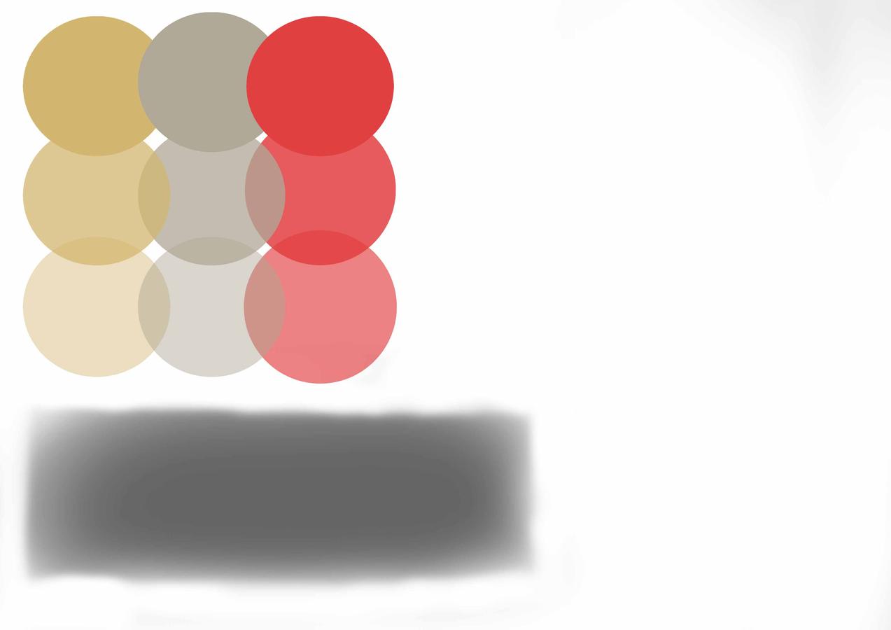
Colours
My understanding of colour has progressed since my preliminary task. During the process of my construction I created a colour chart, this enabled me to see which colours went well together.
I also learnt how to use opacity (on photoshop) to get the best form of colour.
I chose these three colours (gold, silver and red) as I felt they went well together and were colours typically found in magazines of a similar genre to mine and would therefore appeal to my targeted audience.
I also experiment with a black brush, to use down the right hand side of my front cover. I played around with the opacity of this colour too as I did not want it to be a 'block' colour.
I feel I have developed my understanding since my preliminary task as I tried to pick colours that I felt best suited my audience, as opposed to colours that I liked the look of.
By adjusting the opacity scale I have also learnt and put into practice, making specific colours stand out more than others, to show importance for example.
deck
By francesca-alice