The Persuasive Power of Data Visualization
We assume graphical representations have a more powerful effect than non-graphical ones.
Elaboration Likelihood Model of persuasion
Two ways to be persuaded:
- By the argument
- By its presentation
...depending on how much you care
Elaboration: how much you scrutinize the arguments of the persuasive communication
Experiment
- 3 non-polarizing topics:
- "Lowering federal corporate income tax rate creates jobs"
- "Incarceration does not reduce crime rates"
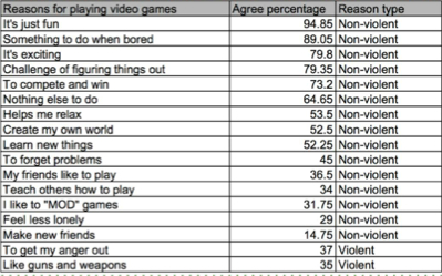
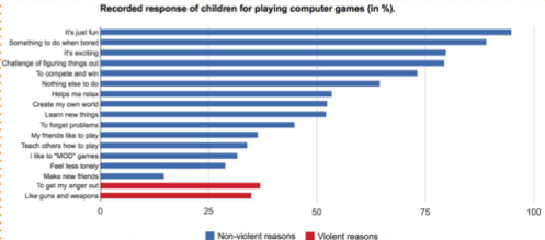
- "Violent video games do not contribute towards youth violence"
- Shown same data in table vs. chart
- Measure change in attitude
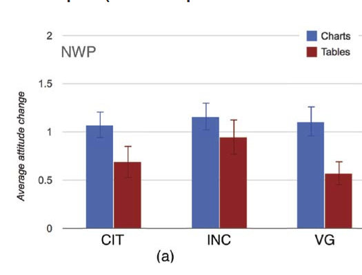
Neutral
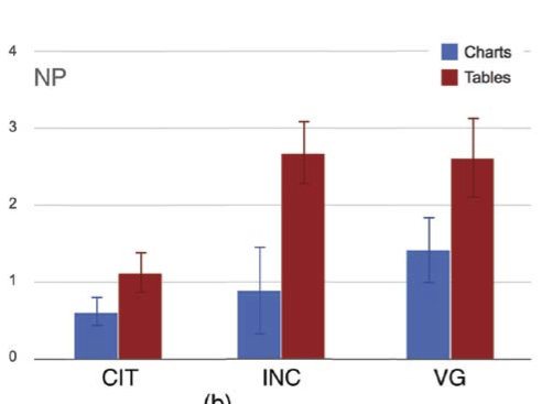
Negatively Polarized
Charts 3-15% more persuasive
Tables 36% more persuasive (maybe)
Unpersuaded
- Lack of trust towards the presented data, statistics and trends
- Oversimplification
- Refusal to change belifes
Persuaded
- Struck by evidence
- More persuaded towards previous position
Study Conclusions
- Persuasive power of visualization depends highly on initial attitudes
- Any exposure to data is persuasive, regardless of form
- Charts: more effective for neutral
- Tables: more effective for biased
How do we use visualization responsibly?
How do we know when we're being persuaded visually?
Visual Persuasion
By Gabe Joseph


