Media Evaluation:
Question 1: In what way does your music magazine, use develop or,challenge forms and conceptions of real music magazine?
My music magazine took inspiration from the many different indie magazines that you can see and experience. I took ideas from the way NME was set up and the way magazines like Q showed their artists.
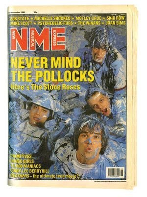
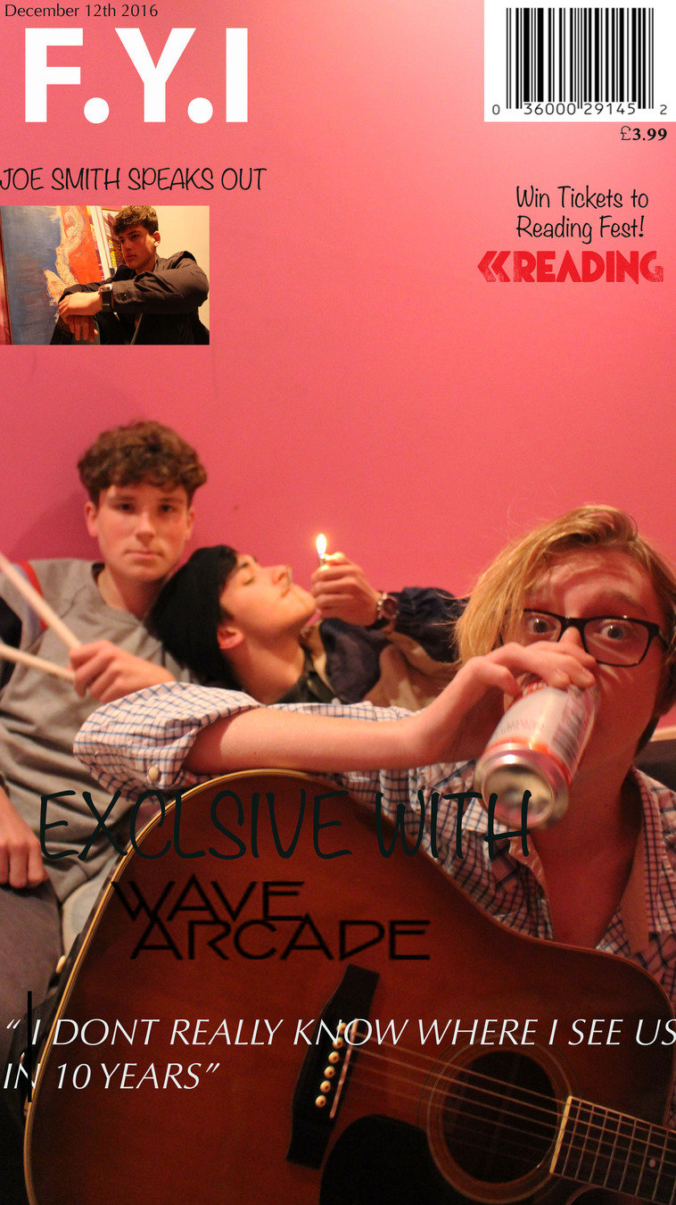
For example with my title and my front cover I took inspiration from The Stone Roses on the front cover of NME. I liked the way it was quite an unnatural planned picture. Seeing as my genre for my magazine is indie I believed that it would be a good place to start. Also regarding the masthead I liked how their is just 3 letters in the corner and its just plain and simple but stands out quite a bit.
Title Text
I already knew what genre I was going to do but having to find inspiration from other magazine covers was quote hard, and then you have to make sure it sends out the right music genre to the audience. The magazine NME is an classed as an indie genre magazine so using it as inspiration was very beneficial.
Question 1
When creating my front cover I had to research different magazine covers and follow that as a guide on how mine should be set out. I also tried to find fonts that wouldn't look to "poppy" or that didn't look to rocky. It had to be somewhere in the middle. So I chose quite a basic font and just capitalized it. I felt like thats almost what NME did and they've come across as an indie magazine.
Front Cover
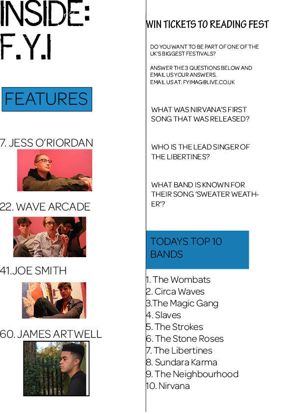
Where as for the colour scheme that has gone with the magazine. Where I did the practical for the front cover I liked the pink wall as its not really a stereotypical background for a band. The boys were just being themselves and acting natural so thats why I think the picture came out so well. Also comparing it to The Stone Roses front cover on NME, Ian Brown is holding the same amount of eye contact with the audience as Louis was able to carry out on my front cover.
Question 1-
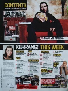
With my contents page, I took inspiration once again from Kerrang. I liked the lay out at the bottom of the magazine but instead of keeping it at the bottom i spread it out to the whole page. I also added lines to separate each column. I used colours that would work well with the front cover and would go with the rest of the magazine. Once again because its an indie magazine i settle for quite basic fonts, which I liked a lot and thought it really worked.
Contents Page
I also copied the idea of using/adding competitions to my magazine. I used reading festival as the place to win tickets too. I wanted to create like a real magazine and there are some magazines that will do that and they all have the same location for winning tickets too and they're always festivals.
I used the pictures of my models also to put on my contents page more than the front cover as i dint want to take away anything from the image of the front cover.
Question 1
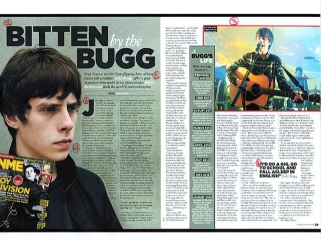
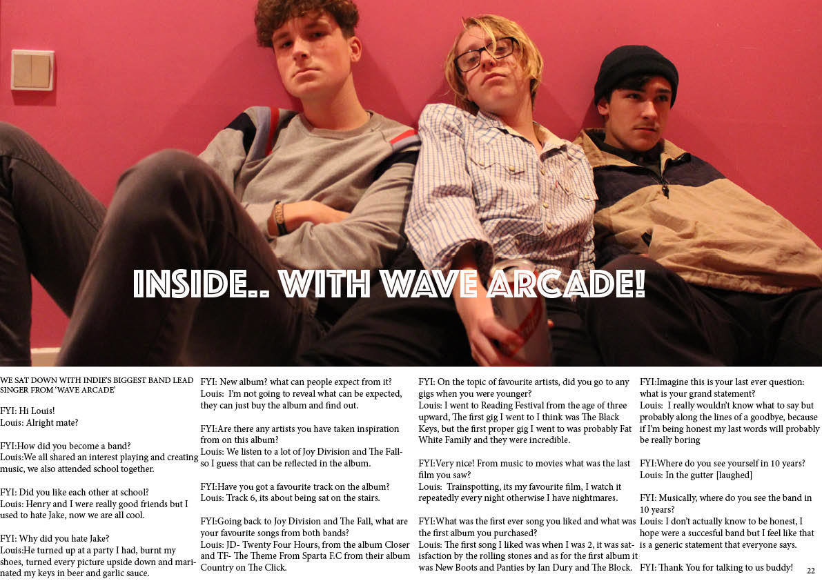
The double page spread was also linked to meet the front cover. They are both taken in the same place. I took inspiration when it comes to writing the double page spread by an interview of Jake Bugg. I read the questions in need of trying to find a place to start when interviewing my band, and so i took ideas from there. I left it to quite natural questions and ones that wouldn't be extremely hard to (in reality) answer.
Double Page Spread
My double page spread was interviewed with just the "lead singer". I also used a different layout compared to the Jake Bugg one. I changed it too the interview layout of when you have the names of the people talking and their response after.
Also instead of having just one picture in the corner like they have done for Jake Bugg I decide to spread my picture across both of the two pages and have the interview laid out at the bottom
deck
By georgiamiles_


