


Gerard Sans | Axiom 🇬🇧 PRO
Founder of Axiom Masterclass, professional trainings // Forging skills for the new era of AI. GDE in AI, Cloud & Angular. Building London's tech & art nexus @nextai_london. Speaker | MC | Trainer.
slides.com/gerardsans | @gerardsans
Text
850
950
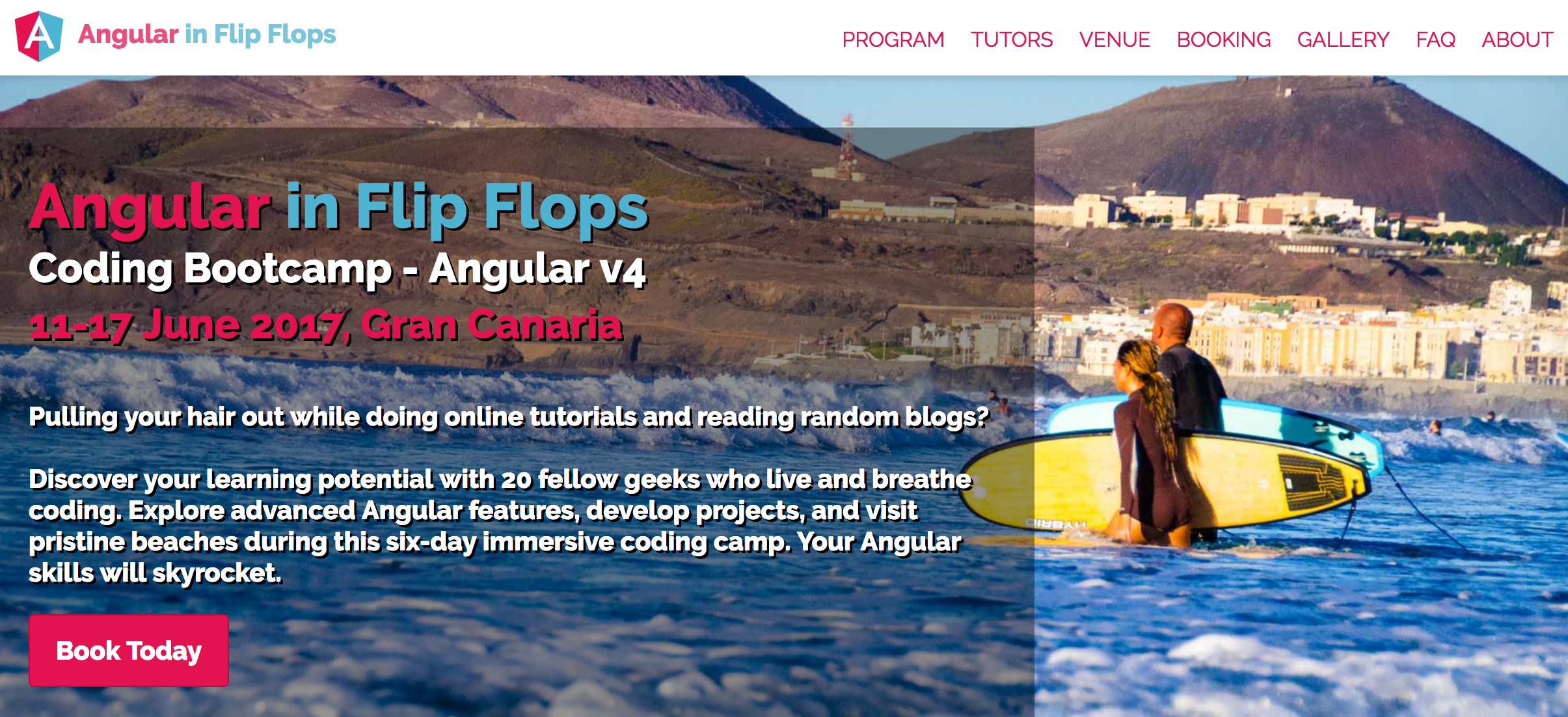
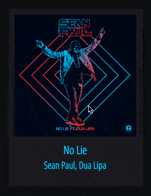
Angular In Flip Flops
Layout
hover
Title/Artist
Selected
@Component({
  selector: 'song-track',   // <song-track></song-track>
  template: `
    <div class="container">
      <track-image image="http://..."></track-image>
      <div class="track-information">
        <track-title>{{track}}</track-title>
        <track-artist>{{artist}}</track-artist>
      </div>
    </div>`
})
export class SongTrack { }@Component({
selector: 'song-track',
styles: [`.container { color: white; }`]
})
export class SongTrack { }@Component({
template: `
<style>
.container { color: deepskyblue; }
</style>
<div class="container">...</div>
`
})
export class SongTrack { }//song-track.component.ts
@Component({
styleUrls: ['src/shared.css'],
})
export class SongTrack { }
//shared.css
.container { ... }<song-track ngClass="selected" class="large"></song-track>
<song-track [ngClass]="'selected'"></song-track>
<song-track [ngClass]="['selected']"></song-track>
<song-track [ngClass]="{'selected': true}"></song-track>
<song-track class="selected large"></song-track>
<song-track class="selected"></song-track><song-track ngClass="selected large">
<song-track [ngClass]="'selected large'">
<song-track [ngClass]="['selected', 'large']">
<song-track [ngClass]="{'selected': true, 'large': true}">
<song-track [ngClass]="{'selected large': true}">
<song-track class="selected large"></song-track><song-track [ngStyle]="{'color': 'white'}" style="font-size: 12px;">
<song-track [ngStyle]="{'font-size.px': '12'}">
<song-track [ngStyle]="{'font-size': '12px'}">
<song-track style="color: white; font-size: 12px;">
<song-track style="font-size: 12px;"><song-track [ngStyle]="{'color': 'white', 'font-size': '12px'}">
<song-track style="color: white; font-size: 12px;">@Component({
host: {
//setting multiple values
'class': 'selected disabled',
'style': 'color: purple; margin: 5px;',
//setting single values (using binding)
'[class.selected]': 'true',
'[class.selected]': '!!selected', //add class if selected = true
'[style.color]': '"purple"' //expression must be a string
}
})
export class SongTrack { }@Component({
})
export class SongTrack {
//<host class="selected"></host>
@HostBinding('class.selected') selected = true;
//<host style="color: red;"></host>
@HostBinding('style.color') color = 'red';
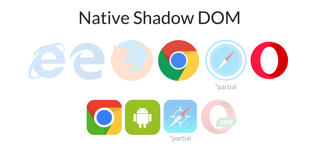
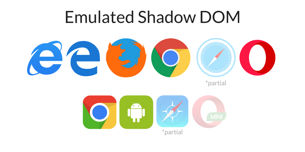
}safari
safari
@Component({
  selector: 'song-track',
  encapsulation: ViewEncapsulation.Emulated
})

<head>
  <style>
    .container[_ngcontent-ikt-1] { ... }
  </style>
</head>
<body>
  <my-app>
    <song-track _nghost-ikt-1>
      <div _ngcontent-ikt-1 class="container"></div>
    </song-track>
  </my-app>
</body>@Component({
selector: 'song-track',
encapsulation: ViewEncapsulation.Native
})
<body>
<my-app>
<song-track>
▾ #shadow-root (open)
<style>.container { ... }</style>
<div class="container"></div>
</song-track>
</my-app>
</body>@Component({
selector: 'song-track',
encapsulation: ViewEncapsulation.None
})
<head>
<style>.container { ... }</style>
</head>
<body>
<my-app>
<song-track>
<div class="container"></div>
</song-track>
</my-app>
</body>@Component({
styles: [`
:host { color: black; }
:host(.selected) { color: red; }
`]
})
export class SongTrack { }
<song-track></song-track>
<song-track class="selected"></song-track>:host-context(.theme) { color: red; }
:host-context(#player1) { color: red; }
<div class="theme">
<song-track></song-track>
</div>
<div id="player1">
<song-track></song-track>
</div>@Component({
styles: [`
:host /deep/ .h3 { color: red; }
:host >>> .h4 { color: purple; }
`],
template: `
<div class="container">
<track-image image="http://..."></track-image>
<div class="track-information">
<track-title>{{track}}</track-title> //<h3><ng-content></h3>
<track-artist>{{artist}}</track-artist> //<h4><ng-content></h4>
</div>
</div>`
})
export class SongTrack { }import { ElementRef } from '@angular/core';
@Component(...)
export class SongTrack {
constructor(private element: ElementRef){
let elem = this.element.nativeElement;
elem.style.color = "blue";
elem.style.cssText = "color: blue; ..."; // multiple styles
elem.setAttribute("style", "color: blue;");
}
}import { ElementRef, Renderer2 } from '@angular/core';
@Component(...)
export class SongTrack {
constructor(
private element: ElementRef,
private renderer: Renderer2
){
let elem = this.element.nativeElement;
renderer.setStyle(elem, "color", "blue");
renderer.addClass(elem, "selected", true);
}
}Encapsulation Modes
Inline, Template inline, External Styles
ngClass, ngStyle
Shadow DOM Selectors
Host bindings/listeners
By Gerard Sans | Axiom 🇬🇧
In this talk we are going to cover all the different ways we can style our Angular Components. From introductory to advanced. We will learn how to style using Shadow DOM selectors, Light Dom, @HostBinding, ElementRef and more.


