Modular & Maintainable CSS with Sass and Compass
洧 杰
I am a
Front-end
去年我專注於
-
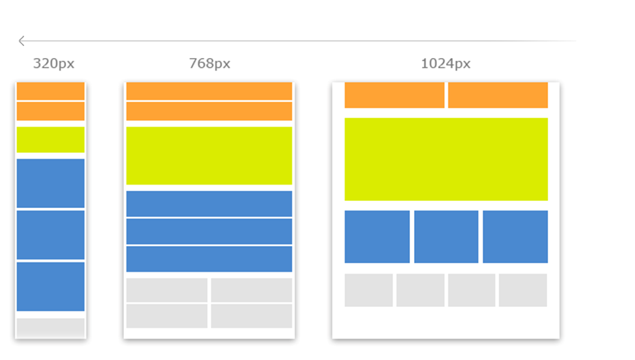
Responsive web Design(RWD)
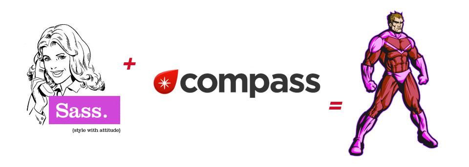
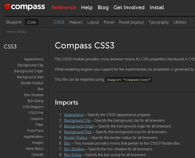
- Compass/Sass
Responsive web design

.menu{width: 33%;}
@media only screen and (max-width: 768px){
.menu{ width : 50%;}
}
@media only screen and (max-width: 480px) {
.menu{ width : 100%;}

}
.menu{width: 33%;}
@media only screen and (max-width: 768px){
.menu{ width : 50%;}
}
@media only screen and (max-width: 480px) {
.menu{ width : 100%;}
}
..more 20~30% CSS code
http://www.steveperrycreative.com/getting-started-with-sass-and-compass/
all.sass→編譯→all.css
減輕複製貼上負擔
Nesting
Sass
CSS
CSS
.headerh1..a...menu..a..
.header {}.header h1{}
.header h1 a{}
.header .menu{}
.header .menu a{}
.header {}.header h1{}
.header h1 a{}
.header .menu{}
.header .menu a{}
Scss
CSS
CSS
.header{ color:red; h1{
.... a{ .. } }}
.header{ color:red; h1{
.... a{ .. } }}
.header {}.header h1{}
.header h1 a{}
.header {}.header h1{}
.header h1 a{}
SASS
.header   h1
    ..    a      ..  .menu     ..    a      ..
.header  h1
    ..    a      ..  .menu     ..    a      ..
Variables
@import
@Mixins
合併樣式超方便
@extend
設計於Sass上的Framework

CSS3 Mixin
image-width、image-height
CSS Sprite
還有很多強大的功能
Sass Framework
Susy
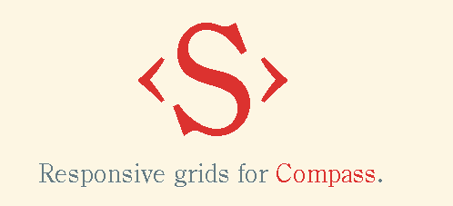
Responsive grids for Compass.
bourbon

A simple and lightweight mixin
library for Sass.
CSS3 Animate
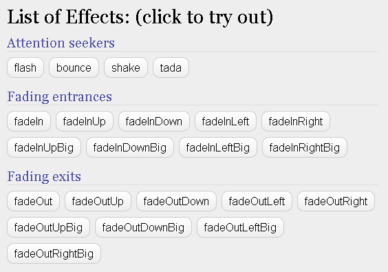
Animate Mixin for Compass/SASS
END
高雄前端社群
讓南部的網頁設計師
有一個交流的場所與管道
Thank you
Modular & Maintainable CSS with Sass and Compass
By gonsakon

