Welcome to the jungle
Ett fönster in i en ny värld
...men hur brett är det?
Landskapet
Desktop browsers

Rendering engine


[URL]
Desktop browsers
Webkit
Blink
Blink
Gecko
EdgeHTML
Trident
Trident
mobile browsers
Safari
Android WebKit
Google Chrome
*vendor* Chrome
ANDROID
APPLE
DIFFERENTIATE!
GOOGLE SERVICES
NOOOO!!!!

ONE RENDERING ENGINE ALLOWED
PROXY
Opera Mini
Let's be apple for a moment
- Size
- Input
- Existing internet
Problem
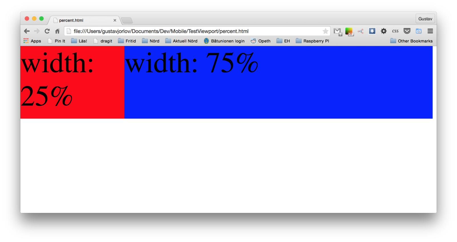
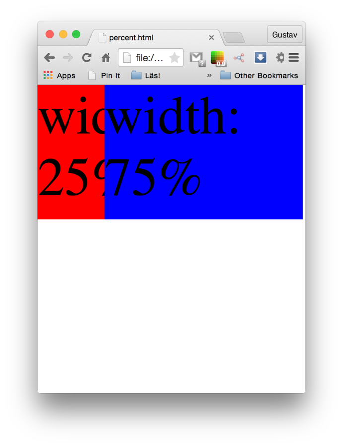
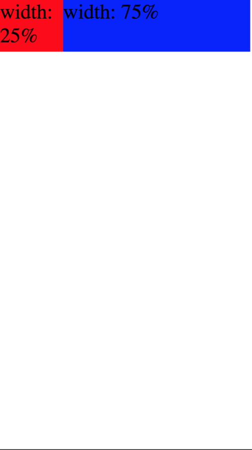
Percent width
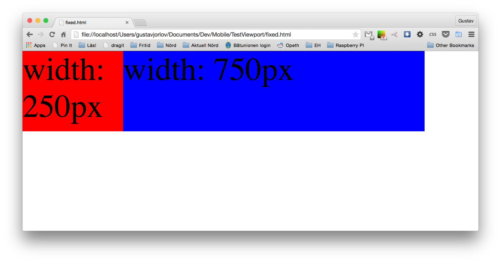
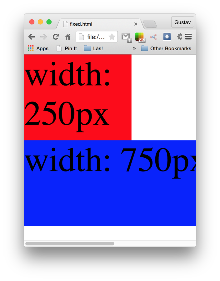
Pixel width
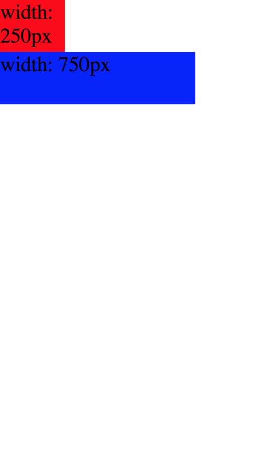
Desktop
Desktop
"Mobile"
"Mobile"
Viewports
?
#something{
    width: 35%;
}
Size: Viewports
35%
body
which is 100% of
html
VIEWPORT
<html>
    <body>
        <div id="something"></div>
    </body>
</html>
which is 100% of
of what!?
Viewports
Desktop
Mobile ?
Browser
Viewport
Device
Viewport
Need more control!
Viewports
Default behaviour
Zoom to fit the Layout Viewport
Viewports
Visual Viewport
(screen pixels)
Layout Viewport
Often 980px, but span 768 - 1024 px
(but what about high resolutions?!)
Need even more control!
Viewports
Visual Viewport
Layout Viewport
Need to tell the rendering engine to only render on desired width
Ideal Viewport
Layout Viewport
===
Visual Viewport
Ideal Viewport
<head>
    <meta name="viewport" content="width=device-width,initial-scale=1">
</head>
Telling the rendering engine to use the device width as layout viewport width
High resolutions
iPhone 3G
Nexus 5
iPhone 6
375px
320px
360px
320px
750px
1080px
Device
Ideal
Device Pixel Ratio
2
1
3
Small interfaces
Viewport Summary
Browser
Viewport
"Mobile"
Viewport
Mobile!
Layout Viewport
Visual Viewport
Ideal Viewport
Meta Viewport
touches, pointers and wars
...and some pitfalls
mousedown
touchstart
mousemove
touchmove
mouseup
touchend
mouseout
-
mouseover
-
Mappning
Don't make your site rely on :hover styles and events
pinch to zoom
scroll
tap
300 ms
double tap
need 300 ms to decide
*touchstart*
Cascades
tap
- touchstart
- touchend
- mouseover
- 1 mousemove
- mousedown
- mouseup
- click
- :hover CSS styles
- mouseout
- :hover CSS styles removed
tap on another element
You think all other browsers use this order :)
Microsoft
and pointer events
pointerdown
touchstart
pointermove
touchmove
pointerup
touchend
pointerout
-
pointerover
-
APPLE
MICROSOFT
Mouse
Finger
Anything!
Best PRactices
The ultimate viewport meta tag
<head>
    <meta name="viewport" content="width=device-width,initial-scale=1">
</head>
https://shop.smashingmagazine.com/products/mobile-web-handbook
WHy didn't we just end up making the viewport as wide as the screen?
Don't make your site rely on :hover and :active events
Welcome to the jungle
By Gustav Jorlöv