Responsive Web Design
Si XiaoJing
1. Background
In "ancient" times
1. Background
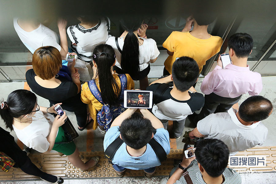
Nowdays
1. Background
Print vs. Web
1. Backgrounds
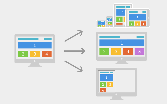
Web is flexible.
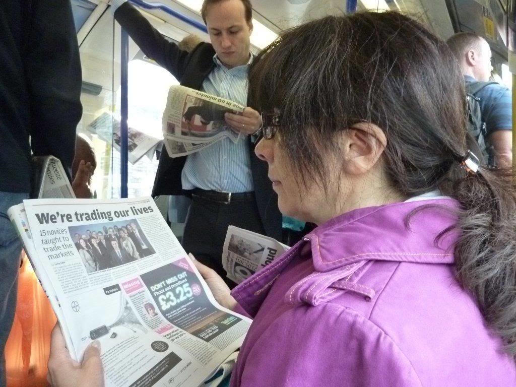
Surfing
1. Background
Before
Now
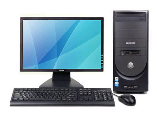
The flexible of web.
1. Background
Time to use it better.
2. Examples
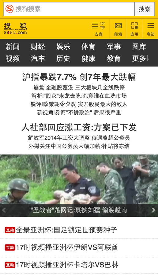
Example 1
2. Examples
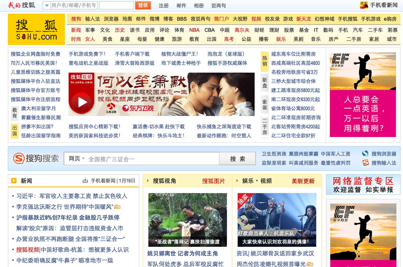
Example 2
2. Examples
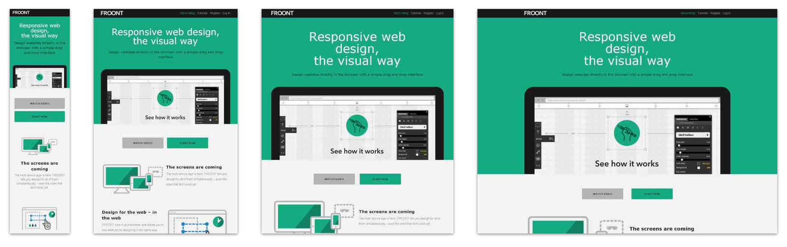
Which one you prefer ?
2. Examples
3. Introduction
Responsive
Web
Design
3. Introduction
响应式
网页
设计
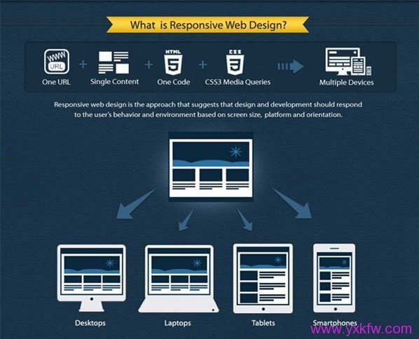
Responsive web design (RWD) is an approach to web design aimed at crafting sites to provide an optimal viewing experience—easy reading and navigation with a minimum of resizing, panning, and scrolling—across a wide range of devices (from desktop computer monitors to mobile phones).
3. Introduction
Description on Wiki:
- One page.
- One content.
- One code.
- Adapt multiple devices.
- Better user expeirences.
3. Introduction
Characteristics of RWD:
3. Introduction
RWD


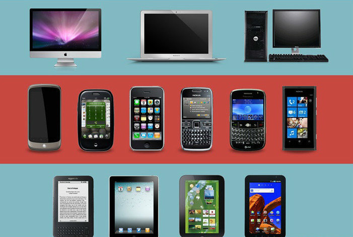
4. Why using RWD ?
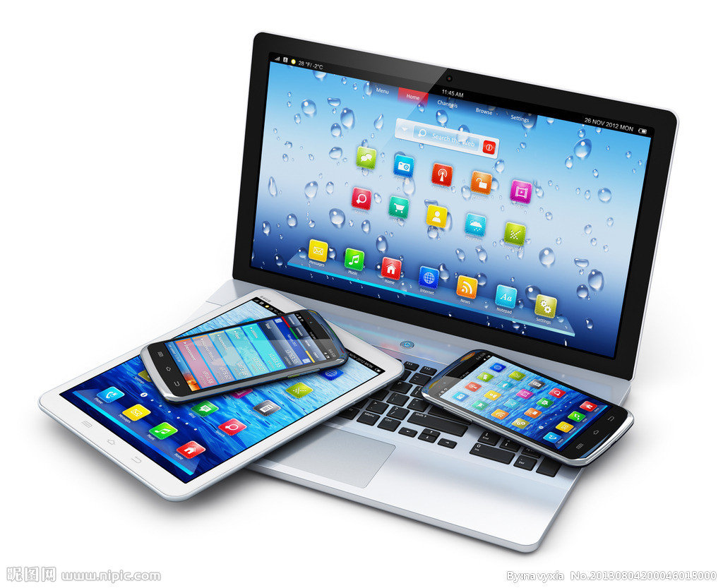
- Mobile increase.
- Various Resolution & Clients.
- Lower cost.
- 2 Targets, 1 Bonus.
4. Why using RWD ?
Multiple devices
4. Why using RWD ?
Different resolutions

4. Why using RWD ?
Time to play real.
5. HOW
5. HOW
Fluids layout:
.left-side {
    width: 25%;
    float: left;
}
.middle {
    width: 50%;
    float: left;
}
.right-side {
    width: 25%;
    float: right;
}
5. HOW
Flexible contents:
img {
    width: 100%;
}

h1 {
    font-size: 2em;
    line-height: 1.5em;
}
5. HOW
Media Queries
- A CSS3 feature.
- Different styles in different medias and resolutions.
Click me to see more.
5. HOW
Media Queries: expressions
<link href="css/common.css" rel="stylesheet"
type="text/css" media="all" />

<link href="css/screen.css" rel="stylesheet"
type="text/css" media="screen" />

<link href="css/print.css" rel="stylesheet"
type="text/css" media="print" />
HTML
5. HOW
@media screen {
    .side {
	display: block;
    }
}

@media print {
    .side {
	display: none;
    }
}
Media Queries: expressions
CSS
5. HOW
@media screen and (min-width: 1200px) {
    // css...
}

@media screen and (min-width: 768px) and (max-width: 980px) {
    // css...
}

@media screen and (max-device-width: 480px) {
    // css...
}
Media Queries: expressions
CSS
- Generally, 2 breakpoints could be just fine,which used for phone、pad、and desktop.
- Breakpoints are besed on design and designer.
5. HOW
Media Queries: breakpoints
5. HOW
<meta name="viewport"
content="width=device-width; initial-scale=1.0" />
Media Queries: Viewport
HTML
6. Tools
-
Chrome:Developer tools.
-
Firefox: Developer -> Responsive views.
6. Tools
7. Workflow
7. Workflow
Thank you!
Responsive Web Design
By Haidong Zhang