General Navigation Cards Component

Use the arrow keys or spacebar to go to the next slide.
Make this presentation full screen for best effect.
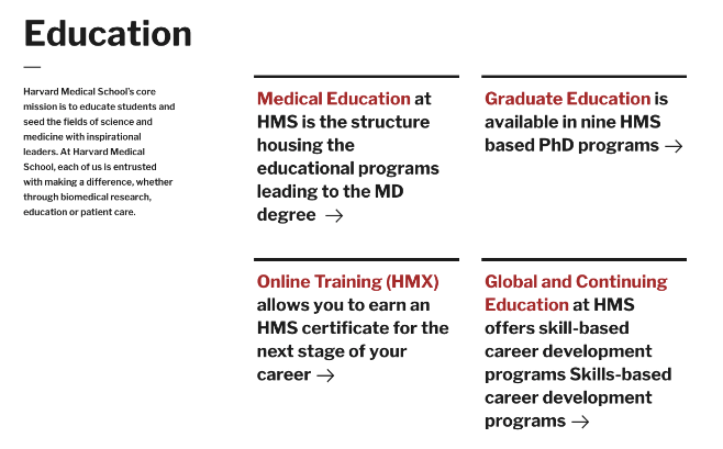
- The General Navigation Cards component allows a user to have section of content on the page to be in a series of cards, only displaying brief information about another piece of content.
- This component is used to display certain pieces of content in a block format that contains teaser information that would lead to the full content once a card is clicked by a user.
- This component is only available to use if the links of content are internal. This means that any link outside of the site you are on will not work and another component would need to be used. Please see Text Navigation with Image Cards for this use case.
What are General Navigation Cards?
Below is a list of available fields that are a part of the General Navigation Cards component:
- Component Title
- Component Intro Text
- General Navigation Item
The component itself has a component title as mentioned above. This would be used for the overall heading and title of what you would be calling this component. For example, if you will be using this component for different medical school pathways, the title could be something along the lines of Education
Available Item Fields
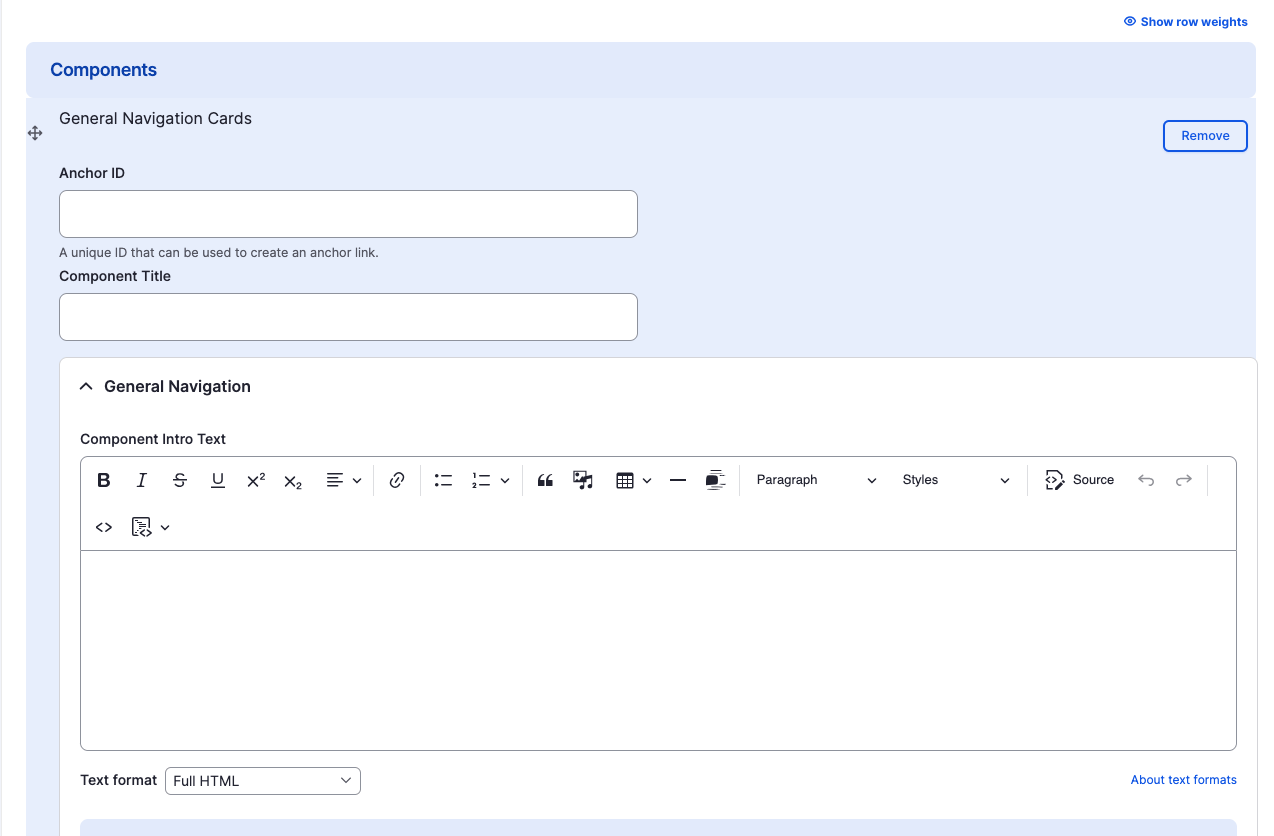
General Navigation Cards (backend)
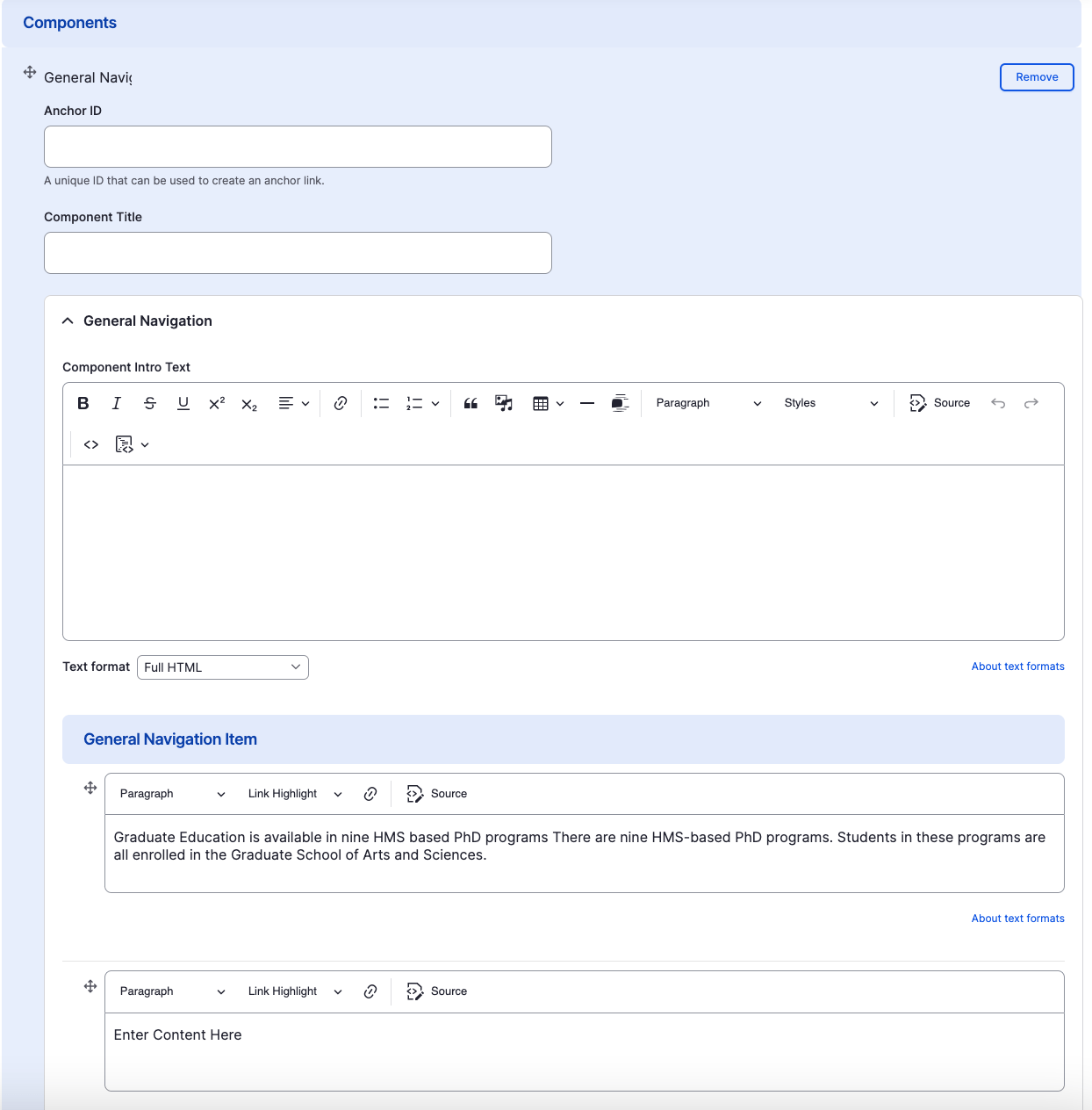
General Navigation Cards
- Component Title
- Component Intro Text
- General Navigation Item

Adding Multiple Navigation Cards
By default when creating General Navigation Cards, only three cards are created. To add additional General Navigation Cards, just click the "Add Another Item" button.
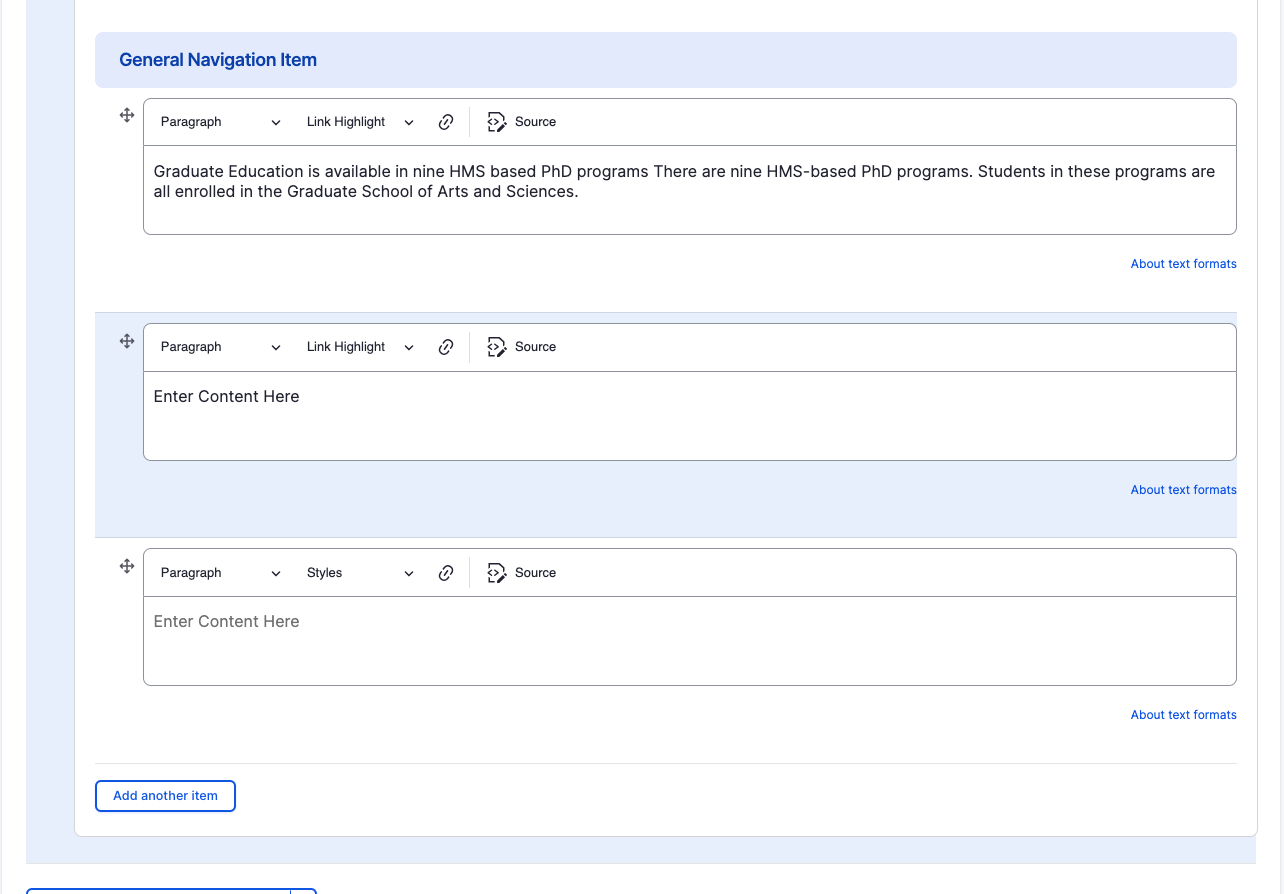
Rearranging and Ordering Navigation Cards
If you have multiple card items, you can change the order as to which the cards will appear. To do so, right above each card item, you will have the ability to drag and drop each one to determine the order.

Removing Navigation Cards
Also, if you would like to remove one of the card items you created, all you have to do is click the remove button associated with the card you would like to remove. There will be a confirm removal that appears so if you didn't mean to remove an item, you can cancel it or you can confirm the removal.
Congratulations!
You have completed the
General Navigation Cards Walkthrough
use the back button to go back to where you were
General Navigation Cards Component
By harvardms
General Navigation Cards Component
In this lesson you will learn about what the General Navigation Cards component is and how to use it within within Drupal. This covers different use cases as well as how it will visually look on your site.
- 1,974


