Visual Navigation Cards Component

Use the arrow keys or spacebar to go to the next slide.
Make this presentation full screen for best effect.

- The Visual Navigation Cards component allows a user to have section of content on the page to be in a series of cards, only displaying brief information about another piece of content, as well as an image displayed in the background of the card.
- This card is intended for use to help users navigate to Departments within HMS. It allows for department sites that are built within the flagship site as well as departments that have their own external sites.
- You can ONLY select Departments in the page reference fields. The content for these cards are pulled in dynamically from the Departments that you reference. The image, title, subtitle and teaser text are all managed on the ‘Teaser’ tab of the Department content type.
What are Visual Navigation Cards?
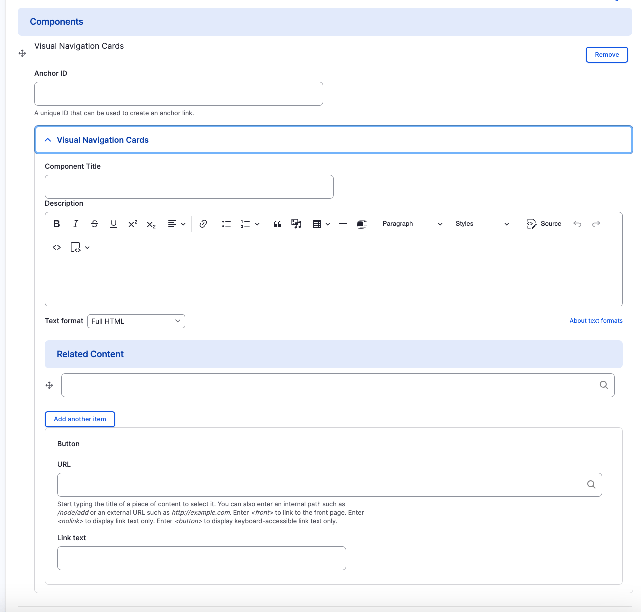
Below is a list of available fields that are a part of the Visual Navigation Cards component:
- Component Title
- Component Description
- Department Page Reference
- URL
- Link Text
Available Item Fields
Visual Navigation Cards (backend)

Visual Navigation Cards
- Component Title
- Component Description
- URL & Link Text
Please note that this information is being pulled from the Teaser section that is field out in the original department page of each card.

Adding Multiple Visual Navigation Cards
By default when creating Visual Navigation Cards, only one card is created. To add additional General Navigation Cards, just click the "Add Another Item" button.

Rearranging and Ordering Multiple Visual Navigation Cards
If you have multiple card items, you can change the order as to which the cards will appear. To do so, right above each card item, you will have the ability to drag and drop each one to determine the order.

Removing Multiple Visual Navigation Cards
Also, if you would like to remove one of the card items you created, all you have to do is click the remove button associated with the card you would like to remove. There will be a confirm removal that appears so if you didn't mean to remove an item, you can cancel it or you can confirm the removal.

Congratulations!
You have completed the
Visual Navigation Cards Walkthrough
use the back button to go back to where you were
Visual Navigation Cards Component
By harvardms
Visual Navigation Cards Component
In this lesson you will learn about what the Visual Navigation Cards component is and how to use it within within Drupal. This covers different use cases as well as how it will visually look on your site.
- 2,080


