Responsive design/dev
Responsive design
Day by day, the number of devices, platforms, and browsers that need to work with your site grows. Responsive web design represents a fundamental shift in how we’ll build websites for the decade to come.” - Jeffrey Veen
Responsive design
Responsive design
- traditional trend: building websites for browsing only by large screens
- modern trend: responsive design for browsing by mobile devices which are the most popular means of browsing the web today
Responsive design
what we are supposed to learn today and in the course of the week:
- responsive units
- relative units
- media queries
- fluid images
- grid systems
- responsive design patterns
- foundation system
Responsive design
Objectives
- uses relative units
- responds to at least three different screen sizes
- incorporates media queries without foundation/bootstrap
- includes fluid images
- demonstrates an understanding of responsive design patterns
Responsive design
According to Mozilla Developers Network docs:
A media query consists of a media type and at least one query that limits the style sheets' scope by using media features such as; width, height and color
they let the presentation of content be tailored to a specific range of output devices without having to change the content itself
Responsive design
Example media query
@media screen and (min-width:600px) {
  nav {
    float: left;
    width: 25%;
  }
  section {
    margin-left: 25%;
  }
}

@media screen and (max-width:599px) {
  nav li {
    display: inline;
  }
}
Responsive design
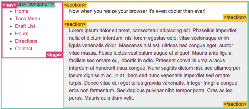
How it will look on a desktop browser
Responsive design
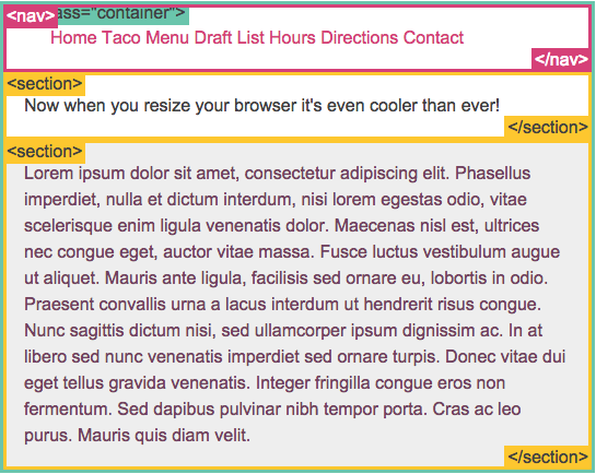
Anything 599px and below and it will look like this:
Responsive design
tasks
simple site with: stories
Responsive design
fluid image resource
fluid images: https://youtu.be/_dnM6kIn4A8
deck
By ian munene
deck
responsive design slides


