
Christopher Bloom
Frontend developer, lover of design systems, CSS architecture, and all things javascript.
Christopher Bloom
Components usable in Drupal
Components usable in React/etc
TypeScript
Less bespoke/simpler
Design system versioning/publishing
Storybook
Tailwind
<p2-cta-image pixel subtitle="Digital experience that advances the human experience.">
  <img src="image.jpg" alt="Demo image"/>
</p2-cta-image>
Components usable in Drupal
Web components are the web standard way to define custom elements that contain their own markup, styles, and behavior.
They work perfectly in Drupal and JS frameworks.
import { Component, Prop, h } from '@stencil/core';

@Component({
  tag: 'my-embedded-component'
})
export class MyEmbeddedComponent {
  @Prop() color: string = 'blue';

  render() {
    return (
      <div>My favorite color is {this.color}</div>
    );
  }
}
3. TypeScript
TypeScript is baked into all Stencil tooling.
4. Less bespoke/simpler
5. Versioning/publishing
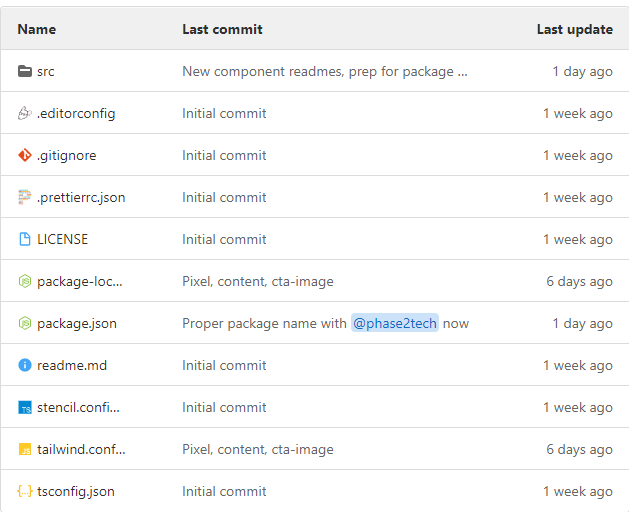
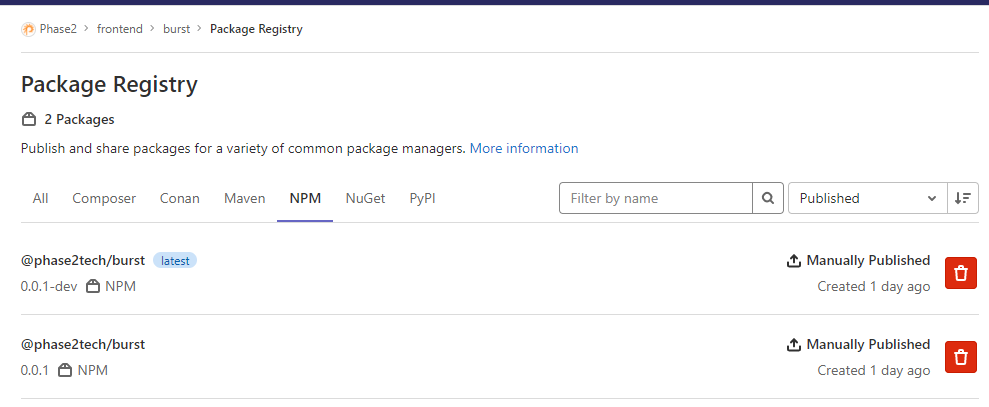
A design repository of components makes for simpler tooling AND easy publishing on the package systems of GitHub/GitLab/NPM.
Repo
Package
6. StoryBook
Solved with a bit of integration:
https://github.com/dutscher/stencil-storybook
7. Tailwind
@apply works in Stencil CSS. It's not true utility classes, but it's at least token-based styling.
:host {
  @apply block w-3 h-3;

  &([color="p2-blue"]) {
    @apply bg-p2-blue;
  }
  &([color="karma-coral"]) {
    @apply bg-karma-coral;
  }
  &([color="soft-black"]) {
    @apply bg-soft-black;
  }
  &([color="not-gray"]) {
    @apply bg-not-gray;
  }
  &([color="dusty-blue"]) {
    @apply bg-dusty-blue;
  }
  &([color="misty-teal"]) {
    @apply bg-misty-teal;
  }
  &([color="electric-violet"]) {
    @apply bg-electric-violet;
  }
  &([color="dark-gray"]) {
    @apply bg-dark-gray;
  }
  &([color="white"]) {
    @apply bg-white;
  }
  &([color="black"]) {
    @apply bg-black;
  }
}By Christopher Bloom


