CSS ADVANCED

Display
The display property specifies the type of box used for an HTML element
Inline block
Position
The position property specifies the type of positioning method used for an element
There are four different position values:
- static
- relative
- fixed
- absolute
Elements are then positioned using the top, bottom, left, and right properties. However, these properties will not work unless the position property is set first. They also work differently depending on the position value.
static
HTML elements are positioned static by default.
Static positioned elements are not affected by the top, bottom, left, and right properties.
An element with position: static; is not positioned in any special way; it is always positioned according to the normal flow of the page:
relative
- An element with position: relative; is positioned relative to its normal position.
- Setting the top, right, bottom, and left properties of a relatively-positioned element will cause it to be adjusted away from its normal position.
- Other content will not be adjusted to fit into any gap left by the element.
Absolute
- An element with position: absolute; is positioned relative to the nearest positioned ancestor (instead of positioned relative to the viewport, like fixed)
- A "positioned" element is one whose position is anything except static
- If an absolute positioned element has no positioned ancestors, it uses the document body, and moves along with page scrolling.
Fixed
- An element with position: fixed; is positioned relative to the viewport, which means it always stays in the same place even if the page is scrolled.
- The top, right, bottom, and left properties are used to position the element.
- A fixed element does not leave a gap in the page where it would normally have been located.
Positioning problems
1. If width or height absolutely positioned element is set to auto, its value will be determined by the width or height of the element's content. If the width or height declared explicitly, then this value will be assigned.
2. If there are positioned elements inside of a block with position: absolute and they have a float, the height of positioned element will be equal to the height of the highest of these elements.
3. For an element with position: absolute it is not possible to set a float property, but for the element with position: relative — possible. The top, right, bottom, and left properties are used to position the element.
Float and Clear
- The float property specifies whether or not an element should float.
- The clear property is used to control the behavior of floating elements.
Z-index
- When elements are positioned, they can overlap other elements
- The z-index property specifies the stack order of an element (which element should be placed in front of, or behind, the others)
- An element can have a positive or negative stack order
Overflow
The overflow property specifies what happens if content overflows an element's box.
Hide element
Clip-path
The clip property lets you specify a rectangle to clip an absolutely positioned element
https://sarasoueidan.com/demos/css-svg-clipping/html-img-clipped-with-css-svg-clippath/index.html
http://bennettfeely.com/clippy/
Clip-path
Mask
Filter
filter: url(resources.svg);
filter: blur(5px);
filter: brightness(0.4);
filter: contrast(200%);
filter: drop-shadow(16px 16px 20px blue);
filter: grayscale(50%);
filter: hue-rotate(90deg);
filter: invert(75%);
filter: opacity(25%);
filter: saturate(30%);
filter: sepia(60%);

/* Using 2 and more filters */
filter: contrast(175%) brightness(3%);

/* Global values */
filter: inherit;
filter: initial;
filter: unset;
The filter property provides for effects like blurring or color shifting on an element’s rendering before the element is displayed. Filters are commonly used to adjust the rendering of an image, a background, or a border.
Filter
Task 0
Survive the task "Positioning" here
If you are confident in your abilities and sure you understand positioning very well, you can skip this exercise. If not, strongly recommend survive it!!!
Send
Task 1
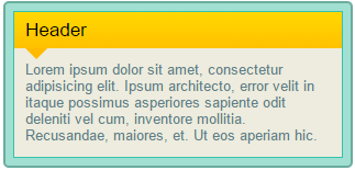
Create such article block
The layout is flexible (its width is changed according to the browser width)
Task 2
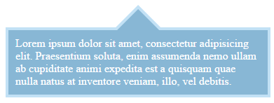
Create such block
Using this layout
<!DOCTYPE html>
<html lang="en">

<head>
    <meta charset="UTF-8">
    <title>Task 2</title>
</head>

<body>

    <div class="arrow-box">Lorem ipsum dolor sit amet,
consectetur adipisicing elit. Praesentium soluta,
 enim assumenda nemo ullam ab cupiditate animi expedita est
 a quisquam quae nulla natus at inventore veniam, illo, vel debitis.</div>

</body>

</html>
Task 3
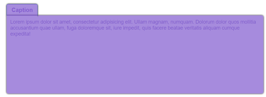
Create this tab
Pay attention to the shadows
Task 4
Create Dropdown top menu using CSS and HTML


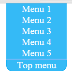
Hover
Click
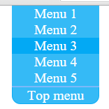
Hover menu item
Tips: Pseudo-class, checkbox, label, for, Adjacent selector
Task 5


Create this menu
Hover effect
Link for icons
Task 6
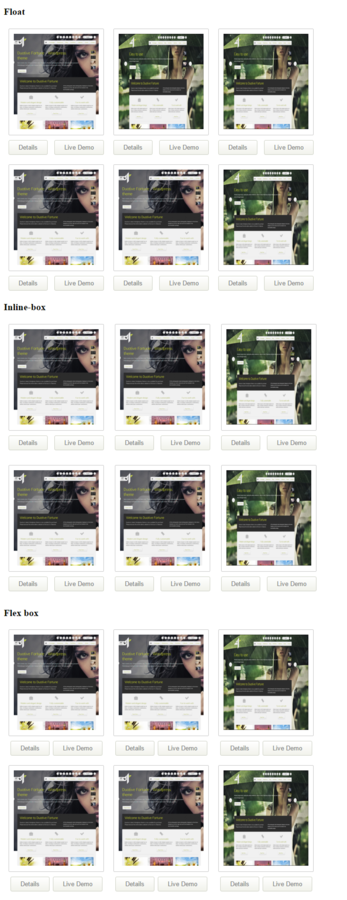
Create thumbnails using three approaches:
- Float
- Inline-box
- Flex-box
Use pictures whatever you want
Home work
http://css.yoksel.ru/flexbox/ Flexbox tutorial
http://flexboxfroggy.com/ Flexbox Froggy
https://events.yandex.ru/lib/talks/563/ CSS: Свободное перемещение и позиционирование
http://learnlayout.com/toc.html Learn CSS Layout
https://webref.ru/css/type/position Позиционирование
https://webref.ru/css/type/format Форматирование
https://webref.ru/css/type/flex Флексы
http://html5.by/blog/flexbox/ Что такое Flexbox?
http://www.youtube.com/watch?v=XD4oOt_oEFU Знакомство с CSS3 Flexbox
http://habrahabr.ru/post/259783/ Flexbox на примере игрального кубика
http://habrahabr.ru/post/242545/ Практическое применение FlexBox
http://habrahabr.ru/post/257253/ Строим с flexbox
http://webkab.ru/izuchaem-flexbox/ Изучаем Flexbox
http://css-live.ru/articles/vizualnoe-rukovodstvo-po-svojstvam-flexbox-iz-css3.html Визуальное руководство по свойствам Flexbox из CSS3
https://css-tricks.com/snippets/css/a-guide-to-flexbox/ Flexbox
THANKS FOR YOUR ATTENTION
CSS advanced
Copy of CSS Advanced
By ilyinalada
Copy of CSS Advanced
- 571


